
Tidyverse with GitHub Copilot for Healthcare Analytics – Part 2
Want to share your content on R-bloggers? click here if you have a blog, or here if you don't.
1. Introduction and recap
Healthcare analytics offers significant benefits to a wide range of stakeholders, including health administrators, organizations, and most importantly, doctors, nurses, and healthcare workers.
In the first part of this series, we introduced a complex dataset of diabetes patient encounters, comprising 100,000+ rows and over 50 columns. This dataset includes a rich array of variables, such as admission type and primary diagnosis. We demonstrated the process of cleaning, redefining, and preparing this data for analysis, highlighting the use of GitHub Copilot to navigate a particularly challenging variable.
In this second installment, we will dive deeper to evaluate the effectiveness of healthcare delivery and the impact of patient-level variables on downstream outcomes. We start by exploring medication prescriptions more closely and setting up the analytics around patient outcomes like hospital readmissions.
Finally, in a supplemental post that we will publish shortly after this one, we will examine the use of Copilot a little more, especially around avoiding tricky situations arising from insufficient context or guidance provided to Copilot (see here for more).
2. Some useful data summaries
Before we explore how downstream outcomes, such as early hospital readmissions, may be influenced by specific care delivery actions, such as whether a patient’s HbA1c was measured during their stay, let’s ground ourselves in the dataset. We’ll start by summarizing key variables, which include:
Covariates — such as initial diagnoses and early interventions upon admission.
Outcomes — both intermediate care delivery results and downstream events, like early readmissions.
Understanding the structure and distribution of these variables is a critical first step before modeling or drawing any conclusions.
Let’s read in the data again and clean it. The code snippet and the data can be downloaded from here. We will summarize the following fields, and instead of tables, we will use some compelling visuals to rapidly get us to our insights.
| Field name | Field type | Field description |
|---|---|---|
primary_diag |
initial admission covariate | primary diagnosis upon admission |
a1c |
initial admission covariate | whether a patient was given the A1c test or not |
diabetesMed |
intermediate response | whether a patient was given any diabetes medication |
acarbose:troglitazone |
intermediate response** | individual 23 diabetes medications that were prescribed or not, and if prescribed, were held steady, increased or decreased |
readmitted |
final response | whether the patient was readmitted early (<30 days) |
Show the code
# --------------------------------------------- #
# Load necessary libraries
# --------------------------------------------- #
library(dplyr)
library(ggplot2)
library(tidyr)
library(kableExtra)
library(gridExtra)
library(grid)
library(lattice)

# --------------------------------------------- #
# Read in the data
# --------------------------------------------- #

D <- read.csv("https://raw.githubusercontent.com/VidishaVac/healthcare-analytics/refs/heads/main/dataset_diabetes/diabetic_data.csv", sep = ",")

# -------------------------------------------------------- #
# Clean and re-define HbA1c and primary diag
# -------------------------------------------------------- #

D <- D %>%
  mutate(
    a1c = ifelse(A1Cresult == "None", "not measured", "measured"),
    primary_diag = case_when(
      diag_1 %in% c(390:459, 785) ~ "Circulatory",
      diag_1 %in% c(460:519, 786) ~ "Respiratory",
      diag_1 %in% c(520:579, 787) ~ "Digestive",
      diag_1 %in% c(580:629, 788) ~ "Genitourinary",
      diag_1 %in% c(630:679) ~ "Pregnancy",
      diag_1 %in% c(680:709, 782) ~ "Skin",
      diag_1 %in% c(710:739) ~ "Musculoskeletal",
      diag_1 %in% c(740:759) ~ "Congenital",
      diag_1 %in% c(800:999) ~ "Injury",
      grepl("^250", diag_1) ~ "Diabetes",
      is.na(diag_1) ~ "Missing",
      TRUE ~ "Other"
    )
  )

# Remove columns not used, patients with a discharge disposition of "expired" or "hospice"
D <- D %>% select(1,2,7:9,25:52) %>%
  filter(!discharge_disposition_id %in% c('11','13','14','19','20','21'))

# Summarize
summary_a1c <- D %>%
  group_by(a1c) %>%
  summarise(count = n(), percent = n() / nrow(D) * 100) %>%
  arrange(desc(percent))
summary_primary_diag <- D %>%
  group_by(primary_diag) %>%
  summarise(count = n(), percent = n() / nrow(D) * 100) %>%
  arrange(desc(percent))
summary_readmitted <- D %>%
  group_by(readmitted) %>%
  summarise(count = n(), percent = n() / nrow(D) * 100) %>%
  arrange(desc(percent))
summary_change <- D %>%
  group_by(change) %>%
  summarise(count = n(), percent = n() / nrow(D) * 100) %>%
  arrange(desc(percent))
summary_diabetesMed <- D %>%
  group_by(diabetesMed) %>%
  summarise(count = n(), percent = n() / nrow(D) * 100) %>%
  arrange(desc(percent))

# summary_primary_diag %>% kable(digits = 1, format.args = list(big.mark = ","), caption = "Summary of primary diagnosis")
# summary_a1c %>% kable(digits = 1, format.args = list(big.mark = ","), caption = "Summary of A1c test")
# summary_diabetesMed %>% kable(digits = 1, format.args = list(big.mark = ","), caption = "Summary of diabetes medication")
# summary_readmitted %>% kable(digits = 1, format.args = list(big.mark = ","), caption = "Summary of early readmission")
Show the code
df <- summary_primary_diag
df <- df %>% mutate(
  label = c(paste(round(df$percent[1:5]), "%", sep = ""), rep(NA, nrow(df) - 5))
)

p0 <- ggplot(data = df, aes(x = reorder(primary_diag, count), y = count, fill = percent)) +
  geom_bar(stat = "identity", color = "black") +
  coord_polar() +
  scale_fill_gradientn(
    "Percent",
    colours = c("#6C5B7B", "#C06C84", "#F67280", "#F8B195")
  ) +
  geom_text(aes(x = primary_diag, y = count / 2, label = label),
    size = 3.5,
    color = "black",
    fontface = "bold"
  ) +
  scale_y_continuous(
    breaks = seq(0, 40000, by = 10000),
    limits = c(-10000, 40000),
    expand = c(0, 0)
  ) +
  annotate("text", x = 11.95, y = 12000, label = "10,000", size = 2.5, color = "black") +
  annotate("text", x = 11.95, y = 22000, label = "20,000", size = 2.5, color = "black") +
  annotate("text", x = 11.95, y = 32000, label = "30,000", size = 2.5, color = "black") +
  theme(
    # Remove axis ticks and text
    axis.title = element_blank(),
    axis.ticks = element_blank(),
    axis.text.y = element_blank(),
    # Use gray text for the region names
    axis.text.x = element_text(color = "gray12", size = 10),
    legend.position = "none",
    plot.title = element_text(face = "bold", size = 15),
    plot.subtitle = element_text(size = 9)
  ) +
  # Add labels
  labs(
    title = "\nPatient primary diagnoses",
    subtitle = paste(
      "\nPrimary diagnoses of admitted patients vary considerably.",
      "Even for diabetic encounters, the most common admitting diagnosis is",
      "circulatory or heart disease. We will call this out in our analysis,",
      "comparing patient outcomes for these high-risk but non-diabetic",
      "admissions with diabetic admissions (which are only 9% of the",
      "admitting or primary diagnoses).",
      sep = "\n"
    )
  )

# Modifying those with fewer categories
df <- summary_a1c
df <- df %>% mutate(
  label = c(paste(round(df$percent), "%", sep = ""))
)


p1 <- ggplot(data = df, aes(x = reorder(a1c, count), y = count, fill = percent)) +
  geom_bar(stat = "identity", color = "black", width = 1) +
  coord_polar(theta = "x", start = pi / 4) +
  scale_fill_gradientn(
    "Percent",
    colours = c("#F67280", "#F8B195")
  ) +
  #    scale_y_continuous(breaks = seq(0, 90000, by = 30000)) +
  annotate("text", x = 1.25, y = 22000, label = "20,000", size = 3.5, color = "black") +
  annotate("text", x = 1.25, y = 42000, label = "40,000", size = 3.5, color = "black") +
  annotate("text", x = 1.25, y = 62000, label = "60,000", size = 3.5, color = "black") +
  annotate("text", x = 1.25, y = 82000, label = "80,000", size = 3.5, color = "black") +
  geom_text(aes(x = a1c, y = count / 2, label = label),
    size = 3.5,
    color = "black",
    fontface = "bold"
  ) +
  theme(
    # Remove axis ticks and text
    axis.title = element_blank(),
    axis.ticks = element_blank(),
    axis.text.y = element_blank(),
    # Use gray text for the region names
    axis.text.x = element_text(color = "gray12", size = 10),
    legend.position = "none",
    plot.title = element_text(face = "bold", size = 15),
    plot.subtitle = element_text(size = 9)
  ) +
  # Add labels
  labs(
    title = "\nHbA1c test measurement",
    subtitle = paste(
      "\nEven though these are all diabetic encounters, for 83% of patients",
      "an HbA1c value is not measured. This is a vital insight, since HbA1c",
      "is a critical tool to assess patient outcomes and to calculate insulin",
      "dosage (see text for source**).",
      sep = "\n"
    )
  )


df <- summary_readmitted
df <- df %>% mutate(
  label = c(paste(round(df$percent), "%", sep = ""))
)


p2 <- ggplot(data = df, aes(x = reorder(readmitted, count), y = count, fill = percent)) +
  geom_bar(stat = "identity", color = "black", width = 1) +
  coord_polar(theta = "x") +
  scale_fill_gradientn(
    "Percent",
    colours = c("#F67280", "#F8B195")
  ) +
  geom_text(aes(x = readmitted, y = count / 2, label = label),
    size = 3.5,
    color = "black",
    fontface = "bold"
  ) +
  scale_y_continuous(breaks = seq(0, 50000, by = 10000)) +
  annotate("text",
    x = 1, y = 18000, label = "20,000", size = 3.5, color = "black",
    angle = -60
  ) +
  annotate("text",
    x = 1, y = 28000, label = "30,000", size = 3.5, color = "black",
    angle = -60
  ) +
  annotate("text",
    x = 1, y = 38000, label = "40,000", size = 3.5, color = "black",
    angle = -60
  ) +
  annotate("text",
    x = 1, y = 48000, label = "50,000", size = 3.5, color = "black",
    angle = -60
  ) +
  theme(
    # Remove axis ticks and text
    axis.title = element_blank(),
    axis.ticks = element_blank(),
    axis.text.y = element_blank(),
    # Use gray text for the region names
    axis.text.x = element_text(color = "gray12", size = 13),
    legend.position = "none",
    plot.title = element_text(face = "bold", size = 15),
    plot.subtitle = element_text(size = 9)
  ) +
  # Add labels
  labs(
    title = "\nReadmissions",
    subtitle = paste(
      "\nReadmission after discharge is an important downstream patient",
      "outcome, due to the cost burden it levies on the healthcare system.",
      "Almost 50% of patients are readmitted, and 11% are readmitted early-",
      "<30 days after being discharged. We will use this (early readmit)",
      "as our primary outcome in the final analysis.",
      sep = "\n"
    )
  )


df <- summary_diabetesMed
df <- df %>% mutate(
  label = c(paste(round(df$percent), "%", sep = ""))
)


p3 <- ggplot(data = df, aes(x = reorder(diabetesMed, count), y = count, fill = percent)) +
  geom_bar(stat = "identity", color = "black", width = 1) +
  coord_polar(theta = "x", start = pi / 4) +
  scale_fill_gradientn(
    "Percent",
    colours = c("#F67280", "#F8B195")
  ) +
  annotate("text", x = 1.25, y = 26000, label = "25,000", size = 3.5, color = "black") +
  annotate("text", x = 1.25, y = 41000, label = "40,000", size = 3.5, color = "black") +
  annotate("text", x = 1.25, y = 61000, label = "60,000", size = 3.5, color = "black") +
  annotate("text", x = 1.25, y = 81000, label = "80,000", size = 3.5, color = "black") +
  geom_text(aes(x = diabetesMed, y = count / 2, label = label),
    size = 3.5,
    color = "black",
    fontface = "bold"
  ) +
  theme(
    # Remove axis ticks and text
    axis.title = element_blank(),
    axis.ticks = element_blank(),
    axis.text.y = element_blank(),
    # Use gray text for the region names
    axis.text.x = element_text(color = "gray12", size = 10),
    legend.position = "none",
    plot.title = element_text(face = "bold", size = 15),
    plot.subtitle = element_text(size = 9)
  ) +
  # Add labels
  labs(
    title = "\nDiabetes medications",
    subtitle = paste(
      "\nThough these are all diabetic encounters, we see that 23% of patients",
      "are never given diabetes medications. In our analysis, we will also",
      "dive deeper into what this means, and how downstream outcomes of these",
      "patients are impacted by this intermediate care delivery variable.",
      sep = "\n"
    )
  )


grid.arrange(p0, p1, p3, p2, nrow = 2, ncol = 2)

The cognitive dilemma of the pie chart
For as long as we have had data and charts, there has been a debate about whether pie charts are helpful. While the visuals above could easily have been rendered as pie charts, I opted instead for a circular bar plot. Even though we’re still showing proportions, I find circular bars more intuitive when trying to understand actual contribution, both absolute and relative. For instance, only 17% of the 100,000 patients in our sample received an HbA1c measurement — fewer than 20,000 individuals. In the circular bar chart, this is immediately clear: not only is the arc labeled just under 20,000, but the smaller sweep of the 17% segment stands in stark visual contrast to the much larger group that did not receive the test. A standard pie chart, by comparison, flattens this distinction — visually and cognitively — making it harder to grasp the disparity at a glance.
See our supplemental post to understand the plotting mechanics in detail.
[Copilot was not used for these charts]
3. A closer look at all diabetes medications
Let’s now take a closer look at the 23 medication prescriptions, each defined by whether a particular medication was prescribed to the patient, including well-known drugs like insulin and metformin.
Each of these 23 fields is originally categorized into four groups or levels – ![]() ,
, ![]() ,
, ![]() ,
, ![]() . We will visualize this data to assess variations across medications, first to explore how they’re being prescribed, evaluating the use of Copilot in the plots we use, and then in relation to our two key covariates.
. We will visualize this data to assess variations across medications, first to explore how they’re being prescribed, evaluating the use of Copilot in the plots we use, and then in relation to our two key covariates.
To facilitate this, we will first reshape the data using gather(), allowing us to analyze all 23 medications simultaneously. We will then create a series of visualizations using dplyr and ggplot2, with assistance from Copilot for fine-tuning our visuals.
3.1. How are these medications being prescribed?
To visualize and understand how these are prescribed, after reshaping the data, we use geom_tile() to plot all 23 medications and their four levels each, leveraging the structure of the reshaped data. See our supplemental AI tools post to learn more about how this plot was designed.
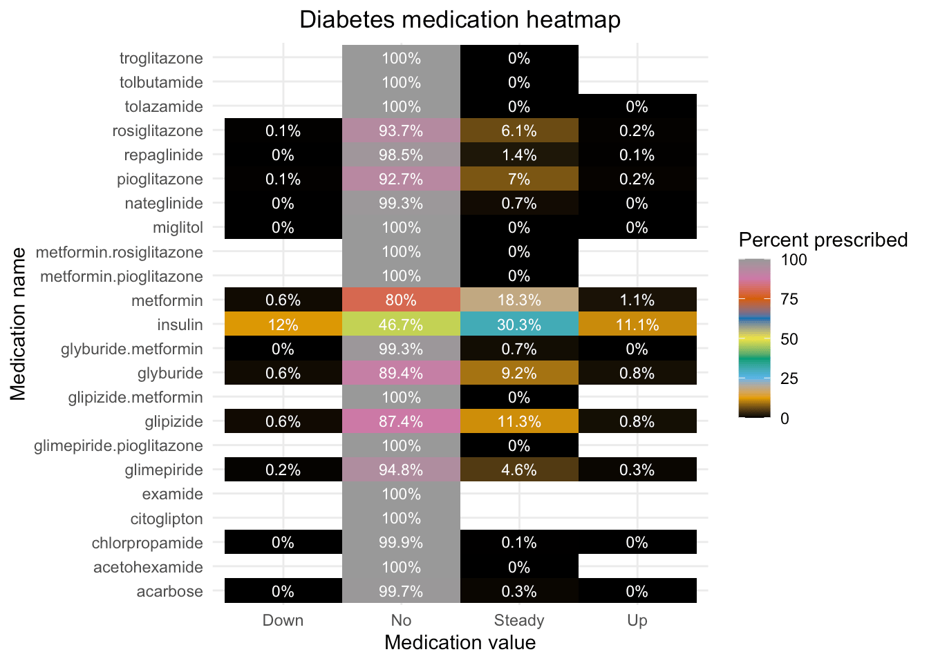
We see that most medications are rarely prescribed; in fact, the medications commonly known for diabetes are the ones most given – insulin and metformin. For the purpose of the next section, we will focus on the medications that are prescribed to at least 5% of patients.
Show the code
# Reshaping wide to get a better view of medications
meds <- D %>%
  select(metformin:metformin.pioglitazone) %>%
  gather(key = "medication", value = "value") %>%
  group_by(medication, value) %>% summarise(n=n()) %>% mutate(pct = (n / sum(n))*100)

p1 <- ggplot(data=meds, aes(x=value, y=medication, fill=pct)) + geom_tile() +
  labs(title = "Diabetes medication heatmap",
       x = "Medication value",
       y = "Medication name", fill="Percent prescribed") + theme_minimal() +
  theme(plot.title = element_text(hjust = 0.5)) +
  scale_fill_gradientn(colors = palette.colors(9),
                       limits = c(0, 100)) +
  geom_text(aes(label = paste(round(pct, 1), "%", sep="")), color = "white", size = 3)

p1

Insulin is prescribed for almost 1.5x as many encounters as any of the other medications. Being a key part of diabetes therapy, this is not surprising; however, the use and dosage of insulin itself are impacted by factors that we will look at in the next section.
Show the code
# Medications prescribed to at least 5% of patients
meds_5pct <- meds %>%
  subset(value == "No" & 100 - pct >= 5) %>%
  mutate(pct_prsc = 100 - pct) %>%
  select(medication, pct_prsc)

ggplot(data = meds_5pct, aes(x = reorder(medication, pct_prsc), y = pct_prsc)) +
  geom_bar(stat = "identity", color = "black", fill = "#56B4E9") +
  labs(
    title = "Medications prescribed to at least 5% of patients",
    x = "Medication name",
    y = "Percent prescribed"
  ) +
  geom_text(aes(label = paste0(round(pct_prsc, 2), "%")),
    position = position_dodge(width = 1), vjust = -0.5, hjust = 1, size = 3.5
  ) +
  coord_flip()
It is worth noting here that it was upon switching to a heatmap style plot using geom_tile(), the more nuanced variations in medications become more evident. This is exactly the value of this tile plot - since in the next section, we will see its ability to handle a complex data structure (23 medications and their 4-fold values), triangulated over A1c test decisions and primary diagnoses, take in our inputs (both the aesthetic specifications as well as the suitable color palettes we provided), and excavate rapid insights into these kind of care delivery patterns.
3.2. Medication usage by 2 key covariates
Now, let’s use the above plot style to triangulate and add more nuance to our investigation – that is, examine the impact made by the admitting primary diagnosis of the patient and whether their HbA1c was measured, on the diabetes medications given to the patient.
3.2.1. Primary diagnoses

While 75% of patients admitted with a diabetes diagnosis are given insulin, this crucial medication is only given to 51% of high-risk circulatory disease patients and 55% of respiratory illness patients. Of those non-diabetic patients who receive insulin, only ~20% receive a change in their dosage, while 40% of diabetic patients get their insulin dosage changed.
Show the code
# i) primary diagnosis

# Re-define diagnoses to focus on a few key ones
D <- D %>% mutate(primary_diag = ifelse(primary_diag %in% c("Digestive", "Genitourinary", "Pregnancy", "Skin", "Musculoskeletal", "Congenital", "Injury", "Other"), "Other", primary_diag))

# Reshape data again
meds_diag <- D %>%
  select(meds_5pct$medication, primary_diag) %>%
  gather(key = "medication", value = "value", -primary_diag) %>%
  group_by(primary_diag, medication, value) %>%
  summarise(n = n()) %>%
  mutate(pct = (n / sum(n)) * 100)

# Plot using color parameters that are robust under color vision deficiencies
ggplot(meds_diag, aes(x = value, y = medication, fill = pct)) +
  geom_tile() +
  facet_wrap(~primary_diag, nrow = 2, ncol = 2) +
  scale_fill_gradientn(
    colors = palette.colors(9),
    limits = c(0, 100)
  ) +
  labs(
    title = "Medication by primary diagnosis & tuned colors",
    x = "Medication value",
    y = "Medication name", fill = "Percent prescribed"
  ) +
  theme_minimal() +
  geom_text(aes(label = paste(round(pct, 1), "%", sep = "")), color = "white", size = 3) +
  theme(plot.title = element_text(hjust = 0.5), legend.position = "none")
3.2.2. A1c test

While 64% of patients whose HbA1c is measured are given insulin, only 52% of those who did not get an HbA1c measurement get this crucial medication. Though this disparity is much less for other medications, the tendency to adjust dosage is higher for patients with an HbA1c measurement. Note that research** has shown that the HbA1c is important in “tailoring appropriate diabetes therapy regimens”, so this finding of a differential dosage adjustment based on HbA1c measurement is extremely important.
Show the code
# ii) A1c

# Re-shape data
meds_a1c <- D %>%
  select(meds_5pct$medication, a1c) %>%
  gather(key = "medication", value = "value", -a1c) %>%
  group_by(a1c, medication, value) %>% summarise(n=n()) %>% mutate(pct = (n / sum(n))*100)

# Visualize with fine-tuned color parameters
ggplot(meds_a1c, aes(x = value, y = medication, fill = pct)) +
  geom_tile() +
  facet_grid(~ a1c) +
  scale_fill_gradientn(colors = palette.colors(9),
                       limits = c(0, 100)) +
  labs(title = "Medication by the A1c test & tuned colors",
       x = "Medication value",
       y = "Medication name", fill="Percent prescribed") +
  theme_minimal() +
  geom_text(aes(label = paste(round(pct, 1), "%", sep="")), color = "white", size = 4) +
  theme(plot.title = element_text(hjust = 0.5))
4. Conclusion and what’s next
These findings highlight meaningful variation in both insulin administration and dosage adjustment across patient groups. While insulin is routinely given to diabetic patients, it is prescribed far less frequently for those with high-risk circulatory or respiratory conditions — and even less likely to be adjusted when given. Notably, patients who receive an HbA1c measurement are not only more likely to be prescribed insulin, but also more likely to have their dosage adjusted — a pattern aligned with clinical guidance emphasizing the role of HbA1c in tailoring diabetes treatment.
Taken together, these patterns suggest that diagnostic practices and comorbid conditions meaningfully shape treatment decisions. With these foundational relationships established, we are now ready to explore how factors like HbA1c measurement and primary diagnosis influence downstream outcomes such as early readmission — a metric of both clinical quality and financial strain. Reducing preventable readmissions not only helps relieve the cost burden on the healthcare system but also improves the patient experience — making this a priority for administrators, caregivers, and, most importantly, the patients themselves. Leveraging AI-assisted pattern discovery, we can now surface deeper insights into how inpatient care decisions translate into longer-term outcomes, guiding more equitable and effective interventions across the board.
In the meantime, be sure to check out the supplemental post we will publish shortly after this one on how we used Copilot in this post, including guidance on effective prompt writing for Copilot, and additional visualizations of the complex data we’re exploring!
R-bloggers.com offers daily e-mail updates about R news and tutorials about learning R and many other topics. Click here if you're looking to post or find an R/data-science job.
Want to share your content on R-bloggers? click here if you have a blog, or here if you don't.