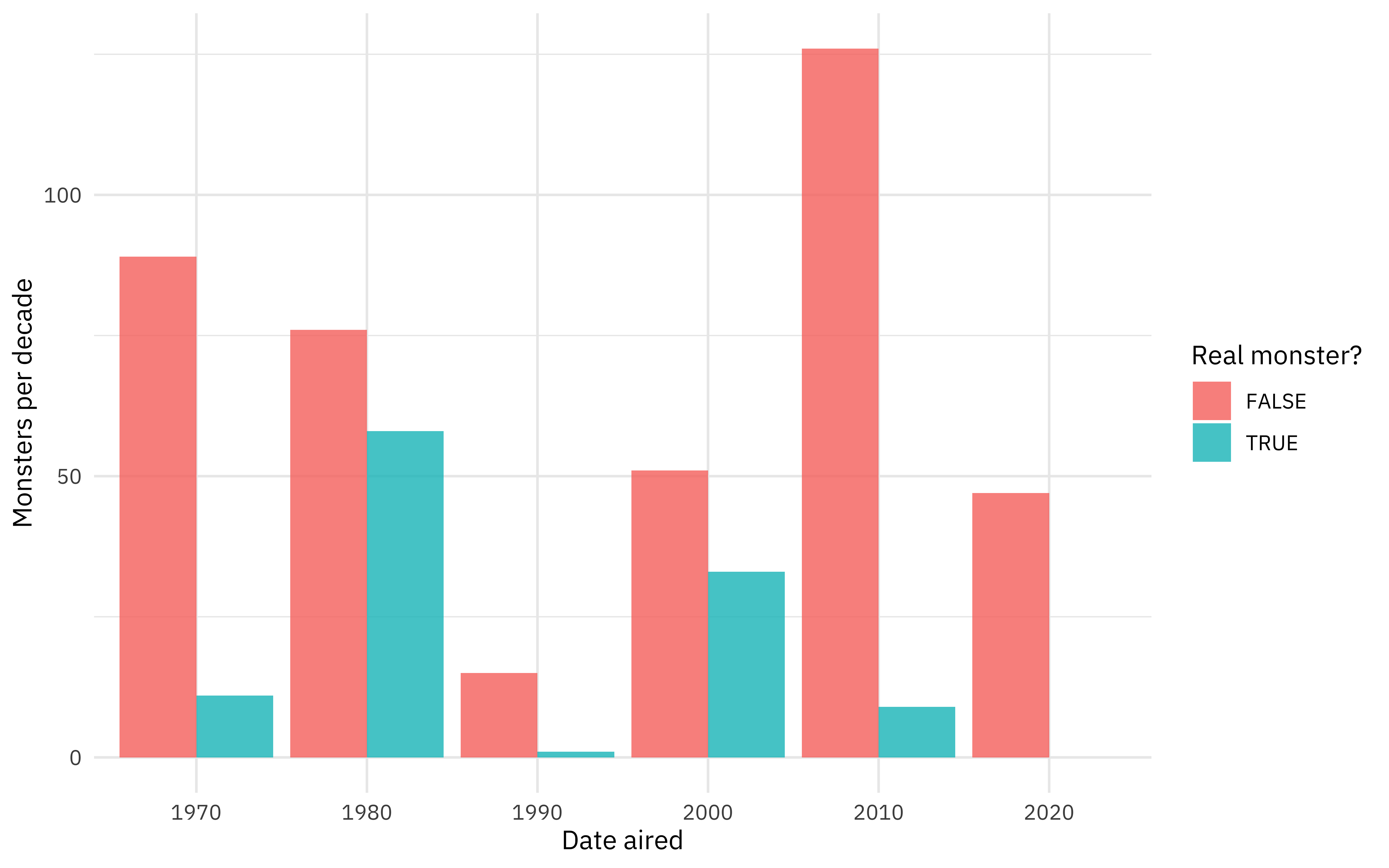
Often (especially when working with large and/or rich datasets) our (gg)plots can feel cluttered with information. But they don’t have to be!
Let’s look at the following plot:
Generate some data
library(dplyr)

bfi <- psychTools::bfi %>%
  mutate(
    O = across(starts_with("O")) %>% rowMeans(na.rm = TRUE),
    C = across(starts_with("C")) %>% rowMeans(na.rm = TRUE),
    E = across(starts_with("E")) %>% rowMeans(na.rm = TRUE),
    A = across(starts_with("A")) %>% rowMeans(na.rm = TRUE),
    N = across(starts_with("N")) %>% rowMeans(na.rm = TRUE)
  ) %>%
  mutate(
    gender = factor(gender, labels = c("Man", "Woman")),
    education = factor(education, labels = c("HS", "finished HS", "some college", "college graduate", "graduate degree"))
  ) %>%
  select(gender, education, age, O:N) %>%
  tidyr::drop_na(education) %>%
  # multiply the data set
  sample_n(size = 10000, replace = TRUE) %>%
  # and add some noise
  mutate(across(O:N, \(x) x + rnorm(x, 0, sd(x))))
library(ggplot2)

theme_set(theme_bw())

base_plot <- ggplot(bfi, aes(age, O, color = education)) +
  facet_wrap(facets = vars(gender)) +
  coord_cartesian(ylim = c(1, 6)) +
  scale_color_viridis_d()

base_plot +
  geom_point(shape = 16, alpha = 0.1) +
  geom_smooth(se = FALSE)
This is a busy plot. It’s hard to see what the each ...