
Little useless-useful R functions – Colourful ggplot line graphs
[This article was first published on R – TomazTsql, and kindly contributed to R-bloggers]. (You can report issue about the content on this page here)
Want to share your content on R-bloggers? click here if you have a blog, or here if you don't.
Want to share your content on R-bloggers? click here if you have a blog, or here if you don't.
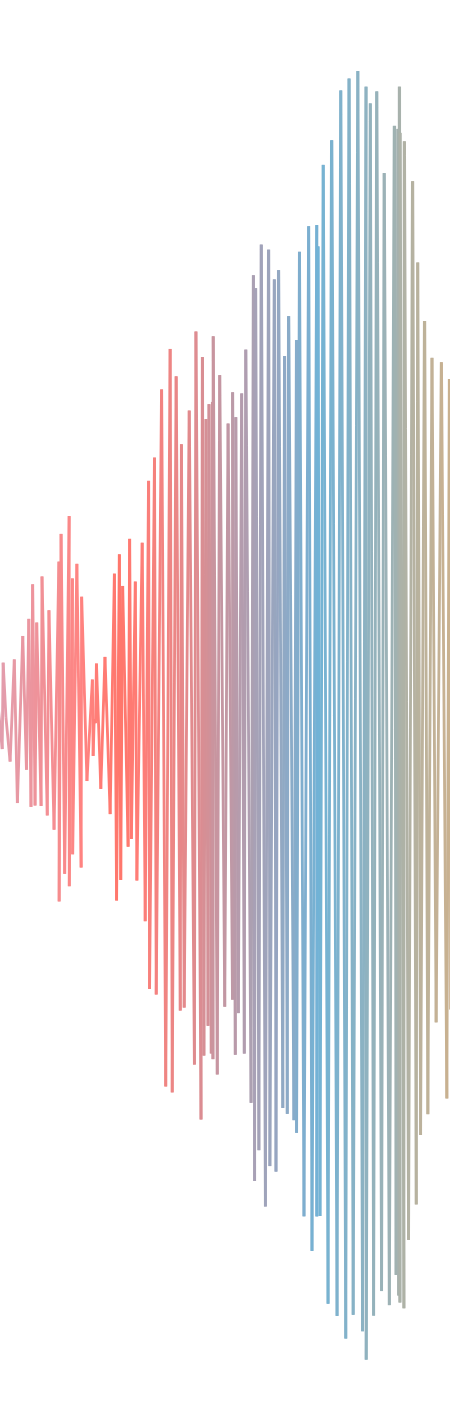
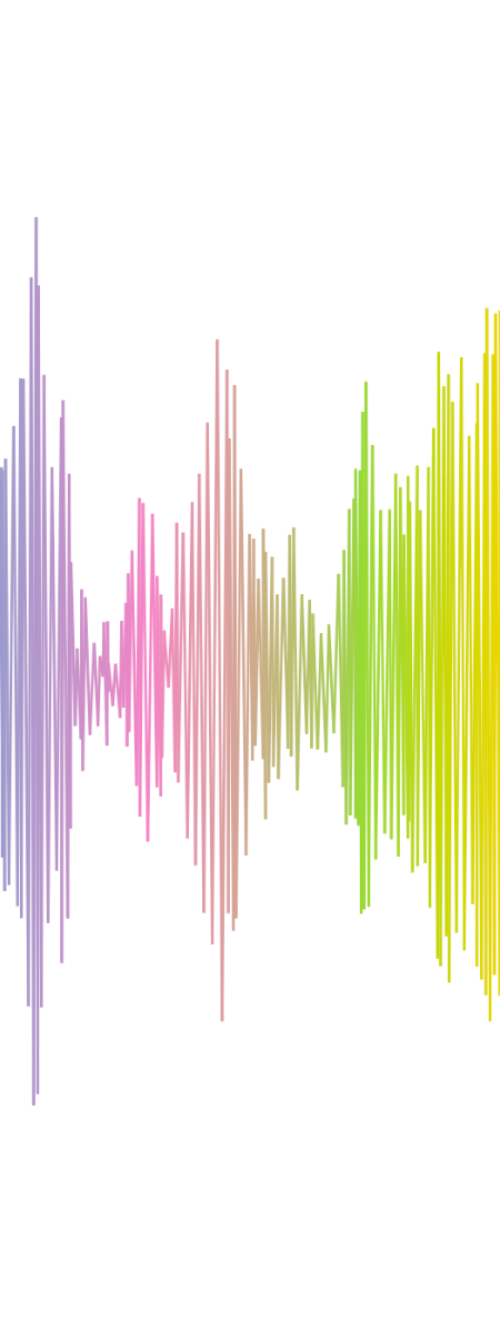
How about some colours in line graph?

Or even more wacky? Nevertheless, let’s create a function that generates some sample “mocked” data and draws a line chart:
#The function
Colourful_graph <- function(n, x, y){
  df <- data.frame(x=x, y=y, col=n)
  for (i in 1:n){
    #get last x,y
    lastx <- tail(df$x, 1)
    lasty <- tail(df$y, 1)
    col <- sample(1:i, 1, replace = T)
    if (i %% 10 == 0) {
      xx <- runif(1, 0.0, 1.0) + lastx
      yy <- runif(1, 0.0, 1.0) - lasty
    } else  {
    xx <- runif(1, 0.0, 1.0) + lastx
    yy <- runif(1, 0.0, 1.0) - lasty
    }
    # change: col=i for rainbow colours
    df <- rbind(df, c(x=xx, y=yy, col=col))

  }
  fake <- df

  brewColours <- as.integer(length(fake$col))
  ColourfulColours <- colorRampPalette(brewer.pal(8, "Set2"))(brewColours)

  # show faked graph
  ggplot(fake, aes(x, y, color = factor(col))) +
    geom_line(color= ColourfulColours) +
    theme(legend.position = "none") +
    theme(panel.grid.major = element_blank(), panel.grid.minor = element_blank(),
          panel.background = element_blank(), axis.line = element_blank(), text=element_blank(), line = element_blank())

}
And run all together with three parameters: n – number of data points and x,y for starting point.
#create colourful graph
Colourful_graph(500,0.4,0.3)
In addition, adding some colorbrewer functionalities can also make line chart random with colours. This following section can be added to function to alternate between the colour palettes:
  #brewer sample 8 color palette
  nn <- as.data.frame(brewer.pal.info)
  nn$names <- row.names.data.frame(nn)
  nn8 <- subset(nn, maxcolors==8, select=c(names))


  brewColours <- as.integer(length(fake$col))
  #ColourfulColours <- colorRampPalette(brewer.pal(8, "Paired"))(brewColours)
  ColourfulColours <- colorRampPalette(brewer.pal(8, sample(nn8$names,1,T)))(brewColours)
Couple of more faked dataset line charts:


As always, code is available in at the Github in same Useless_R_function repository.
Happy R-coding!
To leave a comment for the author, please follow the link and comment on their blog: R – TomazTsql.
R-bloggers.com offers daily e-mail updates about R news and tutorials about learning R and many other topics. Click here if you're looking to post or find an R/data-science job.
Want to share your content on R-bloggers? click here if you have a blog, or here if you don't.