Showing a difference in mean between two groups, take 2
Want to share your content on R-bloggers? click here if you have a blog, or here if you don't.
A couple of years ago, I wrote about the paradoxical difficulty of visualising a difference in means between two groups, while showing both the data and some uncertainty interval. I still feel like many ills in science come from our inability to interpret as simple comparison of means. Anything with more than two groups or a predictor that isn’t categorical makes things worse, of course. It doesn’t take much to overwhelm the intuition.
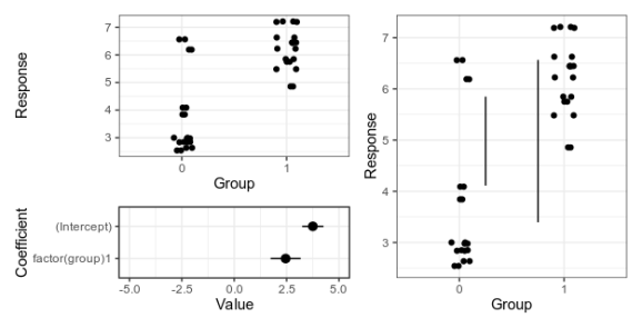
My suggestion at the time was something like this — either a panel that shows the data an another panel with coefficients and uncertainty intervals; or a plot that shows the with lines that represent the magnitude of the difference at the upper and lower limit of the uncertainty interval.
Alternative 1 (left), with separate panels for data and coefficient estimates, and alternative 2 (right), with confidence limits for the difference shown as vertical lines. For details, see the old post about these graphs.
Here is the fake data and linear model we will plot. If you want to follow along, the whole code is on GitHub. Group 0 should have a mean of 4, and the difference between groups should be two, and as the graphs above show, our linear model is not too far off from these numbers.
library(broom)

data <- data.frame(group = rep(0:1, 20))
data$response <- 4 + data$group * 2 + rnorm(20)

model <- lm(response ~ factor(group), data = data)
result <- tidy(model)
Since the last post, a colleague has told me about the Gardner-Altman plot. In a paper arguing that confidence intervals should be used to show the main result of studies, rather than p-values, Gardner & Altman (1986) introduced plots for simultaneously showing confidence intervals and data.
Their Figure 1 shows (hypothetical) systolic blood pressure data for a group of diabetic and non-diabetic people. The left panel is a dot plot for each group. The right panel is a one-dimensional plot (with a different scale than the right panel; zero is centred on the mean of one of the groups), showing the difference between the groups and a confidence interval as a point with error bars.
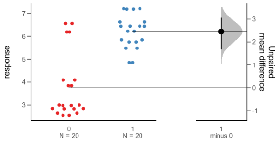
There are functions for making this kind of plot (and several more complex alternatives for paired comparisons and analyses of variance) in the R package dabestr from Ho et al. (2019). An example with our fake data looks like this:
Alternative 3: Gardner-Altman plot with bootstrap confidence interval.
library(dabestr)

bootstrap <- dabest(data,
                    group,
                    response,
                    idx = c("0", "1"),
                    paired = FALSE)

bootstrap_diff <- mean_diff(bootstrap)

plot(bootstrap_diff)
While this plot is neat, I think it is a little too busy — I’m not sure that the double horizontal lines between the panels or the shaded density for the bootstrap confidence interval add much. I’d also like to use other inference methods than bootstrapping. I like how the scale of the right panel has the same unit as the left panel, but is offset so the zero is at the mean of one of the groups.
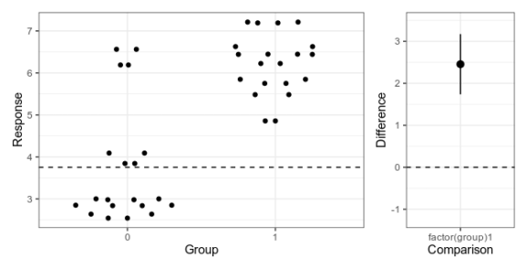
Here is my attempt at making a minimalistic version:
Alternative 4: Simplified Garner-Altman plot.
This piece of code first makes the left panel of data using ggbeeswarm (which I think looks nicer than the jittering I used in the first two alternatives), then the right panel with the estimate and approximate confidence intervals of plus/minus two standard errors of the mean), adjusts the scale, and combines the panels with patchwork.
library(ggbeeswarm)
library(ggplot2)

ymin <- min(data$response)
ymax <- max(data$response)

plot_points_ga <- ggplot() +
  geom_quasirandom(aes(x = factor(group), y = response),
                   data = data) +
  xlab("Group") +
  ylab("Response") +
  theme_bw() +
  scale_y_continuous(limits = c(ymin, ymax))

height_of_plot <- ymax-ymin

group0_fraction <- (coef(model)[1] - ymin)/height_of_plot

diff_min <- - height_of_plot * group0_fraction

diff_max <- (1 - group0_fraction) * height_of_plot

plot_difference_ga <- ggplot() +
  geom_pointrange(aes(x = term, y = estimate,
                      ymin = estimate - 2 * std.error,
                      ymax = estimate + 2 * std.error),
                  data = result[2,]) +
  scale_y_continuous(limits = c(diff_min, diff_max)) +
  ylab("Difference") +
  xlab("Comparison") +
  theme_bw()

(plot_points_ga | plot_difference_ga) +
    plot_layout(widths = c(0.75, 0.25))
Literature
Gardner, M. J., & Altman, D. G. (1986). Confidence intervals rather than P values: estimation rather than hypothesis testing. British Medical Journal
Ho, J., Tumkaya, T., Aryal, S., Choi, H., & Claridge-Chang, A. (2019). Moving beyond P values: data analysis with estimation graphics. Nature methods.
R-bloggers.com offers daily e-mail updates about R news and tutorials about learning R and many other topics. Click here if you're looking to post or find an R/data-science job.
Want to share your content on R-bloggers? click here if you have a blog, or here if you don't.


