
RObservations #10: An Analysis of the Donner-Reed Party with Logistic Regression
Want to share your content on R-bloggers? click here if you have a blog, or here if you don't.
Introduction

The story of the Donner-Reed party is one of the more tragic stories of the American Pioneers. The story is of a group of families and individuals who migrated to California on a wagon train from Midwestern America. The group initially traveled via the Oregon Trail but then opted to take the Hastings Cutoff- a route which was never traveled with wagon trains. While there was some elements of luck involved, there are some interesting characteristics which can be used to model the survival outcome for a given member of the party. While American history is by no means my domain knowledge, I got some more context from the Weird History channel’s video and the History Channel’s blog on the topic.
In this blog post I explore the Donner data set from the vcdExtra package and develop a logistic regression model. A initial model is proposed and refined by using backwards elimination and is diagnosed at every step.Finally we compare all the models made with the main effects model and come up with a model of choice.
Initial Questions
If there is no meaningful questions being posed before exploring our data set, it will be harder to come up with insights. This is why before getting into any EDA or modeling, I’m going to ask the following questions:
- What is the relationship between a individual’s sex, age and family with survival?
- How does the interaction between these 3 variables relate to survival.
As basic as these questions are, these questions will guide the rest of the analysis into model development.
Exploratory data analysis
Because there is no major issue of missing data in this data set, the check I usually do for missing data will be ignored. Lets now look at the relationship of sex, age and family of a given individual in the Donner-Reed party and their survival. Because this is a blog post, all the R code will be included in-line with the output it produces
Individual Sex and Survival
library(vcdExtra)
library(tidyverse)
library(ggthemes)

sexSurvival <-Donner %>% group_by(sex,survived) %>%
  summarize(count=n()) %>%
  mutate(pct=count/sum(count),Count=count)

ggplot(data=sexSurvival,aes(x=sex,y=pct,fill=as.factor(survived)))+
  theme_fivethirtyeight()+
  geom_bar(stat="identity",position="fill")+
  geom_text(mapping= aes(label=scales::percent(pct)),position="stack", vjust=+2.5)+
  geom_text(mapping= aes(label=paste("# of Members:",Count)),position="stack", vjust=+3.8)+
  labs(title="Survival among the Donner Party",subtitle = "Male vs Female")+
  scale_fill_manual(name="Survived",
                    values=c("#F8766D","#00BFC4"),
                    labels=c("No","Yes"))+
  theme(plot.title = element_text(hjust=0.5),plot.subtitle = element_text(hjust=0.5))

As expected for the time (chivalry didn’t die yet) women had ha higher probability of survival than men in the Donner-Reed party.
Individual Age and Suvival
There are two ways age can be viewed, it can either be viewed as a continuous variable or categorically by splitting age in ranges. Lets first see what the raw data can tell us.
# Aesthetics
Donner$SurvivedFactor<-as.factor(Donner$survived)
levels(Donner$SurvivedFactor)<-c("Did not Survive","Survived")

# The plot
ggplot(data=Donner, aes(x=age))+
  theme_fivethirtyeight()+
  geom_histogram(bins=15)+
  facet_wrap(~SurvivedFactor)+
  labs(title="Survival among the Donner Party",subtitle = "Based on Age")+
  theme(plot.title = element_text(hjust=0.5),plot.subtitle = element_text(hjust=0.5))

While there preference for survival to be among individuals under 20, there does not seems to be a clear picture with this diagnostic in terms of exploratory data analysis. Lets try grouping our ages into 14 year ranges:
Donner$AgeRange<-cut(Donner$age,breaks=c(0,15,30,45,60,75),include.lowest = TRUE,right=FALSE)


AgeRangeProp<-Donner %>% group_by(AgeRange,survived)%>%
  summarize(count=n()) %>%
  mutate(pct=count/sum(count),Count=count)

ggplot(data=AgeRangeProp,mapping=aes(x=AgeRange,y=pct,fill=as.factor(survived)))+
  theme_fivethirtyeight()+
  geom_bar(stat="identity",position="fill")+
  geom_text(mapping= aes(label=scales::percent(pct)),position="stack",size=3, vjust=+2.5)+
  geom_text(mapping= aes(label=paste("Count:",Count)),position="stack",size=3, vjust=+3.8)+
  scale_fill_manual(name="Survived",
                    values=c("#F8766D","#00BFC4"),
                    labels=c("No","Yes"))+
  labs(title="Survival among the Donner Party",subtitle = "Based On Age")+
  theme(plot.title = element_text(hjust=0.5),plot.subtitle = element_text(hjust=0.5))
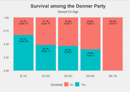
From looking at the data like this, we can see a clearer picture of the effect of age. A given individual in the Donner-Reed party who was under 15 seemed to have had the best chance of survival, with a jump down in chances of survival if they were 15 and older. Interpretation of age as a range thus provides a more intuitive insight.
Survival among Families
FamilyProp<-Donner %>% group_by(family,survived)%>%
  summarize(count=n()) %>%
  mutate(pct=count/sum(count),Count=count) %>%
  group_by(family,count)

FamilyOrder<-aggregate(FamilyProp$count,by=list(Category=FamilyProp$family),FUN=sum) %>% group_by(x)

FamilyProp<-left_join(FamilyProp,FamilyOrder,by=c("family"="Category"))
# Taken from
FamilyProp$family<-reorder(FamilyProp$family,FamilyProp$x)

ggplot(data=FamilyProp,mapping=aes(x=family,y=count,fill=as.factor(survived)))+
  theme_fivethirtyeight()+
  geom_bar(stat="identity",position="stack")+
  scale_fill_manual(name="Survived",
                    values=c("#F8766D","#00BFC4"),
                    labels=c("No","Yes"))+
  geom_text(mapping= aes(label=paste0(Count,"(",scales::percent(pct),")")),
            position="stack",size=3,vjust=1)+
  labs(title="Survival among the Donner Party",subtitle = "Based On family")+
  theme(plot.title = element_text(hjust=0.5),
        plot.subtitle = element_text(hjust=0.5),
        axis.text.x = element_text(angle = 90, vjust = 0.5, hjust=1))

Besides for the Breen family, everyone in the Donner party lost at least one member of their family. In fact, its possible to assign probabilities of survival based on the family for a given individual of the Donner-Reed party. It would be a misstep not to consider this characteristic in a predictive model.
Interaction betweeen Sex and Age
There are two ways age can be viewed- in its raw form as a “continuous” variable or as a categorical variable. To offer a comparison we will make visuals of both of them.
Age as a Categorical Variable
sexAgeRangeDf<- Donner %>% group_by(sex,AgeRange,survived) %>%
  summarize(count=n()) %>%
  mutate(pct=count/sum(count),Count=count)


ggplot(data=sexAgeRangeDf,mapping=aes(x=sex,y=pct,fill=as.factor(survived)))+
  theme_fivethirtyeight()+
  geom_bar(stat="identity",position="fill")+
  scale_fill_manual(name="Survived",
                    values=c("#F8766D","#00BFC4"),
                    labels=c("No","Yes"))+
  geom_text(mapping= aes(label=paste0(Count,"\n(",scales::percent(pct),")")),
            position="stack",size=3,vjust=1)+
  facet_grid(~AgeRange)+
  labs(title="Survival among the Donner Party",subtitle = "Based On Age and Sex")+
  theme(plot.title = element_text(hjust=0.5),
        plot.subtitle = element_text(hjust=0.5),
        axis.text.x = element_text(angle = 90, vjust = 0.5))

When looking at age as a categorical variable, we note that women overall had a higher probability of survival than men. However, women who were 15-29 years old had the highest probability of survival. With men- those whom were under 15 had the highest probability of survival. This once again appears to push the idea that women and children generally were prioritized for survival.
Age as a Continuos variabe
ggplot(data=Donner, aes(x=age,fill=SurvivedFactor))+
  theme_fivethirtyeight()+
  geom_histogram(bins=15)+
  facet_wrap(~sex)+
  labs(title="Survival among the Donner Party",subtitle = "Based on Age")+
  theme(plot.title = element_text(hjust=0.5),plot.subtitle = element_text(hjust=0.5))

We see that same idea when viewing age as a continuous variable. Because age as a continuous variable gives a finer control in the model, age will be treated as a continuous variable in the modelling step.
Interaction between Sex and family
sexFamilyDf<- Donner %>% group_by(sex,family,survived) %>%
  summarize(count=n()) %>%
  mutate(pct=count/sum(count),Count=count)

ggplot(data=sexFamilyDf,mapping=aes(x=sex,y=pct,fill=as.factor(survived)))+
  theme_fivethirtyeight()+
  geom_bar(stat="identity",position="fill")+
  scale_fill_manual(name="Survived",
                    values=c("#F8766D","#00BFC4"),
                    labels=c("No","Yes"))+
  geom_text(mapping= aes(label=paste0(Count,"\n(",scales::percent(pct),")")),
            position="stack",size=3,vjust=1)+
  facet_grid(~family)+
  labs(title="Survival among the Donner Party",subtitle = "Based On Age and Sex")+
  theme(plot.title = element_text(hjust=0.5),
        plot.subtitle = element_text(hjust=0.5),
        axis.text.x = element_text(angle = 90, vjust = 0.5),
        strip.text.x = element_text(angle=45))

The Eddy, Keseberg, McCutchen and families had more women die in their families than men, while the other families had more men die.
Interaction between age and family
ggplot(data=Donner, aes(x=age,fill=SurvivedFactor))+
  theme_fivethirtyeight()+
  geom_histogram(bins=15)+
  facet_wrap(~family)+
  labs(title="Survival among the Donner Party",subtitle = "Based on Age and Family")+
  theme(plot.title = element_text(hjust=0.5),plot.subtitle = element_text(hjust=0.5))

We see that overall, people who were in their “prime” (20-40) or younger generally had a better chance of survival than those who were older.
Interaction between sex, age and family.
Because the visual using age as a continuous variable is more unwieldy, I have included plots treat age as a continuous and categorical variable.
ggplot(data=Donner, aes(x=age,fill=SurvivedFactor))+
  theme_fivethirtyeight()+
  geom_histogram(bins=15)+
  facet_grid(sex~family)+
  labs(title="Survival among the Donner Party",subtitle = "Based on Age, Sex and Family")+
  theme(plot.title = element_text(hjust=0.5),plot.subtitle = element_text(hjust=0.5))

ggplot(data=Donner, aes(x=AgeRange,fill=SurvivedFactor))+
  theme_fivethirtyeight()+
  geom_bar(position="fill")+
  facet_grid(sex~family)+
  labs(title="Survival among the Donner Party",subtitle = "Based on Age, Sex and Family")+
  theme(plot.title = element_text(hjust=0.5),plot.subtitle = element_text(hjust=0.5),
        axis.text.x = element_text(angle = 90))

With the three way interaction of age, sex and family, its harder to see any particular trends present. In the modeling step we will consider the three way interaction model and preform some diagnostics to see if we want it.
Constructing a model
The model that we are choosing to use is (obviously) logistic regression. This is because the response we are trying to model is binary (i.e. Survival). Below are the models and their diagnostics.
Model 1: The full (3-way interaction) model.
library(car)
library(boot)
fit<-glm(survived~family*age*sex, family=binomial(link="logit"),data=Donner)
fit_diag <- glm.diag(fit)

Anova(fit)


## Analysis of Deviance Table (Type II tests)
##
## Response: survived
##                LR Chisq Df Pr(>Chisq)
## family          24.1364  9   0.004091 **
## age              5.6049  1   0.017910 *
## sex             10.4845  1   0.001204 **
## family:age      25.5736  9   0.002398 **
## family:sex       2.5283  9   0.980112
## age:sex          2.7518  1   0.097142 .
## family:age:sex   1.0224  7   0.994459
## ---
## Signif. codes:  0 '***' 0.001 '**' 0.01 '*' 0.05 '.' 0.1 ' ' 1


glm.diag.plots(fit, fit_diag)

This model considers all the effects of age family and sex. Based on the Anova output we can already see that the 3-way interaction is not significant. Based on residual (top left) and QQ-Plot (top right) we see that the ordered deviance residuals do not behave well. While the response is binary, clearly the model can be improved.
Model 2: the 2-way interaction model.
fit2<-glm(survived~family*age+family*sex+age*sex, family=binomial(link="logit"),data=Donner)

fit2_diag <- glm.diag(fit2)

Anova(fit2)


## Analysis of Deviance Table (Type II tests)
##
## Response: survived
##            LR Chisq Df Pr(>Chisq)
## family      24.1364  9   0.004091 **
## age          5.6049  1   0.017910 *
## sex         10.4845  1   0.001204 **
## family:age  25.5736  9   0.002398 **
## family:sex   2.5283  9   0.980112
## age:sex      2.7518  1   0.097142 .
## ---
## Signif. codes:  0 '***' 0.001 '**' 0.01 '*' 0.05 '.' 0.1 ' ' 1


glm.diag.plots(fit2, fit2_diag)

Looking at the 2-way interaction model, we see that there is an improvement in the residuals. However from the Anova model we see that there are still insignificant interaction variables that can be removed from the model.
Model 3: Considering only sigificant effects
While respecting the principal of marginality a model was selected with considering only the significant (p-value < 0.05) effects.
fit3<-glm(survived~family*age+sex, family=binomial(link="logit"),data=Donner)
fit3_diag <- glm.diag(fit3)

Anova(fit3)


## Analysis of Deviance Table (Type II tests)
##
## Response: survived
##            LR Chisq Df Pr(>Chisq)
## family       22.199  9   0.008268 **
## age           5.398  1   0.020162 *
## sex          10.485  1   0.001204 **
## family:age   37.097  9  2.529e-05 ***
## ---
## Signif. codes:  0 '***' 0.001 '**' 0.01 '*' 0.05 '.' 0.1 ' ' 1


glm.diag.plots(fit3, fit3_diag)

While the residuals look much better, there is still flatness present in the QQ-Plot. Lets try finally look at the main effects to see if the residuals will be imporved.
Model 4: The main-effects model.
fit4<-glm(survived~family+age+sex, family=binomial(link="logit"),data=Donner)
fit4_diag <- glm.diag(fit4)

Anova(fit4)


## Analysis of Deviance Table (Type II tests)
##
## Response: survived
##        LR Chisq Df Pr(>Chisq)
## family  22.1993  9   0.008268 **
## age      5.3978  1   0.020162 *
## sex      5.2261  1   0.022250 *
## ---
## Signif. codes:  0 '***' 0.001 '**' 0.01 '*' 0.05 '.' 0.1 ' ' 1


glm.diag.plots(fit4, fit4_diag)

Out of all the models, the main effects model seems to preform the best in terms of residuals.
Comparing Deviance, AIC and BIC of models
library(reshape2)

diagnosticDf<-tibble(
  model=c("full model","2-way","significant","main effects"),
  AIC = c(AIC(fit),AIC(fit2),AIC(fit3),AIC(fit4)),
  BIC = c(BIC(fit),BIC(fit2),BIC(fit3),BIC(fit4)),
  Deviance=c(deviance(fit),deviance(fit2),deviance(fit3),deviance(fit4))
                     ) %>% melt()

ggplot(data=diagnosticDf,mapping = aes(x=model,y=value,fill=variable))+
  theme_fivethirtyeight()+
  geom_bar(position="dodge",stat="identity")+
  geom_text(mapping= aes(label=round(value,2)),
            position="stack",size=3,vjust=1)+
  facet_wrap(~variable)+
  labs(title="Comparing AIC,BIC and Deviance\nof the proposed models")+
  theme(plot.title = element_text(hjust=0.5),
        legend.position = 'none',axis.text.x = element_text(angle = 90, vjust = 0.5))

What the main effects model makes up with in terms of residuals, it suffers in terms of AIC and deviance. While it preforms better with AIC when compared to the full model. It does not do better than the 2-way (model 2) or significant effects models (model 3). In terms of deviance, the main effects model fairs the worst. But from the QQ and residual plots, the main effects model also seems to provide the best goodness-of-fit.
With all this information the best model out of the four proposed models is the main effects model (let me know if you disagree!).
Conclusion
From this blog its clear that there’s more than meets the eye for constructing a logistic regression model. Even after asking pointed questions about the data- diagnostics need to be done to determine the validity of the model. It could be that the simplest model is what best describes the data- but determining that can only be done with applying some diagnostics.
Thank you for reading!
Want to see more of my content?
Be sure to subscribe and never miss an update!
R-bloggers.com offers daily e-mail updates about R news and tutorials about learning R and many other topics. Click here if you're looking to post or find an R/data-science job.
Want to share your content on R-bloggers? click here if you have a blog, or here if you don't.