
F1 Drivers Rated – Version 2
Want to share your content on R-bloggers? click here if you have a blog, or here if you don't.
Hello, so a year and a half a go I created a new metric for measuring F1 drivers performance based around there performance in the race and the expected the performance in the race see blog here
F1 Drivers Rated
Since then my laptop BSOD’ed and me being useless I never committed the code to GitHub and therefore it was lost. I was facing rewriting it but I knew there were weaknesses in the model. The main weakness being is that it took no account into the quality of the car. The metric was based on position but I think that’s unfair because technically a driver would score the same if they were expected to finish 15th and finished 13th then if they were expected to finish 3rd and the driver won. Its definitely more value to actually win the race then 13th and should be valued so.
Data
As with all previous formula 1 I have analysed I get my data from the ergast API linked below
So the easiest one to correct is the positions. My idea for correcting this is using a point system. In reality the current formula 1 pints system only provides points for the first 10 finishes. This would leave a lot of drivers expect points as 0 which I don’t think would add anything to the model. Therefore I have created my own point system for the purposes of the model. I want to make sure I have a points system that will cover most grid sizes so I used to the data to look at grid sizes over the years to understand how many positions the point system needs to cover. This model will hopefully be usable across many years of the series.
grid <- all_data %>%
                            group_by(raceId, date) %>%
                              summarise(Gridtot = n()) %>%
                                ungroup() %>%
                                arrange(date) %>%
                                  mutate(raceno = 1:n())


ggplot(grid, aes(x = raceno, y = Gridtot)) +
                                    geom_line(col = "#32a852") +
                          labs(x = "Race No", y = "Grid Size", title = "F1 Grid Size Through Time") +
                                theme(panel.background = element_blank())

Clearly in the early part of the series there is a lot of volatility in the amount of drivers and teams lining up for a race. In the modern era though the grid size is pretty consistent at between 20 – 24 entries and therefore I’m going to set the models point range up to p24.
| Finishing Position | Model Points |
| 1 | 175 |
| 2 | 155 |
| 3 | 138 |
| 4 | 122 |
| 5 | 107 |
| 6 | 93 |
| 7 | 80 |
| 8 | 68 |
| 9 | 57 |
| 10 | 47 |
| 11 | 38 |
| 12 | 30 |
| 13 | 23 |
| 14 | 17 |
| 15 | 12 |
| 16 | 8 |
| 17 | 5 |
| 18 | 3 |
| 19 | 2 |
| 20 | 0.8 |
| 21 | 0.4 |
| 22 | 0.2 |
| 23 | 0.1 |
| 24 | 0 |
Above is the point system used for the model. Valuing the higher positions more then the lower positions and this is what points I will use to calculate the expected points from.
The next part of the improvement was adding some kind of metric to measure the strength of the car that is being used. This should further isolate the driver performance from the car performance so we can be more precise on the performance of the drivers. There are numerous metrics that can be used to measure performance but i think there are two main ones.
- Average difference to pole time
- highest average position on the grid
I’m going to look at correlation of both metrics and which ever has the most correlation with the amount of points a team scores is the one that will be used in the model.
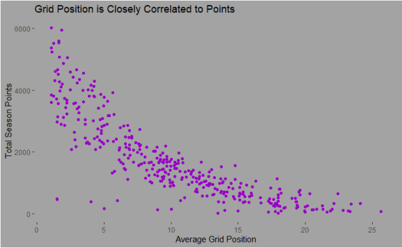
Highest Average grid Position
###creating a data frame with all the data from the ERGAST api

all_data2 <- results %>% left_join(races, by = "raceId") %>%
                            left_join(constructors, by = "constructorId") %>%
                                left_join(drivers, by = "driverId") %>%
                                      left_join(status, by = "statusId") %>%
                                       left_join(grid, by = "raceId") %>%
                                         left_join(factor, by = c("Gridtot", "grid"))


all_data2$position <- as.numeric(as.character(all_data2$position))


### using various dplyr functions to calculate the mean starting position by season for each car


maxavpos <- all_data2 %>% filter(grid > 0) %>%
                          group_by(year,  raceId, constructorRef) %>%
                              summarise(max = min(grid)) %>%
                                ungroup() %>%
                                  group_by(year, constructorRef) %>%
                                      summarise(meanp = mean(max, na.rm = T))


## plotting against the total points
Difference to Pole Position
qualbest <- qual %>% pivot_longer(cols = 7:9, names_to = "qaul", values_to = "times") %>%
                                      separate(times, into = c("m", "s","ms"), sep = ":")


qualbest$m <- as.numeric(as.character(qualbest$m))

qualbest$s <- as.numeric(as.character(qualbest$s))


qualbest2_m <- qualbest %>% mutate(qualt = m * 60 + s) %>%
                              group_by(raceId, driverId) %>%
                                slice_min(qualt) %>%
                                  ungroup() %>%
                      left_join(races, by = "raceId") %>%
                        left_join(constructors, by = "constructorId") %>%
                            group_by(raceId) %>%
                                slice_min(qualt) %>%
                                  select(raceId, qualt)

colnames(qualbest2_m)[2] <- "pole"


qualbest2<- qualbest %>% mutate(qualt = m * 60 + s) %>%
                      left_join(races, by = "raceId") %>%
                        left_join(constructors, by = "constructorId") %>%
                        left_join(qualbest2_m, by = "raceId") %>%
                          group_by(raceId, name.y) %>%
                            slice_min(qualt) %>%
                              mutate(qualdel = qualt / pole -1 ) %>%
                                select(raceId, name.y, qualt, pole, qualdel) %>%
                                    left_join(races, by = "raceId") %>%
                            group_by(year, name.y) %>%
                                  summarise(mean_del = mean(qualdel))

The other option is to use the average difference to pole position. The trend between the two features is pretty similar and looks like one is not more predictive then the other. Therefore I’m going to use both features as i think fundamentally they tell different stories
The model
I used the tidy models group of packages to fit a model. The number of points is explained by the difference to pole, the number of retirees, the starting position on the grid and average starting position.
#creating the training and testing data
split <- initial_split(all_data3, prop = 0.75)


train <- training(split)

testing <- testing(split)


#going to asses the model across multilple sets of data. The boostrap function creates folds to fit many models and therefore be able to tune the mode
f1_folds <- bootstraps(train, strata = points.y)
f1_folds


## the recipe points against all the feautres mentioned
ranger_recipe <-
  recipe(formula =  points.y ~ ., data = train)

## spec for the model - creating a random forest and first tuning hyperperameters mtry and min_n
ranger_spec <-
  rand_forest(mtry = tune(), min_n = tune(), trees = 1000) %>%
  set_mode("regression") %>%
  set_engine("ranger")


ranger_workflow <-
  workflow() %>%
  add_recipe(ranger_recipe) %>%
  add_model(ranger_spec)


## training a grid of models to test which is the best value for the hyperparameters
set.seed(8577)
doParallel::registerDoParallel()
ranger_tune <-
  tune_grid(ranger_workflow,
    resamples = f1_folds,
    grid = 11
  )


#autoplot to see the result
autoplot(ranger_tune)

Clearly the best model is mtry around 2 and min node size to around 30. Once that is selected I run the final model on the train data and then apply it to the current season performance. Below is a summary of how each driver is comparing to expected for the year so far after the Spanish grand prix.

Clearly Norris has performed the best compared to what he would be expected to perform. This is a level that not many driver perform at so I expect to see a reversion to a mean as the season goes on. Maybe this metric can be used to predict how two drivers up against each other in the same team will get on. One for a future blog. Thanks for reading full code here
https://github.com/alexthom2/F1DriverAnalysis/blob/master/xpos.Rmd
R-bloggers.com offers daily e-mail updates about R news and tutorials about learning R and many other topics. Click here if you're looking to post or find an R/data-science job.
Want to share your content on R-bloggers? click here if you have a blog, or here if you don't.