
Plotting movement data in R using ggmap and ggplot
Want to share your content on R-bloggers? click here if you have a blog, or here if you don't.
With ever increasing sources of movement data from GPS in phones, animal trackers, and other devices I want to learn about visualizing movement. This post explores a dataset of caribou tracker collar GPS data which can be found on figshare.

The first step in any project is to prepare the data. Here the data preparation means converting the tag numbers to factor, date column to date formate, and extracting the day of year (DOY) and year.
require(ggplot2)
require(ggmap)

cdat <- read.csv("data/caribou_bc.csv")
cdat$tag.local.identifier <- as.factor(cdat$tag.local.identifier)
cdat$timestamp1 <- as.Date(cdat$timestamp)
cdat$doy <- as.numeric(strftime(cdat$timestamp1, format = "%j"))
cdat$year <- as.numeric(format(cdat$timestamp1, format="%Y"))
We will plot the movement data on top of a background map to visualize where the caribou are located. For a ggmap map we need to make a bounding box which essentially zooms the map in to the right place on Earth. The make_bbox() command takes the latitude and longitude data from our dataset make the bounding box. Then we use get_map() to get the map for the location. Here we use source = "google" but the sources ggmap queries are: Google Maps, OpenStreetMap, Stamen Maps, and Naver Map. So you can get a variety of different background maps. Here we use maptype = “satellite” to get a satellite map for the background. This is a good choice for animal movement because we’re interested in the ground cover aroun the caribou. The maptype from google can also be “terrain”, “terrain-background”, “satellite”, “roadmap”, and “hybrid”.
cbbox <- make_bbox(lon = cdat$location.long, lat = cdat$location.lat, f = .1) #from ggmap
sq_map <- get_map(location = cbbox, maptype = "satellite", source = "google")
After defining the bounding box and getting the background map, we are now ready to plot the movement data. In our dataset, cdat, we have data on the latitude, longitude, and tag ID number which we can use to plot the tracks of inividual caribou. Here each color will show a different animal. The first call is ggmap(sq_map) which maps the background map that we made in the last step. Next, add the movement data using geom_path(). Here we specify that color will show tag ID number. Then we customize the map with labels and themes.
ggmap(sq_map) +
  geom_path(data = cdat, aes(x = location.long, y = location.lat, color = tag.local.identifier),
            size = 1, lineend = "round") +
  labs(x = " ", y = " ", title = "Inividual tracks") +
  theme_minimal() +
  theme(legend.position = "none")

Another way to visualize movement data is to show where the caribou are at different times of the year. Here we will use day of year (DOY) in different colors to show where the caribou are through the seasons. So DOY 1 is January 1st and DOY 365 is December 31st. DOY 182 will be the peak of summer which will also be the midpoint of the color ramp. In this map DOY 182 is green so summer will be the greener colors and purple/red will be winter.
ggmap(sq_map) +
  geom_path(data = cdat, aes(x = location.long, y = location.lat, color = doy, group = tag.local.identifier), size = 0.8) +
  labs(x = " ", y = " ", title = "Seasonal movement") +
  theme_minimal() +
  scale_color_gradientn("DOY", colours = rainbow(7), breaks = c(0, 100, 200, 300, 365))
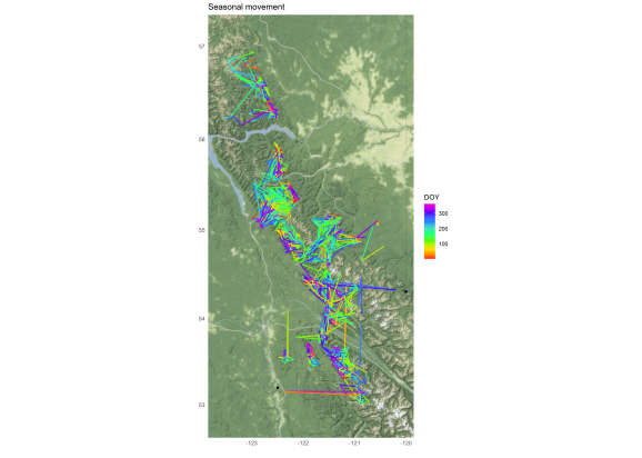
The seasonal map does not give us any great insights.
Let’s look at the caribou movement over time and show the year in different colors. Here we set up the map using ggmap() and add the path with geom_path() but this time color = year. We add a line for scale_color_distiller() to specify the color palette and which breaks should be labeled on the legend.
ggmap(sq_map) +
  geom_path(data = cdat, aes(x = location.long, y = location.lat, color = year, group = tag.local.identifier)) +
  labs(x = " ", y = " ", title = "Movement over time") +
  theme_minimal() +
  scale_color_distiller("Year", palette = "Spectral", breaks = c(1990, 2000, 2009))
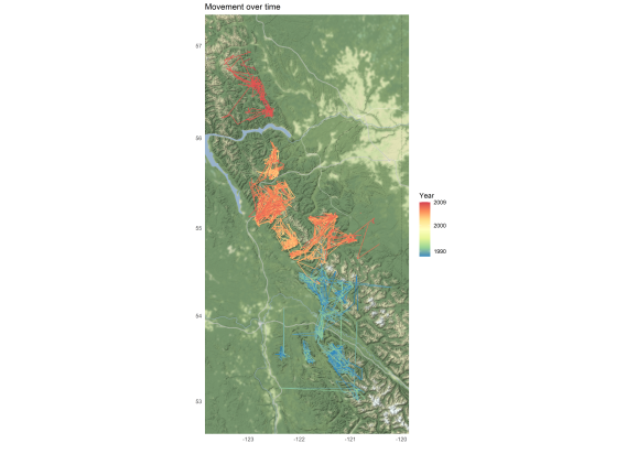
I think this is the most interesting of the three maps that we made. We can see that older GPS points were further south and the more recent points were in the north. It looks like from the 1980s to 2000s the caribou herd shifted northward. Very cool!
Improvements: I would like to improve the color palettes on these maps. For the seasonal trends it would be nice to have the highest and lowest values in the same color so there was no visual distinction between December and January. There is always more to learn with R and tricks to improve visualizations. I find it helpful to keep track of features that I woul like to improve. This way I am ready to incorporate new tricks when I encounter them.
Inspiration: Eric Anderson’s Reproducible Research course notes.
There you have it! Mapping movement data with ggmap and ggplot. I hope that you found this post helpful or at least interesting. Please let me know if you have an R question that you would like explained on here. And thanks for following along with my R journey.
R-bloggers.com offers daily e-mail updates about R news and tutorials about learning R and many other topics. Click here if you're looking to post or find an R/data-science job.
Want to share your content on R-bloggers? click here if you have a blog, or here if you don't.