
Five Factors Across the Business Cycle
Want to share your content on R-bloggers? click here if you have a blog, or here if you don't.
Probably the most popular models in modern investment management are factor models. Growing out of the Capital Asset Pricing Model (CAPM), factor models were first theorized in Arbitrage Portfolio Theory and the concept was expanded and applied to risk premiums by Nobel-laureate Eugene Fama and Kenneth French (French, surprisingly, did NOT win a Nobel prize).
The idea is very simple: you can describe the return of an asset as a series of stacked premiums, or factors:
 = \beta_1 r_1 + \beta_2 r_2 + \beta_3 r_3 + \dots")
Where the expected return of an asset, E(r), is the sumproduct of the expected returns of the factors, r, and the asset’s exposure to those factors, which are the asset’s betas.
Fama and French began with a three factor model: stocks out perform bonds (the equity risk premium–this is where CAPM begins and ends), value stocks outperform growth stocks (known as the value premium), and small stocks outperform large stocks (known as the size premium). They went on to expand the model to include a conservative investment factor, and a profitability factor. This is now known as the Fama/French five-factor model, though most people also include a momentum factor in there somewhere (Carhart is credited with the momentum factor).
Recently, I got a bug in my bonnet about how these factors perform over the business cycle. My training would have me believe that factor responses through time are random enough to be unpredictable–that training includes attending Dimensional Funds’ training wherein I heard Dr. Fama himself speak. However, as I’ve grown more fond of business cycle analysis, I thought I might give this another look.
Let’s start by getting our libraries loaded:
library(quantmod)
library(tidyverse)
library(gridExtra)
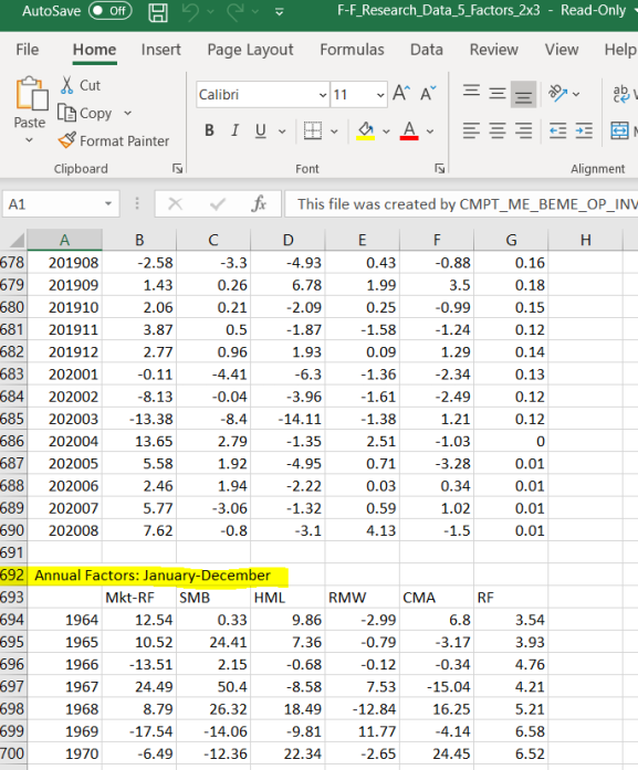
And we need to download the 5-factor monthly data from Kenneth French’s data library. There is some editing to do before you load the file. The bottom of the CSV file contains annual factors, which we need to delete. I saved the edited file as FF Five Factors – Monthly.csv.
We also need to load US Recession data to coordinate the business cycle with the factors.
getSymbols('USREC', src='FRED')
recessions <- window(USREC, start = '1963-07-01', end = '2020-08-31')
I went ahead and “windowed” the recession data to align with the start-end dates of the FF Five Factor file. That makes our life easier here in a minute, AND we can replace the odd date format Dr. French uses with the xts format of the USREC data.
# Read in monthly factor data
factors <- read.csv('FF Five Factors - Monthly.csv')
factors$REC <- recessions # add a column with US recession data
factors <- factors[,-1] # Remove the odd date format, and
# Convert the data frame into an xts using the USREC index of dates.
factors <- as.xts(factors, order.by=index(recessions))
Cool! Now we have data! Let’s just take a preliminary look at everything.
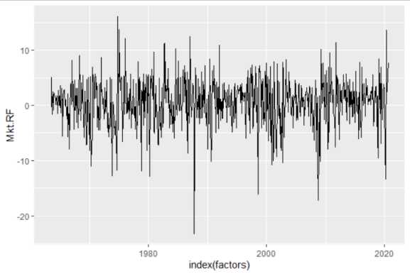
At first glance, the market factor looks pretty random.
ggplot(factors, aes(x=index(factors), y=Mkt.RF))+
  geom_line()
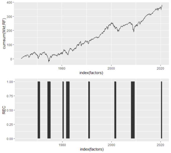
But I know that isn’t the case because I’ve grown reasonably confident in our ability to predict recessions. Indeed, another look (using a cumulative sum and showing recessionary periods) shows that the market factor is not as random as it originally appears.
p1 <- ggplot(factors, aes(x=index(factors), y=cumsum(Mkt.RF)))+
  geom_line()
p2 <- ggplot(factors, aes(x=index(factors), y=REC))+
  geom_area()
grid.arrange(p1, p2)
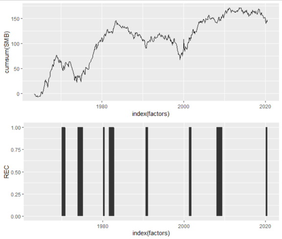
The small stock premium also appears somewhat business-cycle dependent.
p1 <- ggplot(factors, aes(x=index(factors), y=cumsum(SMB)))+
  geom_line()
grid.arrange(p1,p2)
Here is the idea, then: if we can understand how each factor performs during recessions versus expansions, and we have some ability to predict recessions, then we should be able to better optimize a portfolio of factors across the business cycle.
To test this, let’s separate the factors into two distributions: a recessionary distribution and an expansionary distribution.
p_mkt <- data.frame( 'Value' = c( factors$Mkt.RF[ which(factors$REC == 1) ], # Split recessions/expansions
                                  factors$Mkt.RF[ which(factors$REC == 0) ] ),
                     'Economy' = c( rep( 'Recession', length(factors$Mkt.RF[ which(factors$REC == 1) ])),
                                    rep( 'Expansion', length(factors$Mkt.RF[ which(factors$REC == 0) ])) ) ) %>%
  ggplot(mkt, aes(x=mkt[,1], fill=mkt[,2], lty=mkt[,2]))+
  geom_density( alpha = 0.25 )+
  geom_vline( xintercept = mean(factors$Mkt.RF[ which(factors$REC == 1) ] ), lty=2)+
  geom_vline( xintercept = mean(factors$Mkt.RF[ which(factors$REC == 0) ] ))+
  labs( title = 'Market Factor')+
  xlab('')+
  ylab('')+
  theme( legend.title = element_blank())
p_mkt
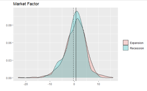
What we find with the market factor is little surprise. The average of the distribution is lower in recessions than in expansions, and recessions tend to see fewer right-tail months than expansions (right-tails are very good returns). Yup, stocks go down in recessions.
p_smb <- data.frame( 'Value' = c( factors$SMB[ which(factors$REC == 1) ],
                                  factors$SMB[ which(factors$REC == 0) ] ),
                     'Economy' = c( rep( 'Recession', length(factors$SMB[ which(factors$REC == 1) ]) ),
                                    rep( 'Expansion', length(factors$SMB[ which(factors$REC == 0) ]) ) ) ) %>%
  ggplot(., aes(x=.[,1], fill=.[,2], lty=.[,2]))+
  geom_density( alpha = 0.25 )+
  geom_vline( xintercept = mean(factors$SMB[ which(factors$REC == 1) ] ), lty=2 )+
  geom_vline( xintercept = mean(factors$SMB[ which(factors$REC == 0) ] ) )+
  labs( title = 'Small Factor' )+
  xlab('')+
  ylab('')+
  theme( legend.title = element_blank())
p_smb
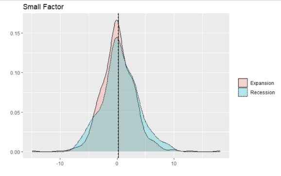
We see similar behavior with the small factor, but, interestingly, the averages are not much different between the two. Rather, in recessions the factor’s standard deviation is much larger than in expansions.
p_hml <- data.frame( 'Value' = c( factors$HML[ which(factors$REC == 1) ],
                                  factors$HML[ which(factors$REC == 0) ] ),
                     'Economy' = c( rep( 'Recession', length(factors$HML[ which(factors$REC == 1) ]) ),
                                    rep( 'Expansion', length(factors$HML[ which(factors$REC == 0) ]) ) ) ) %>%
  ggplot(., aes(x=.[,1], fill=.[,2], lty=.[,2]))+
  geom_density( alpha = 0.25 )+
  geom_vline( xintercept = mean(factors$HML[ which(factors$REC == 1) ]), lty=2)+
  geom_vline( xintercept = mean(factors$HML[ which(factors$REC == 0) ]))+
  labs( title = 'Value Factor' )+
  xlab('')+
  ylab('')+
  theme( legend.title = element_blank())
p_hml
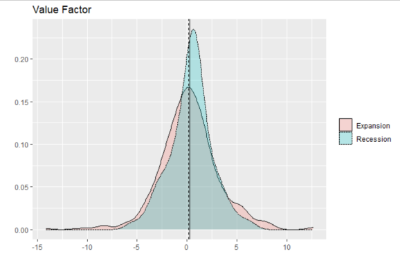
The value factor is very interesting. The average of the distribution is slightly lower in recessions, but still positive. In addition, the standard deviation of returns appears much larger in expansions than recessions! I would not have expected that–this is intriguing to me.
p_rmw <- data.frame( 'Value' = c( factors$RMW[ which(factors$REC == 1) ],
                                  factors$RMW[ which(factors$REC == 0) ] ),
                     'Economy' = c( rep( 'Recession', length(factors$RMW[ which(factors$REC == 1) ]) ),
                                    rep( 'Expansion', length(factors$RMW[ which(factors$REC == 0) ]) ) ) ) %>%
  ggplot(., aes(x=.[,1], fill=.[,2], lty=.[,2]))+
  geom_density( alpha = 0.25 )+
  geom_vline( xintercept = mean(factors$RMW[ which(factors$REC == 1) ]), lty=2)+
  geom_vline( xintercept = mean(factors$RMW[ which(factors$REC == 0) ]))+
  labs( title = 'Profitability Factor' )+
  xlab('')+
  ylab('')+
  theme( legend.title = element_blank())
p_rmw
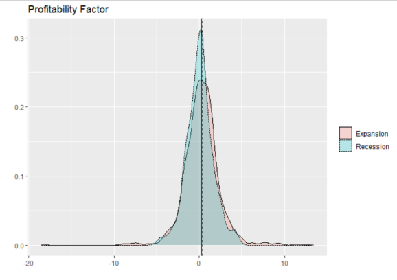
I’m not too suprised that profitable companies tend to outperform in recessions (relative to unprofitable ones). Again, expansions yield more right-tail events, which is what I might expect.
p_cma <- data.frame( 'Value' = c( factors$CMA[ which(factors$REC == 1) ],
                                  factors$CMA[ which(factors$REC == 0) ] ),
                     'Economy' = c( rep( 'Recession', length(factors$CMA[ which(factors$REC == 1) ]) ),
                                    rep( 'Expansion', length(factors$CMA[ which(factors$REC == 0) ]) ) ) ) %>%
  ggplot(., aes(x=.[,1], fill=.[,2], lty=.[,2]))+
  geom_density( alpha = 0.25 )+
  geom_vline( xintercept = mean(factors$CMA[ which(factors$REC == 1) ]), lty=2)+
  geom_vline( xintercept = mean(factors$CMA[ which(factors$REC == 0) ]))+
  labs( title = 'Conservative Investment Factor' )+
  xlab('')+
  ylab('')+
  theme( legend.title = element_blank())
p_cma
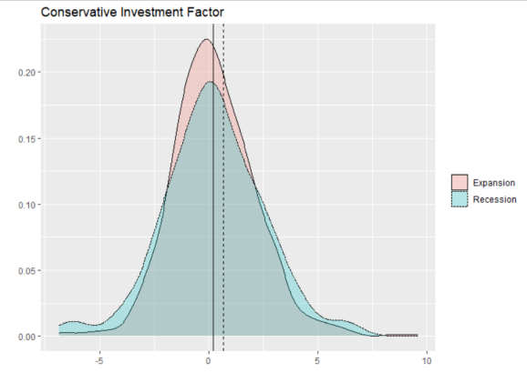
Finally, we have the conservative investment factor. While I am not too surprised that conservatively invested firms outperform during recessions, I am somewhat surprised at the magnitude of outperformance. Not to mention, recessions see more extremes in returns for conservative firms.
In the end, this analysis assumes some ability to predict recessions, which may be a fool’s errand, anyway (I don’t believe it is). That said, optimizing a portfolio of factors across the business cycle may lead to substantial alpha. The next step in my analysis will be to see if this is, in fact, so.
R-bloggers.com offers daily e-mail updates about R news and tutorials about learning R and many other topics. Click here if you're looking to post or find an R/data-science job.
Want to share your content on R-bloggers? click here if you have a blog, or here if you don't.