
Likert-plots and grouped Likert-plots #rstats
Want to share your content on R-bloggers? click here if you have a blog, or here if you don't.
I’m pleased to anounce an update of my sjPlot-package, a package for Data Visualization for Statistics in Social Science. Thanks to the help of Alexander, it is now possible to create grouped Likert-plots. This is what I want to show in this post…
First, we load the required packages and sample data. We want to plot several items from an index, where all these items are 4-point Likert scales. The items deal with coping of family caregivers, i.e. how well they cope with their role of caring for an older relative.
To find the required variables in the data set, we search all variables for a specific pattern. We know that the variables from the COPE-index all have a cop in their variable name. We can easily search for variables in a data set with the find_var()-function.
library(sjPlot)
library(sjmisc)
data(efc)

# find all variables from COPE-Index, which all
# have a "cop" in their variable name, and then
# plot the items as likert-plot
mydf <- find_var(efc, pattern = "cop", out = "df")
plot_likert(mydf)

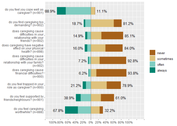
The plot is not perfect, because for those values with just a few answers, we have overlapping values. However, there are quite some options to tweak the plot. For instance, we can increase the axis-range (grid.range), show cumulative percentage-values only at the ende of the bars (values = "sum.outside") and show the percentage-sign (show.prc.sign = TRUE).
plot_likert(
  mydf,
  grid.range = c(1.2, 1.4),
  expand.grid = FALSE,
  values = "sum.outside",
  show.prc.sign = TRUE
)
The interesting question is, whether we can reduce the dimensions of this scale and try to extract principle components, in order to group single items into different sub-scales. To do that, we first run a PCA on the data. This can be done, e.g., with sjt.pca() or sjp.pca().
# creates a HTML-table of the results of an PCA.
sjt.pca(mydf)
| Component 1 | Component 2 | |
|---|---|---|
| do you feel you cope well as caregiver? | 0.29 | 0.60 |
| do you find caregiving too demanding? | -0.60 | -0.42 |
| does caregiving cause difficulties in your relationship with your friends? | -0.69 | -0.16 |
| does caregiving have negative effect on your physical health? | -0.73 | -0.12 |
| does caregiving cause difficulties in your relationship with your family? | -0.64 | -0.01 |
| does caregiving cause financial difficulties? | -0.69 | 0.12 |
| do you feel trapped in your role as caregiver? | -0.68 | -0.38 |
| do you feel supported by friends/neighbours? | -0.07 | 0.64 |
| do you feel caregiving worthwhile? | 0.07 | 0.75 |
| Cronbach’s α | 0.78 | 0.45 |
| varimax-rotation | ||
As we can see, six items are associated with component one, while three items mainly load on the second component. The indices that indicate which items is associated with which component is returned by the function in the element $factor.index. So we save this in an object that can be used to create a grouped Likert-plot.
groups <- sjt.pca(mydf)$factor.index
plot_likert(mydf, groups = groups, values = "sum.outside")

There are even mote options to tweak the Likert-plots. Find the full documentation at
https://strengejacke.github.io/sjPlot/index.html.
R-bloggers.com offers daily e-mail updates about R news and tutorials about learning R and many other topics. Click here if you're looking to post or find an R/data-science job.
Want to share your content on R-bloggers? click here if you have a blog, or here if you don't.