
PerformanceAnalytics — An Indespensible Quant Tool for any Investor
Want to share your content on R-bloggers? click here if you have a blog, or here if you don't.
I’m in the thick of our annual portfolio investment due diligence at work. Basically, this involves surveying all the potential investments we could hold in our portfolios, and then deciding whether we should continue to hold what we own or switch to something else. It is a big job, involving lots of data analysis.
I forget how much I rely on the PerformanceAnalytics package to help me tell the data’s story. It really is an all-in-one package for any quantitative analysis. I’d like to give you a rough-and-tumble of just some of its features.
To start, let’s load two libraries, and gather some data:
library(quantmod)
library(PerformanceAnalytics)

# List some ETFs to run our mock-analysis on.
symbols=c("IVV", "GLD", "VBR", "VWO", "VTI", "DBC")
getSymbols( symbols )
I’ve pulled several different symbols for two main reasons. (1) We need multiple data sets to really understand what this puppy can do, and (2) I’d like to demonstrate how to run analysis en masse.
The code block above will pull OHLC+Volume+Adjusted Close data for each symbol. We need to convert that structure to monthly returns. So,
for(i in 1:length(symbols)){ # Iterate through each symbol
  etf = get( symbols[i] ) # Set up temp variable to store data from symbol
  etf = etf[xts:::startof( etf, "months" )] # Convert to monthly structure
  chg = Delt( etf[,6], k=1 ) # Convert to monthly return
  assign( # Assign a unique variable name to this data set: <ticker>.r
    paste( symbols[i], ".r", sep="" ),
    chg
  )
}
Note that for loops are somewhat frowned upon in R. For my purposes, I haven’t had any trouble with them, so until I do, I keep using them! Okay, we now have return data for each symbol. We will call these variables later!
Now that we have data in the format we want, let’s move on to our first demonstration.
Correlation Visualizations
Portfolio management is, at heart, understanding how assets relate to one another. Understanding these relationships can be made easier through visualizations, of which there are few better than the chart.Correlation() function. First, we need our return data in a tidy data frame structure. I do this with the merge() command. Also, you can see how I’ve used the get() and paste() commands to call my custom variables.
return.data = merge( # Set up the data.frame
  IVV.r,
  GLD.r
)
# I've already included symbols[1] & [2], so this iterates through the rest
for(i in 3:length(symbols)){
  return.data = merge( return.data, get( paste( symbols[i], ".r", sep="" ) ) )
}
colnames(return.data) = symbols # Make column names the ticker
And we are ready to use the correlation viz tool!
chart.Correlation( return.data )
Which yields the very sexy plot below.
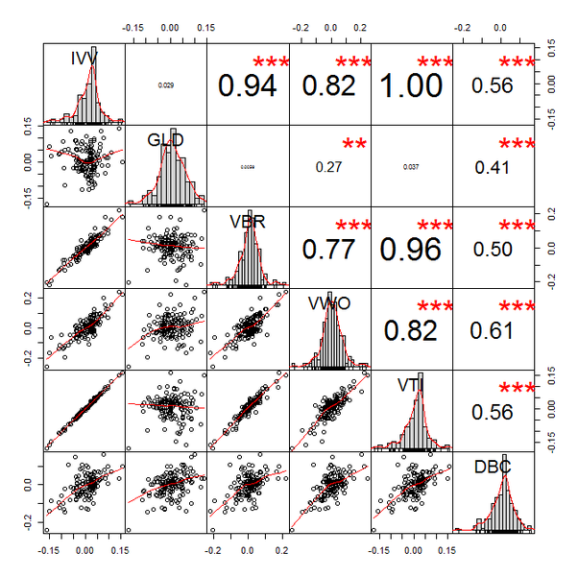
Other than its sexiness, this plot is very helpful. The diagonal gives you the return distribution of each ETF. I like to see how the returns are distributed—are the concentrated in the center? are there lots of outliers? are they heavily skewed? is something just weird? Indeed, this plot recently helped me immediately throw out a position under consideration because the distribution was barbelled (but more heavy left-tailed).
On the lower half, we have the returns of the column-row ETFs plotted against each other. This helps us understand how and when the two positions move with respect to each other. Some positions I like to have a strong linear relationship—say IVV (large cap) and VBR (small cap). Others should serve to offset losses and be strong diversifiers in a portfolio—say IVV (large cap) and GLD (gold). Sometimes, you can find a good replacement position, VTI, for example, which moves in lock-step with IVV. If we find in later analysis that VTI offers a better risk/return profile, we could consider swapping IVV for VTI.
On the top half, we have the traditional correlation metric with its significance level (the asterisks). Honestly, this is the least helpful part of the plot though it can help sum up the other two data points we just reviewed. Ultimately, this is typically the number that feeds into a portfolio optimizer, so it is important. I’d argue, however, that one should use our other observations as primary filters.
Upside/Downside Capture
Another helpful plot is the upside/downside capture. This visualizes the percentage of upside and downside captured by a position relative to a benchmark. Let’s analyze these relative to IVV, our mock core position.
Let’s have R open a new window, then arrange the plots in a 2×3 grid. We will fill the grid with a loop, iterating through each ETF. It looks like this:
dev.new() # Open new plot window
par(mfrow=c(2,3)) # Arrange plots in a 2-row, 3-column grid
for(i in 1:length(symbols)){ # Iterate through each ETF
  etf = get( paste( symbols[i], ".r", sep="" ) )
  bmark = IVV.r # Ratio relative to IVV's return
  colnames( bmark ) = "IVV" # Header on data as IVV
  colnames( etf ) = symbols[i] # Header on data as the ticker
  chart.CaptureRatios(etf, bmark, colorset="dodgerblue4",
    main=paste(symbols[i]))
}
This block yields the Upside/Downside capture ratios for our ETFs:
Note that we could (and should) use a benchmark return as a comparison, but I’m just showing you the ropes here.
Return Distributions
Also helpful are the return distribution visualizations available. Let’s say, for example, I want to understand how non-normal a given asset’s returns are, and I’d like to get a sense of it’s Value at Risk (VaR). We can quickly build some visualizations with the following code:
dev.new() # new Plot
par(mfrow=c(2,3)) # arrange plots in a 2x3 grid
for(i in 1:length(symbols)){ # iterate through each symbol
  etf = get( paste( symbols[i], ".r", sep="" ) ) # load data into temp variable
  colnames( etf ) = symbols[i] # data header as the ticker
  chart.Histogram( etf, main=paste(symbols[i], " Return Distribution"),
    breaks=15, methods=c("add.normal", "add.risk"), # Add the normal curve, and the VaR levels
    colorset=c("steelblue", "darkgreen", "navy") # colors for each (middle color not used)
  )
}
In this block, we have iterated through each ticker, then plotted the return histogram. In addition, I’ve told R to include a normal curve for comparison (it will auto-calculate the mean and standard deviation of the distribution) and the VaR levels. All of that yields this plot:
We can see, quite clearly, that none of these returns are statistically normal, but that shouldn’t be too big a surprise. Also, the vertical dashed lines show us the VaR levels. This is a good way to filter out core strategies from more binary strategies.
Drawdowns
Finally, let’s look at the drawdown plot. This is helpful to get a sense of a fund’s…you guessed it…drawdowns. Just to clarify, a drawdown plot looks at only downward movement relative to a high; it is not a view of the full performance. These visualizations are helpful to compare funds through stressful times, how they perform, and how the recover.
We follow a similar coding pattern as before.
dev.new()
par(mfrow=c(2,3))
for(i in 1:length(symbols)){
  etf = get( paste( symbols[i], ".r", sep="" ) )
  colnames( etf ) = symbols[i]
  chart.Drawdown( etf, geometric=TRUE, colorset="firebrick4" )
}
Which yields
Closing
These are just a few of the capabilities of the PerformanceAnalytics package. Indeed, this is just a few of the visualization tools, there are many more functions which are helpful. The documentation is 200+ pages of quantitative awesomeness.
After quantmod, this is my favorite quantitative package. It can easily serve as the quantitative toolbox for an investor.
R-bloggers.com offers daily e-mail updates about R news and tutorials about learning R and many other topics. Click here if you're looking to post or find an R/data-science job.
Want to share your content on R-bloggers? click here if you have a blog, or here if you don't.