
Graphing My Feelings
Want to share your content on R-bloggers? click here if you have a blog, or here if you don't.
I am so pumped to show off a cool new tool which I learned about through Mara Averick’s Twitter feed. This is a tool called coordinator, created by Aliza Aufrichtig and allows us to convert SVG graphics to data co-ordinates!! Do you know what this means? We can now use our data skills to create even more fun graphs! I’m talking next level in the fun data category.

Graphing My Excitement for Think
While deciding what to plot, I had to consider topics on my mind these days. What I’ve been thinking about lately is none other than the IBM Think 2018 Conference in Las Vegas next week!
In tribute to this event, I’m going to do a tutorial, showing how to use IBM Data Science Experience (DSX) on IBM Cloud to access a free online version of RStudio and easily create these awesome graphs! I’ve been wanting to show off the DSX hosted RStudio option ever since I referred a friend a few weeks back. She was looking for options on how to get RStudio on her iPad. Well look no further, DSX to the rescue and we’ll explore this together.

But first, what is think?
Think is an massive business and technology event hosted by IBM. It’s a really cool event because the scope is so wide. As a person on the tech and analytics side, there is a lot to do.
Dev Zone, Dev Zone, Dev Zone! – This is basically where I hung out all of last year (previously Interconnect). This is the place to see, try and talk about the latest tech. There are demos going on, ‘ask an expert’ sessions (planned and ad hoc) as well as drop in labs. The drop in 20 minute labs are my favorite. Just pop by and do a quick tutorial on any number of technical topics, such as: on creating a chat bot, making an IoT app, performing analysis with DSX and python and much more.
Speakers and sessions– Boy there are a lot this year, over 2700 to be exact! And if choosing your sessions seems like a daunting task, get Watson to help you. If you couldn’t tell from the picture above, I have a bit of a girl crush on Ginni. If you’ve never seen her speak, you should really tune in for the live keynote address. As a woman, I love watching her knock it out of the park on these types of talks. She manages to gracefully walk the hard line imposed on womens behavior in these scenarios. She’s assertive and challenging but not agressive, funny but still intelligent and the list goes on. It is the Chairmans address Tuesday March 20th at 8:30AM. I urge you all to tune in!
Get Certified – With your conference pass comes one free exam and there are about 400 technical certifications and mastery exams that you can take at think. Why not get recognized for your technical skills? See the full list here.
If you can’t come – Don’t fret. You can still have an overflowing agenda just by watching the live (and free) online sessions and engaging in the conversation with #think2018. Just look below at how many free, virtual sessions are offered in each time slot.

Tutorial Time!
Alright, now it’s time to get to the data!
A) Sign up for IBM Cloud Lite (the free account) – Visit bluemix.net/registration/free
Follow the steps to activate and set up your account.
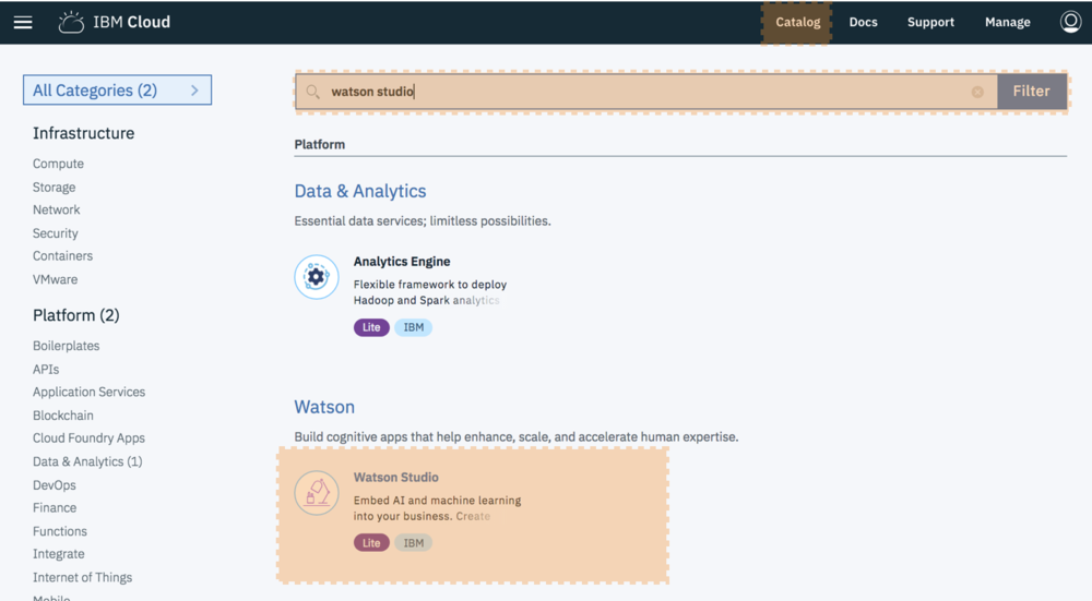
B) Deploy Watson Studio from the catalog. Note this was previously called Data Science Experience

Select the “Lite” plan and hit “Create”. You will then be taken to new screen where you can click “Get started”. This will redirect you to the Watson Studio UI.
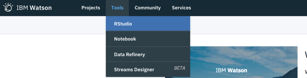
C) Open RStudio – In the top nav click “Tools” > “RStudio”

D) Create a new file – You now are presented with RStudio online! You need to create a new file by selecting “File” > “New File” > “R Script”
E) Start entering and running code – In this section you will start copying and pasting the below code into RStudio. You will then highlight sections of code and hit “Run”.
Code
You can continue on by copying and pasting code from this tutorial or downloading the full R Script here.
F) Install and Load Libraries – Enter the following code, highlight it and click “Run”
########## Pre-Steps ##########

# 1) Create a photo and convert to svg with any tool.  I used: http://pngtosvg.com/
# 2) Convert the svg to csv data coordinates: https://spotify.github.io/coordinator/
# 3) Save the csv on DSX or post online as I did

########## Import Packages ##########
install.packages("data.table")
install.packages("ggplot2")

########## Load Packages ##########

library(data.table)
library(ggplot2)
G) Load the data file – Enter the following code, highlight it and click “Run”. Note that we are loading the first file into a data frame. However, when you are done, you could uncomment a few other lines to try drawing different pictures.

########## Import Data ##########

df= fread('https://raw.githubusercontent.com/lgellis/MiscTutorial/master/files/think_image_coords_final.csv', stringsAsFactors = FALSE)

# alternative 1
# df= fread('https://raw.githubusercontent.com/lgellis/MiscTutorial/master/files/lmd-loves-cloud.csv', stringsAsFactors = FALSE)

# alternative 2
# df= fread('https://raw.githubusercontent.com/lgellis/MiscTutorial/master/files/ibm_think_tile.csv' , stringsAsFactors = FALSE)

#Ensure it loads and attach the column names
summary(df)
dim(df)
attach(df)
H) Create your plot – Enter the following code, highlight it and click “Run”. In the bottom right “Plots” section, you will see your graph.
########## Plot the Data ##########

# Basic scatter plot
p <-ggplot(df, aes(x=x, y=y)) +
  geom_point(colour = '#006699', size = 0.05)
p

I) Fix Ginni! - Poor Ginni was upside down in the last chart. Let's reverse the y-axis to fix this. While we're at it, lets pretty up the graph a bit. Remove axis labels, change background etc. Enter the following code, highlight it and click "Run". In the bottom right "Plots" section, you will see your graph.
#flip the scale
p <-p +  scale_y_reverse()
p

#make it pretty
p +
  theme(panel.background = element_rect(fill = 'white')) +
  theme(axis.line=element_blank(),
        axis.text.x=element_blank(),
        axis.text.y=element_blank(),
        axis.ticks=element_blank(),
        axis.title.x=element_blank(),
        axis.title.y=element_blank(),
        legend.position="none",
        panel.background=element_blank(),
        panel.border=element_blank(),
        panel.grid.major=element_blank(),
        panel.grid.minor=element_blank(),
        plot.background=element_blank())

J) Celebrate! You've made a super awesome graph to promote Think!
Meet Me At Think
Thank you for reading this posting. I'm very excited for both the new tool and for Think next week. Please contact me via any of the channels below if you will be at Think next week. I would love to meet up and discuss data!
R-bloggers.com offers daily e-mail updates about R news and tutorials about learning R and many other topics. Click here if you're looking to post or find an R/data-science job.
Want to share your content on R-bloggers? click here if you have a blog, or here if you don't.