
Mapping acute patient journeys and hospital networks in R
Want to share your content on R-bloggers? click here if you have a blog, or here if you don't.
For original properly formatted article see http://rpubs.com/Dekuran/mappingpatients
I’ve been writing R for a while but this is the first time I’ve decided to document or share anything except with colleagues.
I recently had to look at some anonymised data covering patients’ care across multiple hospitals, as part of which I wanted to map the strength of links between hospitals to get an idea of how much movement goes on and which organisations share the most patients.
The results are not necessarily that useful, but are aesthetically pleasing, and I’m hoping to adapt the code for future projects looking at networks, and potentially produce a shiny app that allows a user to choose different, more useful sub-categories and see how the links differ.
I tried several methods to create this diagram including using the ‘networks’ package overlaid on various types of worldmap, but ended up using a very simple method involving the packages ‘geosphere’ and ‘maps’ to create these images.
Packages used
maps
maps contains world maps that can be zoomed in on based on country or region. It is best for the United States but contains maps of the UK too, and you can customise the window displayed to be a rectangle covering the area of interest.
geosphere
geosphere is a package for calculating and manipulating distances around the globe using spherical trigonometry. We are using the gcIntermediate function, which plots points between two locations using lat-long coordinates on the assumption that the world is a sphere.
dplyr
dpylr is a popular tidyverse package that makes manipulating datasets into the desired shape easy.
Creating the map
Below I go through the basic code, and will follow up with an embedded shiny app giving some more options.
## program to create a diagram showing the relative numbers of shared patients
## between hospitals


## quick helper function for checking whether the necessary packages are installed
## and installing them if not (a bit simple as it doesn't check for latest updates)

PackageCheck<- function(list_of_packages){
  new_packages <- list_of_packages[!(list_of_packages %in% installed.packages()[,"Package"])]
  if(length(new_packages))install.packages(new_packages)
}

## installing and loading the packages I need for this project

PackageCheck(c('maps',"geosphere","dplyr"))
library(maps)
library(dplyr)
library(geosphere)

## Here is some data I've already manipulated from 30 NHS trusts showing the
## number of patients they had in common over a certain period
## Preparing the data was actually slightly arduous but that's for another post
## Note NHS Trust names and values have been changed
## and long and lat codes have been adjusted by a random amount to anonymise
## locations

shared_patient_data<-read.csv('AnonSharedPatMap.csv')

head(shared_patient_data)
##    P1  P2 SHARED_NHSNo   lat.p1    lon.p1   lat.p2     lon.p2    P1.Name
## 1 R01 R02            5 52.06003 0.6452919 53.74908 -2.1795976 Hospital 1
## 2 R01 R03            3 52.06003 0.6452919 54.76383 -1.4053757 Hospital 1
## 3 R01 R04            5 52.06003 0.6452919 51.19221 -2.6177829 Hospital 1
## 4 R01 R05           12 52.06003 0.6452919 53.10060 -2.2142672 Hospital 1
## 5 R01 R06            9 52.06003 0.6452919 53.87270 -1.4794396 Hospital 1
## 6 R01 R07           10 52.06003 0.6452919 53.92487 -0.4319425 Hospital 1
##      P2.Name
## 1 Hospital 2
## 2 Hospital 3
## 3 Hospital 4
## 4 Hospital 5
## 5 Hospital 6
## 6 Hospital 7
We can see that this data.frame contains nine columns, covering the ID of each trust (P1 and P2), the number of shared patients (SHARED_NHSNo), the locations of P1 and 2 in latitude and longitude, and the names of the organisations (anonymised).
Setting colours
colorRampPalette is a base R graphics function to create a palette of colours going from the first one specified to the last.
Here I have specified the background colour of the map as the first colour and a bright blue as the last colour using hex colours.
Applying these colours to the lines indicating numbers of shared patients should mean that the weakest links blend into the background, whereas the strongest ones will pop out in blue.
pal <- colorRampPalette(c("#425563","#41B6E6"))
colours<-pal(120)
Here we create a rank index of the number of shared patients in order to assign the colours. There was too much variation when I tried this using raw values instead of ranks, and the links between a lot of NHS Trusts failed to show at all.
sharedP<-shared_patient_data[order(shared_patient_data$SHARED_NHSNo),]
sharedP$rank<-rank(sharedP$SHARED_NHSNo)
rankmax<-max(rank(sharedP$SHARED_NHSNo))
sharedP<-sharedP[order(-sharedP$rank),]
Producing the map
This next snippet produces a map of the UK, the xlim and ylim functions limit the map to the areas of interest where our NHS Trusts are based.
maps::map('world',
          # regions="uk",
          fill=T,col='#425563',
          lwd=0.18,
          xlim=c(-5.79,1.65),
          ylim=c(50.1,54.8),
          bg="#000000")


## this loop function goes through our list of trusts
## and maps the points between P1 (point / hospital 1) and
## P2 (point / hospital 2) using gcIntermediate, then assigns each line
## a colour based on the number of shared patients and plots it on the map

for (i in 1:nrow(sharedP)) {
  p1 <- shared_patient_data[shared_patient_data$P1 == sharedP[i,]$P1,]
  p2 <- shared_patient_data[shared_patient_data$P2 == sharedP[i,]$P2,]

  # creates vectors based on the earth's curvature between two points
  inter <- gcIntermediate(c(p1[1,]$lon.p1, p1[1,]$lat.p1), c(p2[1,]$lon.p2, p2[1,]$lat.p2), n=100, addStartEnd=TRUE)

  # colour index based on the rank of the strength of connexion between
  # the two NHS Trusts
  colindex<- round((sharedP[i,]$rank / rankmax) * length(colours),0)


  lines(inter, col=colours[120-colindex], lwd=0.8)
}
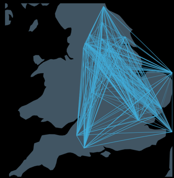
Here is the end product, a map with lines of varying brightness indicating the number of shared patients between each hospital. This could be further tidied up by changing the size to fill the display area and adding titles etc.
R-bloggers.com offers daily e-mail updates about R news and tutorials about learning R and many other topics. Click here if you're looking to post or find an R/data-science job.
Want to share your content on R-bloggers? click here if you have a blog, or here if you don't.