
A simple example of webscraping with R : the top 5% economist ranking
Want to share your content on R-bloggers? click here if you have a blog, or here if you don't.
The data analyzed in this post come from RePEc which is a collaborative project well-known by economists. It gathers links to working papers, journal articles or software components and also provides a ranking of more than 30,000 registered economists. This ranking is calculated by taking a harmonic mean of the ranks of many criterion considered such as the number of works, the number of citations, the H-index, the number of followers on twitter, etc… For a complete list of the criteria used, please see : https://ideas.repec.org/top/.
1. Scrap the data
To scrap the data, I used the R package rvest and the useful functions associated with this package: read_html, html_nodes and html_text to get the data for the top 5% economists, top 5% women economists and the top 5% in 2007. More precise information on the package is available here.
For my basic needs, I used the following lines of code to extract the data:
# Install the package and load it
install.packages(“rvest”)
library(rvest)

# Define the URL and download the HTML page with read_html
url1 <- "https://ideas.repec.org/top/top.person.alldetail.html"
page1 <- read_html(url1)

# To extract pieces out of the HTML page as a table format, use html_table
table1 <- html_table(page1)

# To extract pieces of the HTML page using css selectors, use html_nodes
# The following line extract information inside the <a> selector.
name_economist <- html_nodes(page1,"a")

# Extract attributes, text and tag with html_text
name_economist <- html_text(name_economist)

# Create a data frame with data.frame
name_economist <- data.frame(name_economist)
2. Information from the data
There are 2,489 economists in this top 5% ranking, of whom 109 are dead. Women represent only 6.5% of these 2,489 economists.
American universities dominate this ranking with more than 50% of the top ranked economists affiliated with a US university. Harvard University is the first institution in terms of the number of top 5% economists with 33 economists out of the total 2,489.
California is the state/country that gathers the highest number of top economists with 218, followed by the UK with 207 and then the state of Massachusetts with 193.
3. Number of economists per million population
Using the package rworldmap and data on population found on wikipedia, I constructed a map of the number of economists per million population. To have more precise info on how to use the rwolrdmap package, please read the very good introduction that I used here.
# Install and load the package
install.packages(“rworldmap”)
install.packages(“rworldmap”)

# Join the data frame df to a map with the name of the countries.
n1 <- joinCountryData2Map(df, joinCode="NAME", nameJoinColumn="state")

# Create a color palette
op <- palette(c("lavender", "yellow", "orange", "red"))

# Create the vector cutVector to separate the data in 4 categories:
# Countries between the minimum number of economists per million population
# (df$nbr_per_million) and 1; between 1 and 2; between 2 and 3 and between 3 and the max
cutVector <- c(min(df$nbr_per_million),1,2,3, max(df$nbr_per_million))

# Define the categories and name them for the legend
n1@data[["numcategorie"]] <- cut(n1@data[["nbr_per_million"]], cutVector, include.lowest=TRUE)
levels(n3@data[["numcategorie"]]) <- c(">0 and <1", "between 1 and 2","between 2 and 3", "more than 3")

#   Plot the map n1, use the categories defined with categories, the palette previously defined and a legend.
par(mai=c(0,0,0.2,0),xaxs="i",yaxs="i")
mapParams <- mapCountryData(n1, nameColumnToPlot="numcategorie", colourPalette = "palette",
mapTitle="Number of top 5% economist per million population", addLegend = T, missingCountryCol = NA,
catMethod = "categorical", mapRegion = "Eurasia")

# At end of plotting, reset palette to previous settings:
palette(op)
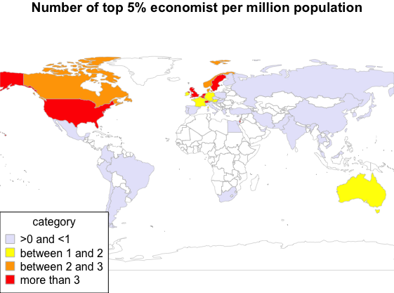
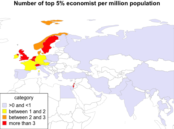
We can see that amongst the countries in Europe, the UK, Sweden, Switzerland, Belgium, Netherlands are the countries for which the number of top economists per million population is the highest.
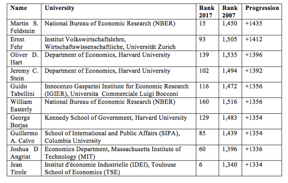
4. Evolution of the ranking
Using the wayback machine, I retrieved data from 2007 to compare with data from 2017. On average, the people who were present in the data for both 2007 and 2017 have lost 131 places in the ranking. The most significant improvement in ranking has been seen in the placement of Martin Feldstein, who gained 1,435 places in 10 years and is now ranked 15.
Top 10 best progression:
Top 10 biggest drop:

R-bloggers.com offers daily e-mail updates about R news and tutorials about learning R and many other topics. Click here if you're looking to post or find an R/data-science job.
Want to share your content on R-bloggers? click here if you have a blog, or here if you don't.