
Cut your regression to mediocrity with this 1 WEIRD TRICK!
Want to share your content on R-bloggers? click here if you have a blog, or here if you don't.
Well, like all clickbait articles, this isn’t going to be nearly as helpful to you as you were hoping — at least, not if you’re looking for some way to stop living an average life and fulfill your potential and blah blah blah.
But, if you’re concerned about regression to the mean (aka “regression to mediocrity”) in your life or your observational studies’ lives, this may be of some interest.
What it is
Regression to the mean is ubiquitous, like an endemic disease. Basically: Over time, high values tend to come down and low values tend to come back up. For instance, very tall people tend to have children who are shorter than they are, & vice versa. This was actually the example that was first used to illustrate RTM by Francis Galton in the late 1800s (and where he termed “regression to mediocrity”); in sports, it’s not uncommon for athletes having a record year to not perform as well in the following season; and if you buy and hold in the stock market long enough, chances are, at some point your portfolio will go up, and then down, and then up again, representing a gradual rise concomitant to whatever the inflation rate happens to be. Even students’ performance on test-taking shows RTM. Give a group of students a test on one day, and then give them the same test a week or so later — chances are, the poor performing students on exam 1 will do a bit better & the high performers won’t score quite so high.
Why it happens
But why? Often, the effect is due largely to random chance. Meaning, that even if the teacher’s class clown (hand raised) showed up drunk & largely or totally guessed on the exam (hand raised once more), there is still a chance (the exact probability depends on the type of test and number of questions) that the student could get an A. Why is this? In short, we live in an imperfect world. If you asked your star student, why didn’t you do as well on the exam this week? S/he could probably think of some reasons in hindsight for their reduced performance (I didn’t get enough sleep last night, I didn’t have my power smoothie breakfast, I was preoccupied thinking about my gf/bf, etc. — this is known as hindsight bias). And some of these may have had influenced her lesser performance to some degree, but you’d be hard-pressed to pinpoint clear and specific causes for said variations.
But I should note, RTM is not assuming that something dramatic happened — like the star student parties hard until the following exam, or the lowest ranking student takes the intervening week to Matrix the study material into his brain. Those are clearly definable agents of change; what we’re talking about here is assuming that all things are held relatively equal.
Why it matters
This is all starting to sound somewhat pedantic, but ultimately RTM — and our ability or inability to control for it — can have drastic impacts on what we assign as the cause(s) of certain outcomes, or the strength of those causes.
For instance, say you’re working for a telecom company and they lay down a bunch of new fiber optic cable in a city. The new stuff is better, faster, cheaper than the old stuff, and they think this is going seriously ramp up the number of subscribers. You, as the data-savvy person, are assessing whether the installation of new cable in the city is indeed driving an increase in subscribers.
If you saw an increase, ok. Is it safe to assume that an increase in subscription is due to solely to your new cables? Or, would more people have eventually subscribed to your service anyway? Let’s say you’re in an area that didn’t have much connectivity to begin with; is it reasonable to assume that more people will get internet access over time, irrespective of your new fiber optics system? Or, let’s say you’re working for a healthcare system running an outreach program for patients being discharged from the hospital. Your goal is to reduce readmissions from this outreach program. After running the program for six months, you run a test and conclude that your program did indeed reduce 30-day patient readmissions. However, a patient going back to the hospital tends to be less likely to return after an initial admission. In these cases, you may be giving yourself too much credit for affecting change that was going to happen anyway.
An illustrative example
I’ll illustrate all of this using a dataset I found while reading this paper from Unwin et al. Please note that I use some of the plotting code from Unwin et al., although I have made some minor but important edits to illustrate the evidence of RTM here (their paper focuses on a different subject). Admittedly, I don’t know much about the dataset, but here’s a quick overview: 72 anorexic girls were assigned to one of three treatment groups to improve their weight: Cognitive Behavioral Therapy (CBT), Family Therapy (FT), or Control (Cont). Their weights were measured before and after the intervention. There are only two sets of measurements here and little else to go on, so we can’t say whether the post-treatment effects become more or less substantial over time. We also lack other important information, such as ages, family income levels, measures of life stress, etc. All things that might account for weight gain or loss and should also be included in the analysis of program effectiveness. However, the patterns in the dataset are illustrative for the purposes of this post. Let’s look at the weights in each treatment group first…
Load packages & data -------------------
mods = c('data.table','ggplot2') # load required packages
rbind(lapply(mods, function(i) suppressPackageStartupMessages(require(i,quietly=TRUE,character.only=TRUE))))
data(anorexia,package='MASS') # load in anorexia data
an=as.data.table(anorexia)
an[,':='(wtMean=(Prewt+Postwt)/2 # get the mean of pre/post weight
    ,wtDiff=Postwt-Prewt # Difference b/n pre/post by subject)]
# boxplot of data
an_melt=melt(an,id.vars='Treat',measure.vars=c('Prewt','Postwt')) # melt data
ggplot(data=an_melt,aes(x=variable,y=value,fill=variable)) + geom_boxplot() +
  facet_grid(.~Treat)
table(an$Treat) # different number of subjects per trial group

#  CBT Cont   FT
#   29   26   17
There are a different number of subjects for each group. There is clearly pre-post change in distributions of the two treatment groups, although the number of patients per group is different.
Now let’s look at the relationship of pre- & post-treatment weights by group:
### Scatterplot of pre-/post-treatment weights -------------------
limits = an[,range(c(Prewt,Postwt))]
limits = limits + 0.05*c(-1,1)*limits
ggplot(data=an, aes(x=Prewt, y=Postwt, colour=Treat)) +
   coord_equal(ylim=limits, xlim=limits) +
   xlab("Pre-treatment weight (lbs)") +
   ylab("Post-treatment weight (lbs)") +
   geom_abline(intercept=0, slope=1, colour="white", size=1.25) +
   geom_point(size=3) +
   facet_grid(.~Treat) +
   scale_colour_discrete(guide="none")
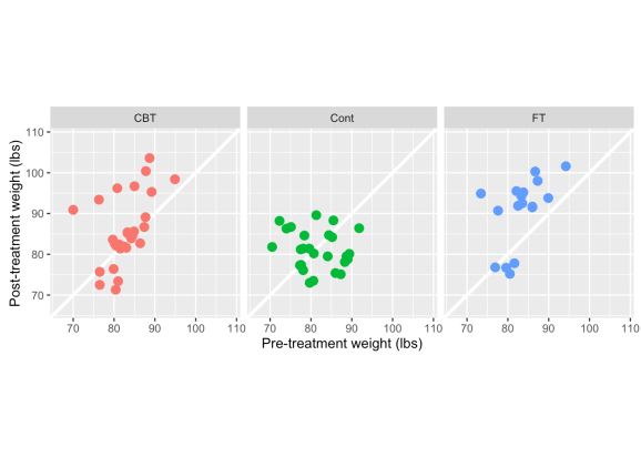
A few things to point out here — CBT & FT have more observations above the white line (indicating weight gain) than below it. There also appears to be a stronger positive relationship between pre- & post-treatment weight in the two treatment groups, whereas the control is clustered in one spot and there is a slightly negative correlation between pre & post weights. This would indicate that in the control group, even heavier girls dropped weight in the post-period follow-up, while subjects in the treatments generally maintained or gained weight. But is this merely because the lightest girls have gained more weight?
In light of what we know about RTM (smaller values tend to get larger, large ones get smaller) let’s look at the percent change in weight, which captures both pre & post weights in one metric.
### scatterplot of pre-/post- percent change -------------------
an[,wtChg:=(Postwt-Prewt)/Prewt] # calculate percent change in weight by subject
cors=an[,list(cors=round(cor(wtChg,Prewt),2)),by=Treat]
ggplot(data=an, aes(x=log(Prewt), y=(log(Postwt)-log(Prewt)), colour=Treat)) +
xlab("Pre-treatment weight (logged lbs)") +
ylab("Percent change in weight (logged lbs)") +
geom_hline(yintercept=0, size=1.25, colour="white") +
geom_point(size=3) +
facet_grid(.~Treat)+
geom_smooth(method='lm',formula=y~x,se = FALSE,col='black',size=.7)+
scale_colour_discrete(guide="none")+
scale_y_continuous(labels=scales::percent)+
geom_text(data=cors, aes(x=4.5,y=-.1,label=paste0('rho:', cors)),
col='black',parse=TRUE)+
geom_smooth(method='lm', formula=y~x, se = FALSE, col='black', size=.7)+
coord_fixed()

Unwin et al. summarize this pretty well:
“There are differences in the weight gain between the treatments, but there is also a lot of individual variation. For some girls the two treatment methods clearly did not help them to gain weight. More girls in the control group failed to gain weight only the very low weight girls gained much weight, which suggests that other influences may have been at work for these girls. The original data description indicates that intervention methods were used for the lightest girls. Generally there appears to be an association that the heavier girls, all still under normal weight, gained less weight than the lighter girls.“
I think the last sentence, which I’ve bolded, is the most informative here. Given that we don’t have much other data (i.e. any other mediating variables) to go on, it’s hard to say that the patterns in weight gain aren’t at least partly an affect of RTM. I’m looking at how the data points cluster (or don’t) around 0%. If the effect of weight gain were strongly influenced by the treatment program, you’d expect to see relatively flat regression lines, because you’d expect weight gain irrespective of how heavy the girls were before their treatment. With that said, CBT and FT generally seem to have a more consisent effect across different weights (the regression slopes are flatter) than the Control.
A similar way to plot out and diagnose this pattern, is to look at the changes in logged values, as Barnett et al. (2005) describe:
### logged pre-/post- change in weight -------------------
ggplot(data=an, aes(x=log(Prewt), y=(log(Postwt)-log(Prewt)), color=Treat)) +
  xlab("Logged pre-treatment weight") +
  ylab("Logged change in weight") +
  geom_hline(yintercept=0, size=1.25, colour="white") +
  geom_point(size=3) +
  geom_smooth(method='lm',formula=y~x,se = FALSE,size=.7)+
  scale_colour_discrete(guide="none")

Again, clearly a pattern of lighter girls gaining more weight, heavier girls gaining less or even losing. The respective regression lines reflect differences in treatment effects. Either therapeutic method seems better than doing nothing.
What you can do about it
Heavier subjects tend to lose weight and lighter subjects tend to gain weight! What can you do about it? Well, Pennsylvania drivers are SHOCKED to learn about this weird loophole… ok, seriously — there are a number of ways to deal with regression to the mean. The methods I detail are from Barnett’s paper. Here are the two strategies they describe, summarized below:
1) Conduct a randomly controlled trial (RCT). This is the “gold standard”, where you can meticulously plan to create groups that are similar in “moderating” variables (age, gender, income, etc), figure out the sample size needed to detect any significant effects, how you’re going to analyze the data, and then administer treatment(s) to some groups while using others as controls. But it takes planning, time, and money to do an RCT. Sometimes none of those things are available (sadly, not even planning).
2) Run a statistical test that accounts for multiple variables that could also affect a change in your response or outcome. Typically, running a good observational study requires adding a few controlling features in order to properly adjust the effect of change between treatment and control groups. With the dataset I’m using, we’ve only got the subject ID and pre/post outcomes. So there might very well be some substantial changes based on variables that we don’t have.
However — and now I’m finally coming to the point of my post — the outcome itself can also be adjusted to account for RTM. And this can be done in two ways…
1) Calculate the expected population RTM
As the authors state, this isn’t the easiest way to adjust for RTM in practice (i.e. you don’t get a subject-level adjustment). But it is nice because it gives you a diagnostic look at the potential effect of RTM on your trial/event/outreach program’s pre/post change.
Let’s try this with the anorexia data. Barnett’s paper provides R, SAS, & Stata code to do both this and the following procedure here. I’ve adapted their code to run as a function.
One note about calculating this measure — When calculating the expected RTM, one needs to choose cutoff values that would represent particularly high or low values in regard to the actual population parameters; we’d expect subjects exceeding these cutoffs to deviate back to a more “normal” value afterward. There’s no one way to derive that, except through knowledge of the subject and perhaps running some simulations at various cutoff values. Hopefully this graph below helps illustrate the point. I’ve chosen values that might be very high or low weights for the girls selected for the study.
### show changes in really high & low weights -------------------
an[,ID:=row.names(an)] # generate IDs for each subject
## create upper & lower limits based on quantile
ul=an[,quantile(Prewt)]
ul=unname(ul[c(2,4)])
## Subjects w/ weights above / below thresholds
wt=an[Prewt==ul[1] | Prewt==ul[2]]
# nrow(wt) - 32 subjects
wt=melt(wt,id.vars=c("ID","Treat"),measure.vars=c("Prewt","Postwt")) # melt it down
ggplot(data=wt, aes(x=variable, y=value, group=as.character(ID), col=Treat))+
 xlab("Pre/Post Study Period")+
  ylab("Weight (lbs)")+
  geom_abline(intercept=ul[1],slope=0,col='black')+
  geom_abline(intercept=ul[2],slope=0,col='black')+
  scale_y_continuous(breaks=c(70,ul[1],ul[2],90,100))+
  geom_line()+
  facet_grid(.~Treat)
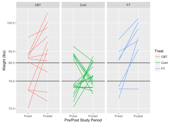
These graphs show how subjects with low weights tend to rise and high weights tend to decrease. As we might hope for, subjects in the treatment groups tend to exhibit this pattern less than in the control group. If the treatments are effective, we’d expect heavier girls to also gain some weight.
I’m not terribly familiar with the clinical management of anorexia, but I believe BMI is the more typical criterion in its diagnosis, which we don’t have in this dataset. Since , I’ve used a bit of Bayesian banditry to simulate the what the population parameters might look like.
The challenge with the cutoff method that I have below, is that you need to know the population mean and standard deviation, which one may not have. In this case, I don’t have a population average for population-level weights to compare to, and I didn’t find the average weight in my very quick search of the literature. I’m getting around this by simulating a population mean and standard deviation using MCMC. More specifically, I’m generating a large number of posterior distributions by assuming the population takes a normal distribution with unknown mean and variance — there are few points here and they are so tightly grouped that the simulated population will end up looking pretty close to the sample.
### Estimate population parameters & show RTM cutoffs at cor coefs -------------------
rtm_function <- function(mu=NULL,sigma=NULL,cut=NULL,m=1) {
# mu = population mean
# sigma = population std deviation
# cut = cut point to define low or high values
# m = number of baseline measurements
# Loops to run through rho and m scenrarios
var_wtn_subj=vector(length=11,mode="numeric") # calculate between-subject variance
var_btn_subj=vector(length=11,mode="numeric") # calculate within-subject variance
RTM_lower=vector(length=11,mode="numeric") # vector of values for lower RTM cutoff
RTM_upper=vector(length=11,mode="numeric") # vector of values for upper RTM cutoff
rho=vector(length=11,mode="numeric") # correlation marix
for (rhox in 0:10) {
rho[rhox+1]<-rhox/10
var_wtn_subj[rhox+1]<-(1-rho[rhox+1])*(sigma^2) # within-subject variance;
var_btn_subj[rhox+1]<-rho[rhox+1]*(sigma^2) # between-subject variance;
for (m in 1:m){ # Number of baseline measurements;
zg<-(cut-mu)/sigma; # z;
zl<-(mu-cut)/sigma; # z;
x1g<-dnorm(x=zg); # phi - probability density;
x2g<-1-pnorm(q=zg); # Phi - CDF
x1l<-dnorm(x=zl); # phi;
x2l<-1-pnorm(q=zl); # Phi;
czl<-x1l/x2l; # C(z) lower limit in paper;
czg<-x1g/x2g; # C(z) upper limit in paper;
RTM_lower[rhox+1]<-(var_wtn_subj[rhox+1]/m)/sqrt(var_btn_subj[rhox+1]+(var_wtn_subj[rhox+1]/m))*czl; # RTM effect, Equations (1) m=1 & (2) m>1
RTM_upper[rhox+1]<-(var_wtn_subj[rhox+1]/m)/sqrt(var_btn_subj[rhox+1]+(var_wtn_subj[rhox+1]/m))*czg; # RTM effect
}
}
output<-cbind(var_btn_subj,var_wtn_subj,rho,RTM_lower,RTM_upper)
print("The expected RTM effect for a range of baseline samples sizes and rhos")
print(output)
print("var_btn_subj=between-subject variance, var_wtn_subj=within-subject variance")
print("rho=within-subject correlation, Rl=RTM effect (< cut-off), Rg=RTM effect (>cut-off)")
}

## run MCMC simulation of population distribution parameters
## NOTE: JAGS needs to be separately installed on your OS to run this code
# library('rjags')
# x=anorexia$Prewt
# N=length(x)
# cat(
# "model {
#   for (i in 1:N) {
#     x[i] ~ dnorm(mu, tau)
#   }
#   mu ~ dnorm(0, .001)
#   sigma ~ dunif(0, 20)
#   tau <- sigma^-2
# }", file = 'anorex.jag')
#
# jags <- jags.model('anorex.jag', data = list('x' = x, 'N' = N),
#                    n.chains = 20, n.adapt = 20000)
# update(jags, 10000)
# jags.samples(jags, c('mu', 'sigma'), 1000)

rtm_function(mu=82.3,sigma=5.2,cut=80)

## [1] "The expected RTM effect for a range of baseline samples sizes and rhos"
##       var_btn_subj var_wtn_subj rho RTM_lower RTM_upper
##  [1,]        0.000       27.040 0.0 5.7155729 2.8041118
##  [2,]        2.704       24.336 0.1 5.1440156 2.5237006
##  [3,]        5.408       21.632 0.2 4.5724583 2.2432894
##  [4,]        8.112       18.928 0.3 4.0009010 1.9628783
##  [5,]       10.816       16.224 0.4 3.4293438 1.6824671
##  [6,]       13.520       13.520 0.5 2.8577865 1.4020559
##  [7,]       16.224       10.816 0.6 2.2862292 1.1216447
##  [8,]       18.928        8.112 0.7 1.7146719 0.8412335
##  [9,]       21.632        5.408 0.8 1.1431146 0.5608224
## [10,]       24.336        2.704 0.9 0.5715573 0.2804112
## [11,]       27.040        0.000 1.0 0.0000000 0.0000000
## [1] "var_btn_subj=between-subject variance, var_wtn_subj=within-subject variance"
## [1] "rho=within-subject correlation, Rl=RTM effect (< cut-off), Rg=RTM effect (>cut-off)"
If we assume there exists a correlation of .3 (just using the correlation between pre & post from the sample population), we’d expect to see an average increase in 4 pounds, due just to regression to the mean. And here’s a group of pooled t-tests to see what pre/post changes are by group:
pooled t-tests -------------------
ttests=data.frame(do.call(rbind,
lapply(an[,levels(factor(Treat,levels=c('Cont','CBT','FT')))],
function(i) {
tt=an[Treat==i,t.test(Postwt,Prewt)]
do.call(cbind,list(
treatment=i,
mean.change = an[Treat==i,round(mean(wtDiff),2)],
lower.CI=round(unname(unlist(tt['conf.int'][1])[1]),2),
upper.CI=round(unname(unlist(tt['conf.int'][1])[2]),2),
p.value=round(unname(unlist(tt['p.value'])),2)))})))
ttests


##   treatment mean.change lower.CI upper.CI p.value
## 1      Cont       -0.45    -3.38     2.48    0.76
## 2       CBT        3.01     -0.6     6.62     0.1
## 3        FT        7.26     2.35    12.17    0.01
So, what we can see is that the control & CBT groups showed an average change that was less than what might be expected just from regression to the mean. The control group even lost weight on average. Barnett et al. continue on with this technique by removing any observation who had a change lower than the hypothesized cutoff. In a way, it’s like removing outliers. I think there are a few problems with this, which are: 1) should outliers be removed just because they have extreme values? It’s a highly debated topic; 2) if your sample size is small already, like my sample size is, it may throw more uncertainty into the results. If I removed everyone who gained <= 4 lbs, I’d be throwing away 2/3 of the data.
What I do like about this method, is that it provides another diagnostic of performance. There’s a big push in the analytics community to get away from p-values ( the ASA’s statement pretty much says it all); this seems like another diagnostic to use, particularly when you’re dealing with results that are “barely” or “nearly significant”.
2) Use ANCOVA to adjust for differences
The next option that Barnett et al. describe, is to adjust the post-treatment results using Analysis of Covariance (ANCOVA). ANCOVA effectively adjusts the dependent variable by the mean of each treatment group plus any other covariate entered into the model. There’s a quick write-up on Wikipedia about it. This is probably the more practical way to adjust for RTM, rather than using a single diagnostic like in option 1. It’s pretty straight-forward in R. Barnett et al. do it with a GLM statement, although I’d imagine there are packages out there that also do it. Let’s see what this does to our dataset…
mean_pre=an[,mean(Prewt)] # mean pre-weight
mean_post=an[,mean(Postwt)] # mean post-weight
an[,basediff := Prewt - mean_pre] # calculate baseline difference from mean
an[,Treat := factor(Treat,levels=c('Cont','CBT','FT'))] # set control group as reference point
model = lm(Postwt ~ basediff + Treat,an) # ANCOVA using lm
summary(model) # summary of the model


## Call:
## lm(formula = Postwt ~ basediff + Treat, data = an)
##
## Residuals:
##      Min       1Q   Median       3Q      Max
## -14.1083  -4.2773  -0.5484   5.4838  15.2922
##
## Coefficients:
##             Estimate Std. Error t value Pr(>|t|)
## (Intercept)  81.4773     1.3754  59.240  < 2e-16 ***
## basediff      0.4345     0.1612   2.695 0.008850 **
## TreatCBT      4.0971     1.8935   2.164 0.033999 *
## TreatFT       8.6601     2.1931   3.949 0.000189 ***
## ---
## Signif. codes:  0 '***' 0.001 '**' 0.01 '*' 0.05 '.' 0.1 ' ' 1
##
## Residual standard error: 6.978 on 68 degrees of freedom
## Multiple R-squared:  0.2777, Adjusted R-squared:  0.2458
## F-statistic: 8.713 on 3 and 68 DF,  p-value: 5.719e-05
Using the above model, we can see that both CBT and Family Therapy outperform the control. But here we see that CBT falls into that “barely significant” range at .03.
Honestly, I’m not sure how this method differs conceptually from just doing a regression. I guess if you don’t have any other contextualizing data (certainly the case with the dataset I’m using), this is a good complement to the t-test, which is simply giving a within-group comparison.
In conclusion…
Regression to the Mean (or if you really want to dramatize it, Mediocrity) is everywhere. It’s important to account for it in your analysis. The best way to deal with it is by using a randomized controlled trial. Often though, observational studies are the best we can do, and it’s essential to control for intermediating factors where possible. The two methods described above are potential options.

R-bloggers.com offers daily e-mail updates about R news and tutorials about learning R and many other topics. Click here if you're looking to post or find an R/data-science job.
Want to share your content on R-bloggers? click here if you have a blog, or here if you don't.