
Doodling With 3d Animated Charts in R
Want to share your content on R-bloggers? click here if you have a blog, or here if you don't.
Doodling with some Gapminder data on child mortality and GDP per capita in PPP$, I wondered whether a 3d plot of the data over the time would show different trajectories over time for different countries, perhaps showing different development pathways over time.
Here are a couple of quick sketches, generated using R (this is the first time I’ve tried to play with 3d plots…)
library(xlsx)
#data downloaded from Gapminder
#dir()
#wb=loadWorkbook("indicator gapminder gdp_per_capita_ppp.xlsx")
#names(getSheets(wb))

#Set up dataframes
gdp=read.xlsx("indicator gapminder gdp_per_capita_ppp.xlsx", sheetName = "Data")
mort=read.xlsx("indicator gapminder under5mortality.xlsx", sheetName = "Data")

#Tidy up the data a bit
library(plyr)

gdpm=melt(gdp,id.vars = 'GDP.per.capita',variable.name='year')
gdpm$year = as.integer(gsub('X', '', gdpm$year))
gdpm=rename(gdpm, c("GDP.per.capita"="country", "value"="GDP.per.capita"))

mortm=melt(mort,id.vars = 'Under.five.mortality',variable.name='year')
mortm$year = as.integer(gsub('X', '', mortm$year))
mortm=rename(mortm, c("Under.five.mortality"="country", "value"="Under.five.mortality"))

#The following gives us a long dataset by country and year with cols for GDP and mortality
gdpmort=merge(gdpm,mortm,by=c('country','year'))

#Filter out some datasets by country
x.us=gdpmort[gdpmort['country']=='United States',]
x.bg=gdpmort[gdpmort['country']=='Bangladesh',]
x.cn=gdpmort[gdpmort['country']=='China',]
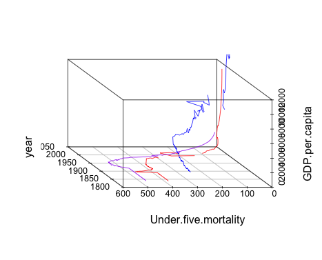
Now let’s have a go at some charts. First, let’s try a static 3d line plot using the scatterplot3d package:
library(scatterplot3d)

s3d = scatterplot3d(x.cn$year,x.cn$Under.five.mortality,x.cn$GDP.per.capita,
                     color = "red", angle = -50, type='l', zlab = "GDP.per.capita",
                     ylab = "Under.five.mortality", xlab = "year")
s3d$points3d(x.bg$year,x.bg$Under.five.mortality, x.bg$GDP.per.capita,
             col = "purple", type = "l")
s3d$points3d(x.us$year,x.us$Under.five.mortality, x.us$GDP.per.capita,
             col = "blue", type = "l")
Here’s what it looks like… (it’s worth fiddling with the angle setting to get different views):
A 3d bar chart provides a slightly different view:
s3d = scatterplot3d(x.cn$year,x.cn$Under.five.mortality,x.cn$GDP.per.capita,
                     color = "red", angle = -50, type='h', zlab = "GDP.per.capita",
                     ylab = "Under.five.mortality", xlab = "year",pch = " ")
s3d$points3d(x.bg$year,x.bg$Under.five.mortality, x.bg$GDP.per.capita,
             col = "purple", type = "h",pch = " ")
s3d$points3d(x.us$year,x.us$Under.five.mortality, x.us$GDP.per.capita,
             col = "blue", type = "h",pch = " ")

As well as static 3d plots, we can generate interactive ones using the
Here’s the code to generate an interactive 3d plot that you can twist and turn with a mouse:
#Get the data from required countries - data cols are GDP and child mortality
x.several = gdpmort[gdpmort$country %in% c('United States','China','Bangladesh'),]

library(rgl)
plot3d(x.several$year,x.several$Under.five.mortality,log10(x.several$GDP.per.capita), col=as.integer(x.several$country), size=3)
We can also set the 3d chart spinning….
play3d(spin3d(axis = c(0, 0, 1)))
We can also grab frames from the spinning animation and save them as individual png files. If you have Imagemagick installed, there’s a function that will generate the image files and weave them into an animated gif automatically.
It’s easy enough to install on a Mac if you have the Homebrew package manager installed. On the command line:
brew install imagemagick
Then we can generate the movie:
movie3d(spin3d(axis = c(0, 0, 1)), duration = 10,
        dir = getwd())
Here’s what it looks like:

Handy…:-)

R-bloggers.com offers daily e-mail updates about R news and tutorials about learning R and many other topics. Click here if you're looking to post or find an R/data-science job.
Want to share your content on R-bloggers? click here if you have a blog, or here if you don't.