Mapping the taste profile of Scottish whishkeys
Want to share your content on R-bloggers? click here if you have a blog, or here if you don't.
Recently, I came across this interesting blog post http://blog.revolutionanalytics.com/2013/12/k-means-clustering-86-single-malt-scotch-whiskies.html by the Revolutions blog poster Luba Gloukhov. This post initially caught my attention because of the originality of the dataset: 86 scottish whiskeys marked on a scale of 0-4 in 12 different taste profile (source data is here). Now I know what I like, and I like my whiskey, so I liked what I saw.
For these reasons, I set out to analyze the data a little bit more. Since Luba had already addressed most of what could be done in terms of clustering analysis, I restricted myself to mostly visualization of the data. First, I simply set out to plot a straightforward infographic of the data (the full version with all 86 whiskeys is available here Whiskey_taste_profile_infographic):
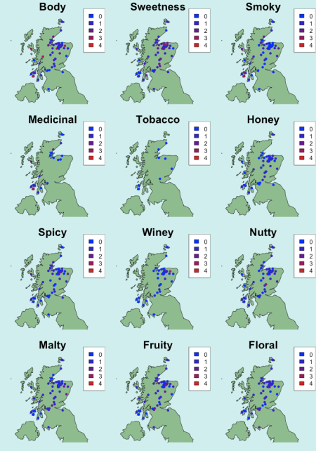
I then geotagged each distillery to the Scottish territory and color coded them according to the marks given for each taste profile. The most distinctive pattern we see is the clear separation between the land-based whiskeys and those from the Isles of Argyll.
We can then look at how geographical position (i.e. longitude and latitude) correlates to each taste profile.

Correlation between geographical position (longitude and latitude) of whiskeys and their taste profile score.
Better yet, we can look at similarities between different whiskeys and how these are affected by geographical location.

Correlation matrix of Scottish whiskeys constructed on the basis on their similarities in 12 different taste profiles
R-bloggers.com offers daily e-mail updates about R news and tutorials about learning R and many other topics. Click here if you're looking to post or find an R/data-science job.
Want to share your content on R-bloggers? click here if you have a blog, or here if you don't.


