
Introducing CrimeMap – A Web App Powered by ShinyApps!
[This article was first published on Blend it like a Bayesian!, and kindly contributed to R-bloggers]. (You can report issue about the content on this page here)
Want to share your content on R-bloggers? click here if you have a blog, or here if you don't.
A few months ago I did a mini project using open crime data and R to create crime visualisations. At that time, I was already thinking about a web app using Shiny but I couldn’t justify the time to develop the app and then set up a server etc. Not until two weeks ago when I received an invitation to join the alpha testing of ShinyApps.Want to share your content on R-bloggers? click here if you have a blog, or here if you don't.
ShinyApps – A Wonderful Discovery
I went through the ShinyApps’ getting started guide. Everything looks pretty straight forward. So I decided to go ahead and moved my codes from the crime visualisation project to a new ShinyApps project. The progress was unexpectedly smooth. Given that I had no web application development experience prior to this mini exercise, I consider this a quick success! All credit goes to the RStudio team for providing these tools and hosting services (especially Tareef Kawaf who kindly answered all my questions).I would summarise the whole process in the following few steps:
- Sign up for a ShingApps alpha testing account here (you will need a Google account).
- Install packages shiny and shinyapps (click on the links for installation help).
- Sign in to my.shinyapps.io, give your ShinyApps account a name (“blenditbayes” in my case) and get your application token/secret.
- Go through the tutorials, create the ui.R and server.R scripts for your app.
- Test the app locally using runApp().
- Once you’re happy with the app, apply your token/secret and deploy your app using deployApp().
That’s it! I can focus my effort solely on developing the app. The rest has been taken care of and simplified by the deployApp() and other ShinyApps functions.
CrimeMap in Action
So here is my first ever web app “CrimeMap” powered by ShinyApps! I will go through the usage briefly in the following sections. I hope you can give it a try and give me some feedback (e.g. what features are missing?) so I can continue to improve it. Your comments will be valuable to the ShinyApps development team too.

Basic Usage
First, enter a location of your choice (e.g. London) within England, Wales and Northern Ireland. Select the first month of crime data collection and then the length of the analysis period. After that, click on the “Update” button. My experience is that the graphs should come up within a minute if the length of analysis is less than or equal to 6 months. Depending on the location and the length of analysis, the process might take longer (say a couple minutes).
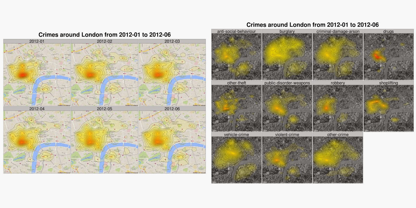
The outputs (at the time of writing) are displayed in three tabs: Data, Crime Map and Trends. The Data tab shows the original crime data records downloaded from the data.police.uk (I may add a feature like “download as CSV in future). The crime map is a density plot of the crime data. Finally, the trends tab shows bar charts of crime records over time in different crime categories. Right click on the map and you can save the image in its original size (1280 x 1280).

The outputs (at the time of writing) are displayed in three tabs: Data, Crime Map and Trends. The Data tab shows the original crime data records downloaded from the data.police.uk (I may add a feature like “download as CSV in future). The crime map is a density plot of the crime data. Finally, the trends tab shows bar charts of crime records over time in different crime categories. Right click on the map and you can save the image in its original size (1280 x 1280).

Customise the Maps
Continue to scroll down the menu on the left, you will find more settings for the map. Change the facet settings to create map facets according to crime type, categories and month. You can select different Google map format (roadmap, satellite, hybrid or terrain). There are also options to download the Google map image in high resolution (it takes a bit longer), in black & white and at various zoom levels. When you click the “Update” button to refresh the maps, it may take a while to show the new graphs if you have lots of facets.
Fine-tuning the Density Plots
The Density Plot Settings allow user to modify the “behind the scenes” ggplot2 codes. You can modify the layer transparency (alpha range), the number of bins, the width and the colour of the boundary lines as well as the colours of the gradient. My hope is to develop a user-friendly interface that allows users to quickly create maps with their own favourite themes.
Exploring the Trends
Why am I including the trends visualisation?
It just happened that I read this article around the same time I received the ShinyApps invitation. As I had already coded something for crime data visualisation, I thought it would be interesting to look at the data myself.
So here is a handy tool for you explore and visualise the data with a few clicks. I will leave you with your own conclusions.

Feedback Please
As I mentioned above, I am new to web app development and this is my first ever experiment. Please have a go, create a few maps and let me know what can be done better. Thanks in advance!! All the codes are available here.To leave a comment for the author, please follow the link and comment on their blog: Blend it like a Bayesian!.
R-bloggers.com offers daily e-mail updates about R news and tutorials about learning R and many other topics. Click here if you're looking to post or find an R/data-science job.
Want to share your content on R-bloggers? click here if you have a blog, or here if you don't.