
”How to draw the line” with ggplot2
Want to share your content on R-bloggers? click here if you have a blog, or here if you don't.
In a recent tutorial in the eLife journal, Huang, Rattner, Liu & Nathans suggested that researchers who draw scatterplots should start providing not one but three regression lines. I quote,
Plotting both regression lines gives a fuller picture of the data, and comparing their slopes provides a simple graphical assessment of the correlation coefficient. Plotting the orthogonal regression line (red) provides additional information because it makes no assumptions about the dependence or independence of the variables; as such, it appears to more accurately describe the trend in the data compared to either of the ordinary least squares regression lines.

Not that new, but I do love a good scatterplot, so I decided to try drawing some lines. I use the temperature and wind variables in the air quality data set (NA values removed). We will need Hadley Wickham’s ggplot2 and Bendix Carstensen’s, Lyle Gurrin’s and Claus Ekstrom’s MethComp.
library(ggplot2)
library(MethComp)

data(airquality)
data <- na.exclude(airquality)
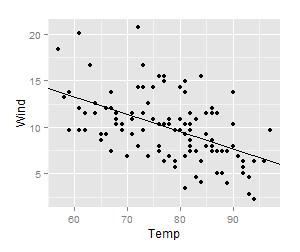
Let’s first make the regular old scatterplot with a regression (temperature as response; wind as predictor):
plot.y <- qplot(y=Temp, x=Wind, data=data)
model.y <- lm(Temp ~ Wind, data)
coef.y <- coef(model.y)
plot.y + geom_abline(intercept=coef.y[1],
  slope=coef.y[2])

And then, a regular old scatterplot of the other regression:
plot.x <- qplot(y=Wind, x=Temp, data=data)
model.x <- lm(Wind ~ Temp, data)
coef(model.x)
plot.x + geom_abline(intercept=coef(model.x)[1],
  slope=coef(model.x)[2])
So far, everything is normal. To put both lines in the same plot, we’ll need to rearrange the coefficients a little. From the above regression we get the equation x = a + by, and we rearrange it to y = – a / b + (1 / b) x.
rearrange.coef <- function(coef) {
  alpha <- coef[1]
  beta <- coef[2]
  new.coef <- c(-alpha/beta, 1/beta)
  names(new.coef) <- c("intercept", "slope")
  return(new.coef)
}
coef.x <- rearrange.coef(coef(model.x))
The third regression line is different: orthogonal, total least squares or Deming regression. There is a function for that in the MethComp package.
deming <- Deming(y=airquality$Temp, x=airquality$Wind)
deming
We can even use the rearrange.coef function above to see that the coefficients of Deming regression does not depend on which variable is taken as the response or predictor:
rearrange.coef(deming)
 intercept      slope
24.8083259 -0.1906826
Deming(y=airquality$Wind, x=airquality$Temp)[1:2]
 Intercept      Slope
24.8083259 -0.1906826
So, here is the final plot with all three lines:
plot.y + geom_abline(intercept=coef.y[1],
  slope=coef.y[2], colour="red") +
  geom_abline(intercept=coef.x[1],
  slope=coef.x[2], colour="blue") +
  geom_abline(intercept=deming[1],
  slope=deming[2], colour="purple")

Now for the dénouement of this post. Of course, there’s already an R function for doing this. It’s even in the same package as I used for the Deming regression; I just didn’t immediately rtfm. It uses base R graphics, though, and I tend to prefer ggplot2:
plot(x=data$Wind, y=data$Temp)
bothlines(x=data$Wind, y=data$Temp, Dem=T, col=c("red", "blue", "purple"))
This is the resulting plot (and one can even check out the source code of bothlines and see that I did my algebra correctly).

In this case, as well as in a few others that I tried, it seems like one of the ordinary regression lines (in this case the one with wind as response and temperature as predictor) is much closer to the Deming regression line than the other. I wonder under what circumstances that is the case, and if it tells anything useful about the variables. I welcome any thoughts on this matter from you, dear reader.
Literature
Huang L, Rattner A, Liu H, Nathans J. (2013) Tutorial: How to draw the line in biomedical research. eLife e00638 doi:10.7554/eLife.00638
Postat i:data analysis Tagged: ggplot2, MethComp, orthogonal regression, R, regression lines


R-bloggers.com offers daily e-mail updates about R news and tutorials about learning R and many other topics. Click here if you're looking to post or find an R/data-science job.
Want to share your content on R-bloggers? click here if you have a blog, or here if you don't.