Power-laws: choose your x and y variables carefully
Want to share your content on R-bloggers? click here if you have a blog, or here if you don't.
This is a follow-up of the post Power of running world records
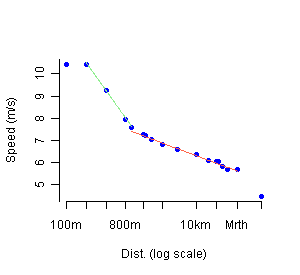
As suggested by Andrew, plotting running world records could benefit from a change of variables. More exactly the use of different variables sheds light on a [now] well-known [to me] sports result provided in a 2000 Nature paper by Sandra Savaglio and Vincenzo Carbone (thanks Ken): the dependence between time and distance in log-log scale is not linear on the whole range of races, but piecewise linear. There is one break-point around time 2’33’’ (or equivalently distance around 1100 m). As mentioned in the article, this threshold corresponds to a physiological critical change in the athlete’s energy expenditure: in short races (less than 1000 m) the effort follows an anaerobic metabolism, whereas it switches to aerobic metabolism for middle and long distances (or longer…). Interestingly, the energy is more efficiently consumed in the second regime than in the first: the decay in speed slows down for endurance races.
The reason of this graphical/visual difference is simple. Denote distance, time and speed by D, T and S. I have plotted the log T~ log D relation, which gave with
. When using the speed S as one of the variables, the relations are
and
with
and
to the first order because
is close to 1. With Nature paper findings (with the opposite sign convention), the two
s are
(anaerobic) and
(aerobic), ie
and
. My improper
is indeed in between. The slope ratio is much larger (larger than 2) on a plot involving the speed, clearly showing the two regimes, than on my original plot (a few 10%), which is the reason why it appear almost linear (although afterthought, and with good goggles, two lines might have been detected).
Below is the S ~ log D relation (click to enlarge) on which it appears clearly that 100 m and 100 km races are two outliers. It takes time to erase the loss of time due to the start of the race (100 m and 200 m are run at the same speed…), whereas the 100 km suffers from a lack of interest among athletes. Achim Zeileis also provides an extended world records table and R code in his comment.
As an aside, Andrew and Cosma Shalizi also comment and resolve an ambiguity of mine: one usually speaks about power-laws without much precision of context, but there are mainly two separate sets of power-law models. Either power-law regressions, where you plot y~x for two different variables (this is the case here); or power-law distributions, ie the probability distribution of a single variable x is , or extensions of that (with lots of natural examples, ranging from the size of cities to the number of deaths in attacks in wars).
R-bloggers.com offers daily e-mail updates about R news and tutorials about learning R and many other topics. Click here if you're looking to post or find an R/data-science job.
Want to share your content on R-bloggers? click here if you have a blog, or here if you don't.


