Visualizing Sampling Distributions
Want to share your content on R-bloggers? click here if you have a blog, or here if you don't.
Teacher: “How variable is your estimate of the mean?”
Student: “Uhhh, it’s not. I took a sample and calculated the sample mean. I only have one number.”
Teacher: “Yes, but what is the standard deviation of sample means?”
Student: “What do you mean means, I only have the one friggin number.”
Statisticians have a habit of talking about single events as though they’ve happened (or could happen) over and over again. This is the basis of the Frequentist paradigm, and I’ve found that it really irks early students of statistics. Questions of the type: “How variable is that estimate?” asked by a statistician translates to “How variable would our collection of estimates be if we were to draw samples of the same size from the population, over and over again?”
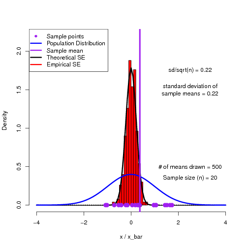
As a way to help students get into this way of thinking, I have found simulations to be quite useful. Here is an R script to demonstrate the sampling distribution of means and how we can reproduce the theoretical standard error of the mean.
## This script plots a histogram of sample means from a known population and compares this
## distribution against the theoretical Standard Error of the Means distribution.

## You can play around with sample size (n) to see how the standard error distribution changes.

rm(list=ls())

var_ <- new.env()
n<-20            ## Sample n individuals at a time
p_mean<-0        ## Population mean
p_sd<-1            ## Population standard deviation
N<-500            ## Number of times the experiment (sampling) is replicated

pdf('SE.pdf')

for(i in 1:N)                                ## do the experiment N times
{
smp<-rnorm(n,p_mean,p_sd)                 ## sample n data points from the population

var_$x_bar<-c(var_$x_bar,mean(smp))         ## keep track of the mean (x_bar) from each sample

hist(var_$x_bar,probability=TRUE,col="red",xlim=c(-4,4),xlab="x / x_bar",main="",ylim=c(0,2.2))  # Plot a histogram of x_bar values
points(mean(smp),0,pch=19,cex=1.5,col='black')
curve(dnorm(x,p_mean,p_sd/sqrt(n)),lwd=3,add=TRUE)

text(2.5,1.75,labels=paste('sd/sqrt(n) = ',round(p_sd/sqrt(n),2),sep=''))
text(2.5,1.5,labels=paste('standard deviation of\nsample means = ',round(sd(var_$x_bar),2),sep='') )

curve(dnorm(x,p_mean,p_sd),main="",ylab="",xlim=c(-4,4),xlab="X",col="blue",lwd=3,add=TRUE) ## Plot the sample

text(2.5,0.5,labels=paste('# of means drawn = ',i,sep=''))
text(2.5,0.35,labels=paste('Sample size (n) = ',n,sep=''))
points(smp,rep(0,n),pch=19,cex=1.5,col='purple')
abline(v= mean(smp),col='purple',lwd=4)

legend("topleft",legend=c('Sample points','Population Distribution','Sample mean','Theoretical SE','Empirical SE'),
lty=c(0,1,1,1,1,1,1),lwd=c(0,3,3,3,3,3,3),pch=c(16,NA,NA,NA,NA,NA,NA),col=c('purple','blue','purple','black','red'))

print(paste(i," of ",N))
}
dev.off()

############################################################################################
############################################################################################
The output of the script is a multi-page pdf which can be flipped through to show the building of a histogram of sample means converging on the theoretical sampling distribution.
R-bloggers.com offers daily e-mail updates about R news and tutorials about learning R and many other topics. Click here if you're looking to post or find an R/data-science job.
Want to share your content on R-bloggers? click here if you have a blog, or here if you don't.

