
Social Network Analysis using R and Gephis
[This article was first published on Enterprise Software Doesn't Have to Suck, and kindly contributed to R-bloggers]. (You can report issue about the content on this page here)
Want to share your content on R-bloggers? click here if you have a blog, or here if you don't.
Want to share your content on R-bloggers? click here if you have a blog, or here if you don't.
After learning the basics of R, I decided to learn something harder last week. I picked Social Network Analysis (SNA) to learn the concepts of SNA and R. My primary interest in SNA is visual exploration of networks, so I needed to find a tool first.
Which tool to use for visual SNA? Features needed:
1) graphical representation of network
2) visually navigate the graph (zoom in/out, drag) to explore large graphs
3) manipulate the graph (filter nodes, edit/delete/group nodes and same for edges)
4) free, preferably open source. I’m not currently interested in commercial tools (can’t justify their steep price tag for my experiments).
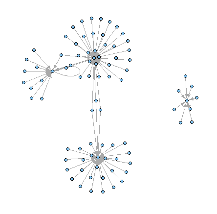
I found out that R has good libraries like SNA (checkout Drew Conway’s tutorial) and iGraph (see this tutorial) for social network analysis. However, they lack features to deal with large graphs (nodes > 200, edges > 500 seem to make the process slow and the plots unusable), navigate and manipulate the graph visually. All I could do was plot simple networks (shown below).
So I continued my hunt for a good tool for visual SNA and discovered Gephis, an open source app for visual exploration. Think “photoshop for graphs“.
WARNING: SNA with Gephis is addictive. I’ve had my share of sleepless nights and dreams of nodes and edges
After you download Gephi, checkout Gephi quick start guide to get your bearings.
I played with Gephi for several hours to learn it (its kewl) and to impress my daughter (her dad is no fireman, who saves people, but he can do nifty things with a computer 😉 I was able to discover interesting facts from the data, including:
– Avg. degree: the number of edges/connections attached to a node
– Network diameter: The longest path between the nodes in the graph
– Average path length: In how many steps (on avg) can one can reach any node from any other node in the graph
– Degree power law: The higher this number, the more unequal is the distribution of connections within the network, which means that some nodes are very well-connected and some are not at all
– Average clustering coefficient: Shows how well the nodes are embedded in their neighborhood i.e. is there a “small world” effect within the network
– Modularity: The higher this parameter, the more defined are the communities within the network. A result of 0.4 or more is usually considered meaningful
– Betweenness centrality was calculated for each node, which shows how often the node appears on the shortest path between any two random nodes in the network. The higher this parameter, the more influential the node is. The nodes which have high betweenness centrality are not necessarily the ones that have the most connections and don’t have to be the most “popular” ones Here’s a video of Gephi features (older version)
Gephi Features Tour from gephi on Vimeo.
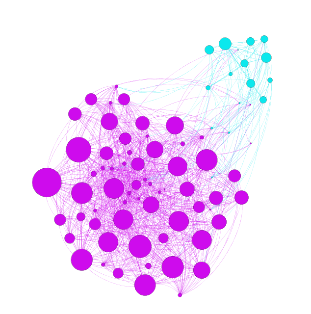
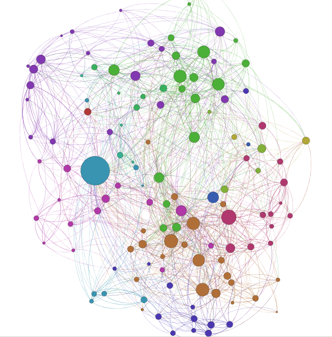
I was also able to discover interesting patterns in the data, like the communities that emerge, popular people and the connectors. See the graph below to see nodes with different colors (communities), size (popularity) and how most connections between the two communities flow through a few nodes (connections)
I played with Gephi for several hours to learn it (its kewl) and to impress my daughter (her dad is no fireman, who saves people, but he can do nifty things with a computer 😉 I was able to discover interesting facts from the data, including:
– Avg. degree: the number of edges/connections attached to a node
– Network diameter: The longest path between the nodes in the graph
– Average path length: In how many steps (on avg) can one can reach any node from any other node in the graph
– Degree power law: The higher this number, the more unequal is the distribution of connections within the network, which means that some nodes are very well-connected and some are not at all
– Average clustering coefficient: Shows how well the nodes are embedded in their neighborhood i.e. is there a “small world” effect within the network
– Modularity: The higher this parameter, the more defined are the communities within the network. A result of 0.4 or more is usually considered meaningful
– Betweenness centrality was calculated for each node, which shows how often the node appears on the shortest path between any two random nodes in the network. The higher this parameter, the more influential the node is. The nodes which have high betweenness centrality are not necessarily the ones that have the most connections and don’t have to be the most “popular” ones Here’s a video of Gephi features (older version)
Gephi Features Tour from gephi on Vimeo.
I was also able to discover interesting patterns in the data, like the communities that emerge, popular people and the connectors. See the graph below to see nodes with different colors (communities), size (popularity) and how most connections between the two communities flow through a few nodes (connections)
Web rendition of these graphs is also possible. Checkout this visualization of Perl authors (you can drag the graph with left click and dragging your mouse; you can zoom-in/out on the graph with your mouse wheel)
Lessons learned so far:
– I quickly realized that you need a good machine for using Gephi effectively (a good video card, enough memory and fast CPU)
– There is a great, active community behind Gephi, so expect frequent releases to resolve critical issues and new features. I’m waiting for this month’s release that fixes some issues I’ve faced 🙂 If you know of other tools to visually explore graphs, please leave a comment.
Which network data I used? There’s a wealth of network data available today, including social networking sites, phone logs, work history, chat logs, email logs etc. I decided to create test data for email traffic to test the hypothesis of “who we send emails to or receive emails from” is a good indicator of our social network. My test data has 50,000+ nodes and 150,000+ edges.
I used R to create the create data for graph. R is good at handling millions of rows of data and is powerful for data manipulation (cleaning, creating edge lists, adjacency matrix etc.). I used it to format raw email traffic test data into graph formats (edgelist, adjacency matrix etc.) It took me a couple of hours to write code for creating the data set to feed into Gephi. Using R to solve a real need has been a good learning experience so far.
Leave a comment, if you’re interested in seeing the code.
To leave a comment for the author, please follow the link and comment on their blog: Enterprise Software Doesn't Have to Suck.
R-bloggers.com offers daily e-mail updates about R news and tutorials about learning R and many other topics. Click here if you're looking to post or find an R/data-science job.
Want to share your content on R-bloggers? click here if you have a blog, or here if you don't.