
2 y-axis plotting
Want to share your content on R-bloggers? click here if you have a blog, or here if you don't.
A simple plotting feature we need to be able to do with R is make a 2 y-axis plot. First let’s grab some data using the built-in beaver1 and beaver2 datasets within R. Go ahead and take a look at the data by typing it into R as I have below.
# Get the beaver datasets
beaver1
beaver2
We’re going to plot the temperatures within both of these datasets, which we can see (after punching into R) is the third column.
First let’s check the length of these datasets and make sure they’re the same.
# Get the length of column 3
length(beaver1[,3])
length(beaver2[,3])
[1] 114
[2] 100
Since beaver1 is longer, we’ll only plot rows 1 through 100 of the temperature data, so that it is the same length as beaver2.
# Plot the data
plot(beaver1[1:100, 3], type ="l", ylab = "beaver1 temperature")
Cool, your plot should look like this.

Now, let’s add that second dataset on the right y-axis. So, we have to have to create a plot on top of this plot using the command par(new = TRUE).
# Add the second y-axis
plot(beaver1[1:100, 3], type ="l", ylab = "beaver1 temperature")
par(new = TRUE)
plot(beaver2[,3], type = "l")
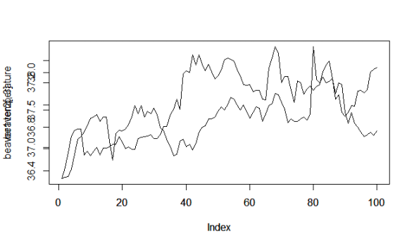
Woah, this plot is ugly! We have 2 y-axis labels plotting, 2 y-axis values plotting, and 2 x-axis values and labels plotting. Let’s turn those off using the commands xaxt = “n” and yaxt = “n”.
# updated plot
plot(beaver1[1:100, 3], type ="l", ylab = "beaver1 temperature")
par(new = TRUE)
plot(beaver2[,3], type = "l", xaxt = "n", yaxt = "n",
     ylab = "", xlab = "")
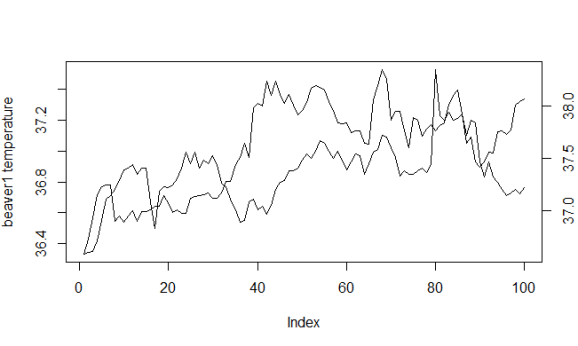
Okay, it’s still pretty ugly, so let’s clean it up. Let’s make the margins bigger on the right side of the plot, add a y2 axis label, add a title, change the color of the lines and adjust the x-axis label. Don’t forget the legend! Here’s the code:
# final plot
par(mar = c(5, 5, 3, 5))
plot(beaver1[1:100, 3], type ="l", ylab = "beaver1 temperature",
     main = "Beaver Temperature Plot", xlab = "Time",
     col = "blue")
par(new = TRUE)
plot(beaver2[,3], type = "l", xaxt = "n", yaxt = "n",
     ylab = "", xlab = "", col = "red", lty = 2)
axis(side = 4)
mtext("beaver2 temperature", side = 4, line = 3)
legend("topleft", c("beaver1", "beaver2"),
       col = c("blue", "red"), lty = c(1, 2))
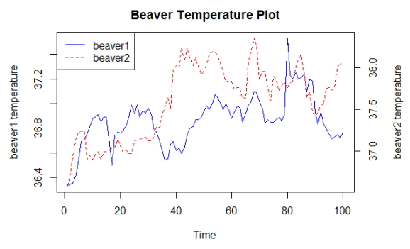
Woo! Looks good. That’s all for now.

R-bloggers.com offers daily e-mail updates about R news and tutorials about learning R and many other topics. Click here if you're looking to post or find an R/data-science job.
Want to share your content on R-bloggers? click here if you have a blog, or here if you don't.