
What Happened Then? Using Approximated Twitter Follower Accession to Identify Political Events
Want to share your content on R-bloggers? click here if you have a blog, or here if you don't.
Following a chat with @andypryke, I thought I’d try out a simple bit of feature detection around approximated follower acquisition charts (e.g. Estimated Follower Accession Charts for Twitter) to see if I could detect dates around which there were spikes in follower acquisition.
So for example, here’s the follower acquistion chart for Seem Malhotra:

We see a spike in follower count about 440 days ago, with an increased daily follower acquisition rate thereafter. WHat happened 440 days or so ago? We can easily look this up on something like Wolfram Alpha (query on /440 days ago/) or directly in R:
as.Date(Sys.time())-440
[1] "2011-12-20"
So what happened in December 2011? A quick search on /”Seema Malhotra” December 2011/ turns up the news that she won a by-election on 16 December 2011. The spike in followers matches the by-election date well, and the increased rate in daily follower acquisition since then is presumably related to the fact that Seema Malhotra is now an MP.
So what’s the new line on the chart (the black, stepped line along the bottom)? It’s actually a 5 point moving average of the first difference in follower count over time (that is, sort of a smoothed version of a crude approximation to the gradient of the follower acquisition curve; the firstdiff curve is normalised by finding the difference in accumulated follower count between consecutive time samples divided the number of days between samples. So it’s a sort of gradient rather than first difference. If the samples were all a day apart, it would be a first difference…). I also filter the line to only show days on which there was a “significant jump” in follower count, arbitrarily set at a 5 sample moving average of more than 50 new followers per day. Note that scaling of the moving average values too – the numerical y-axis scale is 1:1 for the cumulative follower number, but 10x the moving average value. The numerical value labels that annotate the line chart correspond to the number of days ago (relative to the date the chart was generated) that the peak corresponds to. For any chart critics out there – this is a “working chart”, rather than a polished presentation graphic;-)
#Process Twitter user data file
processUsersData=function(data){
  data$tz=as.POSIXct(data$created_at)
  data$days=as.integer(difftime(Sys.time(),data$tz,units='days'))
  data=data[rev(rownames(data)),]
  data$acc=1:length(data$days)
  data$recency=cummin(data$days)
  data$frfo=data$friends_count/data$followers_count
  data$stfo=data$statuses_count/data$followers_count
  data$foperday=data$followers_count/data$days
  data$stperday=data$statuses_count/data$days
  data$fost=data$followers_count/(1+data$statuses_count)

  data
}

#The TTR library includes various moving average functions
require(TTR)

differ_a=function(d){
  d=processUsersData(d)

  #Find the users who are used to approximate the accession date
  d2=subset(d,days==recency)
  #Dedupe these rows (need to check if I grab the first of the last...)
  d3=d2[!duplicated(d2$recency),]

  #First difference
  d3$accdiff=c(0,diff(d3$acc))
  d3$daysdiff=c(0,-diff(d3$days))
  d3$firstdiff=d3$accdiff/d3$daysdiff

  #First difference smoothed over 5 values - note we do dodgy things against time here - just look for signal!
  d3$SMA5=SMA(d3$firstdiff,5)

  #Second difference
  d3$fdd=c(0,diff(d3$firstdiff))
  d3$seconddiff=d3$fdd/d3$daysdiff

  d3
}

#An example plotter - sm is the user data
g= ggplot(processUsersData(sm))
g=g+geom_point(aes(x=-days,y=acc),size=1) #The black acc/days dots
g=g+geom_point(aes(x=-recency,y=acc),col='red',size=1) #The red acc/days  acquisition date estimate dots
g=g+geom_line(data=differ_a(sm),aes(x=-days,y=10*SMA5)) #The firstdiff moving average line
g=g+geom_text(data=subset(differ_a(sm),SMA5>50),aes(x=-days,y=10*SMA5,label=days),size=3) #Feature label
g=g+ggtitle("Seema Malhotra") #Chart title
Here’s Chris Pincher:
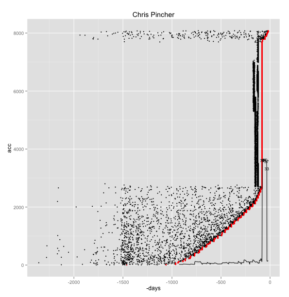
This account got hit about 79 days ago (December 15th 2012) – we need to ignore the width of the moving average curve and just focus on the leading edge, as a zoom into the chart, with a barchart depicting firstdiff replacing the first diff moving average line, demonstrates.
#Got a rogue datapoint in there somehow?
ggplot(subset(processUsersData(cpmp),days<5000))
g=g+geom_point(aes(x=-days,y=acc),size=1)
g=g+geom_point(aes(x=-recency,y=acc),col='red',size=1)
g=g+geom_bar(data=subset(differ_a(cpmp),days50 & days<5000),aes(x=-days,y=firstdiff,label=days),size=3)
g=g+ggtitle("Chris Pincher")+xlim(-200,-25)

The spam followers that were signed up to the account look like they were created in batches several months prior to what I presume was an attack? COuld this have been in response to his Speaking Out about the Collapse of Drive Assist on Thursday, December 13th, 2012, his Huffpo post on the 11th, or his vote against the Human Rights Act as reported on the 5th?
Who else has an odd follower acquisition chart? How about Aidan Burley?

219 days ago – 28th July 2012…

I guess that caused something of a Twitter storm, and a resulting growth in his follower count… Diane Abbott’s racist tweet row from December 2012 also grew her twitter following… Top tip for follower acquisition, there;-)
Nadine Dorries’ outspoken comments in May 2012 around David Cameron’s party leadership, and then same sex marriage, was good for her Twitter follower count, which received another push when she joined I’m a Celebrity and was suspended from the Parliamentary Conservative party.
Showing your emotions in Parliament looks like a handy trick too…Here’s a spike around about October 20th, 2011…

(There also looks to be a gradient change around 200 days ago maybe? The second diff calculations might pull this out?)
Chris Bryant’s speech on the phone hacking saga in July 2011 showed that publicly well-received parliamentary speeches can be good for numbers too; not surprisingly, the phone hacking scandal was also good for Tom Watson’s follower count around the end of July 2011. Election victories can be good too: Andy Sawford got a jump in followers when he was announced as a PPC (10th August 2012) and then when he won his seat (November 7th 2012); Ben Bradshaw’s numbers also jumped around the time of his May 2010 election victory, as did Lynne Featherstone’s, particularly with her appointment to a government position. Jesse Norman appeared to get a bump after the Prime Minister confronted him on July 11th 2012; Nick de Bois saw a leap in followers following the riots in his constituency in early August 2011, and the riots also seem to have bumped David Lammy’s and Diane Abbott’s numbers up.
A tragedy on September 17th looks like it may have pushed Peter Hain’s numbers, but he was in the news a reasonable amount around that time – maybe getting your name in the press for several days in a row is good for Twitter follower counts? Steve Rotherham also benefited from another recalled tragedy, the Hillsborough distaster, when, in October 2011, he called the ex-Sun’s editor out over it’s original coverage; he seems to have received another boost in followers when he lead a debate on internet trolls in September 2012.
Personal misfortune didn’t do Michael Fabricant any harm – his speeding conviction colourful Twitter baiting in October 2012 caused his follower count to fly and achieve an elevated rate of daily growth it’s maintained ever since.
A Dispatches special on ticket touts got a bounce in followers for Sharon Hodgson, who was sponsoring a private member’s bill on ticket touts at the time; winning a social media award seemed to do Kevin Brennan a favour in terms of his daily follower acquisition rate, as this ramp increase around the start of December 2010 shows:

So there we have it; political life as seen through the lens of Twitter follower acquisition bursts:-)
But what now? I guess one thing to do would be to have a go at estimating the daily growth rates of the various twittering MPs, and see if thy have any bearing to things like ministerial (or Shadow Minister) responsiblity? Where rates seem to change (sustained kinks in the curve), it might be worth looking to see whether we can identify any signs of changes in tweeting behaviour – or maybe news stories that come to associate the MP with Twitter in some way?

R-bloggers.com offers daily e-mail updates about R news and tutorials about learning R and many other topics. Click here if you're looking to post or find an R/data-science job.
Want to share your content on R-bloggers? click here if you have a blog, or here if you don't.