
Visualizing the History of Epidemics
Want to share your content on R-bloggers? click here if you have a blog, or here if you don't.
I really like National Geographic. Their magazine is great, their television documentaries are done well and they helped give me a lifelong love of maps. They generate very good information and help shed light on the world we all share. So why is this graphic so awful?
Let's have a look:

We'll start off by saying that no one will mistake me for Edward Tufte or Stephen Few or Nathan Yau, though I love their stuff, have read it and have tried to adopt as many of their more sensible recommendations as I can. That understood, I think I'm on solid footing when I say that at a minimum, all graphical elements should fit within the display surface. The first three quantities are so massive, that they can't be contained. How big are they? Well, we have the numbers within the circles, but beyond that, who knows? The plague of Justinian looks like it could be Jupiter to the Black Plague's Saturn, with modern epidemics having more of an Earthly size.
Speaking of circles, I try to avoid them. If those three aforementioned experts have taught me anything it's that the human brain cannot easily process the area of a round object. Quick: without looking at the numbers, tell me what's the relativity between HIV and ebola.
Did you have to scroll to look at both objects? I did. Not only do the largest epidemics spill over the display area, they make it difficult to view a large number of data points at the same time. As we scroll down, we eventually land on a display which has Asian flu at the top and the great plague of London at the bottom. Justinian, the black death and medieval history are erased from our thoughts.
And what's with the x-axis? The circles move from one side to the other, but this dimension conveys no meaning whatsoever.
As an aside, although I love having the years shown, it would have been good to use that to augment the graphic with something that conveys how epidemics have changed over time. Population has changed, medicine has changed and the character of human disease has changed. As I look at the graphic, what I tend to extrapolate from this is that surely the plague of Justinian wiped out most of southern Europe, Anatolia and Mesopotamia. In contrast, SARS likely appeared during a slow news cycle.
It would be disingenuous of me to criticize a display without proposing one of my own. So, here goes.
dfEpidemic = data.frame(Outbreak = c("Plague of Justinian", "Black Plague"
                                     , "HIV/AIDS", "1918 Flu", "Modern Plague"
                                     , "Asian Flu", "6th Cholera Pandemic"
                                     , "Russian Flu", "Hong Kong Flut"
                                     , "5th Cholera Pandemic", "4th Cholera Pandemic"
                                     , "7th Cholera Pandemic", "Swine Flu"
                                     , "2nd Cholera Pandemic", "First Cholera Pandemic"
                                     , "Great Plague of London", "Typhus Epidemic of 1847"
                                     , "Haiti Cholera Epidemic", "Ebola"
                                     , "Congo Measles Epidemic", "West African Meningitis"
                                     , "SARS")
                        , Count = c(100000000, 50000000, 39000000, 20000000
                                    , 10000000, 2000000, 1500000, 1000000
                                    , 1000000, 981899, 704596, 570000, 284000
                                    , 200000, 110000, 100000, 20000, 6631
                                    , 4877, 4555, 1210, 774)
                        , FirstYear = c(541, 1346, 1960, 1918, 1894, 1957, 1899, 1889
                                        , 1968, 1881, 1863, 1961, 2009, 1829, 1817
                                        , 1665, 1847, 2011, 2014, 2011, 2009, 2002))
dfEpidemic$Outbreak = factor(dfEpidemic$Outbreak
                             , levels=dfEpidemic$Outbreak[order(dfEpidemic$FirstYear
                                                                , decreasing=TRUE)])
library(ggplot2)
library(scales)
plt = ggplot(data = dfEpidemic, aes(x=Outbreak, y=Count)) + geom_bar(stat="identity") + coord_flip()
plt = plt + scale_y_continuous(labels=comma)
plt
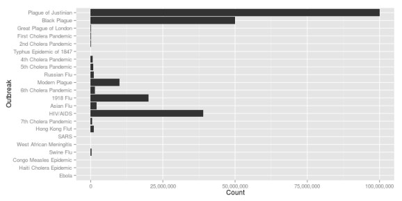
I'm showing that data as a bar chart, so everything fits within the display and the relative size is easy to recognize. I also order the bars by starting year so that we can convey an additional item of information. Are diseases getting more extreme? Nope. Quite the reverse. 1918 flu and HIV have been significant health issues, but they pale in comparison to the plague of Justinian or the Black Death. HIV is significant, but we've been living with that disease for longer than I've been alive. If we want to convey a fourth dimension, we could shade the bars based on the length of the disease.
dfEpidemic$LastYear = c(542, 1350, 2014, 1920, 1903, 1958, 1923, 1890, 1969, 1896, 1879
, 2014, 2009, 1849, 1823, 1666, 1847, 2014, 2014, 2014, 2010, 2003)
dfEpidemic$Duration = with(dfEpidemic, LastYear - FirstYear + 1)
dfEpidemic$Rate = with(dfEpidemic, Count / Duration)
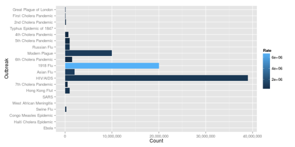
plt = ggplot(data = dfEpidemic, aes(x=Outbreak, y=Count, fill=Rate)) + geom_bar(stat="identity")
plt = plt + coord_flip() + scale_y_continuous(labels=comma)
plt

The plague of Justinian dwarfs everything. We'll have one last look with this observation removed. I'll also take out the Black Death so that we're a bit more focused on modern epidemics.
dfEpidemic2 = dfEpidemic[-(1:2), ]
plt = ggplot(data = dfEpidemic2, aes(x=Outbreak, y=Count, fill=Rate)) + geom_bar(stat="identity")
plt = plt + coord_flip() + scale_y_continuous(labels=comma)
plt
HIV/AIDS now stands out as having the most victims, though the 1918 flu pandemic caused people to succomb more quickly.
These bar charts are hardly the last word in data visualization. Still, I think they convey more information, more objectively than the National Geographic's exhibit. I'd love to see further comments and refinements.
Session info:
## R version 3.1.1 (2014-07-10)
## Platform: x86_64-pc-linux-gnu (64-bit)
##
## locale:
##  [1] LC_CTYPE=en_US.UTF-8       LC_NUMERIC=C
##  [3] LC_TIME=en_US.UTF-8        LC_COLLATE=en_US.UTF-8
##  [5] LC_MONETARY=en_US.UTF-8    LC_MESSAGES=en_US.UTF-8
##  [7] LC_PAPER=en_US.UTF-8       LC_NAME=C
##  [9] LC_ADDRESS=C               LC_TELEPHONE=C
## [11] LC_MEASUREMENT=en_US.UTF-8 LC_IDENTIFICATION=C
##
## attached base packages:
## [1] stats     graphics  grDevices utils     datasets  methods   base
##
## other attached packages:
## [1] knitr_1.6        RWordPress_0.2-3 scales_0.2.4     ggplot2_1.0.0
##
## loaded via a namespace (and not attached):
##  [1] colorspace_1.2-4 digest_0.6.4     evaluate_0.5.5   formatR_0.10
##  [5] grid_3.1.1       gtable_0.1.2     htmltools_0.2.4  labeling_0.2
##  [9] MASS_7.3-34      munsell_0.4.2    plyr_1.8.1       proto_0.3-10
## [13] Rcpp_0.11.2      RCurl_1.95-4.1   reshape2_1.4     rmarkdown_0.2.50
## [17] stringr_0.6.2    tools_3.1.1      XML_3.98-1.1     XMLRPC_0.3-0
## [21] yaml_2.1.13

R-bloggers.com offers daily e-mail updates about R news and tutorials about learning R and many other topics. Click here if you're looking to post or find an R/data-science job.
Want to share your content on R-bloggers? click here if you have a blog, or here if you don't.