
Simple time series plot using R : Part 2
[This article was first published on We think therefore we R, and kindly contributed to R-bloggers]. (You can report issue about the content on this page here)
Want to share your content on R-bloggers? click here if you have a blog, or here if you don't.
Want to share your content on R-bloggers? click here if you have a blog, or here if you don't.
I would like to share my experience of plotting different time series in the same plot for comparison. As an assignment I had to plot the time series of Infant mortality rate(IMR) along with the SOX emission(sulphur emission) for the past 5 decades in the same graph and compare how the intensities have been varying in the past 5 decades.Well to start with there is a problem of how to get these plots in the same graph as one is a mortality rate and other is an emission rate, having different units of measurements!
What we essentially want to do is to see how the intensity of these problem has been changing, whether the intensity has increased/decreased. From a policy makers standpoint, whether it requires immediate attention or not. So what we can do instead is divide all the IMR values by the maximum IMR value that we have for the past 5 decade and store them as “IMR.std”. Similarly divide all the SOX values by the maximum SOX value and store it in “SOX.Std”. What we have achieved is a parsimonious way of representing the 2 variables that have values between “0 and 1”.(Achieving the desired standardization).
Now that we have “IMR.Std.” and “SOX.Std.” both with values between “0-1” I can plot them in the same graph. Recalling from the previous post:
# Make sure the working directory is set to where the file is, in this case “Environment.csv”:
a <- read.csv("Environment.csv")
# Plotting the “IMR.Std” on a graph
plot(a$Year, a$IMR.Std., type=”l”, xlab= “Years”, ylab= “Intensity of problem(normalized between 0-1)”, col=”green” , lwd=2)
# Adding the plot for “SOX.Std.”
# lines(…) command basically adds the argument variable to the existing plot.
lines(a$Year, a$SOX.std., type=”l”, col=”red”, lwd=2)
Ideally this should have done the job. Giving me the IMR.Std(in green) and SOX.Std.(in red) in the same plot. But this dint happen for the reason that the data for SOX was available only after 1975 and also the data was not available for alternate years. Well I thought that R would treat it trivially and just plot the “non-NA” values of SOX.std. that were there but as it happens that this was not such a trivial thing for R. It demands a lot more rigor(just like a mathematical proof), to execute a command, not taking anything for granted. Hence to get the desired result I had to specify that it considers only the “non-NA” values for SOX.Std.
The code for SOX.std had to be altered a bit:
a <- read.csv("Environment.csv")
plot(a$Year, a$IMR.Std., type=”l”, xlab= “Years”, ylab= “Intensity of problem(normalized between 0-1)”, col=”green” , lwd=2)
# All I need to make sure now is that I direct R to refer to only the “non-NA” values in the SOX.Std. variable.
lines( a$Year[ !is.na(a$SOX.std.) ], a$SOX.std.[ !is.na(a$SOX.std.) ], type=”l”, col=”red”, lwd=2)
It was Utkarsh’s generosity, who gave me the codes, that saved me a lot of time in solving this small issue, I wish to pass this on as it might save someone else’s.
What we essentially want to do is to see how the intensity of these problem has been changing, whether the intensity has increased/decreased. From a policy makers standpoint, whether it requires immediate attention or not. So what we can do instead is divide all the IMR values by the maximum IMR value that we have for the past 5 decade and store them as “IMR.std”. Similarly divide all the SOX values by the maximum SOX value and store it in “SOX.Std”. What we have achieved is a parsimonious way of representing the 2 variables that have values between “0 and 1”.(Achieving the desired standardization).
Now that we have “IMR.Std.” and “SOX.Std.” both with values between “0-1” I can plot them in the same graph. Recalling from the previous post:
# Make sure the working directory is set to where the file is, in this case “Environment.csv”:
a <- read.csv("Environment.csv")
# Plotting the “IMR.Std” on a graph
plot(a$Year, a$IMR.Std., type=”l”, xlab= “Years”, ylab= “Intensity of problem(normalized between 0-1)”, col=”green” , lwd=2)
# Adding the plot for “SOX.Std.”
# lines(…) command basically adds the argument variable to the existing plot.
lines(a$Year, a$SOX.std., type=”l”, col=”red”, lwd=2)
Ideally this should have done the job. Giving me the IMR.Std(in green) and SOX.Std.(in red) in the same plot. But this dint happen for the reason that the data for SOX was available only after 1975 and also the data was not available for alternate years. Well I thought that R would treat it trivially and just plot the “non-NA” values of SOX.std. that were there but as it happens that this was not such a trivial thing for R. It demands a lot more rigor(just like a mathematical proof), to execute a command, not taking anything for granted. Hence to get the desired result I had to specify that it considers only the “non-NA” values for SOX.Std.
The code for SOX.std had to be altered a bit:
a <- read.csv("Environment.csv")
plot(a$Year, a$IMR.Std., type=”l”, xlab= “Years”, ylab= “Intensity of problem(normalized between 0-1)”, col=”green” , lwd=2)
# All I need to make sure now is that I direct R to refer to only the “non-NA” values in the SOX.Std. variable.
lines( a$Year[ !is.na(a$SOX.std.) ], a$SOX.std.[ !is.na(a$SOX.std.) ], type=”l”, col=”red”, lwd=2)
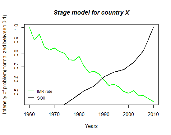 |
| This is how the plot finally looks like. |
It was Utkarsh’s generosity, who gave me the codes, that saved me a lot of time in solving this small issue, I wish to pass this on as it might save someone else’s.
To leave a comment for the author, please follow the link and comment on their blog: We think therefore we R.
R-bloggers.com offers daily e-mail updates about R news and tutorials about learning R and many other topics. Click here if you're looking to post or find an R/data-science job.
Want to share your content on R-bloggers? click here if you have a blog, or here if you don't.