
Near-instant high quality graphs in R
Want to share your content on R-bloggers? click here if you have a blog, or here if you don't.
One of the main attractions of R (for me) is the ability to produce high quality graphics that look just the way you want them to. The basic plot functions are generally excellent for exploratory work and for getting to know your data. Most packages have additional functions for appropriate exploratory work or for summarizing and communicating inferences. Generally the default plots are at least as good as other (e.g., commercial packages) but with the added advantage of being fairly easy to customize once you understand basic plotting functions and parameters.
Even so, getting a plot looking just right for a presentation or publication often takes a lot of work using basic plotting functions. One reason for this is that constructing a good graphic is an inherently difficult enterprise, one that balances aesthetic factors and statistical factors and that requires a good understanding of who will look at the graphic, what they know, what they want to know and how they will interpret it. It can takes hours – maybe days – to get a graphic right.
In Serious Stats I focused on exploratory plots and how to use basic plotting functions to customize them. I think this was important to include, but one of my regrets was not having enough space to cover a different approach to plotting in R. This is Hadley Wickham’s ggplot2 package (inspired by Leland Wilkinson’s grammar of graphics approach).
In this blog post I’ll quickly demonstrate a few ways that ggplot2 can be used to quickly produce amazing graphics for presentations or publication. I’ll finish by mentioning some pros and cons of the approach.
The main attraction of ggplot2 for newcomers to R is the qplot() quick plot function. Like the R plot() function it will recognize certain types and combinations of R objects and produce an appropriate plot (in most cases). Unlike the basic R plots the output tends to be both functional and pretty. Thus you may be able to generate the graph you need for your talk or paper almost instantly.
A good place to start is the vanilla scatter plot. Here is the R default:

Compare it with the ggplot2 default:

Below is the R code for comparison. (The data here are from hov.csv file used in Chapter 10 Example 10.2 of Serious Stats).
# install and then load the package
install.packages('ggplot2')
library(ggplot2)

# get the data
hov.dat <-  read.csv('http://www2.ntupsychology.net/seriousstats/hov.csv')

# using plot()
with(hov.dat, plot(x, y))

# using qplot()
qplot(x, y, data=hov.dat)
R code formatted by Pretty R at inside-R.org
Adding a line of best fit
The ggplot2 version is (in my view) rather prettier, but a big advantage is being able to add a range of different model fits very easily. The common choice of model fit is that of a straight line (usually the least squares regression line). Doing this in ggplot2 is easier than with basic plot functions (and you also get 95% confidence bands by default).
Here is the straight line fit from a linear model:
 POST
POST
qplot(x, y, data=hov.dat, geom=c(‘point’, ‘smooth’), method=’lm’)
The geom specifies the type of plot (one with points and a smoothed line in this case) while the method specifies the model for obtaining the smoothed line. A formula can also be added (but the formula defaults to y as a simple linear function of x).
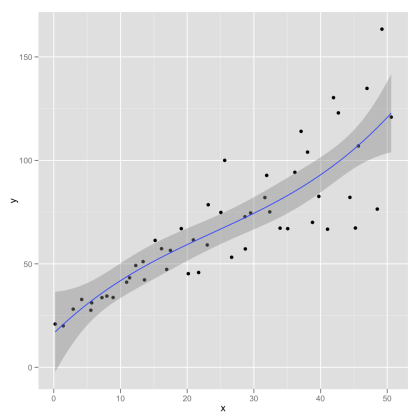
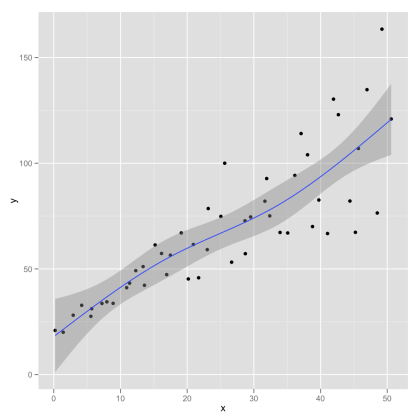
Loess, polynomial fits or splines
Mind you, the linear model fit has some disadvantages. Even if you are working with a related statistical model (e.g., a Pearson’s r or least squares simple or multiple regression) you might want to have a more data driven plot. A good choice here is to use a local regression approach such as loess. This lets the data speak for themselves – effectively fitting a complex curve driven by the local properties of the data. If this is reasonably linear then your audience should be able to see the quality of the straight-line fit themselves. The local regression also gives approximate 95% confidence bands. These may support informal inference without having to make strong assumptions about the model.
Here is the loess plot:

Here is the code for the loess plot:
qplot(x, y, data=hov.dat, geom=c(‘point’, ‘smooth’), method=’loess’)
I like the loess approach here because its fairly obvious that the linear fit does quite well. showing the straight line fit has the appearance of imposing the pattern on the data, whereas a local regression approach illustrates the pattern while allowing departures from the straight line fit to show through.
In Serious Stats I mention loess only in passing (as an alternative to polynomial regression). Loess is generally superior as an exploratory tool – whereas polynomial regression (particularly quadratic and cubic fits) are more useful for inference. Here is an example of a cubic polynomial fit (followed by R code):
qplot(x, y, data=hov.dat, geom=c(‘point’, ‘smooth’), method=’lm’, formula= y ~ poly(x, 2))
Also available are fits using robust linear regression or splines. Robust linear regression (see section 10.5.2 of Serious Stats for a brief introduction) changes the loss function least squares in order to reduce impact of extreme points. Sample R code (graph not shown):
library(MASS)
qplot(x, y, data=hov.dat, geom=c(‘point’, ‘smooth’), method=’rlm’)
One slight problem here is that the approximate confidence bands assume normality and thus are probably too narrow.
Splines are an alternative to loess that fits sections of simpler curves together. Here is a spline with three degrees of freedom:
library(splines)
qplot(x, y, data=hov.dat, geom=c(‘point’, ‘smooth’), method=’lm’, formula=y ~ ns(x, 3))
A few final thoughts
If you want to know more the best place to start is with Hadley Wickham’s book. Chapter 2 covers qplot() and is available free online.
The immediate pros of the ggplot2 approach are fairly obvious – quick, good-looking graphs. There is, however, much more to the package and there is almost no limit to what you can produce. The output of the ggplot2 functions is itself an R object that can be stored and edited to create new graphs. You can use qplot() to create many other graphs – notably kernel density plots, bar charts, box plots and histograms. You can get these by changing the geom (or by default with certain object types an input).
The cons are less obvious. First, it takes some time investment to get to grips with the grammar of graphics approach (though this is very minimal if you stick with the quick plot function). Second, you may not like the default look of the ggplot2 output (though you can tweak it fairly easily). For instance, I prefer the default kernel density and histogram plots from the R base package to the default ggplot2 ones. I like to take a bare bones plot and build it up … trying to keep visual clutter to a minimum. I also tend to want black and white images for publication (whereas I would use grey and colour images more often in presentations). This is mostly to do with personal taste.
Filed under: graphics, R code, serious stats Tagged: confidence intervals, exploratory data analysis, loess, multiple regression, polynomial regression, R, robust statistics, software, splines, statistics
R-bloggers.com offers daily e-mail updates about R news and tutorials about learning R and many other topics. Click here if you're looking to post or find an R/data-science job.
Want to share your content on R-bloggers? click here if you have a blog, or here if you don't.