
Graphing with fPortfolio
Want to share your content on R-bloggers? click here if you have a blog, or here if you don't.
Now to making pretty-looking graphs and charts for portfolio optimization! The first thing we will do is determine the frontier for our combination of securities. Remember, the variable returnsMatrix below is a matrix of returns for all the securities in your portfolio.
This gives us the frontier. If you type in ?frontierPlot and read through, you will find out all the interesting plots you can make.
frontier=portfolioFrontier(as.timeSeries(returnsMatrix))
We can plot this by:
frontierPlot(frontier)
grid()

The circles in dark mark the efficient frontier and the grid() function just makes it look nicer. We can now add to this plot by doing the following:
minvariancePoints(frontier,col=’red’,pch=20)
cmlPoints(frontier,col=’blue’,pch=20)
tangencyPoints(frontier,col=’yellow’,pch=4)
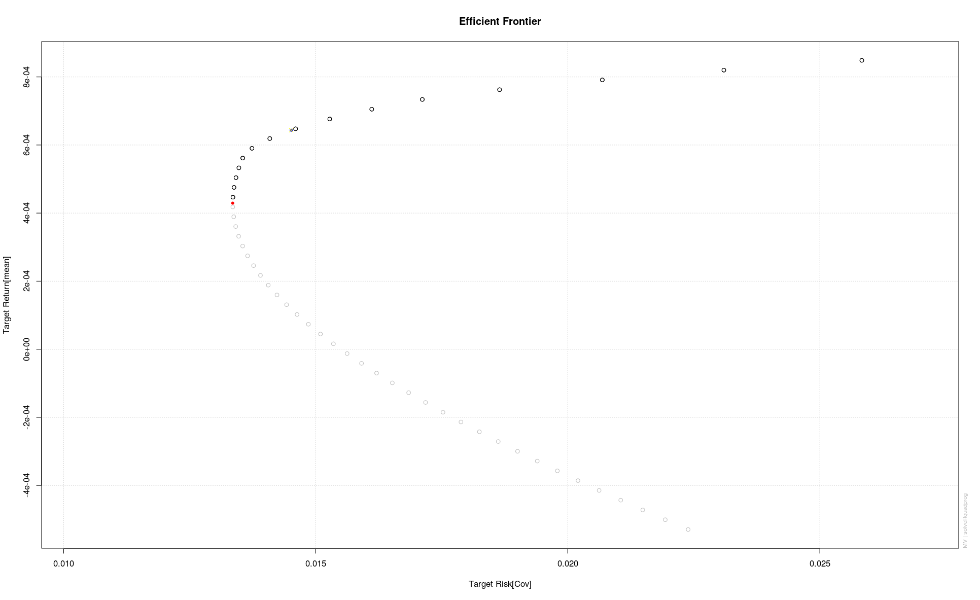
This added the minimum variance point, the capital market point and the tangency point. The tangency point is marked with an ‘x’ in yellow and lies in exactly the same location as the capital market point in blue. We can pile on even more stuff:
tangencyLines(frontier,col=’blue’)
sharpeRatioLines(frontier,col=’orange’,lwd=2)
twoAssetsLines(frontier,col=’green’,lwd=2)
singleAssetPoints(frontier,col=’black’,pch=20)

So we now have the tangency line in blue, the Sharpe ratio line in orange, some of the visible asset points in black and the efficient frontiers for all possible combinations of two assets in our portfolio. Looking at this we can kind of see how the assets contribute to the portfolio efficient frontier, and why some assets are highly weighted while others are weighted at 0. Another very interesting chart is obtained by:
weightsPlot(frontier)

This displays the weights on the different securities, the risk, and the return along the frontier. The black line through the chart indicates the minimum variance portfolio. Let’s create some graphs for the tangency portfolio:
tgPort=tangencyPortfolio(returnsMatrix)
weightsPie(tgPort)

This gives a pie-chart of the weights on the securities in the tangency portfolio.
weightedReturnsPie(tgPort)

This gives a pie-chart of the weighted returns of the tangency portfolio.

R-bloggers.com offers daily e-mail updates about R news and tutorials about learning R and many other topics. Click here if you're looking to post or find an R/data-science job.
Want to share your content on R-bloggers? click here if you have a blog, or here if you don't.