
F1Stats – Visually Comparing Qualifying and Grid Positions with Race Classification
Want to share your content on R-bloggers? click here if you have a blog, or here if you don't.
[If this isn’t your thing, the posts in this thread will be moving to a new blog soon, rather than taking over OUseful.info…]
Following the roundabout tour of F1Stats – A Prequel to Getting Started With Rank Correlations, here’s a walk through of my attempt to replicate the first part of A Tale of Two Motorsports: A Graphical-Statistical Analysis of How Practice, Qualifying, and Past SuccessRelate to Finish Position in NASCAR and Formula One Racing. Specifically, a look at the correlation between various rankings achieved over a race weekend and the final race position for that weekend.
The intention behind doing the replication is two-fold: firstly, published papers presumably do “proper stats”, so by pinching the methodology, I can hopefully pick up some tricks about how you’re supposed to do this stats lark by apprenticing myself, via the web, to someone who has done something similar; secondly, it provides an answer scheme, of a sort: I can check my answers with the answers in the back of the book published paper. I’m also hoping that by working through the exercise, I can start to frame my own questions and start testing my own assumptions.
So… let’s finally get started. The data I’ll be using for now is pulled from my scraper of the FormulaOne website (personal research purposes, blah, blah, blah;-). If you’re following along, from the Download button grab the whole SQLite database and save it into whatever directory you’re going to be working in in R…
…because this is an R-based replication… (I use RStudio for my R tinkerings; if you need to change directory when you’re in R, setwd('~/path/to/myfiles')).
To load the data in, and have a quick peek at what’s loaded, I use the following recipe:
f1 = dbConnect(drv ="SQLite", dbname="f1com_megascraper.sqlite")

#There are a couple of ways we can display the tables that are loaded
#Directly:
dbListTables(f1)
#Or via a query:
dbGetQuery(f1, 'SELECT name FROM sqlite_master WHERE type="table"')
The last two commands each display a list of the names of the database tables that can be loaded in as separate R dataframes.
To load the data in from a particular table, we run a SELECT query on the database. Let’s start with grabbing the same data that the paper analysed – the results from 2009:
#Grab the race results from the raceResults table for 2009
results.race=dbGetQuery(f1, 'SELECT pos as racepos, race, grid, driverNum FROM raceResults where year==2009')

#We can load data in from other tables and merge the results:
results.quali=dbGetQuery(f2, 'SELECT pos as qpos, driverNum, race FROM qualiResults where year==2009')
results.combined.clunky = merge(results.race, results.quali, by = c('race', 'driverNum'), all=T)

#A more efficient approach is to run a JOINed query to pull in the data in in one go
results.combined=dbGetQuery(f1,
    'SELECT raceResults.year as year, qualiResults.pos as qpos, p3Results.pos as p3pos, raceResults.pos as racepos, raceResults.race as race, raceResults.grid as grid, raceResults.driverNum as driverNum, raceResults.raceNum as raceNum FROM raceResults, qualiResults, p3Results WHERE raceResults.year==2009 and raceResults.year = qualiResults.year and raceResults.year = p3Results.year and raceResults.race = qualiResults.race and raceResults.race = p3Results.race and raceResults.driverNum = qualiResults.driverNum and raceResults.driverNum = p3Results.driverNum;' )

#Note: I haven't used SQL that much so there may be a more efficient way of writing this?

#We can preview the response
head(results.combined)
#  year qpos p3pos racepos      race grid driverNum raceNum
#1 2009    1     3       1 AUSTRALIA    1        22       1
#2 2009    2     6       2 AUSTRALIA    2        23       1
#3 2009   20     2       3 AUSTRALIA   20         9       1
#4 2009   19     8       4 AUSTRALIA   19        10       1
#5 2009   10    17       5 AUSTRALIA   10         7       1
#6 2009    5     1       6 AUSTRALIA    5        16       1

#We can look at the format of each column
str(results.combined)
#'data.frame':	338 obs. of  8 variables:
# $ year     : chr  "2009" "2009" "2009" "2009" ...
# $ qpos     : chr  "1" "2" "20" "19" ...
# $ p3pos    : chr  "3" "6" "2" "8" ...
# $ racepos  : chr  "1" "2" "3" "4" ...
# $ race     : chr  "AUSTRALIA" "AUSTRALIA" "AUSTRALIA" "AUSTRALIA" ...
# $ grid     : chr  "1" "2" "20" "19" ...
# $ driverNum: chr  "22" "23" "9" "10" ...
# $ raceNum  : int  1 1 1 1 1 1 1 1 1 1 ...

#We can inspect the different values taken by each field
levels(factor(results.combined$racepos))
# [1] "1"   "10"  "11"  "12"  "13"  "14"  "15"  "16"  "17"  "18"  "19"  "2"   "3"   "4"   "5"   "6"   "7"   "8"   "9"
#[20] "DSQ" "Ret"

#We need to do a little tidying... Let's make integer versions of the positions
#NA values will be introduced where there are no integers
results.combined$racepos.int=as.integer(as.character(results.combined$racepos))
results.combined$grid.int=as.integer(as.character(results.combined$grid))
results.combined$qpos.int=as.integer(as.character(results.combined$qpos))

#The race classification does not give a numerical position for each driver
##(eg in cases of DSQ or Ret) although the tables are ordered
#Let's use the row order for each race to give an actual numerical position to each driver for the race
#(If we wanted to do this for practice and quali too, we would have to load the tables
#in separately, number each row, then merge them.)
require(reshape)
results.combined=ddply(results.combined, .(race), mutate, racepos.raw=1:length(race))

#Now we have a data frame that looks like this:
head(results.combined)
#  year qpos p3pos racepos      race grid driverNum raceNum racepos.int grid.int qpos.int racepos.raw
#1 2009    2    11       1 ABU DHABI    2        15      17           1        2        2           1
#2 2009    3    15       2 ABU DHABI    3        14      17           2        3        3           2
#3 2009    5     1       3 ABU DHABI    5        22      17           3        5        5           3
#4 2009    4     3       4 ABU DHABI    4        23      17           4        4        4           4
#5 2009    8     5       5 ABU DHABI    8         6      17           5        8        8           5
#6 2009   12    13       6 ABU DHABI   12        10      17           6       12       12           6

#If necessary we can force the order of the races factor levels away from alphabetical into race order
results.combined$race=reorder(results.combined$race, results.combined$raceNum)
levels(results.combined$race)
# [1] "AUSTRALIA"     "MALAYSIA"      "CHINA"         "BAHRAIN"       "SPAIN"         "MONACO"        "TURKEY"
# [8] "GREAT BRITAIN" "GERMANY"       "HUNGARY"       "EUROPE"        "BELGIUM"       "ITALY"         "SINGAPORE"
#[15] "JAPAN"         "BRAZIL"        "ABU DHABI"
We’re now in a position whereby we can start to look at the data, and do some analysis of it. The paper shows a couple of example scatterplots charting the “qualifying” position against the final race position. We can go one better in single line using the ggplot2 package:
require(ggplot2)
g=ggplot(results.combined) + geom_point(aes(x=qpos.int, y=racepos.raw)) + facet_wrap(~race)
g

At first glance, this may all look very confusing, but just take your time, actually look at it, see it you can spot any patterns or emergent structure in the way the points are distributed. Does it look as if the points on the chart might have a story to tell? (If a picture saves a thousand words, and it takes five minutes to read a thousand words, the picture might actually take a couple of minutes to read get across the same information…;-)
First thing to notice: there are lots of panels – one for each race. The panels are ordered left to right, then down a row, left to right, down a row, etc, in the order they took place during the season. So you should be able to quickly spot the first race of the season (top left), the last race (at the end of the last/bottom row), and races in mid-season (middle of them all!)
Now focus on a single chart and thing about that the positioning of the points actually means. If the qualifying position was the same as the race position, what would you expect to see? That is, if the car that qualified first finished first; the car that qualified second finished second; the car that qualified tenth finished tenth; and so on. As the axes are incrementally ordered, I’d expect to see a straight line, going up at 45 degrees if the same space was given on each axis (that is, if the charts were square plots).
We can run a quick experiment to see how that looks:
#Plot increasing x and increasing y in step with each other
ggplot() + geom_point(aes(x=1:20, y=1:20))

Looking over the race charts, some of the charts have the points plotted roughly along a straight line – Turkey and Abu Dhabi, for example. If the cars started the race roughly according to qualifying position, this would suggest the races may have been rather processional? On the other hand, Brazil is all over the place – qualifying position appears to bear very little relationship to where the cars actually finished the race.
Even for such a simple chart type, it’s amazing how much structure we might be able to pull out of these charts. If every one was a straight line, we might imagine a very boring season, full of processions. If every chart was all over the place, with little apparent association between qualifying and race positions, we might begin to wonder whether there was any “form” to speak of at all. (Such events may on the surface provide exciting races, at least at the start of the season, but if every driver has an equal, but random, chance of winning, it makes it hard to root for anyone in particular, makes it hard to root for an underdog versus a favourite, and so on.)
Again, we can run a quick experiment to see what things would look like if each car qualified at random and was placed at random at the end of the race:
expt2 = NULL
#We're going to run 20 experiments (z)
for (i in 1:20){
    #Each experiment generates a random start order (x) and random finish order (y)
    expt=data.frame(x=sample(1:20, 20), y=sample(1:20, 20), z=i)
    expt2=rbind(expt2, expt)
}
#Plot the result, by experiment
ggplot(expt2) + geom_point(aes(x=x, y=y)) + facet_wrap(~z)
Here’s the result:

There’s not a lot of order in there, is there? However, it is worth noting that on occasion it may look as if there is some sort of ordering (as in trial 4, for example?), purely by chance.
For what it’s worth, we can also tidy up the race plots a little to make them a little bit more presentable:
g = g + ggtitle( 'F1 2009' )
g = g + xlab('Qualifying Position') + ylab('Final Race Classification')
g
Here’s the chart with added titles and axis labels:

We can also grab a plot for a single race. The paper showed scatterplots for Brazil and Japan.
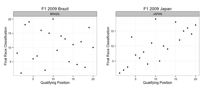
Here’s the code:
g1 = ggplot(subset(results.combined, race == 'BRAZIL')) + geom_point(aes(x=qpos.int, y=racepos.raw)) + facet_wrap(~race)
g1 = g1 + ggtitle('F1 2009 Brazil') + xlab('Qualifying Position') + ylab('Final Race Classification') + theme_bw()

g2 = ggplot(subset(results.combined, race=='JAPAN' ) )+geom_point(aes(x =qpos.int, y=racepos.raw)) + facet_wrap(~race)
g2 = g2 + ggtitle('F1 2009 Japan') + xlab('Qualifying Position') + ylab('Final Race Classification') + theme_bw()

require( gridExtra )
grid.arrange( g1, g2, ncol=2 )
Note that I have: i) filtered the data to get just the data required for each race; ii) added a little bit more styling with the theme_bw() call; iii) used the gridExtra package to generate the side-by-side plot.
Here’s what the data looked like in the original paper:

NOT the same… Hmmm… How about if we plot the grid.int position vs. the final position? (Set x = grid.int and tweak the xlab()):

So – the “qualifying” position in the published paper is actually the grid position? Did I not read the paper closely enough, or did they make a mistake? (So much for academic peer review stopping errors getting through. Like, erm, the error in the visualiastion of the confidence interval that also got through? 😉
Generating similar views for other years should be trivial – simply tweak the year selector in the SELECT query and then repeat as above.
In the limit, I guess everything could be wrapped up in a single function to plot either the facetted view, or, if a list of explicitly named races are passed in to the function, as a set of more specific race charts. But that is left as an exercise for the reader…;-)
Okay – enough for now… am I ever going to get even as far as blogging the correlation analysis., let alone the regressions?! Hopefully in the next post in this series!
PS I couldn’t resist… here’s the summary set of charts for the 2012 season, in respect of grid positions vs. final race classifications:

Was it as you remember it?!! Were Australia and Malaysia all over the place? Was there a big crash amongst the front runners in Belgium?!
PPS Rather than swap this blog with too many posts on this topic, I intend to start a new uncourse blog and post them there in future… details to follow…
PPPS if you liked this post, you might like this Ergast API Interactive F1 Results data app

R-bloggers.com offers daily e-mail updates about R news and tutorials about learning R and many other topics. Click here if you're looking to post or find an R/data-science job.
Want to share your content on R-bloggers? click here if you have a blog, or here if you don't.