
Example 9.23: Demonstrating proportional hazards
[This article was first published on SAS and R, and kindly contributed to R-bloggers]. (You can report issue about the content on this page here)
Want to share your content on R-bloggers? click here if you have a blog, or here if you don't.
Want to share your content on R-bloggers? click here if you have a blog, or here if you don't.

A colleague recently asked after a slide suitable for explaining proportional hazards. In particular, she was concerned that her audience not focus on the time to event or probability of the event. An initial thought was to display the cumulative hazards, which have a constant proportion if the model is true. But the colleague’s audience might get distracted both by the language (what’s a “hazard”?) and the fact that the cumulative hazard doesn’t have a readily interpretable scale. The failure curve, meaning the probability of failure by time t, over time, might be a bit more accessible.
Rather than just draw some curves, we simulated data, based on the code we demonstrated previously. In this case, there’s no need for any interesting censoring, but a more interesting survival curve seems worthwhile.
SAS
The more interesting curve is introduced by manually accelerating and slowing down the Weibull survival time demonstrated in the previous approach. We also trichotomized one of the exposures to match the colleague’s study, and censored all values greater than 10 to keep focus where the underlying hazard was interesting.
data simcox;
  beta1 = .2;
  beta2 = log(1.25);
  lambdat = 20; *baseline hazard;
  do i = 1 to 10000;
    x1 = normal(45);
    x2 = (normal(0) gt -1) + (normal(0) gt 1);
    linpred = -beta1*x1 - beta2*x2;
    t = rand("WEIBULL", 1, lambdaT * exp(linpred));
 if t gt 5 then t = 5 + (t-5)/10;
 if t gt 7 then t = 7 + (t-7) * 20;
    * time of event;
 censored = (t > 10);
    output;
  end;
run;
The phreg procedure will fit the model and produces nice plots of the survival function and the cumulative hazard. But to generate useful versions of these, you need to make an additional data set with the covariate values you want to show plots for. We set the other covariate’s value at 0. You can also include an id variable with some descriptive text.
data covars;
x1 = 0; x2 = 2; id = "Arm 3"; output;
x1 = 0; x2 = 1; id = "Arm 2"; output;
x1 = 0; x2 = 0; id = "Arm 1"; output;
run;

proc phreg data = simcox plot(overlay)=cumhaz;
class x2 (ref = "0");
baseline covariates = covars out= kkout cumhaz = cumhaz
    survival = survival / rowid = id;
model t*censored(1) = x1 x2;
run;
The cumulative hazard plot generated by the plot option is shown below, demonstrating the correct relative hazard of 1.25. The related survival curve could be generated with plot = s .

To get the desired plot of the failure times, use the out = option to the baseline statement. This generates a data set with the listed statistics (here the cumulative hazard and the survival probability, across time). Then we can produce a plot using the gplot procedure, after generating the failure probability.
data kk2;
set kkout;
iprob = 1 - survival;
run;

goptions reset=all;
legend1 label = none value=(h=2);
axis1 order = (0 to 1 by .25) minor = none value=(h=2)
  label = (a = 90 h = 3 "Probability of infection");
axis2 order = (0 to 10 by 2) minor = none value=(h=2)
  label = (h=3 "Attributable time");;
symbol1 i = sm51s v = none w = 3 r = 3;
proc gplot data = kk2;
plot iprob * t = id / vaxis = axis1 haxis = axis2 legend=legend1;
run; quit;
The result is shown at the top. Note the use of the h= option in various places in the axis and legend statement to make the font more visible when shrunk to fit onto a slide. The smoothing spline plotted through the data with the smXXs interpolation makes a nice shape out of the underlying abrupt changes in the hazard. The symbol, legend, and axis statements are discussed in chapter 6.
R
As in SAS, we begin by simulating the data. Note that we use the simple categorical variable simulator mentioned in the comments for example 7.20.
n = 10000
beta1 = .2
beta2 = log(1.25)
lambdaT = 20

x1 = rnorm(n,0)
x2 = sample(0:2,n,rep=TRUE,prob=c(1/3,1/3,1/3))
# true event time
T = rweibull(n, shape=1, scale=lambdaT*exp(-beta1*x1 - beta2*x2))
T[T>5] = 5 + (T[T>5] -5)/10
T[T>7] = 7 + (T[T>7] -7) * 20
event = T < rep(10,n)
Now we can fit the model using the coxph() function from the Survival package. There is a default method for plot()ing the "survfit" objects resulting from several package functions. However, it shows the typical survival plot. To show failure probability instead, we'll manually take the complement of the survival probability, but still take advantage of the default method. Note the use of the xmax option to limit the x-axis. The results (below) are somewhat bland, and it's unclear if the lines can be colored differently, or their widths increased. They are also as angular as the cumulative hazards shown in the SAS implementation.
library(survival)
plotph = coxph(Surv(T, event)~ x1 * strata(x2),
     method="breslow")
summary(plotph)
sp = survfit(plotph)
sp$surv = 1 - sp$surv
plot(sp, xmax=10)

Consequently, as is so often the case, presentation graphics require more manual fiddling. We'll begin by extracting the data we need from the "survfit" object. We'll take just the failure times and probabilities, as well as the name of the strata to which each observation belongs, limiting the data to time < 10. The last of these lines uses the names() function to pull the names of the strata, repeating each an appropriate number of times with the useful rep() function.
sp = survfit(plotph)
failtimes = sp$time[sp$time
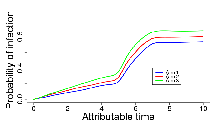
All that remains is plotting the data, which is not dissimilar to many examples in the book and in this blog. There's likely some way to make these three lines with a little less typing, but knowing how to do it from scratch gives you the most flexibility. It proved difficult to get the desired amount of smoothness from the loess(), lowess(), or supsmu() functions, but smooth.spline() served admirably. The code below demonstrates increasing the axis and tick label sizes
plot(failprobs~failtimes, type="n", ylim=c(0,1), cex.lab=2, cex.axis= 1.5,
     ylab= "Probability of infection", xlab = "Attributable time")
lines(smooth.spline(y=failprobs[failcats == "x2=0"],
     x=failtimes[failcats == "x2=0"],all.knots=TRUE, spar=1.8),
     col = "blue", lwd = 3)
lines(smooth.spline(y=failprobs[failcats == "x2=1"],
     x=failtimes[failcats == "x2=1"],all.knots=TRUE, spar=1.8),
     col = "red", lwd = 3)
lines(smooth.spline(y=failprobs[failcats == "x2=2"],
     x=failtimes[failcats == "x2=2"],all.knots=TRUE, spar=1.8),
     col = "green", lwd = 3)
legend(x=7,y=0.4,legend=c("Arm 1", "Arm 2", "Arm 3"),
     col = c("blue","red","green"), lty = c(1,1,1), lwd = c(3,3,3) )
To leave a comment for the author, please follow the link and comment on their blog: SAS and R.
R-bloggers.com offers daily e-mail updates about R news and tutorials about learning R and many other topics. Click here if you're looking to post or find an R/data-science job.
Want to share your content on R-bloggers? click here if you have a blog, or here if you don't.