
Example 9.22: shading plots and inequalities
[This article was first published on SAS and R, and kindly contributed to R-bloggers]. (You can report issue about the content on this page here)
Want to share your content on R-bloggers? click here if you have a blog, or here if you don't.
Want to share your content on R-bloggers? click here if you have a blog, or here if you don't.

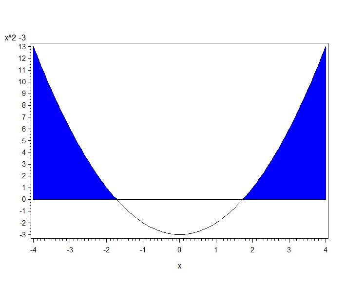
A colleague teaching college algebra wrote in the R-sig-teaching list asking for assistance in plotting the solutions to the inequality x^2 – 3 > 0. This type of display is handy in providing a graphical solution to accompany an analytic one.
R
The plotFun() function within the mosaic package comes in handy here.
library(mosaic)
plotFun( x^2 -3 ~ x, xlim=c(-4,4))
ladd(panel.abline(h=0,v=0,col='gray50'))
plotFun( (x^2 -3) * (x^2 > 3) ~ x, type='h', alpha=.5,
  lwd=4, col='lightblue', add=TRUE)
plotFun( x^2 -3 ~ x, xlim=c(-4,4), add=TRUE)
As is common when crafting figures using R, the final product is built up in parts. First the curve is created, then vertical and horizontal lines are added. The shading is done using a second call to plotFun(). Finally, the curve is plotted again, to leave it on top of the final figure.
Alternatively, one might want to construct the solution more directly. This is fairly straightforward using the lines() (section 5.2.1) and polygon() (sections 2.6.4, 5.2.13) functions.
x = seq(-4,4,length=81)
fun = (x^2 -3)
sol = ((x^2 -3) * (x^2 > 3))

plot(x,fun, type="l", ylab=expression(x^2 - 3))
lines(x, sol)
polygon(c(-4,x,4), c(0,sol,0), col= "gray", border=NA)
abline(h=0, v=0)
The type="l" option to plot() draws a line plot instead of the default scatterplot. In the polygon() call we add points on the x axis to close the shape. One advantage of this approach is that the superscript can be correctly displayed in the y axis label, as shown in the plot below.

SAS
In SAS we’ll construct the plot from scratch, using a data step to generate the function and solution, and the areas option of the gplot statement to make the shaded areas. The areas option fills in the area between the first line and the bottom of the plot, then between pairs of lines, so we have to draw the x axis manually, and we’ll make the data for this as well.
data test;
do x = -4 to 4 by .1;
  sol = (x*x - 3) * (x*x >3);
  fun = x*x-3;
  zero = 0;
  output;
  end;
run;
The symbol statement is required so that there are lines to shade between. The pattern statements define the colors to use in the shading. Here we get a white color below the x axis (plotted zero line), then a blue color between the solution and the x axis. Then we plot the x axis line again– otherwise it does not show. The overlay option plots all four lines on the same image. The result is shown below.
pattern1 color=white;
pattern2 color=blue;
symbol1 i = j v = none c = black;
symbol2 i = j v = none c = black;
symbol3 i = j v = none c = black;
symbol4 i = j v = none c = black;
proc gplot data = test;
plot (zero sol fun zero) * x / overlay areas=2;
label zero = "x^2 -3";
run; quit;
To leave a comment for the author, please follow the link and comment on their blog: SAS and R.
R-bloggers.com offers daily e-mail updates about R news and tutorials about learning R and many other topics. Click here if you're looking to post or find an R/data-science job.
Want to share your content on R-bloggers? click here if you have a blog, or here if you don't.