
Animating neural networks from the nnet package
Want to share your content on R-bloggers? click here if you have a blog, or here if you don't.
My research has allowed me to implement techniques for visualizing multivariate models in R and I wanted to share some additional techniques I’ve developed, in addition to my previous post. For example, I think a primary obstacle towards developing a useful neural network model is an under-appreciation of the effects model parameters have on model performance. Visualization techniques enable us to more fully understand how these models are developed, which can lead to more careful determination of model parameters.
Neural networks characterize relationships between explanatory and response variables through a series of training iterations. Training of the model is initiated using a random set of weighted connections between the layers. The predicted values are compared to the observed values in the training dataset. Based on the errors or differences between observed and predicted, the weights are adjusted to minimize prediction error using a ‘back-propagation algorithm’1. The process is repeated with additional training iterations until some stopping criteria is met, such as a maximum number of training iterations set by the user or convergence towards a minimum error value. This process is similar in theory to the fitting of least-squares regression lines, although neural networks incorporate many more parameters. Both methods seek to minimize an error criterion.
The development of neural networks for prediction also requires he use of test datasets for evaluating the predictive performance of the trained models. Neural networks are so effective at relating variables that they commonly characterize relationships in the training data that have no actual relevance. In other words, these models identify and characterize noise in the data rather than actual (i.e., biological, ecological, physical, etc.) relationships among variables. This concept is similar to creating a loess function with a decreasingly restrictive smoothing parameter (span argument) to model a polynomial relationship between two variables (code here):
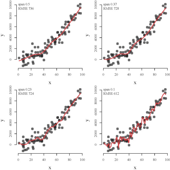
The loess function from top left to bottom right shows how a model can be overfit. The function becomes increasingly overfit to the observed data such that the modeled relationship between x and y characterizes peculiarities of the data that have no actual relevance. The function with a decreasingly restrictive smoothing parameter might better approximate the observed points (lower root mean square error) but the ability to generalize is compromised (i.e., bias-variance tradeoff).
A neural network model that is not overfit to the training data should predict observations in a test dataset that are close to the observed. Textbooks often indicate the importance of evaluating model performance on a test dataset2, yet methods are not available in R for visualizing model performance as a function of training iterations. This blog will present an approach for visualizing the training process of neural network models using the plot.nnet function in my previous blog. I’ll also be creating animations using the animation package created by Yihui Xie.
Let’s start by creating our simulated dataset (same as my previous posts). We create eight random variables with an arbitrary correlation structure and then create a response variable as a linear combination of the eight random variables. The parameters describing the true relationship between the response and explanatory variables are known and were drawn randomly from a uniform distribution.
require(clusterGeneration)
require(nnet)

set.seed(2)
num.vars<-8
num.obs<-1000

#arbitrary correlation matrix and random variables
cov.mat<-genPositiveDefMat(num.vars,covMethod=c("unifcorrmat"))$Sigma
rand.vars<-mvrnorm(num.obs,rep(0,num.vars),Sigma=cov.mat)
parms<-runif(num.vars,-10,10)

#response variable as linear combination of random variables and random error term
y<-rand.vars %*% matrix(parms) + rnorm(num.obs,sd=20)

#prepare data for use with nnet and plot.nnet
rand.vars<-data.frame(rand.vars)
y<-data.frame((y-min(y))/(max(y)-min(y)))
names(y)<-'y'
We’ve rescaled our response variable from 0-1, as in the previous blog, so we can make use of a logistic transfer function. Here we use a linear transfer function as before, so rescaling is not necessary but this does allow for comparability should we choose to use a logistic transfer function.
Now we import the plot function from Github (thanks to Harald’s tip in my previous post).
require(devtools)
source_gist('5086859') #loaded as 'plot.nnet' in the workspace
Now we’re going to train a neural network model from one to 100 training iterations to see how error changes for a training and test dataset. The nnet function returns training errors but only after each of ten training iterations (trace argument set to true). We could plot these errors but the resolution is rather poor. We also can’t track error for the test dataset. Instead, we can use a loop to train the model up to a given set of iterations. After each iteration, we can save the error for each dataset in an object. The loop will start again with the maximum number of training iterations as n + 1, where n was the maximum number of training iterations in the previous loop. This is not the most efficient way to track errors but it works for our purposes.
First, we’ll have to define a vector that identifies our training and test dataset so we can evaluate the ability of our model to generalize. The nnet function returns the final error as the sums of squares for the model residuals. We’ll use that information to calculate the root mean square error (RMSE). Additionally, we’ll have to get model predictions to determine RMSE for the test dataset.
#get vector of T/F that is used to subset data for training
set.seed(3)
train.dat<-rep(F,num.obs)
train.dat[sample(num.obs,600)]<-T

num.it<-100 #number of training iterations

err.dat<-matrix(ncol=2,nrow=num.it) #object for appending errors

for(i in 1:num.it){

	#to monitor progress
	cat(i,'\n')
	flush.console()

	#to ensure same set of random starting weights are used each time
	set.seed(5)

	#temporary nnet model
	mod.tmp<-nnet(rand.vars[train.dat,],y[train.dat,],size=10,linout=T,maxit=i,trace=F)

	#training and test errors
	train.err<-sqrt(mod.tmp$value/sum(train.dat))
	test.pred<-predict(mod.tmp,newdata=rand.vars[!train.dat,])
	test.err<-sqrt(sum((test.pred-y[!train.dat,])^2)/sum(!train.dat))

	#append error after each iteration
	err.dat[i,]<-c(train.err,test.err)

	}
The code fills a matrix of error values with rows for one to 100 training iterations. The first column is the prediction error for the training dataset and the second column is the prediction error for the test dataset.
We can use a similar approach to create our animation by making calls to plot.nnet as training progresses. Similarly, we can plot the error data from our error matrix to see how error changes after each training iteration. We’ll create our animation using the saveHTML function from the animation package. One challenge with the animation package is that it requires ImageMagick. The functions will not work unless this software is installed on your machine. ImageMagick is open source and easy to install, the only trick is to make sure the path where the software is installed is added to your system’s list of environmental variables. This blog offers a fantastic introduction to using ImageMagick with R.
This code can be used to create an HTML animation once ImageMagick is installed.
#make animation
require(animation)

num.it<-100

#this vector is needed for proper scaling of weights in the plot
max.wt<-0
for(i in 1:num.it){
  set.seed(5)
  mod.tmp<-nnet(rand.vars[train.dat,],y[train.dat,,drop=F],size=10,linout=T,maxit=i-1,trace=F)
  if(max(abs(mod.tmp$wts))>max.wt) max.wt<-max(abs(mod.tmp$wts))
  }

ani.options(outdir = 'C:/Users/Marcus/Desktop/') #your local path
saveHTML(
  {
  for(i in 1:num.it){

  	#plot.nnet
    par(mfrow=c(1,2),mar=c(0,0,1,0),family='serif')
    set.seed(5)
    mod.tmp<-nnet(rand.vars[train.dat,],y[train.dat,,drop=F],size=10,linout=T,maxit=i-1,trace=F)
    rel.rsc.tmp<-1+6*max(abs(mod.tmp$wts))/max(max.wt)    #this vector sets scale for line thickness
  	plot.nnet(mod.tmp,nid=T,rel.rsc=rel.rsc.tmp,alpha.val=0.8,
  		pos.col='darkgreen',neg.col='darkblue',circle.col='brown',xlim=c(0,100))

  	#plot error
    plot(seq(0,num.it)[c(1:i)],err.dat[,2][c(1:i)],type='l',col='darkgrey',bty='n',ylim=c(-0.1,0.5),
    	xlim=c(-15,num.it+15),axes=F,ylab='RMSE',xlab='Iteration',lwd=2,cex.lab=1.3)
    axis(side=1,at=seq(0,num.it,length=5),line=-4)
    mtext(side=1,'Iteration',line=-2)
    axis(side=2,at=c(seq(0,0.4,length=5)),line=-3)
    mtext(side=2,'RMSE',line=-1)
    lines(seq(0,num.it)[c(1:i)],err.dat[c(1:i),1],type='l',col='red',lwd=2)
    lines(seq(0,num.it)[c(1:i)],err.dat[c(1:i),2],type='l',col='green',lwd=2)

  	title(paste('Iteration',i,'of',num.it),outer=T,line=-2)
  	}
  },

  interval = 0.15, ani.width = 700, ani.height = 350, ani.opts='controls'

  )
The first argument to saveHTML is an expression where we can include anything we want to plot. We’ve created an animation of 100 training iterations by successively increasing the total number of training iterations using a loop. The code prior to saveHTML is not necessary for plotting but ensures that the line widths for the neural interpretation diagram are consistent from the first to last training iteration. In other words, scaling of the line widths is always in proportion to the maximum weight that was found in all of the training iterations. This creates a plot that allows for more accurate visualization of weight changes. The key arguments in the call to saveHTML are interval (frame rate), ani.width (width of animation), and ani.height (height of animation). You can view the animation by clicking on the image below.
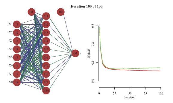
The animation on the left shows the weight changes with additional training iterations using a neural interpretation diagram. Line color and width is proportional to sign and magnitude of the weight. Positive weights are dark green and negative weights are dark blue. The animation on the right shows the prediction errors (RMSE) for the training (red) and test (green) datasets. Note the rapid decline in error with the first few training iterations, then marginal improvement with additional training. Also note the increase in error for the test dataset.
We can also look at the predicted values compared to the observed values as a function of model training. The values should be very similar if our neural network model has sufficiently characterized the relationships between our variables. We can use the saveHTML function again to create the animation for a series of loops through the training iterations. We’ll plot the predicted values against the observed values for each dataset with some help from ggplot2.
#make animations, pred vs obs
require(ggplot2)

#create color scheme for group points, overrides default for ggplot
myColors<-c('red','green')
names(myColors)<-c('training','test')
colScale<-scale_colour_manual(name = "grps",values = myColors)

#function for getting rmse of prediction, used to plot text
rmse.fun<-function(dat.in,sub.in)
	format(sqrt(sum((dat.in[sub.in,]-y[sub.in,])^2)/sum(sub.in)),nsmall=4,digits=4)

options(outdir = 'C:/Users/Marcus/Desktop/') #your local path
saveHTML(
  {
  for(i in 1:num.it){

     #temporary nnet mod for the loop
     mod.tmp<-nnet(rand.vars[train.dat,],y[train.dat,,drop=F],size=10,linout=T,maxit=i,trace=F)

     #predicted values and factor variable defining training and test datasets
     pred.vals<-predict(mod.tmp,new=rand.vars)
     sub.fac<-rep('test',length=num.obs)
     sub.fac[train.dat]<-'training'
     sub.fac<-factor(sub.fac,c('training','test'))

     #data frame to plot
     plot.tmp<-data.frame(cbind(sub.fac,pred.vals,y))
     names(plot.tmp)<-c('Group','Predicted','Observed')

     #plot title
     title.val<-paste('Iteration',i,'of',num.it)

     #RMSE of prediction, used for plot text, called using geom_text in ggplot
     rmse.val<-data.frame(
        Group=factor(levels(sub.fac),c('training','test')),
        rmse=paste('rmse =',c(rmse.fun(pred.vals,train.dat),rmse.fun(pred.vals,!train.dat))),
        x.val=rep(0.9,2),
        y.val=rep(0.1,2)
        )

     #ggplot object
     p.tmp<-ggplot(data=plot.tmp, aes(x=Observed,y=Predicted,group=Group,colour=Group)) +
        geom_abline() +
        geom_point(size=6,alpha=0.5) +
        scale_x_continuous(limits=c(0,1)) +
        scale_y_continuous(limits=c(0,1)) +
        facet_grid(.~Group) +
        theme_bw() +
        colScale +
        geom_text(data=rmse.val, aes(x=x.val,y=y.val,label=rmse,group=Group),colour="black",size=4) +
        ggtitle(title.val) +
        theme(
           plot.title=element_text(vjust=2,size=18),
           legend.position='none'
           )

     print(p.tmp)

     }

  },

  interval = 0.15, ani.width = 700, ani.height = 350, ani.opts='controls'

  )
Click the image below to view the animation.
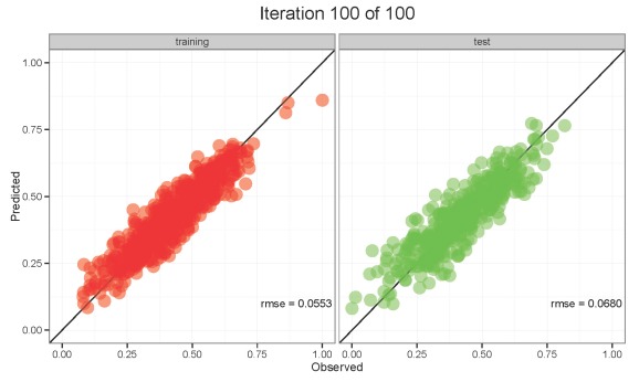
The animation on the left shows the values for the training dataset and the animation on the right shows the values for the test dataset. Both datasets are poorly predicted in the first ten or so training iterations. Predictions stabilize and approximate the observed values with additional training. The model seems to have good abilities to generalize on the test dataset once training is completed. However, notice the RMSE values for each dataset and how they change with training. RMSE values are always decreasing for the training dataset, whereas RMSE values decrease initially for the test dataset but slowly begin to increase with additional training. This increase in RMSE for the test dataset is an early indication that overfitting may occur. Our first animation showed similar results. What would happen if we allowed training to progress up to 2000 training iterations? Over-training will improve predictive performance on the training dataset at the expense of performance on the test dataset. The model will be overfit and unable to generalize meaningful relationships among variables. The point is, always be cautious of models that have not been evaluated with an independent dataset.
1Rumelhart, D.E., Hinton, G.E., Williams, R.J. 1986. Learning representations by back-propagating errors. Nature. 323(6088):533-536.
2Venables, W.N., Ripley, B.D. 2002. Modern Applied Statistics with S, 4th ed. Springer, New York.

R-bloggers.com offers daily e-mail updates about R news and tutorials about learning R and many other topics. Click here if you're looking to post or find an R/data-science job.
Want to share your content on R-bloggers? click here if you have a blog, or here if you don't.