
Watermain Breaks in the City of Toronto
Want to share your content on R-bloggers? click here if you have a blog, or here if you don't.
It has been a while since my last post due to the major transition of moving back to Canada. This post will be a bit shorter than my previous ones but hopefully it will give some insight on practically investigating and analyzing open data that are becoming more popular these days. All the code for this post is found at my Github.
Drinking Water
Water is a basic physiological need for humans. We can go days without food and be okay, but without water… that’s another story. Drinking water or potable water is something in the developed world we take for granted. Much of the world does not have great access to clean water and by United Nations had made their 6th Sustainable Development Goal to “ensure access to water and sanitation for all” and that all people would have universal access to safe and affordable water by 2030.
In Ontario (province of Canada) we are fortunate to have good water quality in most cities, towns, municipalities. It’s important to note that a disparity exists between regions across the province: large vs. small cities, southern vs. northern locations, and within indigenous communities. Across the province, there are different types of drinking water systems, various combinations of owners/operators, and (complex) regulatory network ensuring that the quality of the water reaching users is acceptable for consumption.
Watermains Breaks
Within these drinking water systems, the large pipes that carry most of the water through the system from the treatment plant through the distribution system are called watermains (or water mains). In the event of a watermain failing, either by a crack, some leaking or a catastrophic break, this can have potential effects on the flow of water to users. There can be loss of pressure in the distribution system, potentially allowing contaminants (chemical or microbiological) to enter the drinking water system due to the loss of pressure. No one wants to have E. coli or some industrial chemical in their tap water.
There are many factors behind a watermain failure. Most of the time there multiple concurrent factors that cause the pipe to crack or break. A non-exhaustive list of factors include type of pipe material, age of pipe, surrounding soil conditions, corrosion, pressure fluctuations, direct damage, extreme temperatures, extreme weather events, and poor system design.

Toronto Watermain Break Data
The City of Toronto has an Open Data Catalogue containing various types of datasets on a number of topics like environment, public safety, development, and government. You can follow them on Twitter to know when they update/refresh their data. The watermain break data can be found here. I downloaded the Excel flat-file containing the date and geographic location of watermain breaks from 1990 to 2016 within the city of Toronto boundaries. For this post I will be focusing on the temporal nature of the data, aka what do the trends of watermain breaks look like over time in Toronto. I ran into issues on converting the X,Y coordinate data into real latitude and longitude information so that will have to wait (potential part 2 in the future???).
Data Import, Exploration, Processing
After downloading the Excel file into my data folder, I use the list.files function and some regular expression to identify the .xlsx files in the folder. This isn’t necessary since we only have one file in our folder but I’ve decided to make it good practice to have a standard method in selecting multiple files and file types in my data folder in a programmatic fashion. Afterwards I use the read_excel function from the readxl package to import the dataset into R.
watermain.files <- list.files("data", pattern = "\\.xlsx$")
wm.df <- read_excel(paste0("data/",watermain.files))
We see that there are 35461 rows or (assumed) unique watermain breaks. After using the str function to get a basic idea of the types of columns I have. I rename the column names using the names function and create a new column with the year as a factor type (I actually don’t end up using this).
wm.df <- read_excel(paste0("data/",watermain.files))
names(wm.df) <- c("Date","Year","X_coord","Y_coord") #change column names
wm.df$Year_f <- as.factor(wm.df$Year) #create new column with 'Year' as factor
wm.df$Year <- as.integer(wm.df$Year) #convert original 'Year' to an integer
Next I use the floor_date function from the lubridate package to create new columns containing the month and week. This will be useful later on when I want to aggregate the frequency counts of watermain breaks by week or month.
wm.df$week <- floor_date(wm.df$Date, unit = "week") #floor to week
wm.df$month <- floor_date(wm.df$Date, unit = "month") #floor to month
Then I just create a new column that contains the same date information but instead of POSIXct, it is in Date format.
wm.df <- wm.df %>% mutate(date = as.Date(Date))
This is not related to the temporal information but a good step with the data exploratory workflow. I want to do a bit a quality control/assurance with the data I have. I use the summary function to look at the Date, Year, X_coord, and Y_coord columns. First thing that catches my eye is that there seems to be some extreme values or outliers in the spatial information, specifically the X_coord maximum and Y_coord minimum. For geographic information, typical errors include inputting latitude when it should be longitude, and vice-versa.
wm.df %>% select(X_coord, Y_coord) %>% summary()
    X_coord           Y_coord
 Min.   : 294164   Min.   : 304472
 1st Qu.: 303580   1st Qu.:4838095
 Median : 311195   Median :4842843
 Mean   : 311820   Mean   :4841655
 3rd Qu.: 318587   3rd Qu.:4846416
 Max.   :4845682   Max.   :4855952
First I look at the X_coord first and discover that the maximum value is not likely a Y_coord and it is the only “error” in this column. The code below shows the steps I took to identify and remove this outlier.
wm.df %>% arrange(desc(X_coord)) #error is X_coord = 4845681.6, not a Y_coord either
sort(wm.df$X_coord,decreasing = T)[1:3] # look at the top 3 largest values
summary(wm.df$X_coord) #identify the error/outlier
wm.df[which(wm.df$X_coord == max(wm.df$X_coord)),] #identify the row with the error/outlier
wm.df <- wm.df[-which(wm.df$X_coord == max(wm.df$X_coord)),] #remove error 2000-01-22
Then for the Y_coord I do the same steps and discover there are three errors within this column. Again, the code below shows the steps I took to remove them.
 wm.df %>% arrange(Y_coord) #first three Y_coord are duplicates of X_coord
sort(wm.df$Y_coord,decreasing = F)[1:3] # Y_coord errors, three
wm.df[which(wm.df$Y_coord %in% sort(wm.df$Y_coord,decreasing = F)[1:3]),]
wm.df <- wm.df[-which(wm.df$Y_coord %in% sort(wm.df$Y_coord,decreasing = F)[1:3]),] #remove these errors
Now I can aggregate the data by each week, month, and date simply using the count function from the dplyr package.
month.wm <- wm.df %>% count(month) #month
week.wm <- wm.df %>% count(week)
year.wm <- wm.df %>% count(Year)
Data Visualization
Then we can use ggplot2 create a simple plot that visualizes the number of watermain breaks per week from 1990 to 2016.
ggplot(data = week.wm, aes(x=week,y=n)) +
   geom_line() + labs(title = "Watermain Breaks in Toronto (1990-2016)",
                      x = "Year", y = "Number of Breaks per Week") +
  scale_x_datetime(date_breaks = "2 years", date_labels = "%Y") + theme_minimal()
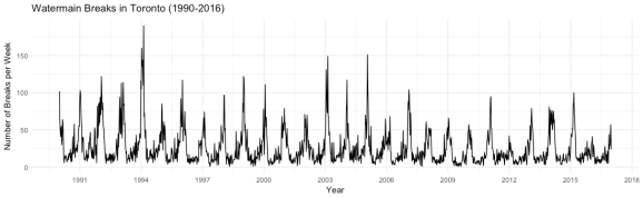
It looks like there is some pattern over time with peaks occurring in a periodic fashion. Let’s take a look at the seasonality of watermain breaks by month and week. We can add a new column to our data frame that codes for the month using the mutate function.
mth.wm <- wm.df %>% group_by(month,Year) %>%
count(month) %>%
mutate(month_n = as.factor(month(month, label = T)))

mthwk.wm <- wm.df %>% group_by(week,month,Year) %>%
count(week,month,Year) %>%
mutate(month_n = as.factor(month(month, label = T))) %>%
mutate(yweek = week(week))
Then we can visualize this using boxplots representing the number of watermain breaks per month.
ggplot(mth.wm, aes(x=month_n,y=n)) +
geom_boxplot(aes(group=month_n)) +
labs(title = "Seasonality of Watermain Breaks in Toronto (1990-2016)",
x = "Month", y = "Number of Breaks") + theme_minimal()
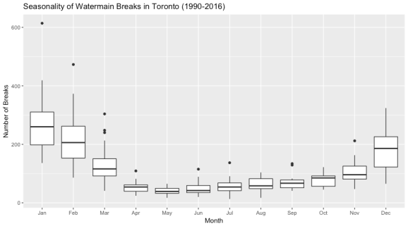
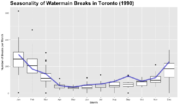
Looking at the dark black line in each boxplot, we can see that there is a clear increase in the median number of watermain breaks in Toronto during the colder months (November, December, January, February). Let’s use the nifty animation package and create a .gif file to see how trend changes over the 27 year period. The boxplots in the animation below are for the entire time period from 1990 to 2016 and the changing line represents the median number of watermain breaks per month in the specified year in the title.
library(animation)
aspect.w <span 				data-mce-type="bookmark" 				id="mce_SELREST_start" 				data-mce-style="overflow:hidden;line-height:0" 				style="overflow:hidden;line-height:0" 			></span><- 800
aspect.r <- 1.6
title.size <- 20
ani.options(ani.width=aspect.w,ani.height=aspect.w/aspect.r, units="px")

saveGIF( {
  for (i in unique(mth.wm$Year)) {
    g.loop <- ggplot(data=mth.wm, aes(x=month_n,y=n)) +
      geom_boxplot(aes(group=month_n)) +
      stat_summary(data = subset(mth.wm, Year == i), fun.y=median, geom="line",
                   aes(group=1), color = "#222FC8", alpha = 0.6, size = 2) +
      labs(title = paste0("Seasonality of Watermain Breaks in Toronto (",i,")"),
           x = "Month", y = "Number of Breaks per Month") +
      theme(plot.title = element_text(size = title.size, face = "bold"))
    print(g.loop)
    }
  }, movie.name = "wm_wm.gif",interval=0.9,nmax=30,2)
Basic Time Series Decomposition
Since I aggregated the counts of watermain breaks by month, we have a set of data points in discrete intervals over time. In a basic sense, this is a time series and many other types of data exist in this format (stock market data, weather data, digital signal data, etc.) and there is a wealth of science and methods that deal with this type of data. That deserves a post in itself to talk about. Back to watermains… to get a better idea of the periodic pattern we observed in the first line plot and if there is a general trend over the 27 year period, we can use some R packages to “decompose” the data, extract the seasonal and trend components of the watermain break time series, and visualize them. By looking at these output plots we can make some preliminary inferences on the watermain breaks happening from 1990 to 2016.
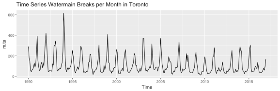
Since I am a ggplot2 junkie, we’ll make sure we have the ggfortify package loaded in our R session and make use of the convenient autoplot function. First we’re going to create a time series object that contains the counts of watermain breaks per month from 1990 to 2016. The first argument in the ts function is the vector containing the counts of watermain breaks per month. We don’t necessarily have to worry about the column containing the date information since the second argument you can specify the start date c(1990,1) or January 1990 and the third argument you can specify the intervals/frequency of each data point; in this case since our time unit is a month we set the frequency to 12.
m.ts <- ts(month.wm$n, start=c(1990,1), frequency=12)
Now that we have our ts object, we can use the convenient autoplot function to do a lazy plot the data. This is the monthly counts version of the first plot we made earlier in the post (which was counts per week).
autoplot(m.ts, main = "Time Series Watermain Breaks per Month in Toronto")
Then we use the decompose function to extract the seasonal and trend information from the time series. The output is a list of data frames containing the original time series, the seasonal component, trend component, random component, and some other attribute information. Here I use the option to assume an additive time series model since the seasonal variation looks pretty consistent. This link has a nice summary of the steps in decomposing a basic time series if you want to read further on this. The equation that this additive model is based on is below:
Y[t] = T[t] + S[t] + e[t]
Where Y is the data point per time unit (month) is equal to the sum of the three components: T – trend, S – seasonality, and e – a random component. In short, the random component is the the remainder of the trend and seasonal components and can be suggestive of outliers in the data while considering the trend and seasonality.
autoplot(decompose(m.ts, type = "additive"))
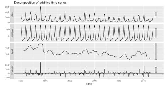
From this plot we see the original time series at the top with the facet label ‘data’ (we seen this twice now so it’s nothing new). The second plot show the seasonal component and since there is a definite repeating pattern with the peaks coinciding with the peaks of watermain breaks and we can conclude there is seasonality or periodicity with the data (and confirms what we saw with the monthly box plots). The third plot displays the trend while disregarding the seasonal component and we can see that over the time period there is a general decreasing trend of watermain breaks in Toronto. The final and fourth plot shows the remainder or random component and it describes any variation or deviation in the data that is not considered in the seasonal or trend data. We can see in the original data the high spike in 1994 has a spike in the remainder plot as well. We can make a general conclusion that there this is an extraordinary number of watermain breaks in that small window. A more systematic approach would be to predetermine an threshold in which a remainder value would be significant, since we see some deviations occurring the recent years.
Spatial Data
The dataset contains spatial information contained in the columns labelled X_coord and Y_coord . It seems like the City of Toronto uses the Modified Transverse Mercator (MTM), North American Datum 1927 (NAD27) with a truncated northing (-4,000,000) geographic coordinate system. I’m not very familiar with doing coordinate system conversions in R but I would appreciate any feedback on how to do this! Regardless of this, I decided to visualize the spatial information and get a general idea of where these breaks were happening and when. The code below takes the coordinate data and plots them using ggplot2.
ggplot(data = wm.df, aes(x = X_coord, y = Y_coord, color = year)) +
  geom_point(size = 1.5, alpha = 0.4) +
  scale_color_viridis(option = "B") +
  labs(title = paste0("Map of Watermain Breaks"),
       subtitle = paste0("City of Toronto (1990-2016)")) +
  theme(axis.text = element_blank(), axis.title = element_blank(),
        axis.ticks = element_blank(), panel.background = element_rect(fill = "grey95",colour = "grey5"),
        legend.background = element_rect(fill = "grey95"),
        panel.grid.minor = element_blank(), panel.grid.major = element_blank(),
        plot.title = element_text(size = title.size, face = "bold"),
        plot.subtitle = element_text(size = title.size*0.6, face = "plain"),
        plot.background = element_rect(fill = "grey95"))
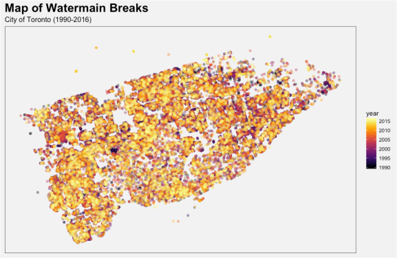
I am also a viridispackage junkie if you haven’t noticed from my other posts. So as the legend says, the brighter yellow indicates a more recent watermain break. This plot isn’t too information since it shows all the watermain breaks over the entire 27 year period and we don’t have any reference for exact locations within the city of Toronto.
So what does this mean…
At first glance, you might be concerned after doing some quick mental math (35461 breaks over 27 years… ~1300 breaks per year) and conclude that tap water provided these pipes is not safe and the residents of Toronto should only drink bottled water for the rest of their lives. This is NOT the point of this post and nor does it suggest people should be overly paranoid with seeing this. The city of Toronto is well-resourced and have the capacity to response to these watermain breaks, isolate them, fix them in a timely manner, and resume service of safe drinking water. The health risk from these breaks shouldn’t concern the average Torontonian and since waterborne diseases are extremely rare in developed countries and Toronto makes sure that their four water treatment plants are fully functioning to make sure all the water is safe. If you want to more about watermain breaks in Toronto you can check out their website and read on how they are working hard behind the scene to ensure that you (if you live in Toronto) have access to safe drinking water.
Everything in the post are my own views and as always feedback, comments, suggestions are always welcome. I am constantly learning new things about using R and love to learn. Feel free to reach out to me

R-bloggers.com offers daily e-mail updates about R news and tutorials about learning R and many other topics. Click here if you're looking to post or find an R/data-science job.
Want to share your content on R-bloggers? click here if you have a blog, or here if you don't.