
The real meaning of spurious correlations
Want to share your content on R-bloggers? click here if you have a blog, or here if you don't.
Like many data nerds, I’m a big fan of Tyler Vigen’s Spurious Correlations, a humourous illustration of the old adage “correlation does not equal causation”. Technically, I suppose it should be called “spurious interpretations” since the correlations themselves are quite real, but then good marketing is everything.
There is, however, a more formal definition of the term spurious correlation or more specifically, as the excellent Wikipedia page is now titled, spurious correlation of ratios. It describes the following situation:
- You take a bunch of measurements X1, X2, X3…
- And a second bunch of measurements Y1, Y2, Y3…
- There’s no correlation between them
- Now divide both of them by a third set of measurements Z1, Z2, Z3…
- Guess what? Now there is correlation between the ratios X/Z and Y/Z
It’s easy to demonstrate for yourself, using R to create something like the chart in the Wikipedia article.
First, create 500 observations for each of x, y and z.
library(ggplot2)

set.seed(123)
spurious_data <- data.frame(x = rnorm(500, 10, 1),
                            y = rnorm(500, 10, 1),
                            z = rnorm(500, 30, 3))
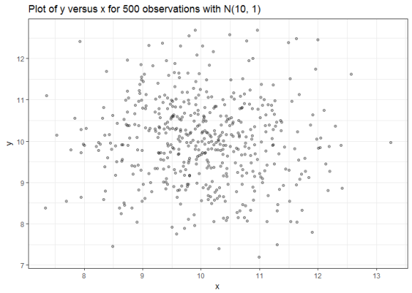
Next, convince yourself that x and y are uncorrelated.
cor(spurious_data$x, spurious_data$y)
# [1] -0.05943856
spurious_data %>% ggplot(aes(x, y)) + geom_point(alpha = 0.3) +
theme_bw() + labs(title = "Plot of y versus x for 500 observations with N(10, 1)")
Finally, repeat step 2 after dividing x and y through by z.
cor(spurious_data$x / spurious_data$z, spurious_data$y / spurious_data$z)
# [1] 0.4517972
spurious_data %>% ggplot(aes(x/z, y/z)) + geom_point(aes(color = z), alpha = 0.5) +
 theme_bw() + geom_smooth(method = "lm") +
scale_color_gradientn(colours = c("red", "white", "blue")) +
labs(title = "Plot of y/z versus x/z for 500 observations with x,y N(10, 1); z N(30, 3)")
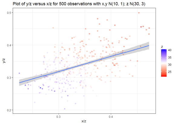
This effect is reasonably intuitive: dividing both x and y by the same z forces them into the range (0,1). Larger values for z push x/z and y/z towards lower values, smaller values of z push them towards higher values. Visually though, it’s quite a striking effect which is even more pronounced if we increase the standard deviation for z.
spurious_data$z <- rnorm(500, 30, 6)
cor(spurious_data$x / spurious_data$z, spurious_data$y / spurious_data$z)
# [1] 0.8424597
spurious_data %>% ggplot(aes(x/z, y/z)) + geom_point(aes(color = z), alpha = 0.5) +
theme_bw() + geom_smooth(method = "lm") +
scale_color_gradientn(colours = c("red", "white", "blue")) +
labs(title = "Plot of y/z versus x/z for 500 observations with x,y N(10, 1); z N(30, 6)")

Which looks an awful lot like a chart that I found recently in a published article that I was reading at work. Note that both axes are rates between 0-100 (percentages), suggesting that values were divided by a common divisor.

Should you wish to compare ratios or “relative” measurements, consult this reference and take a look at the R package propr, which implements methods for proportionality.
Filed under: R, statistics Tagged: causation, correlation, proportionality, ratios

R-bloggers.com offers daily e-mail updates about R news and tutorials about learning R and many other topics. Click here if you're looking to post or find an R/data-science job.
Want to share your content on R-bloggers? click here if you have a blog, or here if you don't.