
Looking at flood insurance claims with choroplethr
Want to share your content on R-bloggers? click here if you have a blog, or here if you don't.
I recently learned how to use the choroplethr package through a short tutorial by the package author Ari Lamstein (youtube link here). To cement what I learned, I thought I would use this package to visualize flood insurance claims.
I am using the FIMA NFIP redacted claims dataset from FEMA, and it contains more than 2 million claims transactions going all the way back to 1970. (The dataset can be accessed from this URL.) From what I can tell, this dataset is updated somewhat regularly. For this post, the version of the dataset used was published on 26 Jun 2019, and I downloaded it on 10 Jul 2019. (Credit: I learned of this dataset from Jeremy Singer-Vine’s Data Is Plural newsletter, 2019.07.10 edition.)
To access all the code in this post in a single script, click here.
First, let’s load libraries and the dataset:
library(tidyverse)
library(choroplethr)
library(choroplethrMaps)


df <- read_csv("openfema_claims20190331.csv",
               col_types = cols(asofdate = col_date(format = "%Y-%m-%d"),
                                dateofloss = col_date(format = "%Y-%m-%d"),
                                originalconstructiondate = col_date(format = "%Y-%m-%d"),
                                originalnbdate = col_date(format = "%Y-%m-%d")))
I get some parsing failures, indicating that there might be some issues with the dataset, but I will ignore them for now since it’s not a relevant point for this post. I end up with around 2.4 million observations of 39 variables. We are only going to be interested in a handful of variables. Here they are along with the description given in the accompanying data dictionary:
-
yearofloss: Year in which the flood loss occurred (YYYY).state: The two-character alpha abbreviation of the state in which the insured property is located.countycode: The Federal Information Processing Standard(FIPS) defined unique 5-digit code for the identification of counties and equivalent entities of the united States, its possessions, and insular areas. The NFIP relies on our geocoding service to assign county.amountpaidonbuildingclaim: Dollar amount paid on the building claim. In some instances, a negative amount may appear which occurs when a check issued to a policy holder isn’t cashed and has to be re-issued.amountpaidoncontentsclaim: Dollar amount paid on the contents claim. In some instances, a negative amount may appear, which occurs when a check issued to a policy holder isn’t cashed and has to be re-issued.amountpaidonincreasedcostofcomplianceclaim: Dollar amount paid on the Increased Cost of Compliance (ICC) claim. Increased Cost of Compliance (ICC) coverage is one of several flood insurances resources for policyholders who need additional help rebuilding after a flood. It provides up to $30,000 to help cover the cost of mitigation measures that will reduce the flood risk. As we are not explicitly defining the building and contents components of the claim, I don’t think it is necessary to define ICC.
I didn’t understand the explanation for negative amounts for the claim fields. Since there were less than 20 records which such fields, I decided to remove them. I also removed all rows without any state information (12 records).
# select just the columns we want and remove rows with no state info or
# negative claim amounts
small_df <- df %>%
    select(year = yearofloss, state, countycode,
           claim_bldg = amountpaidonbuildingclaim,
           claim_contents = amountpaidoncontentsclaim,
           claim_ICC = amountpaidonincreasedcostofcomplianceclaim) %>%
    filter(!is.na(state)) %>%
    replace_na(list(claim_bldg = 0, claim_contents = 0, claim_ICC = 0)) %>%
    filter(!(claim_bldg < 0 | claim_contents < 0 | claim_ICC < 0))
The code below makes a histogram of the number of claims per year:
# histogram of year
with(small_df, hist(year, breaks = c(min(year):max(year)),
                    main = "No. of claims / year", xlab = "Year"))
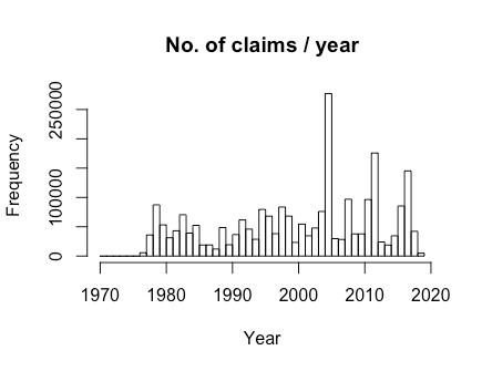
While there are supposed to be records from 1970, the records before 1978 seem to be pretty sparse. We also don’t have a full year of records for 2019 yet. As such, I filtered for just records between 1978 and 2018 (inclusive). I also assumed that the total claim amount was the sum of the 3 claim columns: this is the only claim amount I work with in this post.
small_df <- small_df %>% filter(year >= 1978 & year <= 2018) %>%
    mutate(total_cost = claim_bldg + claim_contents + claim_ICC)
Number of claims by state
For my first map, I wanted to show the number of claims made by state. To do that, I have to give to the state_choropleth() function a very specific dataframe: it must have a region column with state names (e.g. “new york”, not “NY” or “New York”), and a value column with the number of the claims. The dataset has states in two-letter abbreviations, so we have to do a mapping from those abbreviations to the state names. Thankfully it is easy to do that with the mapvalues() function in the plyr package and the state.regions dataframe in the choroplethMaps package:
state_no_claims_df <- small_df %>% group_by(state) %>%
    summarize(claim_cnt = n())

# map to state name
data(state.regions)
state_no_claims_df$region <- plyr::mapvalues(state_no_claims_df$state,
                                             from = state.regions$abb,
                                             to = state.regions$region)

# rename columns for choroplethr
names(state_no_claims_df) <- c("state", "value", "region")

# basic map
state_choropleth(state_no_claims_df)
Note that we get a warning because our dataframe has regions that are not mappable (AS, GU, PR, VI: presumably places like Guam and Puerto Rico). Nevertheless we get a colored map:

Not bad for a really short command! By default, the value column is split into 7 buckets (according to quantiles). To see which states are above/below the median number of claims, we can set the num_colors option to 2:
# above and below median
state_choropleth(state_no_claims_df, num_colors = 2)

For a continuous scale, set num_colors to 1 (if you have negative values, you can set num_colors 0 for a diverging scale):
# continuous scale
state_choropleth(state_no_claims_df, num_colors = 1)

From the map above, it is clear that Louisiana had the most number of claims, followed by Texas and Florida.
It is easy to add a title and legend label to the map:
# one with title
state_choropleth(state_no_claims_df, num_colors = 1,
                 title = "No. of claims by state", legend = "No. of claims")

The output of state_choropleth is a ggplot object, so we can modify the output as we would with ggplot graphics. One bug I noticed was that in adding the color scale below, the legend name reverted to “value” (instead of “No. of claims”); I have not figured out how to amend this yet.
# choroplethr output is a ggplot object
gg1 <- state_choropleth(state_no_claims_df, num_colors = 1, title = "No. of claims by state", legend = "No. of claims") class(gg1) #> [1] "gg"     "ggplot"

gg1 + scale_fill_distiller(palette = "Spectral") +
    theme(plot.title = element_text(size = rel(2), face = "bold", hjust = 0.5))

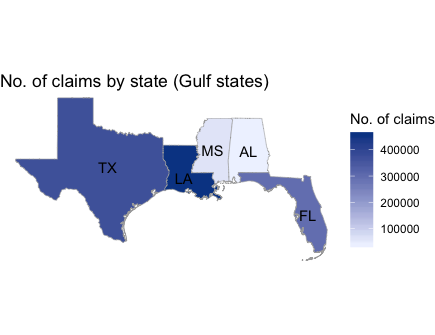
state_choropleth() allows us to plot just the states we want by passing a vector of states to the zoom option. In the code below, we just plot the states which border the Gulf of Mexico:
# zoom in on gulf states: have a shoreline on gulf of mexico
gulf_states <- c("texas", "louisiana", "mississippi", "alabama", "florida")
state_choropleth(state_no_claims_df, num_colors = 1,
                 title = "No. of claims by state (Gulf states)", legend = "No. of claims",
                 zoom = gulf_states)
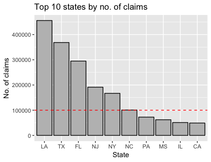
This last barplot shows the no. of claims by state (in descending order). 6 states have over 100,000 claims, with North Carolina barely hitting that number.
# bar plot of no. of claims
ggplot(data = state_no_claims_df %>% arrange(desc(value)) %>% head(n = 10)) +
    geom_bar(aes(x = reorder(state, -value), y = value), stat = "identity",
             fill = "gray", col = "black") +
    geom_abline(intercept = 100000, slope = 0, col = "red", lty = 2) +
    labs(x = "State", y = "No. of claims", title = "Top 10 states by no. of claims")
Total claim amount by state
This section doesn’t contain any new choroplethr syntax, but is for the completeness of the data story. Instead of looking at the number of claims by state, I look at the total claim amounts by state. My initial guess is that we shouldn’t see that much variation from the plots above.
The code below extracts the summary information from the claims level dataset and makes the choropleth map and the barplot (the red line indicates the $1 billion mark):
state_claims_amt_df <- small_df %>% group_by(state) %>%
    summarize(value = log10(sum(total_cost)))

# map to state name
state_claims_amt_df$region <- plyr::mapvalues(state_claims_amt_df$state, from = state.regions$abb, to = state.regions$region) state_choropleth(state_claims_amt_df, num_colors = 1, title = "log10(Claim amount) by state", legend = "") + scale_fill_distiller(palette = "Spectral") + theme(plot.title = element_text(size = rel(2), face = "bold", hjust = 0.5)) # bar plot of claim amt ggplot(data = state_claims_amt_df %>% arrange(desc(value)) %>% head(n = 10)) +
    geom_bar(aes(x = reorder(state, -value), y = 10^value), stat = "identity",
             fill = "gray", col = "black") +
    geom_abline(intercept = 10^9, slope = 0, col = "red", lty = 2) +
    scale_y_continuous(labels = function(x) format(x, scientific = TRUE)) +
    labs(x = "State", y = "Total claims", title = "Top 10 states by total claims")

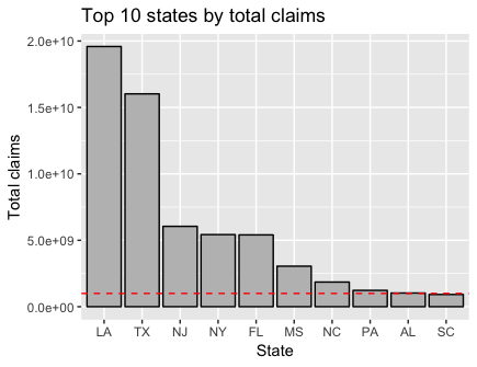
Perhaps not surprisingly the top 5 states with the most number of claims are also the top 5 states with the largest claim amounts. What might be more surprising is how much more money was claimed in LA and TX compared to the other states.
Number of claims by county
choroplethr makes plotting by county really easy, as long as you have the 5-digit FIPS code for the counties. Instead of using the state_choropleth() function, use the county_choropleth() function. As before, this function must have a “region” column with the FIPS codes (as numbers, not strings), and a “value” column for the values to be plotted. The county.regions dataset in the choroplethrMaps package can help the conversion of region values if necessary.
county_summary_df <- small_df %>% group_by(countycode) %>%
    summarize(claim_cnt = n(), claim_amt = sum(total_cost)) %>%
    mutate(countycode = as.numeric(countycode))

names(county_summary_df) <- c("region", "value", "claim_amt")

county_choropleth(county_summary_df)

As with state_choropleth(), the default is to split the values into 7 bins according to quantiles. We get a bunch of warnings because several counties have NA values. By default, these counties are filled black. In this particular case I think they affect how we read the map, I use the code below to change the NAs to white. In this context it makes sense too, since counties have NA values because they have no claims.
# change fill color for NAs to be white
county_choropleth(county_summary_df, title = "No. of claims by county") +
    scale_fill_brewer(na.value = "white")

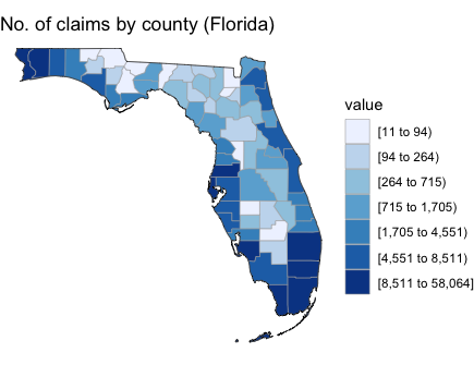
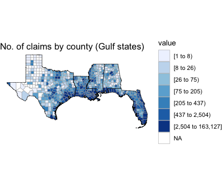
We can draw county maps for specific states as well. The code below makes two plots: the first zooms in on just Florida, the second zooms in on all the Gulf states.
# zoom into florida only
county_choropleth(county_summary_df, title = "No. of claims by county (Florida)",
                  state_zoom = "florida") +
    scale_fill_brewer(na.value = "white")

# zoom into gulf
county_choropleth(county_summary_df, title = "No. of claims by county (Gulf states)",
                  state_zoom = gulf_states) +
    scale_fill_brewer(na.value = "white")
Top 5 states: a (slightly) deeper look
In this section we take a temporal look at the top 5 states. The code below filters for them and summarizes the data:
top_states <- (state_no_claims_df %>% arrange(desc(value)) %>% head(n = 5))[[1]]
top_df <- small_df %>% filter(state %in% top_states)
top_regions <- plyr::mapvalues(top_states, from = state.regions$abb,
                               to = state.regions$region)

state_yr_summary_df <- top_df %>% group_by(state, year) %>%
    summarize(claim_cnt = n(), claim_amt = sum(total_cost))
The first chunk of code plots the number of claims for each state for each year, while the second chunk does the same for total claim amount:
ggplot(data = state_yr_summary_df, aes(x = year, y = claim_cnt, col = state)) +
    geom_line() + geom_point() +
    scale_y_continuous(labels = function(x) format(x, scientific = TRUE)) +
    labs(x = "Year", y = "No. of claims", title = "No. of claims by state") +
    theme_bw()

ggplot(data = state_yr_summary_df, aes(x = year, y = claim_amt, col = state)) +
    geom_line() + geom_point() +
    scale_y_continuous(labels = function(x) format(x, scientific = TRUE)) +
    labs(x = "Year", y = "Claim amount", title = "Claim amount by state") +
    theme_bw()


It looks like for these states, most of the claims and most of the damage comes in just one or two particular incidents. From the state and the year, you can probably guess the disaster that caused the spike.
R-bloggers.com offers daily e-mail updates about R news and tutorials about learning R and many other topics. Click here if you're looking to post or find an R/data-science job.
Want to share your content on R-bloggers? click here if you have a blog, or here if you don't.