
Easily plotting grouped bars with ggplot #rstats
Want to share your content on R-bloggers? click here if you have a blog, or here if you don't.
Summary
This tutorial shows how to create diagrams with grouped bar charts or dot plots with ggplot. The groups can also be displayed as facet grids.
Importing the data from SPSS
All following examples are based on an imported SPSS data set. Refer to this posting for more details on how to do that and to my script page to download the scripts. This is important to know because the way the variable and value labels are accessed may depend on whether you use an imported SPSS dataset or not (i.e. you may have to change parameters to get the sample running).
You can, for instance, import your SPSS data like this, if you are using my script:
source(“sjImportSPSS.R”)
efc <- importSPSS("GER_Services_FU_PV_dt.sav")
efc_vars <- getVariableLabels(efc)
efc_labels <- getValueLabels(efc)
The R script
You can download the script from my script page. I will not describe the code in detail because the source code is (hopefully) well commented. Basically, the script just transforms the data from two variables (one count variable with categories and one grouping variables) to fit into the ggplot-requirements for plotting bar charts. You can use a lot of parameters to change the style of the output, e.g. you can plot bars or dots, dodged or stacked bars, change colors etc. and you don’t need to know how this works in ggplot. You simply pass your “preferred settings” as parameters.
You can include the script via this single line:
source("sjPlotGroupFrequencies.R")
Examples
The minimal requirements for this function to work are two variables: One of which frequencies should be plotted and one variable that indicates the groups. Once you’ve (imported) a data set and included the script as shown above, you can plot a bar graph with default settings like this:
sjp.grpfrq(efc$e42dep,
           efc$n1pv_ovs)
The varCount parameter requires the variable containing the frequencies that should be plotted. varGroup indicates the groups. The result is a kind of “graphical” cross tabulation of varCount and varGroup:
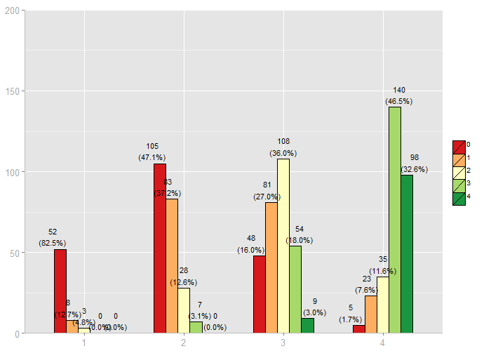
Default grouped bar charts from my function, using ggplot in R
This graph provides no information on category or variable labels. However, you can pass these information as parameter as well:
sjp.grpfrq(efc$e42dep,
           efc$n1pv_ovs,
           title = efc_vars['e42dep'],
           axisLabels.x = efc_labels[['e42dep']],
           legendLabels = efc_labels[['n1pv_ovs']],
           legendTitle = efc_vars[['n1pv_ovs']],
           barColor = "brewer",
           colorPalette = "PuBu",
           showPercentageValues = FALSE)
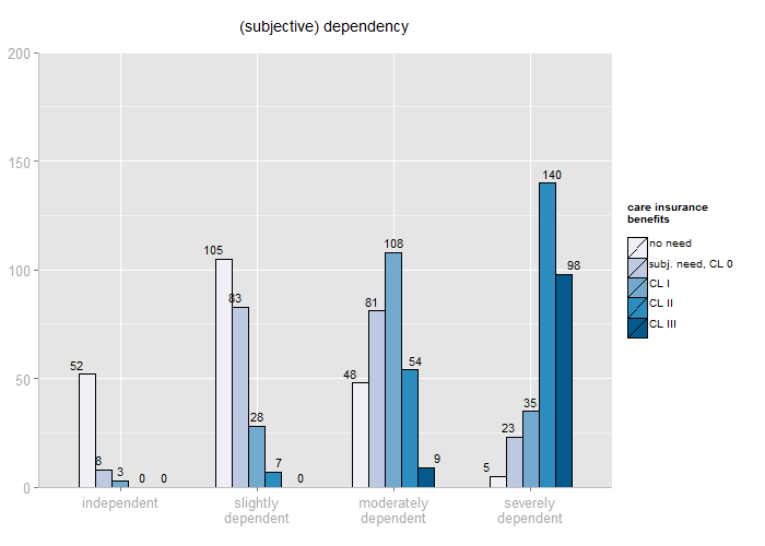
Grouped bars with different color palette, category and legend labels and diagram title.
As you can see above, category labels can be passed as parameter, typically a vector of char values. If you have used my script to import data from SPSS, you simply access the category labels with efc_labels[['--variablename--']]. The variable names are saved in efc_vars. Furthermore, you can see that the bar colors have changed. You can either use your own color values, “gs” for a greyscale, or use “brewer” in combination with “colorPalette” to use any of the pre-defined color brewer palettes supported by ggplot. You find further information in the documentation of the R script.
You can also plot dots instead of bars:
sjp.grpfrq(fc$e42dep,
           efc$n1pv_ovs,
           title = efc_vars['e42dep'],
           axisLabels.x = efc_labels[['e42dep']],
           legendLabels = efc_labels[['n1pv_ovs']],
           legendTitle = efc_vars[['n1pv_ovs']],
           barColor = "brewer",
           type = "dots",
           showPercentageValues = FALSE)

Dot plot with different color palette, no percentage values shown.
To avoid overlapping, you can see the dodged position of the dots in the graph above. Since this may make it harder to define which dot belongs to which group, shaded rectangles surrounding each group are plotted by default. You can, of course, switch them off as well.
If you prefer stacked bars, you can do this with the barPosition parameter:
sjp.grpfrq(efc$e42dep,
           efc$n1pv_ovs,
           title = efc_vars['e42dep'],
           axisLabels.x = efc_labels[['e42dep']],
           legendLabels = efc_labels[['n1pv_ovs']],
           legendTitle = efc_vars[['n1pv_ovs']],
           barPosition = "stack",
           showPercentageValues = FALSE,
           upperYlim = 350)
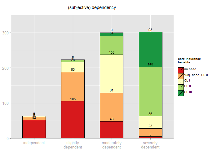
Stacked group bar chart, with default color palette and fixed upper y-axis limit.
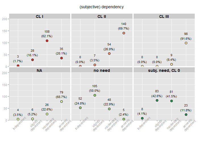
If you like, you can also display each category in a single diagram using facet grids. Please notice that facet grids calculate category percentages, i.e. each category sums up to 100%, while the other plots use group percentages, i.e. each groups sums up to 100%!
sjp.grpfrq(efc$e42dep,
           efc$n1pv_ovs,
           title = efc_vars['e42dep'],
           legendLabels = efc_labels[['n1pv_ovs']],
           legendTitle = efc_vars[['n1pv_ovs']],
           useFacetGrid=TRUE)

Facet grid with one diagram per group, each diagram representing one category.
This example should demonstrate how dots in a facet grid may look like.
sjp.grpfrq(efc$e42dep,
           convertToLabel(efc$n1pv_ovs),
           title = efc_vars['e42dep'],
           axisLabels.x = efc_labels[['e42dep']],
           useFacetGrid=TRUE,
           type="dots",
           omitNA=FALSE,
           hideLegend=TRUE,
           axisLabelAngle.x=45,
           axisLabelSize=0.9)
Facet grid with dot plots, using grid title instead of legend.
As you can see, I have replaced the factor values of the grouping varible (which were “0″, “1″, “2″ etc.) with the related category or factor labels. This can easily be performed with the convertToLabel function, which is also included in the sjImportSPSS script. By this, the group variable now contains “CL 1″ or “CL 2″ as values instead of “1″ or “2″. This makes it possible to plot the group titles into each facet, which makes the legend needles. In this case, I would recommend removing the legend, because the facets are ordered in alphabetical way, while the legend is not. This may lead to differences between legend colors and facet colors.
And finally, three examples for plotting distributions of metric scales, e.g. age. First, a grouped histogram chart, with mean intercept lines for each group.
sjp.grpfrq(efc$e17age,
           efc$e16sex,
           legendLabels = efc_labels[['e16sex']],
           type="hist",
           showValueLabels=FALSE,
           axisTitle.x ="Age of Elderly Dependent",
           showMeanIntercept=TRUE)

Grouped histogram with mean intercept line for each group
If you wish, you can also display box plots for each groups. The groups’ mean value is displayed as white point inside the box.
sjp.grpfrq(efc$e17age,
           efc$e16sex,
           legendLabels = efc_labels[['e16sex']],
           type="box",
           barColor="brewer",
           colorPalette="Pastel1",
           axisTitle.y="Age of Elderly Dependent")

Box plot with white mean-point
Or, if you don’t want to lose information on the distribution, you may want to use violin plots. These are “mirrored” denstity curves for each group. Additionally, a small box plot is plotted inside the violins.
sjp.grpfrq(efc$e17age,
           efc$e16sex,
           legendLabels = efc_labels[['e16sex']],
           type="v",
           barColor="brewer",
           colorPalette="Pastel1",
           axisTitle.y="Age of Elderly Dependent")

Violin plot with small box plot inside. Mean value is indicates by the black point.
You can, of course, change many more parameters. A complete overview with short information on each parameter is in the documentation inside the R script.
Have fun!
Tagged: ggplot, R, rstats, SPSS, Statistik

R-bloggers.com offers daily e-mail updates about R news and tutorials about learning R and many other topics. Click here if you're looking to post or find an R/data-science job.
Want to share your content on R-bloggers? click here if you have a blog, or here if you don't.