
Analysis on Google’s Best Apps of 2017 List
Want to share your content on R-bloggers? click here if you have a blog, or here if you don't.

As we are fast approaching the end of the year, “Best of 2017” lists are being released. I had a look at Google’s “Best Apps of 2017” list and I like their arrangement of picking the top 5 apps by categories such as “Best Social”, “Most Innovative” etc. However, I found myself wishing I could dive deeper. I wanted to examine which factors contribute to the placement of an app on these lists. A natural way of doing this would be to download the data and start analyzing. Simple right? Think again, this is the classic problem of information on the web. There absolutely is an abundance of information on the internet. But it’s only consumable in the way that the website wishes to serve it up. For example, in the best apps list, I can see every app, their category, their total downloads, ratings etc. All the information I need is available to me, but it’s not in the format that I need to facilitate additional analysis and insights. Its meant for the user to browse and read right on their website. The website controls the narrative.
Strategy
So what do we do? The information we want is available to us, but it’s not in the form we need. Luckily for us, many people much smarter than I have solved this problem. The concept is called screen scraping and it’s a technique used to automate copying data off of websites. For data wranglers, there are a number of libraries and packages that have been developed to make screen scraping relatively straight forward. In Python, the package Beautiful Soup has a large following. In R, the package rvest has been getting a lot of traction.
Since I’m more proficient with R, we will use the rvest package to scrape data from the Google Best Apps of 2017 website and store it in a data frame. We will then use a variety of R packages to analyze the data set further.
Step 1: Set Up
Pick your tools
As discussed in other blog posts, there are a wide variety of tools available to explore and manipulate the data. No tool is unequivocally “better” than another one. I chose R as my programming language because it allows for easy screen scraping and pretty visualizations. In terms of setting up the R working environment, we have a couple of options open to us. We can use something like R Studio for a local analytics on our personal computer. The downfall is that local analysis and locally stored data sets are not easily shared or collaborated on. To allow for easy set up and collaboration, we are going to be using the free IBM Cloud Lite account and Data Science Experience to host and run our R analysis and data set.
A) Sign up for IBM Cloud Lite – Visit bluemix.net/registration/free
Follow the steps to activate and set up your account.

B) Deploy Watson Studio from the catalog. Note this was previously called Data Science Experience.
Select the “Lite” plan and hit “Create”.
You will then be taken to new screen where you can click “Get started”. This will redirect you to the Watson Studio UI.

C) Create a New Project – It’s best to start by creating a project so that you can store the R notebook and other assets together logically (models, data connections etc). Create the project. If this is your project, you will also need to create an object storage service to store your data. This is free and just a few clicks.

D) Create a New Notebook – Notebooks are a cool way of writing code, because they allow you to weave in the execution of code and display of content and at the same time.
Select “Assets”. Select “New Notebook”. Set the proper paramaters: name, description, project etc.
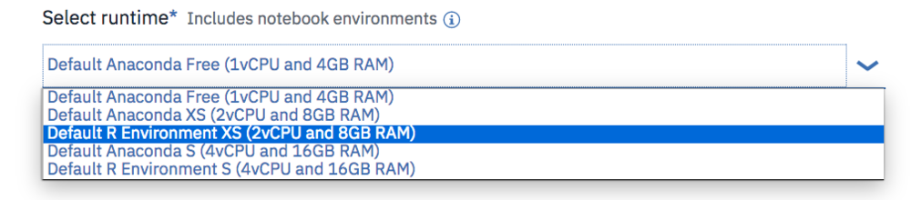
Ensure you select an R environment as the notebook environment. Click create
Step 2: Gather the data using screenscraping


For each step below, the instructions are: Create a new cell. Enter the code below. Run the code by pressing the top nav button “run cell” which looks like a right arrow.
Note: If you need to close and reopen your notebook, please make sure to click the edit button in the upper right so that you can interact with the notebook and run the code.
Install and load packages
R packages contain a grouping of R data functions and code that can be used to perform your analysis. We need to install and load them in DSX so that we can call upon them later. As per the previous tutorial, enter the following code into a new cell, highlight the cell and hit the “run cell” button.
#install packages - do this one time
install.packages("rvest")
install.packages("plyr")
install.packages("alluvial")
install.packages("ggplot2")
install.packages("plotrix")
install.packages("treemap")
install.packages("plotly")
install.packages("data.table")
You may get a warning note that the package was installed into a particular directory as ‘lib’ is unspecified. This is completely fine. It still installs successfully and you will not have any problems loading it in the next step. After you successfully install all the packages, you may want to comment out the lines of code with a “#” in front of each line. This will help you to rerun all code at a later date without having to import in all packages again. As done previously, enter the following code into a new cell, highlight the cell and hit the “run cell” button.
# Load the relevant libraries - do this every time
library(rvest)
library(plyr)
library(alluvial)
library(ggplot2)
library(plotrix)
library(treemap)
library(plotly)
library(data.table)
Call the rvest library to create a screen scraping function for the Google “Best of” website
Screen scraping is a very in depth topic and it can get incredibly complicated depending on how the page you would like to scrape is formatted. Luckily the page we are trying to scrape allows the data objects we want to be referenced relatively easily. Since there are 6 pages total that we would like to scrape (all with the same format), I made a function that we can call for every page. Creating a function helps to prevent repeated blocks of code. This function takes two input parameters: the website URL that you want the data from and the category name you would like to assign to this data set. It then retrieves the apps title, rating count, download count, content rating (mature, teen etc), write up (description) and assigns the category you provided. Finally, it returns a data frame to you with all of the information nicely packed up.
To learn more about screen scraping using rvest, I found this tutorial to be very beneficial.
###########  CREATE Function for Google Screen Scrape ################

scrapeGoogleReviews <- function(url, categoryName ){
  #Specifying the url for desired website to be scrapped
  webpage <- read_html(url)
  df <-data.frame(
    app_title = html_text(html_nodes(webpage,'.id-app-title')),
    rating_count = html_text(html_nodes(webpage,'.rating-count')),
    download_count = html_text(html_nodes(webpage,'.download-count')),
    # commenting this line out as it has broken since original posting ## content_rating = html_text(html_nodes(webpage,'.content-rating-title')),
    write_up = html_text(html_nodes(webpage,'.editorial-snippet')),
    category = categoryName)
  df
  return(df)
}
Call the function just created (scrapeGoogleReviews) for every "Best Apps" list we want
Each web page hosts it's own "Best of 2017 App" list such s "Best Social", "Most Influential", "Best for Kids" etc. The function is called for each web page and the results are placed in their own data frame. We then put all the data frames together into one combined data frame with the rbind command.
###########  CALL Function for Screen Scrape ################

df1 <-scrapeGoogleReviews('https://play.google.com/store/apps/topic?id=campaign_editorial_apps_bestof2017&hl=en','Winner')
df2 <-scrapeGoogleReviews('https://play.google.com/store/apps/topic?id=campaign_editorial_apps_entertaining_bestof2017&hl=en','Most Entertaining')
df3 <-scrapeGoogleReviews('https://play.google.com/store/apps/topic?id=campaign_editorial_apps_social_bestof2017&hl=en','Best Social')
df4 <-scrapeGoogleReviews('https://play.google.com/store/apps/topic?id=campaign_editorial_apps_productivity_bestof2017&hl=en','Daily Helper')
df5 <-scrapeGoogleReviews('https://play.google.com/store/apps/topic?id=campaign_editorial_apps_innovative_bestof2017&hl=en','Most Innovative')
df6 <-scrapeGoogleReviews('https://play.google.com/store/apps/topic?id=campaign_editorial_apps_Hiddengem_bestof2017&hl=en','Hidden Gem')
df7 <-scrapeGoogleReviews('https://play.google.com/store/apps/topic?id=campaign_editorial_apps_kids_bestof2017&hl=en','Best for Kids')
df8 <-scrapeGoogleReviews('https://play.google.com/store/apps/topic?id=campaign_editorial_3002de9_apps_bestof_mostpopular2017&hl=en','Most Popular')

#Combine all of the data frames
fulldf <- rbind(df1,df2, df3, df4, df5, df6, df7, df8)
#Peek at the data frame
head(fulldf)

Step 3: Format Your Data
Download the full data set
Screen scraping is incredibly fragile as web page structure can change at any time. To ensure that those doing the tutorial can continue on with the visualizations, download the full dataset from GH
fulldf <- fread('https://raw.githubusercontent.com/lgellis/GoogleBestOf2017AppsAnalysis/master/GoogleBestApps.csv')
Convert to numeric
The downfall to screen scraping is that we often have to reformat the data to suit our needs. For example, in our data frame we have the two numeric variables: download_count and rating_count. As much as they look like numbers in the preview above, they are actually text with some pesky commas included in them that make conversion to numeric slightly more complicated. Below we create two new columns with the numeric version of these variables. The conversion is performed by first removing any non-numeric values with the gsub function and then converting to numeric with the as.numeric function.
###########  Extra formatting ################

# Remove commas and convert to numeric
fulldf$rating_count_numeric <- as.numeric(gsub("[^0-9]", "", fulldf$rating_count))
fulldf$download_count_numeric <- as.numeric(gsub("[^0-9]", "", fulldf$download_count))

attach(fulldf)
Create helper variables for easier analysis and visualization
There are some things just off the bat, that I know we will want for visualization. To start, it would be nice to have the percent of overall downloads for each app within the data set.
# Add percent downloads
totalDownload <- sum(download_count_numeric)
fulldf$percentDownloadApp <- round(download_count_numeric/totalDownload *100, 2)
attach(fulldf)
Next, we want to bin our download and rating totals. "Binning" is a way of grouping values within a particular range into the same group. This is an easy way for us to be able to look at volumes more simply later on.
#Binning by downloads
breaks <- c(0,10000,1000000,10000000, 100000000)
fulldf$download_total_ranking = findInterval(download_count_numeric,breaks)

#Binning by rating totals
breaks2 <- c(10,100,1000,100000, 10000000)
fulldf$rating_total_ranking = findInterval(rating_count_numeric,breaks2)
attach(fulldf)

#peek at the data
head(fulldf)

Step 4: Analyze Your Data
Visualize app data

Create a pie chart showing the top downloaded apps within the data set. We use the percentDownloadApp variable created in step 3 and the plot_ly function to create the pie chart. Given that the majority of the data set has less than 1% of the downloads, we also only include apps with greater than 1% with the ifelse function.
###########  Visualize the Data ################

plot_ly(fulldf, labels =fulldf$app_title, values =ifelse(fulldf$percentDownloadApp>1,fulldf$percentDownloadApp,''), type = 'pie') %>%
  layout(title = 'Percentage of App Downloads by App',
         xaxis = list(showgrid = FALSE, zeroline = FALSE, showticklabels = FALSE),
         yaxis = list(showgrid = FALSE, zeroline = FALSE, showticklabels = FALSE))

Create a treemap to represent all app download volumes - Treemaps are perfect for visualizing volumes in a creative way. The treemap function offers the added benefit of not including titles for categories with minimal data.
#Treemap without category
treemap(fulldf, #Your data frame object
        index=c("app_title" ),
        vSize = "download_count_numeric",
        type="index",
        palette = "Blues",
        title="Treemap of App Download Volumes",
        fontsize.title = 14
)

Create a classic bar chart to represent all app downloads - We are using ggplot to pull a pretty bar chart.
# Bar Plot of downloads by app
g <- ggplot(fulldf, aes(app_title, download_count_numeric))
g + geom_bar(stat="identity", width = 0.5, fill="tomato2") +
  labs(title="Bar Chart",
       subtitle="Applications",
       caption="Downloads of apps") +
  theme(axis.text.x = element_text(angle=65, vjust=0.6))

Create a bubble chart showing the top downloaded apps and the number of ratings they received. We use the ggplot function again to create this bubble plot. The size of the bubbles represent the volume of downloads, the color represents the number of ratings. Given the disparity of download volumes, we only look at the top apps. We filter the data set to only include apps that have greater than 1,000,000 downloads.
ggplot(data = fulldf[download_count_numeric>1000000, ], mapping = aes(x = category, y = rating_count_numeric)) +
  geom_point(aes(size = download_count_numeric), alpha = 1/3) +
  geom_point(aes(colour = rating_count_numeric)) +
  geom_text(aes(label=app_title), size=2.5, vjust = -2) #vjust moves text up
Visualize category summary data
Before we do any visualizations, we need to create the summary data frame for categories. Summary data frames are just tables which have rolled up aggregate information like average, sum, count etc. They are similar to pivot tables in excel. We use the ddply function to easily create a table with summary stats for categories.
###########  Visualize Category Stats ################

totalDownload <- sum(fulldf$download_count_numeric)
totalDownload
#Some numerical summaries
statCatTable <- ddply(fulldf, c("category"), summarise,
                   N    = length(app_title),
                   sumDownload  = sum(download_count_numeric),
                   sumOfRatingsCompleted = sum(rating_count_numeric),
                   minDownload = min(download_count_numeric),
                   maxDownload = max(download_count_numeric),
                   avgDownload = mean(download_count_numeric),
                   minRatingsCompleted = min(rating_count_numeric),
                   maxRatingsCompleted = max(rating_count_numeric),
                   avgRatingsCompleted = mean(rating_count_numeric),
                   sdDownload = sd(download_count_numeric),
                   sdRatings = sd(rating_count_numeric),
                   percentRatingPerDownload = round(sum(rating_count_numeric)/sum(download_count_numeric)*100,2),
                   percentDownload = round(sum(download_count_numeric)/totalDownload * 100,2)
)
statCatTable
attach(statCatTable)

#peek at the table
head(statCatTable)

Create a bar chart displaying the percent of downloads which give ratings - This is an important stat because it can show user engagement. We employ the trusty ggplot function and the newly created variable percentRatingPerDownload that we added to our summary data frame above.
#Bar chart
ggplot(statCatTable, aes(x = factor(category), y=percentRatingPerDownload,fill=factor(category)) ) +
  geom_bar(width = 1,stat="identity")

Create a circular pie chart to show the same information in a different way - Use this chart with caution as it can be misleading on a quick glance. In this example it could look like "Most Popular" has the highest value. When you inspect further it's clear that "Most Entertaining" has the most complete circle and therefore highest value.
#circular - caution the use b/c often the middle is visually smallest
ggplot(statCatTable, aes(x = factor(category), y=percentRatingPerDownload,fill=factor(category)) ) +
  geom_bar(width = 1,stat="identity")+coord_polar(theta = "y")

Create a radial pie chart as final alternative - While the radial pie may not be as visually appealing as the circular pie, I think it presents a more obvious interpretation of the data. We use the radial.pie function to make this chart.
#radial
radial.pie(statCatTable$percentRatingPerDownload, labels=statCatTable$category,radlab=FALSE, label.prop=1.2)

Create a color coded dot plot to show the relative download volumes by category - Dot plots are a great alternative to bar charts. They are even more powerful when you can group and color code them by category. We use the dotchart function.
#Color coded dot plot

#pick r colors - http://data.library.virginia.edu/setting-up-color-palettes-in-r/

x <- fulldf
x$color[fulldf$category=='Winner'] <- "#1B9E77"
x$color[fulldf$category=='Most Innovative'] <- "#D95F02"
x$color[fulldf$category=='Best for Kids'] <- "#7570B3"
x$color[fulldf$category=='Best Social'] <- "#E7298A"
x$color[fulldf$category=='Daily Helper'] <- "#66A61E"
x$color[fulldf$category=='Hidden Gem'] <- "#E6AB02"
x$color[fulldf$category=='Most Entertaining'] <- "#A6761D"
x$color[fulldf$category=='Most Popular'] <- "#666666"

dotchart(fulldf$download_count_numeric,labels=app_title,cex=.7,groups= fulldf$category,
         main="Downloads by App",
         xlab="Downloads", gcolor="black", color=x$color)
Visualize category and content summary data
Create summary data - Now we want to look at the combined category, content and binned download/ratings stats to see what types of users there are out there. As previously, we are going to use the ddply function to create the summary.
###########  Visualize Content + Category Stats ################

#What is driving the most downloads??
catsum <- ddply(fulldf, c("category", "content_rating","rating_total_ranking", "download_total_ranking"), summarise,
                N    = length(app_title),
                sumDownload = sum(download_count_numeric),
                sumRatings = sum(rating_count_numeric)
)
attach(catsum)

#peek at the table
head(catsum)


Create a stacked bar chart - We have looked exhaustively at the download count per category. However, it is interesting for us to have a deeper look at how the audience factors into the download rates. In this case it appears that teens are highly contributing to downloads
##Stackedbar by category
ggplot(catsum, aes(x=category, y=sumDownload, fill=content_rating)) +
  geom_bar(stat="identity") +
  xlab("Category") +
  ylab("Download Count")
Create a chart displaying the flow of data from one group to another. We are going to use the alluvial package to visualize which categories and content ratings are contributing to apps having the highest bin of downloads (download total ranking). Since we are specifically interested in the top tier, we highlight it in green to emphasize the data flow.
## Do visualization to see what is driving a high number of downloads

alluvial(catsum[c(1:2,4)] , freq=catsum$N,
         col = ifelse(catsum$download_total_ranking == 5, "green", "grey"),
         border = ifelse(catsum$download_total_ranking == 5, "green", "grey"),
         cex = 0.6
)
Create another data flow chart but with a focus on teens - From above, we can see that teens are a huge contributor to high downloads of an app. So, we pull the same chart and this time highlight the teens data flow.
alluvial(catsum[c(1:2,4)] , freq=catsum$N,
         col = ifelse(catsum$content_rating == 'Teen', "blue", "grey"),
         border = ifelse(catsum$content_rating == 'Teen', "blue", "grey"),
         cex = 0.6
)
Thank You
Thank you for exploring the Google Best Apps of 2017 lists with me. We used a variety of data wrangling and analysis techniques. Please comment below if you enjoyed this blog, have questions or would like to see something different in the future. Note that all of the code can also be downloaded from my github repo. If you have trouble downloading the file from github, go to the main page of the repo and select "Clone or Download" and then "Download Zip".
Written by Laura Ellis
R-bloggers.com offers daily e-mail updates about R news and tutorials about learning R and many other topics. Click here if you're looking to post or find an R/data-science job.
Want to share your content on R-bloggers? click here if you have a blog, or here if you don't.