
RObservations #15: I reverse-engineered Atlas.co (well, some of it)
Want to share your content on R-bloggers? click here if you have a blog, or here if you don't.
Introduction

A while back, the famous travel Youtubers Kara and Nate announced that they launched a new company called Atlas.co which prints custom souvenir maps as hangable artwork. After spending some time looking at how the maps looked I thought it would be interesting to see if it is possible to reverse engineer it – and lo and behold- it is (hence the blog) – in R!
In this blog I’m going to share the code that I have put together for this. There is definitely potential to build out this code and make it into a full blown Shiny application with printing capabilities, but for now, I’m sharing the “bare bones” functional code without any of the “bells and whistles” you would find when making a custom map on Atlas.co. Features like making a custom title, being able to edit the map text in a graphical interface, account for multiple stops and having a drop-shipping business infrastructure to print on demand are the big things lacking here. Additionally, I have only figured out how to plot the driving routes- flight paths shouldn’t be to difficult to figure out but I haven’t spent much time working on it.
This was a cool idea to tinker with and I hope you enjoy this code as much as I do! It might be a long shot, but if Kara and Nate are reading this – I’m a big fan of the site and the product, which is why I wanted to try to make it myself! Thank you for the inspiration!
Required packages
The code for this requires installation of the leaflet, tidygeocoder and osrm packages. I load tidyverse in my code out of habit (might not be a good one) so that I can use the pipe operator but otherwise it is not necessary.
If you are interested in printing your work you are going to want to install the htmlWidgets, magick and webshot packages.
The Map Code
The code for making the map is actually pretty straight forward as its based on functions available in the leaflet and osrm packages. The real challenge is because we are interested in only certain parameters, choosing which ones to put the user in control of vs which ones not to requires some thinking. The features that we can add are endless, but we don’t want to be overwhelming.
The code for making the visual is here. I could go and explain every part, but if you have a little bit of exposure to the libraries used, its essentially putting pieces together and setting the appropriate arguments.
library(tidyverse)
library(leaflet)
library(tidygeocoder)
library(osrm)


plot_route<-function(to,
                     from,
                     how="car",
                     colour="black",
                     opacity=1,
                     weight=1,
                     radius=2,
                     label_text=c(to,from),
                     label_position="bottom",
                     provider=providers$CartoDB.PositronNoLabels,
                     font = "Lucida Console",
                     font_weight="bold",
                     font_size= "14px",
                     text_indent="15px"){
  address_single <- tibble(singlelineaddress = c(to,from)) %>%
    geocode(address=singlelineaddress,method = 'arcgis') %>%
  transmute(id = singlelineaddress,
         lon=long,
         lat=lat)

  trip <- osrmRoute(src=address_single[1,2:3] %>% c,
                     dst=address_single[2,2:3] %>% c,
                     returnclass="sf",
                    overview="full",
                    osrm.profile = how )

    m<-leaflet(trip,
               options = leafletOptions(zoomControl = FALSE,
                                        attributionControl=FALSE)) %>%
       fitBounds(lng1 = max(address_single$lon)+0.1,
                 lat1 = max(address_single$lat)+0.1,
                 lng2 = min(address_single$lon)-0.1,
                 lat2 = min(address_single$lat)-0.1) %>%
      addTiles() %>%
  addProviderTiles(provider = provider) %>%
  addCircleMarkers(lat = address_single$lat,
                   lng = address_single$lon,
                   color = colour,
                   stroke = FALSE,
                   radius = radius,
                   fillOpacity = opacity) %>%
      addPolylines(color = colour,
                   opacity=opacity,
                   weight=weight) %>%
       addLabelOnlyMarkers(address_single$lon,
                           address_single$lat,
                           label =  label_text,
                           labelOptions = labelOptions(noHide = T,
                                                       direction = label_position,
                                                       textOnly = T,
                                                       style=list("font-family" = font,
                                                                  "font-weight"= font_weight,
                                                                  "font-size"=font_size,
                                                                  "text-indent"=text_indent)))

  m
}
With that done, lets try out function.
viz<- plot_route("New York City",
                 "Los Angeles",
                  how="car",
                  font="Courier",
                  label_position="right",
                  weight=1.5)

viz

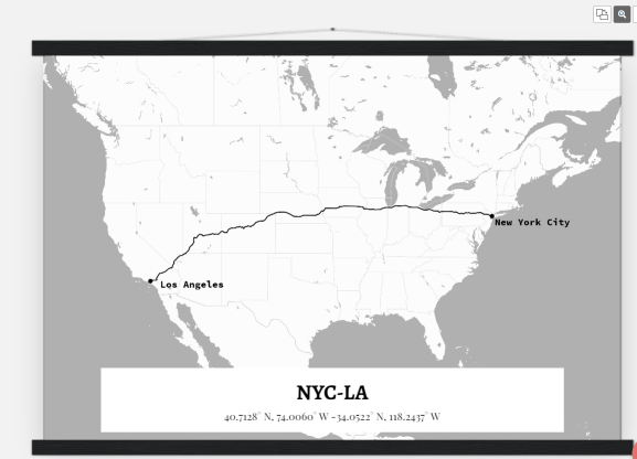
Now lets compare it to Atlas.co:
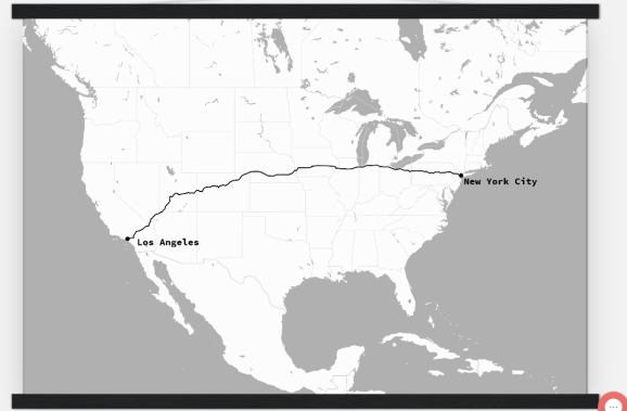
Atlas.co does look better because of the saturation, but with some theming we could get it to look the same.
Making your map an SVG file (for printing)
Now that we have the map created, we can format the map for printing. Its important to have it exported as an .svg file as this ensures your map will look crisp regardless of the size you want it.
Here is a short function I wrote for exporting your map as a .svg file:
library(webshot)
library(htmlwidgets)
library(magick)

get_route_svg<-function(viz, svg_name="Rplot.svg", zoom=3){
  # Saving the html generated
  saveWidget(viz, "temp.html", selfcontained = FALSE)

  webshot("temp.html",
          cliprect = "viewport",
          zoom=zoom,
          file = "Rplot.png") %>%
    image_read() %>%
    image_convert(format='svg') %>%
    image_write('Rplot.svg')

  file.remove("temp.html")
  file.remove("Rplot.png")
  print(paste(svg_name,"written in",getwd()))
}

get_route_svg(viz)
After that you are ready to have your map printed locally or online!
You could tweak the map with another platform as well, this is what I made with Canva.com:

Compared to Atlas.co
Conclusion
This was pretty fun to do. I never got a chance to learn how to use leaflet and with less than 100 lines of code its possible to make beautiful visuals. It is possible to make this into a full blown application with an end to end solution for creating custom maps and printing them with Shiny, but for now I’ll leave that for another time.
Thank you for reading my blog! For more intricate and pretty maps, be sure to check out Atlas.co!

Want to see more of my content?
Be sure to subscribe and never miss an update!
R-bloggers.com offers daily e-mail updates about R news and tutorials about learning R and many other topics. Click here if you're looking to post or find an R/data-science job.
Want to share your content on R-bloggers? click here if you have a blog, or here if you don't.