
Excess Deaths in 2020
Want to share your content on R-bloggers? click here if you have a blog, or here if you don't.
Prompted by a guest visit to Mine Çetinkaya-Rundel’s Advanced Data Visualization class here at Duke, I’ve updated my US and state excess death graphs. Earlier posts (like this one from February) will update as well.
I am interested in all-cause mortality in the United States for 2020. I look at each jurisdiction, ordered by how far off its 2015-2019 average it was in 2020.

All-cause mortality by jurisdiction.
The zero-percent line in this graph is average deaths between 2015 and 2015. For each jurisdiction, the grey dots show how far above or below its average each year from 2015 to 2019 was. Because zero represents each jurisdiction’s mean, the grey points are distributed around it. The blue bar shows a range of plus or minus two standard deviations from this mean. The red triangle is where each jurisdiction ended up in 2020, again in comparison to its own average over the previous five years. It’s clear that the pandemic was quite devastating across the country.
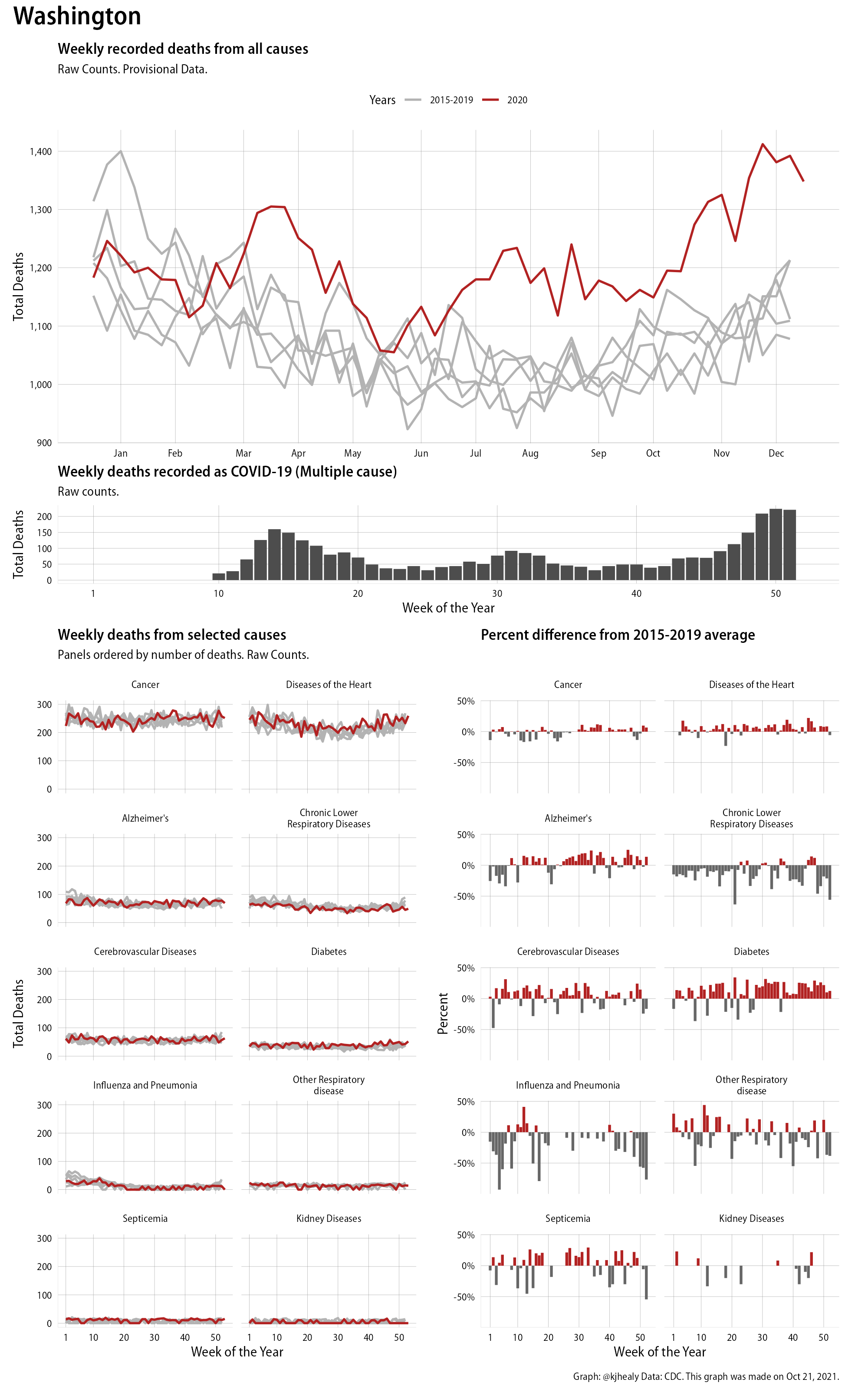
Next, here’s a dashboard-style overview of weekly mortality in 2020 for the whole of the United States, based on CDC data as of October 21st, 2021. We look at a few different things at once here.

An overview of mortality in the US in 2020
This figure has four sections. At the top is the weekly count of deaths from all causes in the United States. Counts for 2020 are highlighted in red. In gray are the equivalent counts for the years 2015 to 2019. If you’re not familiar with mortality data of this sort, one thing that will jump out at you is its strongly seasonal character. People are more likely to die in the Winter than in the Summer. You’ll also note the relative stability of these patterns, which we exploit to draw the graph. The grey lines over the past five years are pretty steady, as the ordinary cycle of things continues. They provide the baseline for the graph—that is, the thing we’re comparing the red line of 2020 to. (This is why we don’t extend the y-axis to zero: no-one thinks that there are years in the United States when no-one dies.) It’s this patterned character to the data that lets us infer excess mortality, too.
Not everything is fixed, of course. Even absent a pandemic, some years are worse than others. For example, the flu season in the Winter of 2017-2018 was exceptionally severe and is the reason there’s a high peak for one of the gray lines. The severity of the flu is easy to underestimate.
The second section shows the count of COVID-related deaths from week to week. The bars show the “COVID-19 (U071, Multiple Cause of Death)” ICD code.
The bottom left panel shows the same weekly data as the upper panel, but broken out by major cause of death. When looking at these panels, perhaps the most important thing to bear in mind is that individual deaths may be recorded as having more than one cause.
Causes are ordered from highest to lowest by prevalence, with Malignant Neoplasms (that is, cancer) and heart disease being the leading causes in the country in these data. The bottom right panel shows the CDC’s own calculation of the percentage difference between each cause of death so far this year as compared to its average in the five previous years. The ordering of the panels is the same, from highest to lowest overall number of deaths. But because the column charts show weekly changes, you can see where excess deaths are being registered within each cause. I present straight counts here, but the CDC has some modeled estimates of excess deaths due to COVID-19. These estimates attempt to account for the reporting lags that we are still experiencing. For details, consult their dashboards.
The data for these figures comes from the CDC and is available in covdata, a data package of mine that bundles up this and other data in a way that will be useful to researchers and students who use R for data analysis. The plots were made using ggplot2. Changing the extension of any image from .png to .pdf will get you a PDF of the graph.
A gallery of excess mortality summaries for every jurisdiction the CDC tracks
This gallery contains pictures that are the same as the one above, but there is one for every jurisdiction that the CDC tracks. Click or touch a thumbnail to see the full version and browse the gallery of images. Trend lines for these counts, especially when broken out by cause, will be noisier the smaller the population of the jurisdiction.


R-bloggers.com offers daily e-mail updates about R news and tutorials about learning R and many other topics. Click here if you're looking to post or find an R/data-science job.
Want to share your content on R-bloggers? click here if you have a blog, or here if you don't.