
The hidden diagnostic plots for the lm object
Want to share your content on R-bloggers? click here if you have a blog, or here if you don't.
When plotting an lm object in R, one typically sees a 2 by 2 panel of diagnostic plots, much like the one below:
set.seed(1)
x <- matrix(rnorm(200), nrow = 20)
y <- rowSums(x[,1:3]) + rnorm(20)
lmfit <- lm(y ~ x)
summary(lmfit)
par(mfrow = c(2, 2))
plot(lmfit)

This link has an excellent explanation of each of these 4 plots, and I highly recommend giving it a read.
Most R users are familiar with these 4 plots. But did you know that the plot() function for lm objects can actually give you 6 plots? It says so right in the documentation:

We can specify which of the 6 plots we want when calling this function using the which option. By default, we are given plots 1, 2, 3 and 5. Let’s have a look at what plots 4 and 6 are.
Plot 4 is of Cook’s distance vs. observation number (i.e. row number). Cook’s distance is a measure of how influential a given observation is on the linear regression fit, with a value > 1 typically indicating a highly influential point. By plotting this value against row number, we can see if highly influential points exhibit any relationship to their position in the dataset. This is useful for time series data as it can indicate if our fit is disproportionately influenced by data from a particular time period.
Here is what plot 4 might look like:
plot(lmfit, which = 4)

Plot 6 is of Cook’s distance against (leverage)/(1 – leverage). An observation’s leverage must fall in the interval ![[0,1]](https://s0.wp.com/latex.php?latex=%5B0%2C1%5D&bg=ffffff&%23038;fg=333333&%23038;s=0 "[0,1]")
Here is what plot 6 might look like:
plot(lmfit, which = 6)
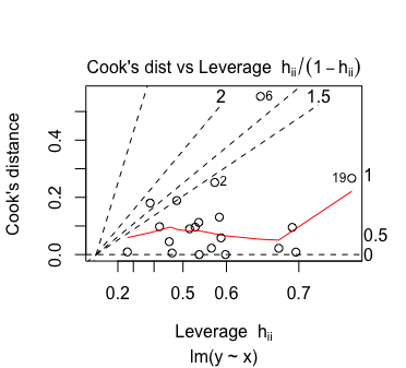
I’m not too sure how one should interpret this plot. As far as I know, one should take extra notice of points with high leverage and/or high Cook’s distance. So any observation in the top-left, top-right or bottom-right corner should be taken note of. If anyone knows of a better way to interpret this plot, let me know!
R-bloggers.com offers daily e-mail updates about R news and tutorials about learning R and many other topics. Click here if you're looking to post or find an R/data-science job.
Want to share your content on R-bloggers? click here if you have a blog, or here if you don't.