
Couplings of Normal variables
Want to share your content on R-bloggers? click here if you have a blog, or here if you don't.
Hi,
Just to play a bit with the gganimate package, and to celebrate National Coupling Day, the above plot shows different couplings of two univariate Normal distributions, Normal(0,1) and Normal(2,1). That is, each point is a pair (x,y) where x follows a Normal(0,1) and y follows a Normal(2,1). Below I’ll recall briefly how each coupling operates, in the Normal case. The code is available at the end of the post.
To create the plots, x-values were drawn from a Normal(0,1) distribution and kept fixed. Only the y-values change from a coupling to the next.
The optimal transport coupling is the simplest here. The y-values are simply defined by y = x + 2, i.e. they are translated by 2, the difference between the means of Normal(0,1) and Normal(2,1). It leads to the smallest expected value for the distance between y and x, over all couplings of the given Normals. The multivariate Normal case is well explained in this blog post by Djalil Chafaï.
The reflection coupling is also simple. Each point is reflected with respect to the midpoint between the means. Here it just amounts to defining y = 2 – x. Reflection couplings can be used to study stochastic processses, for instance multivariate diffusions as in this important 1986 paper by Lindvall and Rogers, and this more recent one by Eberle in 2016.
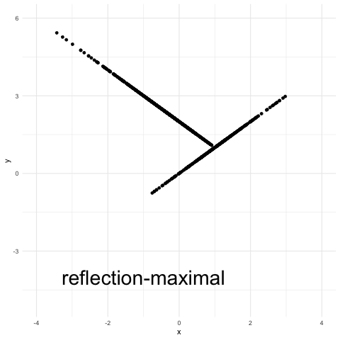
A variant of the reflection coupling, termed “reflection-maximal” coupling in the above plot, appears in this recent study of Hamiltonian Monte Carlo by Bou-Rabee, Eberle and Zimmer. It’s a maximal coupling with a reflection element to it (see Eq. (15) in that article for a precise definition). Essentially, there is an attempt at accepting x as a draw from a Normal(2,1). If this does not succeed, then y is defined as 2 – x (a reflection). The procedure is a maximal coupling because the probability of the event {x = y} is maximal over all possible couplings.
Finally the coupling referred to as “maximal coupling” in the plot is obtained with the procedure described in this earlier post. It is also a maximal coupling (these are not unique), but the distribution of y given that “y is not x” is independent of x.
That’s it! The code is below.
library(ggplot2)
library(gganimate)
set.seed(1)

# normal means
mu1 <- 0
mu2 <- 2
# std deviation
sigma <- 1
# number of samples
nsamples <- 1000
# reflection-maximal coupling
reflmax_samples <- matrix(nrow = nsamples, ncol = 2)
# draw x components first
reflmax_samples[,1] <- rnorm(nsamples)
# this follows the notation of Bou-Rabee et al, 2018, roughly
z <- mu1 - mu2
normz <- sqrt(sum(z^2))
e <- z / normz
utilde <- runif(nsamples, 0, 1)
accepts <- (log(utilde) < (dnorm(e * reflmax_samples[,1] + normz, 0, 1, log = TRUE) - dnorm(e*reflmax_samples[,1], log = TRUE)))
eta <- reflmax_samples[,1]
eta[accepts] <- reflmax_samples[accepts,1] + z
eta[!accepts]<- reflmax_samples[!accepts,1] - 2 * (e * reflmax_samples[!accepts,1]) * e
reflmax_samples[,2] <- mu2 + eta

df <- data.frame(coupling = rep("reflection-maximal", nsamples), x = reflmax_samples[,1], y = reflmax_samples[,2])

# reflection coupling
refl_samples <- matrix(0, nrow = nsamples, ncol = 2)
refl_samples[,1] <- reflmax_samples[,1]
refl_samples[,2] <- (mu2-mu1)-refl_samples[,1]

df <- rbind(df, data.frame(coupling = rep("reflection", nsamples), x = refl_samples[,1], y = refl_samples[,2]))

# optimal transport coupling
transport_samples <- matrix(0, nrow = nsamples, ncol = 2)
transport_samples[,1] <- reflmax_samples[,1]
transport_samples[,2] <- mu2 - mu1 + transport_samples[,1]

df <- rbind(df, data.frame(coupling = rep("optimal transport", nsamples), x = transport_samples[,1], y = transport_samples[,2]))

# max coupling
max_samples <- matrix(0, nrow = nsamples, ncol = 2)
max_samples[,1] <- reflmax_samples[,1]
dp <- function(x) dnorm(x, mean = mu1, sd = 1, log = TRUE)
dq <- function(x) dnorm(x, mean = mu2, sd = 1, log = TRUE)
rq <- function(n) rnorm(n, mean = mu2, sd = 1)
for (isample in 1:nsamples){
x <- max_samples[isample,1]
if (dp(x) + log(runif(1)) < dq(x)){
max_samples[isample,2] <- x
} else {
reject <- TRUE
y <- NA
while (reject){
y <- rq(1)
reject <- (dq(y) + log(runif(1)) < dp(y))
}
max_samples[isample,2] <- y
}
}
df <- rbind(df, data.frame(coupling = rep("maximal", nsamples), x = max_samples[,1], y = max_samples[,2]))

## Scatter plots and marginals
# ggplot(df, aes(x=x, y=y, group = coupling, colour = factor(coupling))) +
# geom_point()+
# theme_minimal() + viridis::scale_color_viridis(discrete=T)
#
# ggplot(df, aes(x=x, group = coupling, fill = factor(coupling))) + geom_histogram(aes(y = ..density..), position = position_dodge()) +
# theme_minimal() + viridis::scale_fill_viridis(discrete=T)
#
# ggplot(df, aes(x=y, group = coupling, fill = factor(coupling))) + geom_histogram(aes(y = ..density..), position = position_dodge()) +
# theme_minimal() + viridis::scale_fill_viridis(discrete=T)

# gganimate

ggplot(df, aes(x = x, y = y)) + xlim(-4, 4) + ylim(-5, 6) +
geom_point()+ geom_text(data = data.frame(coupling = unique(df$coupling)), aes(label = coupling, x = -1, y = -4), size = 10) +
theme_minimal() +
transition_states(coupling, 3, 1)
R-bloggers.com offers daily e-mail updates about R news and tutorials about learning R and many other topics. Click here if you're looking to post or find an R/data-science job.
Want to share your content on R-bloggers? click here if you have a blog, or here if you don't.