
Creating figures like the paper ‘Completeness of Digital Accessible Knowledge of Plants of Ghana’ Part 4
Want to share your content on R-bloggers? click here if you have a blog, or here if you don't.
This is the fourth part of the of the post where are going to create figure 4 Plot of Inventory Completeness against sample size for grid cells. Part 3 of this series we created chronohorogram for understanding seasonality by year of the data records.
If you have not already done so, please follow steps in Part 1 of the post to set up the data. Since this functionality was recently added to package bdvis, make sure you have v 0.2.9 or higher installed on your system.
The first step to generate this plot will be to compute completeness of the data. Package bdvis provides us with a handy function for that, as long as we want to compute the completeness for a degree grid. This was partially covered in an earlier blog post.
comp = bdcomplete(occ)
This command would return a completeness data matrix called comp and generate a plot of inventory completeness values (c) versus number of spices observed (sobs) in the data set as follows.
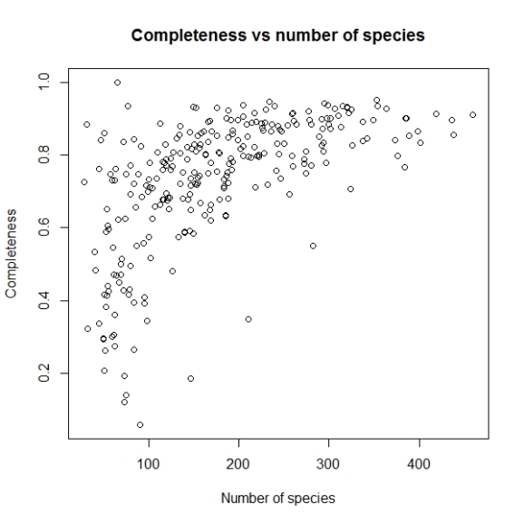
head(comp)

   Cell_id nrec   Sobs  Sest      c
 1 35536   3436   243   276.3514  0.8793151
 2 35537   4315   299   318.7432  0.9380592
 3 35538   518    152   187.4118  0.8110483
 4 35896   17148  320   343.9483  0.9303724
 5 35897   7684   300   338.8402  0.8853732
 6 35898   865    169   216.7325  0.7797632
The data returned has cell identification numbers, number of records per cell, number of observed and estimated species and the completeness coefficient (c).
The default cut off number of records per grid cell is 50, but let us set that to 100 so we can filter out some grid cells which are data deficient.
comp = bdcomplete(occ, recs=100)
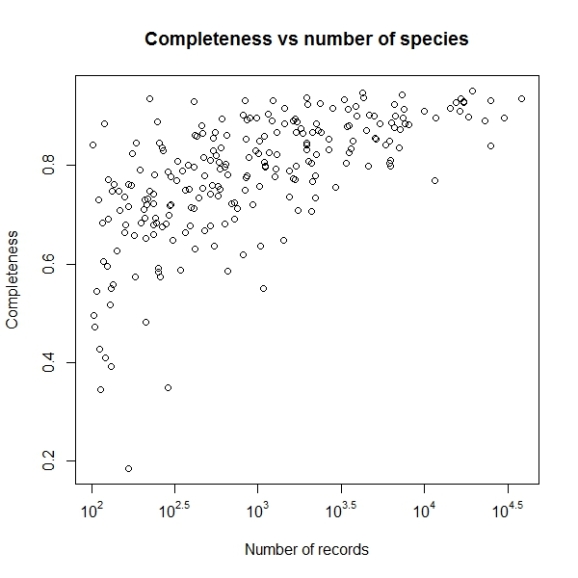
The graph we want to plot is Inventory Completeness (c) against sample size for grid cells (nrec) and not the one provided by default.
plot(comp$nrec, comp$c, main="Completeness vs number of species",
     xlab="Number of species", ylab="Completeness")
Will produce a graph like this:
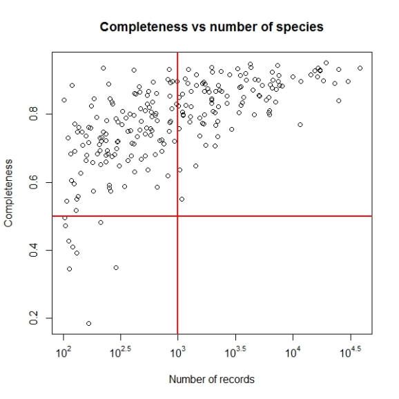
The problem with this graph is since there is very high variation in number of records per grid cell, majority of points having less than 5000 records are getting mixed up. So let us use log scale for number of records.
plot(log10(comp$nrec), comp$c, main="Completeness vs number of species",
     xlab="Number of species", ylab="Completeness")
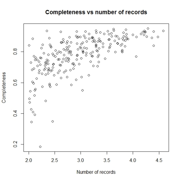
Now this looks better. Let us change the x axis labels to some sensible values, to make this graph easy to understand. For that we will remove the current x axis labels by using xaxt parameter and then construct and add the tick marks and values associated.
plot(log10(comp$nrec),comp$c,main="Completeness vs number of species",
     xlab="Number of records",ylab="Completeness",xaxt="n")
atx <- axTicks(1)
labels <- sapply(atx,function(i) as.expression(bquote(10^ .(i))))
axis(1,at=atx,labels=labels)
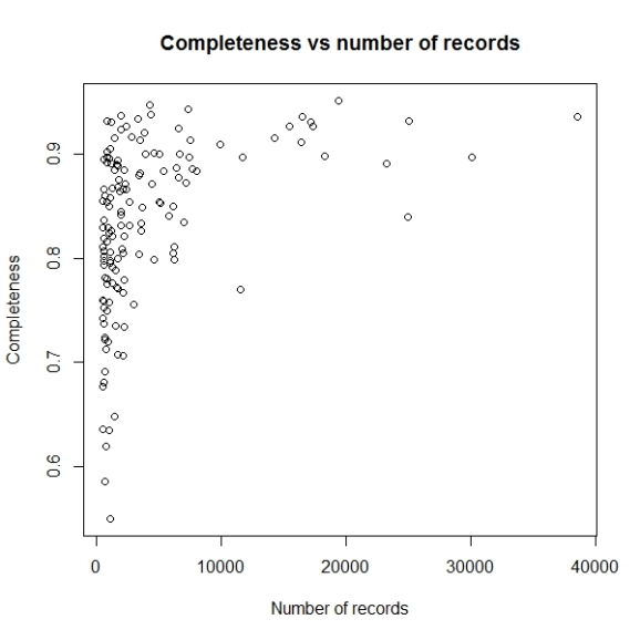
Not let us add the lines to denote the cut off values of completeness we want to consider i.e. higher than 0.5 as inventory completeness values for cells having number of records greater than 1000.
abline(h = 0.5, v = 3, col = "red", lwd = 2)
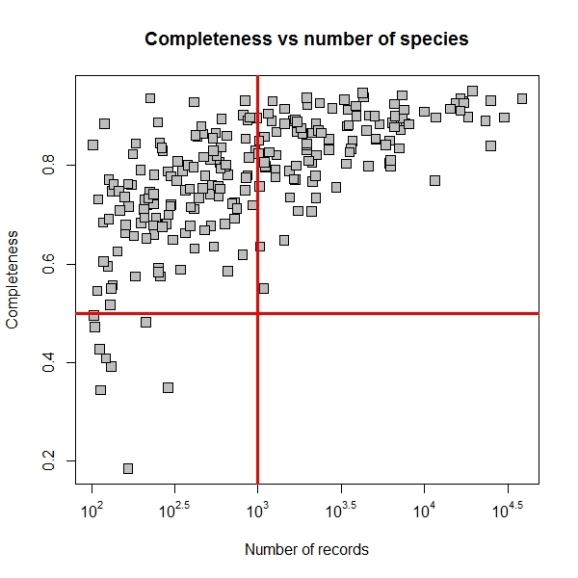
Now we may set the point size and shape to match the figure in paper by using pch and cex parameters. The final plot code will be as follows:
plot(log10(comp$nrec),comp$c,main="Completeness vs number of species",
     xlab="Number of records",ylab="Completeness",xaxt="n",
     pch=22, bg="grey", cex=1.5)
atx <- axTicks(1)
labels <- sapply(atx,function(i) as.expression(bquote(10^ .(i))))
axis(1,at=atx,labels=labels)
abline(h = 0.5, v = 3, col = "red", lwd = 3)
If you have suggestions on improving the features of package bdvis please post them in issues in Github repository and any questions or comments about this post, please poth them here.
References
- Asase, Alex, and A Townsend Peterson. 2016. “Completeness of Digital Accessible Knowledge of Plants of Ghana.” Biodiversity Informatics, 1–11. doi:http://dx.doi.org/10.17161/bi.v11i0.5860.
- Barve, Vijay, and Javier Otegui. 2016. “Bdvis: Visualizing Biodiversity Data in R.” Bioinformatics. doi:http://dx.doi.org/10.1093/bioinformatics/btw333.

R-bloggers.com offers daily e-mail updates about R news and tutorials about learning R and many other topics. Click here if you're looking to post or find an R/data-science job.
Want to share your content on R-bloggers? click here if you have a blog, or here if you don't.