
Pipe-friendly workflow with sjPlot, sjmisc and sjstats, part 1 #rstats #tidyverse
Want to share your content on R-bloggers? click here if you have a blog, or here if you don't.
Recent development in R packages are increasingly focussing on the philosophy of tidy data and a common package design and api. Tidy data is an important part of data exploration and analysis, as shown in the following figure:
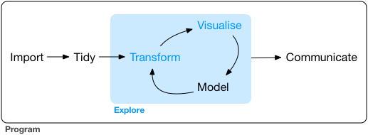
Tidying data not only includes data cleaning, but also data transformation, both being necessary to perform the core steps of data analysis and visualization. This is a complex process, which involves many steps. You need many packages and functions to perfom those tasks. This is where a common package design and api comes into play: „A powerful strategy for solving complex problems is to combine many simple pieces“, says the tidyverse manifesto. For a coding workflow, this means:
- compose single functions with the pipe
- design your API so that it is easy to use by humans
The latter bullet point is helpful to achieve the first bullet point.
The sj-packages, namely sjPlot (data visualization), sjmisc (labelled data and data transformation) and sjstats (common statistical functions, also for regression modelling), are revised accordingly, to follow this design philosophy (as far as possible and feasible).
Pipe-friendly functions and tidy data
The „pipe-operator“ (%>%) was introduced by the magrittr-package and aims at a semantical change of your code, making reading and writing code more intuive. The %>% simply takes the left-hand side of an input and puts its result as first argument to the right-hand side.
library(sjmisc)
library(magrittr) # for pipe
data(efc)
# show head (first 6 observations) of efc-data
efc %>% head()
When doing data „tidying“ and transformation, the result of a left-hand side function is usually a data frame (for instance, when working with packages like dplyr or tidyr). Hence, the first argument of a function following the tidyverse-philosophy should always be the data.
In this blog post, I’ll focus on some functions of the sjPlot-package.
Using sjPlot in a pipe-workflow
The sjPlot-package for data visualization (see comprehensive documentation here) already included some functions that required the data as first argument (e.g. sjp.likert() or sjp.pca()). Other commonly used function, however, do not follow this design: sjp.frq() requires a vector, and sjp.xtab() requires two vectors, but no data frame, impossible to seamlessly integrate in a pipe-workflow.
library(sjmisc)
data(efc)
sjp.frq(efc$c172code)

The sjplot()-function
On the other hand, to quickly create figures for data exploration, it is often more feasible to just pass a vector to a function, instead of a prepared data frame. For this reason, I decided not to revise these functions and change their argument-structure. Instead, the latest sjPlot-update got a new wrapper function, sjplot(), which allows an easy integration of sjPlot-functions into a pipe-workflow. Since sjplot() is generic, you have to specify the plot-function via the fun-argument. The following code gives you the same figure as above:
library(sjmisc)
library(dplyr)
data(efc)
efc %>%
  select(c172code) %>%
  sjplot()
Functions that require multiple vectors as input – like sjp.scatter() or sjp.grpfrq() – work in the same manner:
efc %>%
  select(e17age, c172code, c161sex) %>%
  sjplot(fun = "scatter")
efc %>%
  select(e17age, c172code) %>%
  sjplot(fun = "grpfrq",
         type = "box",
         geom.colors = "Set1")

The plot_grid() function
Another convenient function is plot_grid(), which arranges multiple plots into a single grid-layout plot.
efc %>%
  select(e42dep, c172code, e16sex, c161sex) %>%
  sjplot() %>%
  plot_grid()

This function also accepts plot lists that are returned by some of the package’s function, which create multiple plots. It is an alternative to facetting plots. For example, plotting marginal effects of model predictors, by default arranges the plots in a facet-grid:
fit <- lm(tot_sc_e ~ c12hour + e17age +
          e42dep + neg_c_7, data = efc)
# plot marginal effects, as facet grid
sjp.lm(fit, type = "eff")

One disadvantage is the common axis-scale – all scales are continuous, although „dependency“ is a factor. Using plot_grid() solves this problem:
# plot marginal effects for each
# predictor, each as single plot
p <- sjp.lm(fit, type = "eff",
            facet.grid = FALSE,
            prnt.plot = FALSE)
# "p" has an element "$plot.list", which
# will automatically be used by plot_grid
plot_grid(p)

Final words
These were some examples of how to use the sjPlot-package in a pipe-workflow. Feel free to add your comments, further suggestions, either here or (preferably) at GitHub.
The next posting will cover new aspects of the sjmisc and sjstats packages.
Tagged: data visualization, ggplot, R, rstats, sjPlot, tidyverse

R-bloggers.com offers daily e-mail updates about R news and tutorials about learning R and many other topics. Click here if you're looking to post or find an R/data-science job.
Want to share your content on R-bloggers? click here if you have a blog, or here if you don't.