
Tools in Tandem – SQL and ggplot. But is it Really R?
Want to share your content on R-bloggers? click here if you have a blog, or here if you don't.
Increasingly I find that I have fallen into using not-really-R whilst playing around with Formula One stats data. Instead, I seem to be using a hybrid of SQL to get data out of a small SQLite3 datbase and into an R dataframe, and then ggplot2 to render visualise it.
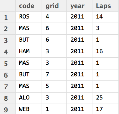
So for example, I’ve recently been dabbling with laptime data from the ergast database, using it as the basis for counts of how many laps have been led by a particular driver. The recipe typically goes something like this – set up a database connection, and run a query:
#Set up a connection to a local copy of the ergast database
library(DBI)
ergastdb = dbConnect(RSQLite::SQLite(), './ergastdb13.sqlite')

#Run a query
q='SELECT code, grid, year, COUNT(l.lap) AS Laps
    FROM (SELECT grid, raceId, driverId from results) rg,
        lapTimes l, races r, drivers d
    WHERE rg.raceId=l.raceId AND d.driverId=l.driverId
          AND rg.driverId=l.driverId AND l.position=1 AND r.raceId=l.raceId
    GROUP BY grid, driverRef, year
    ORDER BY year'

driverlapsledfromgridposition=dbGetQuery(ergastdb,q)
In this case, the data is table that shows for each year a count of laps led by each driver given their grid position in corresponding races (null values are not reported). The data grabbed from the database is based into a dataframe in a relatively tidy format, from which we can easily generate a visualisation of it.
The chart I have opted for is a text plot faceted by year:
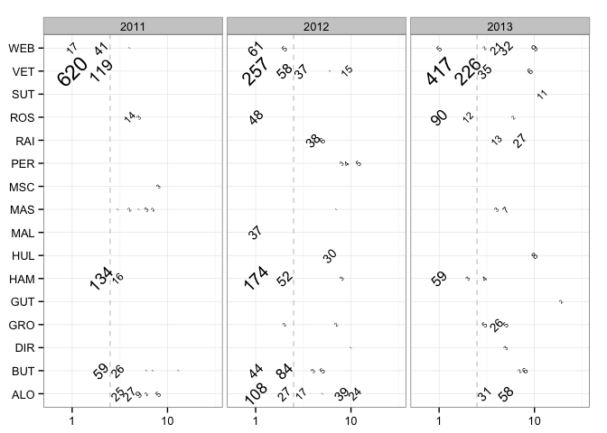
The count of lead laps for a given driver by grid position is given as a text label, sized by count, and rotated to mimimise overlap. The horizontal grid is actually a logarithmic scale, which “stretches out” the positions at the from of the grid (grid positions 1 and 2) compared to positions lower down the grid – where counts are likely to be lower anyway. To try to recapture some sense of where grid positions lay along the horizontal axis, a dashed vertical line at grid position 2.5 marks out the front row. The x-axis is further expanded to mitigate against labels being obfuscated or overflowing off the left hand side of the plotting area. The clean black and white theme finished off the chart.
g = ggplot(driverlapsledfromgridposition)
g = g + geom_vline(xintercept = 2.5, colour='lightgrey', linetype='dashed')
g = g + geom_text(aes(x=grid, y=code, label=Laps, size=log(Laps), angle=45))
g = g + facet_wrap(~year) + xlab(NULL) + ylab(NULL) + guides(size=FALSE)
g + scale_x_log10(expand=c(0,0.3)) + theme_bw()
There are still a few problems with this graphic, however. The order of labels on the y-axis is in alphabetical order, and would perhaps be more informative if ordered to show championship rankings, for example.
However, to return to the main theme of this post, whilst the R language and RStudio environment are being used as a medium within which this activity has taken place, the data wrangling and analysis (in the sense of counting) is being performed by the SQL query, and the visual representation and analysis (in the sense of faceting, for example, and generating visual cues based on data properties) is being performed by routines supplied as part of the ggplot library.
So if asked whether this is an example of using R for data analysis and visualisation, what would your response be? What does it take for something to be peculiarly or particularly an R based analysis?
For more details, see the “Laps Completed and Laps Led” draft chapter and the Wrangling F1 Data With R book.

R-bloggers.com offers daily e-mail updates about R news and tutorials about learning R and many other topics. Click here if you're looking to post or find an R/data-science job.
Want to share your content on R-bloggers? click here if you have a blog, or here if you don't.