
Quantitative Finance applications in R – 8
Want to share your content on R-bloggers? click here if you have a blog, or here if you don't.
The latest in a series by Daniel Hanson
Introduction
Correlations between holdings in a portfolio are of course a key component in financial risk management. Borrowing a tool common in fields such as bioinformatics and genetics, we will look at how to use heat maps in R for visualizing correlations among financial returns, and examine behavior in both a stable and down market.
While base R contains its own heatmap(.) function, the reader will likely find the heatmap.2(.) function in the R package gplots to be a bit more user friendly. A very nicely written companion article entitled A short tutorial for decent heat maps in R (Sebastian Raschka, 2013), which covers more details and features, is available on the web; we will also refer to it in the discussion below.
We will present the topic in the form of an example.
Sample Data
As in previous articles, we will make use of R packages Quandl and xts to acquire and manage our market data. Here, in a simple example, we will use returns from the following global equity indices over the period 1998-01-05 to the present, and then examine correlations between them:
S&P 500 (US)
RUSSELL 2000 (US Small Cap)
NIKKEI (Japan)
HANG SENG (Hong Kong)
DAX (Germany)
CAC (France)
KOSPI (Korea)
First, we gather the index values and convert to returns:
library(xts)
library(Quandl)

my_start_date <- "1998-01-05"
SP500.Q <- Quandl("YAHOO/INDEX_GSPC", start_date = my_start_date, type = "xts")
RUSS2000.Q <- Quandl("YAHOO/INDEX_RUT", start_date = my_start_date, type = "xts")
NIKKEI.Q <- Quandl("NIKKEI/INDEX", start_date = my_start_date, type = "xts")
HANG_SENG.Q <- Quandl("YAHOO/INDEX_HSI", start_date = my_start_date, type = "xts")
DAX.Q <- Quandl("YAHOO/INDEX_GDAXI", start_date = my_start_date, type = "xts")
CAC.Q <- Quandl("YAHOO/INDEX_FCHI", start_date = my_start_date, type = "xts")
KOSPI.Q <- Quandl("YAHOO/INDEX_KS11", start_date = my_start_date, type = "xts")

# Depending on the index, the final price for each day is either
# "Adjusted Close" or "Close Price".  Extract this single column for each:
SP500 <- SP500.Q[,"Adjusted Close"]
RUSS2000 <- RUSS2000.Q[,"Adjusted Close"]
DAX <- DAX.Q[,"Adjusted Close"]
CAC <- CAC.Q[,"Adjusted Close"]
KOSPI <- KOSPI.Q[,"Adjusted Close"]
NIKKEI <- NIKKEI.Q[,"Close Price"]
HANG_SENG <- HANG_SENG.Q[,"Adjusted Close"]

# The xts merge(.) function will only accept two series at a time.
# We can, however, merge multiple columns by downcasting to *zoo* objects.
# Remark:  "all = FALSE" uses an inner join to merge the data.
z <- merge(as.zoo(SP500), as.zoo(RUSS2000), as.zoo(DAX), as.zoo(CAC),
           as.zoo(KOSPI), as.zoo(NIKKEI), as.zoo(HANG_SENG), all = FALSE)

# Set the column names; these will be used in the heat maps:
myColnames <- c("SP500","RUSS2000","DAX","CAC","KOSPI","NIKKEI","HANG_SENG")
colnames(z) <- myColnames

# Cast back to an xts object:
mktPrices <- as.xts(z)

# Next, calculate log returns:
mktRtns <- diff(log(mktPrices), lag = 1)
head(mktRtns)
mktRtns <- mktRtns[-1, ]  # Remove resulting NA in the 1st row
Generate Heat Maps
As noted above, heatmap.2(.) is the function in the gplots package that we will use. For convenience, we’ll wrap this function inside our own generate_heat_map(.) function, as we will call this parameterization several times to compare market conditions.
As for the parameterization, the comments should be self-explanatory, but we’re keeping things simple by eliminating the dendogram, and leaving out the trace lines inside the heat map and density plot inside the color legend. Note also the setting Rowv = FALSE, this ensures the ordering of the rows and columns remains consistent from plot to plot. We’re also just using the default color settings; for customized colors, see the Raschka tutorial linked above.
require(gplots)

generate_heat_map <- function(correlationMatrix, title)
{

  heatmap.2(x = correlationMatrix,		# the correlation matrix input
            cellnote = correlationMatrix	# places correlation value in each cell
            main = title,			# heat map title
            symm = TRUE,			# configure diagram as standard correlation matrix
            dendrogram="none",		# do not draw a row dendrogram
            Rowv = FALSE,			# keep ordering consistent
            trace="none",			# turns off trace lines inside the heat map
            density.info="none",		# turns off density plot inside color legend
            notecol="black")		# set font color of cell labels to black

}
Next, let’s calculate three correlation matrices using the data we have obtained:
- Correlations based on the entire data set from 1998-01-05 to the present
- Correlations of market indices during a reasonably calm period -- January through December 2004
- Correlations of falling market indices in the midst of the financial crisis - October 2008 through May 2009
# Convert each to percent format
corr1 <- cor(mktRtns) * 100
corr2 <- cor(mktRtns['2004-01/2004-12']) * 100
corr3 <- cor(mktRtns['2008-10/2009-05']) * 100
Now, let’s call our heat map function using the total market data set:
generate_heat_map(corr1, "Correlations of World Market Returns, Jan 1998 - Present")
And then, examine the result:
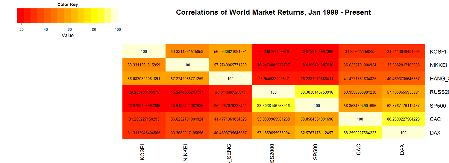
As expected, we trivially have correlations of 100% down the main diagonal. Note that, as shown in the color key, the darker the color, the lower the correlation. By design, using the parameters of the heatmap.2(.) function, we set the title with the main = title parameter setting, and the correlations shown in black by using the notecol="black" setting.
Next, let’s look at a period of relative calm in the markets, namely the year 2004:
generate_heat_map(corr2, "Correlations of World Market Returns, Jan - Dec 2004")
This gives us:
generate_heat_map(corr2, "Correlations of World Market Returns, Jan - Dec 2004")
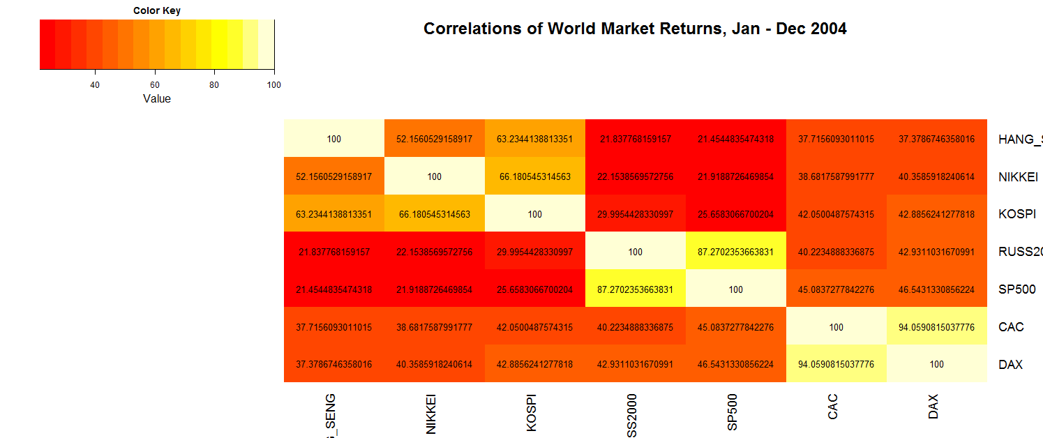
Note that in this case, at a glance of the darker colors in each of the cells, we can see that we have even lower correlations than those from our entire data set. This may of course be verified by comparing the numerical values.
Finally, let’s look at the opposite extreme, during the upheaval of the financial crisis in 2008-2009:
generate_heat_map(corr3, "Correlations of World Market Returns, Oct 2008 - May 2009")
This yields the following heat map:
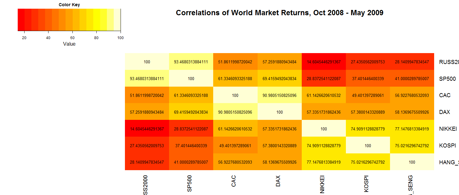
Note that in this case, again just at first glance, we can tell the correlations have increased compared to 2004, by the colors changing from dark to light nearly across the board. While there are some correlations that do not increase all that much, such as the SP500/Nikkei and the Russell 2000/Kospi values, there are others across international and capitalization categories that jump quite significantly, such as the SP500/Hang Seng correlation going from about 21% to 41%, and that of the Russell 2000/DAX moving from 43% to over 57%. So, in other words, portfolio diversification can take a hit in down markets.
Conclusion
In this example, we only looked at seven market indices, but for a closer look at how correlations were affected during 2008-09 -- and how heat maps among a greater number of market sectors compared -- this article, entitled Diversification is Broken, is a recommended and interesting read.
R-bloggers.com offers daily e-mail updates about R news and tutorials about learning R and many other topics. Click here if you're looking to post or find an R/data-science job.
Want to share your content on R-bloggers? click here if you have a blog, or here if you don't.