
The aesthetics of error bars
[This article was first published on Psychological Statistics, and kindly contributed to R-bloggers]. (You can report issue about the content on this page here)
Want to share your content on R-bloggers? click here if you have a blog, or here if you don't.
This blog and my other main blog (the companion blog for my book) are now syndicated via R-bloggers (posts tagged R only) and statsblogs.com. The latter is a relatively new blog aggregator but looks to have some interesting content. R-bloggers it quite well established and I was already an occasional reader.Want to share your content on R-bloggers? click here if you have a blog, or here if you don't.
Looking at some recent content I noticed an interesting piece by Ben Bolker (author, among other things, of the excellent bbmle package in R) on dynamite plots. Until a few years ago (possibly in the early research for my book) I had not heard the term ‘dynamite plot’ or the negative press the attract in some research fields. In my own discipline (psychology) and in experimental psychology in particular bar plots with error bars (looking like sticks of dynamite stacked in a row) are rather popular. In fact, I was taught to use them in preference to dot plots when plotting interactions in ANOVA (their main application in experimental psychology). The main arguments against dot plots are that it is easy to manipulate them to make effects look large large by adjusting the scale (and sometimes software does this automatically). The advantage of switching to a bar plot is that these are supposed to be zero-referenced and thus effects are likely to more appropriately scaled.
Here is an example of a dynamite plot adapted from chapter 3 of my book:
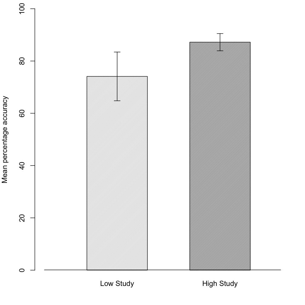
(Colleagues of mine will note that the quantity displayed by the error bars is not labeled. This should always be clear from plot or figure caption – here they are 95% CIs).
Some of the material on dynamite plots on the web is somewhat one-sided (e.g., see here, here, here or the comments here). Ben Bolker bravely presents a more balanced picture. He also gets to the heart of the issue by noting that most criticisms of dynamite plots suggest box plots or plots of raw data as alternatives. This doesn’t seem appropriate if your goal is inference rather than description. As Bolker notes, if you’ve decided to something like ANOVA you are already implicitly assuming approximate normality of the errors and so forth. Thus if the main purpose of the plot is inferential or to display key patterns among the data, box plots or raw data plots are not so useful. (Don’t get me wrong I think think that plotting raw data is a good idea – but exploratory work and model checking are different from inference). So for a plot of means with error bars, the choice of dot plot or bar plot is one of aesthetics. These days my preference is for dot plots (which are more versatile and have a better information to ink ratio), but I think a well constructed dynamite plot can be appropriate in some situations. I would usually save these for a situation in which the pattern was quite simple (e.g., a 2 by 2 interaction), there was a meaningful zero or other reference point and when my audience are familiar with this style of plot and may prefer them.
A further aesthetic point here is how to plot the error bars themselves. I am persuaded by Andrew Gelman’s argument that the crossbars on conventional error bar plots are ugly and counterproductive. They draw your attention to the extremes of the error bar – when values closer to the statistic being estimated are more plausible. Here is the earlier dyamite plot redrawn as a conventional error bar plot and in cleaner Gelman-approved style:


In my paper on within-subject CIs I used the style on the left. However, with hindsight I wish I’d included the style on the right. Varying the width of the bars avoids the ugly crossbars but may make detecting a ‘statistically significant’ difference trickier. I think that aesthetics win here because graphical methods aim to support informal inference – they are not supposed to be there for fine-grain, formal inference (which can be supported by formal hypothesis tests of various kinds – not just null hypothesis significance tests).
UPDATE: The functions for these plots are on the book blog. More generally my functions for the book, CIs for ANOVA and a few other things are all available here. I plan to update these functions regularly to add functionality and deal with any undocumented features.
To leave a comment for the author, please follow the link and comment on their blog: Psychological Statistics.
R-bloggers.com offers daily e-mail updates about R news and tutorials about learning R and many other topics. Click here if you're looking to post or find an R/data-science job.
Want to share your content on R-bloggers? click here if you have a blog, or here if you don't.