Fun Editing R Graphs in Inkscape
Want to share your content on R-bloggers? click here if you have a blog, or here if you don't.
Last week, I read a chapter out of Visualize This by Nathan Yau. I was, of course, delighted to see that he was championing the use of R. One really cool thing that I learned from his book, and was very surprised about, was that you can export an R graph in PDF form and then easily edit individual elements of the graph in Adobe Illustrator.
Ever since I started making graphs in R, I always assumed that they were essentially “flat” images, where if you wanted to edit them you’d have to use an eraser tool and then redraw components laboriously. However, opening up a graph in PDF format (and I now also presume SVG format as well), you can select individual elements of the graph, and fine tune their look very nicely.
The disadvantage for me, when thinking about Adobe Illustrator, is the price! Thankfully you can usually find an open source alternative. He mentions this of course, by saying you can also use Inkscape. Perhaps deferring to Adobe Illustrator enthusiasts, however, he doesn’t go farther than that, and all examples are in Illustrator.
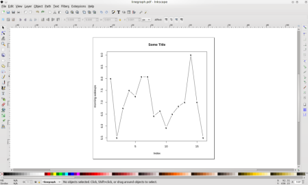
So, I decided to do my own example, and post here! I took some time series data that I wrote about in a previous post and made a very simple plot. The only graphing code I used was effectively this: plot(timeseriesvariable, type=’b’, main=”Some Title”) . Nice and simple, right? I then exported to PDF and opened it in Inkscape. Here’s what it looked like when I opened it up in Inkscape:
Pretty basic looking at this point. One oddity was that the q’s in the plot are actually supposed to be circles! Anyway, next I selected the x axis label and changed the text, and the font to make it look a bit nicer:
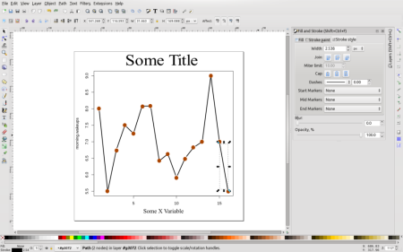
For the next few steps, I increased the width of the line segments, changed the title size and font, and added brown circles where the q’s were. I learned a neat trick for placing the circles: After you place the first one, right click on it and click copy, then move your mouse cursor to where you want another one to be, then type CTRL-V, and the circle will show up exactly in the spot of your mouse cursor point.
For the next steps, I selected the box that encompasses the chart area and deleted it. Then I selected each numeric value along the Y axis and rotated them (using the little curved purple arrows near the top left of the screen). This is similar to what Nathan shows you in his book. Now it’s looking pretty nice!
Finally, I inserted a new layer, and made a light gray box for the layer, and pushed that layer to the back of the original layer so that it forms a nice newspaper-y background (again, a-la Nathan). I also changed the text and font of the Y axis. Here’s a “finished” product:
And there you have it! You can save the new image into whatever format you want, and distribute! That was a lot of fun. I didn’t have to use a heck of a lot of R code and my finished product looks pretty fancy. Most importantly, it was all done with free software that can be installed on Linux, Windows or Mac.
R-bloggers.com offers daily e-mail updates about R news and tutorials about learning R and many other topics. Click here if you're looking to post or find an R/data-science job.
Want to share your content on R-bloggers? click here if you have a blog, or here if you don't.


