

Want to share your content on R-bloggers? click here if you have a blog, or here if you don't.
Making a bad chart < svg class="anchor-symbol" aria-hidden="true" height="26" width="26" viewBox="0 0 22 22" xmlns="http://www.w3.org/2000/svg"> < path d="M0 0h24v24H0z" fill="currentColor"> < path d="M3.9 12c0-1.71 1.39-3.1 3.1-3.1h4V7H7c-2.76.0-5 2.24-5 5s2.24 5 5 5h4v-1.9H7c-1.71.0-3.1-1.39-3.1-3.1zM8 13h8v-2H8v2zm9-6h-4v1.9h4c1.71.0 3.1 1.39 3.1 3.1s-1.39 3.1-3.1 3.1h-4V17h4c2.76.0 5-2.24 5-5s-2.24-5-5-5z">
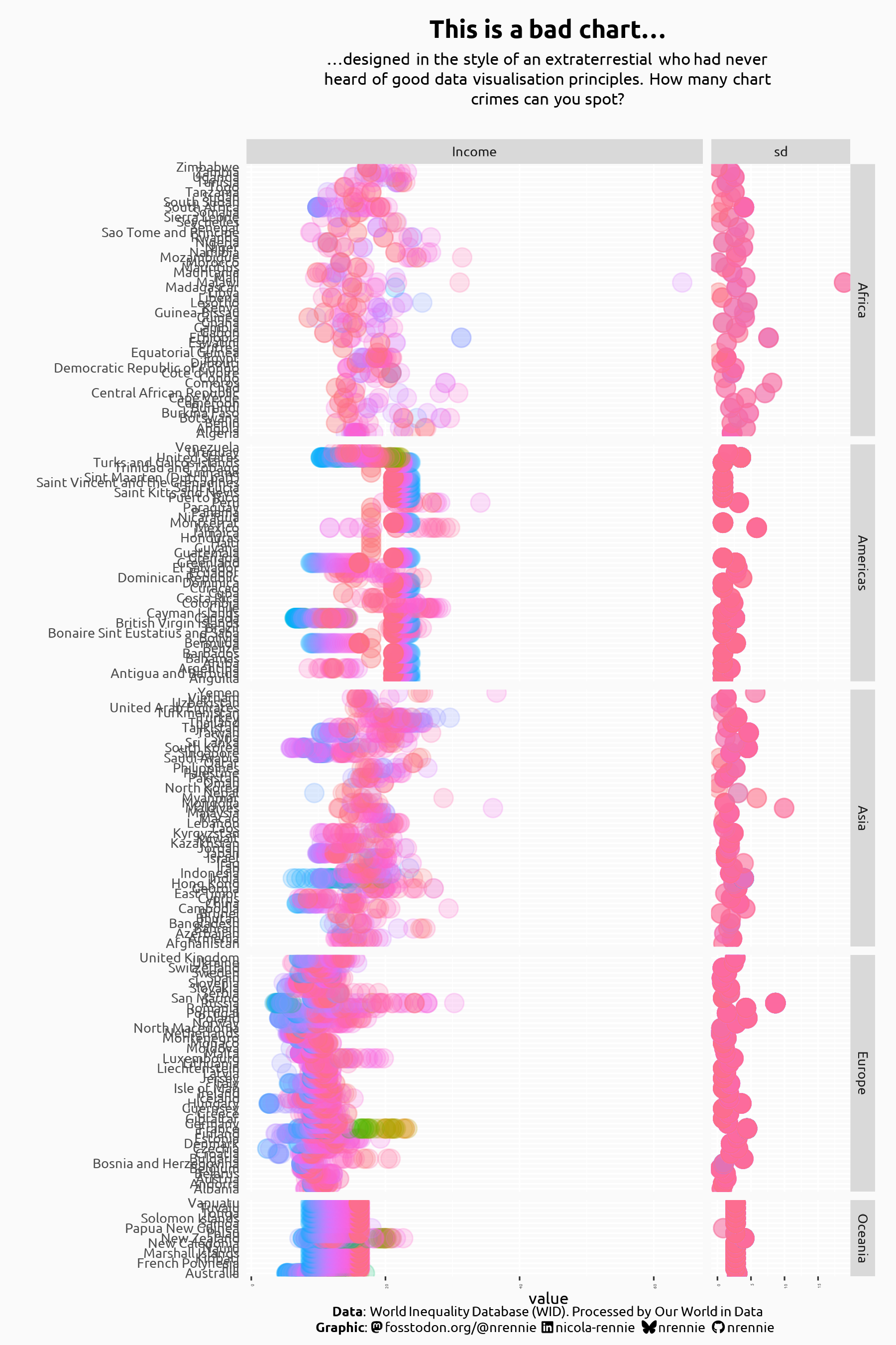
As part of the 30 Day Chart Challenge in April 2025, I made a (deliberately) bad chart, which didn’t follow any data visualisation best practices:
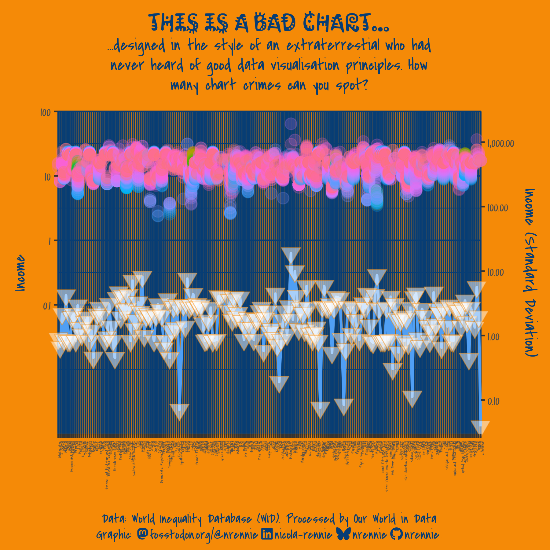
There are many things wrong with this chart, to list just some of them:
-
Structural elements
- It uses a logarithmic scale
- There is a dual y-axis…
- …and it’s not clear which set of data maps to which axis!
- There’s a lot of data in there.
-
Aesthetic elements
- It hurts your eyes! The colours are garish and painful to look at.
- The s are difficult to read.
- The sizes are very small, especially for the x-axis.
- The rainbow colour palette is hard to interpret and not accessible.
Not all of these bad chart elements are always bad. For example, there might be some cases when a logarithmic scale is appropriate if well-designed. However, the way these elements are used in this example are particularly bad.
Data < svg class="anchor-symbol" aria-hidden="true" height="26" width="26" viewBox="0 0 22 22" xmlns="http://www.w3.org/2000/svg"> < path d="M0 0h24v24H0z" fill="currentColor"> < path d="M3.9 12c0-1.71 1.39-3.1 3.1-3.1h4V7H7c-2.76.0-5 2.24-5 5s2.24 5 5 5h4v-1.9H7c-1.71.0-3.1-1.39-3.1-3.1zM8 13h8v-2H8v2zm9-6h-4v1.9h4c1.71.0 3.1 1.39 3.1 3.1s-1.39 3.1-3.1 3.1h-4V17h4c2.76.0 5-2.24 5-5s-2.24-5-5-5z">
The data used in this example is from Our World in Data on income inequality represented by the share of income received by the richest 1% of the population.
Applying best practices < svg class="anchor-symbol" aria-hidden="true" height="26" width="26" viewBox="0 0 22 22" xmlns="http://www.w3.org/2000/svg"> < path d="M0 0h24v24H0z" fill="currentColor"> < path d="M3.9 12c0-1.71 1.39-3.1 3.1-3.1h4V7H7c-2.76.0-5 2.24-5 5s2.24 5 5 5h4v-1.9H7c-1.71.0-3.1-1.39-3.1-3.1zM8 13h8v-2H8v2zm9-6h-4v1.9h4c1.71.0 3.1 1.39 3.1 3.1s-1.39 3.1-3.1 3.1h-4V17h4c2.76.0 5-2.24 5-5s-2.24-5-5-5z">
We’re going to go through a series of steps and apply best practices to improve this chart. Before jumping in to making a chart, we need to know what we’re aiming to communicate. Here, we might want to show the change in income inequality over time for different countries. We might also want to focus in on something more specific e.g. biggest increases over time, a specific continent, or most recent values.
Step 1: Fix the colours and s < svg class="anchor-symbol" aria-hidden="true" height="26" width="26" viewBox="0 0 22 22" xmlns="http://www.w3.org/2000/svg"> < path d="M0 0h24v24H0z" fill="currentColor"> < path d="M3.9 12c0-1.71 1.39-3.1 3.1-3.1h4V7H7c-2.76.0-5 2.24-5 5s2.24 5 5 5h4v-1.9H7c-1.71.0-3.1-1.39-3.1-3.1zM8 13h8v-2H8v2zm9-6h-4v1.9h4c1.71.0 3.1 1.39 3.1 3.1s-1.39 3.1-3.1 3.1h-4V17h4c2.76.0 5-2.24 5-5s-2.24-5-5-5z">
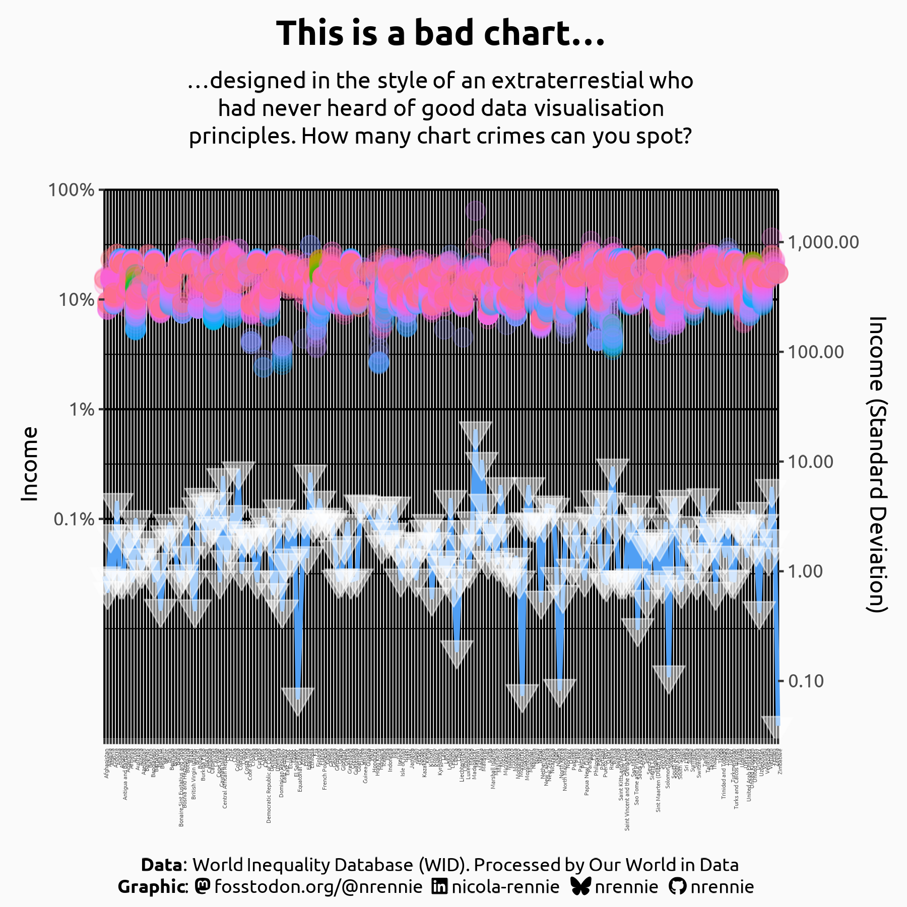
Although the garish background colour and gaudy text are probably not the most pressing issues with this chart, they are the main reasons it hurts my eyes to look at it. Since I don’t want to look at it any longer than I have to (and assume you don’t either), let’s go ahead and deal with that first.
-
Colours: We replace the bright orange with a very light grey colour (white also works, but using something slightly off-white makes it easier see where the edge of the plot is against a white editor background). The blue text colour is also replaced with black to maximise contrast.
-
Font: The unusual title , and handwriting-style make it difficult to read. We replace both with a simple, sans serif that is easier to read.
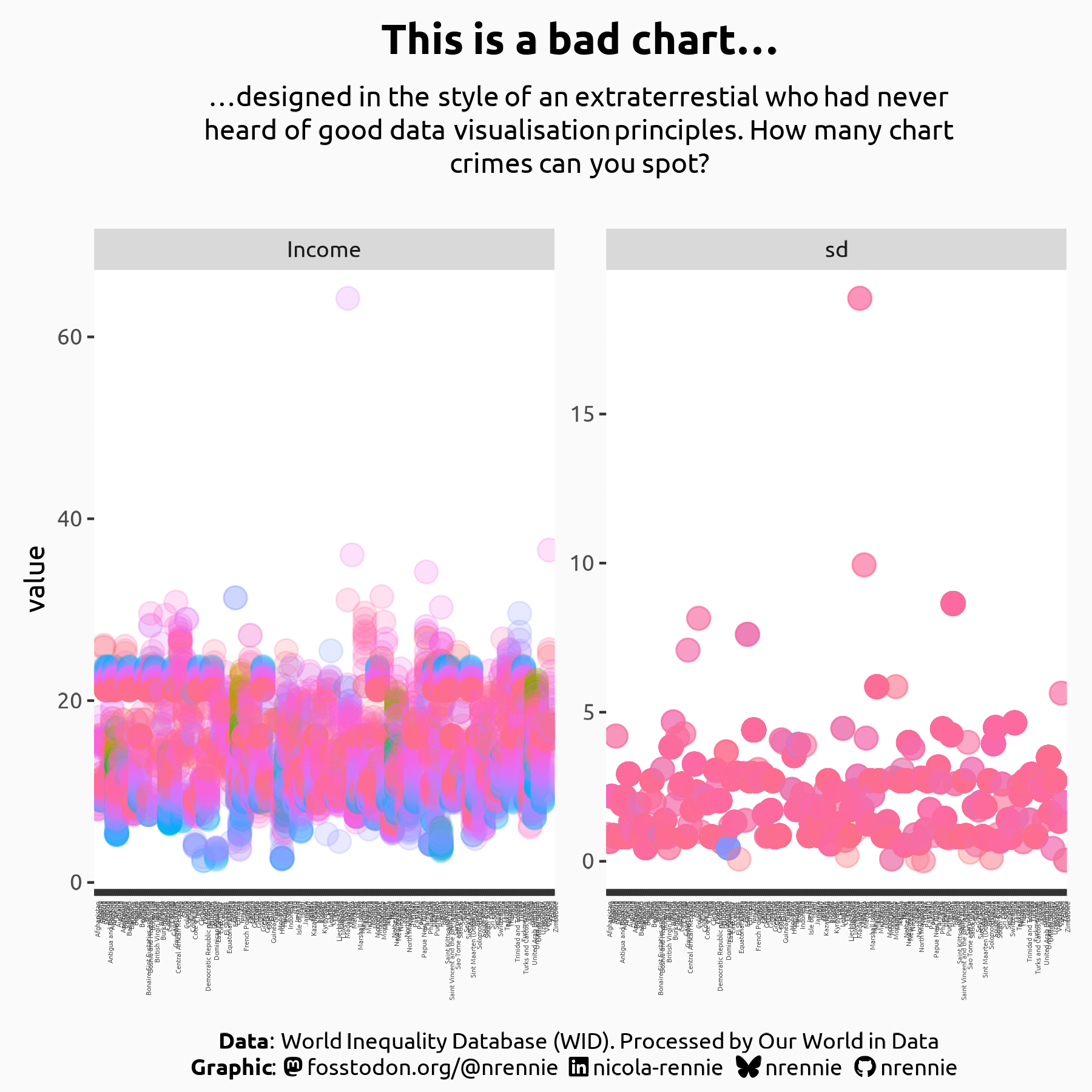
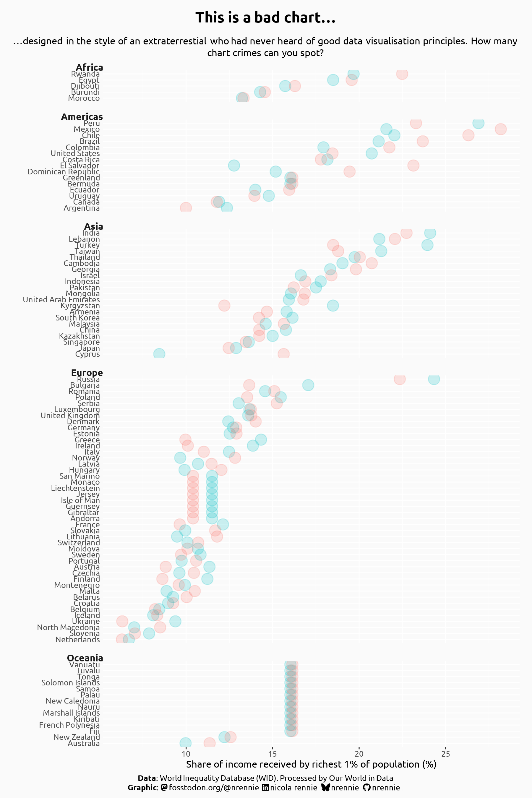
Step 2: Choose appropriate scales < svg class="anchor-symbol" aria-hidden="true" height="26" width="26" viewBox="0 0 22 22" xmlns="http://www.w3.org/2000/svg"> < path d="M0 0h24v24H0z" fill="currentColor"> < path d="M3.9 12c0-1.71 1.39-3.1 3.1-3.1h4V7H7c-2.76.0-5 2.24-5 5s2.24 5 5 5h4v-1.9H7c-1.71.0-3.1-1.39-3.1-3.1zM8 13h8v-2H8v2zm9-6h-4v1.9h4c1.71.0 3.1 1.39 3.1 3.1s-1.39 3.1-3.1 3.1h-4V17h4c2.76.0 5-2.24 5-5s-2.24-5-5-5z">
The biggest problem with this chart is the choice of y axes. It commits a double crime of having a dual y-axis, and using (different) log scales on both. Dual axes are almost always a poor choice of chart design because the choice of transformation for the secondary axis is entirely arbitrary but can hugely impact how the plot is interpreted. In this case, it’s also impossible to tell which points belong to which axis. Logarithmic scales are also difficult to interpret because their multiplicative nature means they can which can hide or exaggerate patterns.
-
Split into two: Rather than using two axes to show two variables, we instead use two separate plots i.e. small multiple scatter charts. One chart shows the income values, and the other shows the standard deviation with labels indicating which one is which.
-
Use a linear scale: We use a linear scale instead of logarithmic to make interpretation easier. In these small multiple plots, we also allow the range of each y-axis to vary since they show variables with quite different ranges.
-
Remove grid lines: There are too many grid lines in the background, making it difficult to read. We’ll remove these for now, and then consider which ones we may need to add back in later.
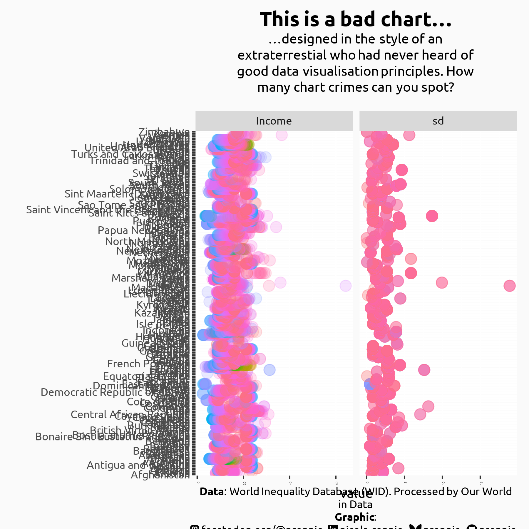
Step 3: Place categories on y-axis < svg class="anchor-symbol" aria-hidden="true" height="26" width="26" viewBox="0 0 22 22" xmlns="http://www.w3.org/2000/svg"> < path d="M0 0h24v24H0z" fill="currentColor"> < path d="M3.9 12c0-1.71 1.39-3.1 3.1-3.1h4V7H7c-2.76.0-5 2.24-5 5s2.24 5 5 5h4v-1.9H7c-1.71.0-3.1-1.39-3.1-3.1zM8 13h8v-2H8v2zm9-6h-4v1.9h4c1.71.0 3.1 1.39 3.1 3.1s-1.39 3.1-3.1 3.1h-4V17h4c2.76.0 5-2.24 5-5s-2.24-5-5-5z">
The current x-axis labels are categorical, and to avoid them overlapping with each other, they have been rotated by 90 degrees and use a very small size which makes them exceptionally difficult to read.
-
Place categories on the y-axis: We place categorical labels on the y-axis to allow them to use a horizontal text layout and give a more comfortable reading experience.
-
Increase size: We use a size that is large enough to be read comfortably. Unfortunately, this results in some of the text overlapping vertically.
-
Resize the plot: We make the plot larger to ensure all category labels can be read clearly and have enough space. The sizing isn’t quite perfect yet, but will likely change anyway as we make further improvements to the chart.
-
Group categories: When there are many categories, it can sometimes be beneficial to group them together. Here, we group countries into continents to make specific values easier to find.
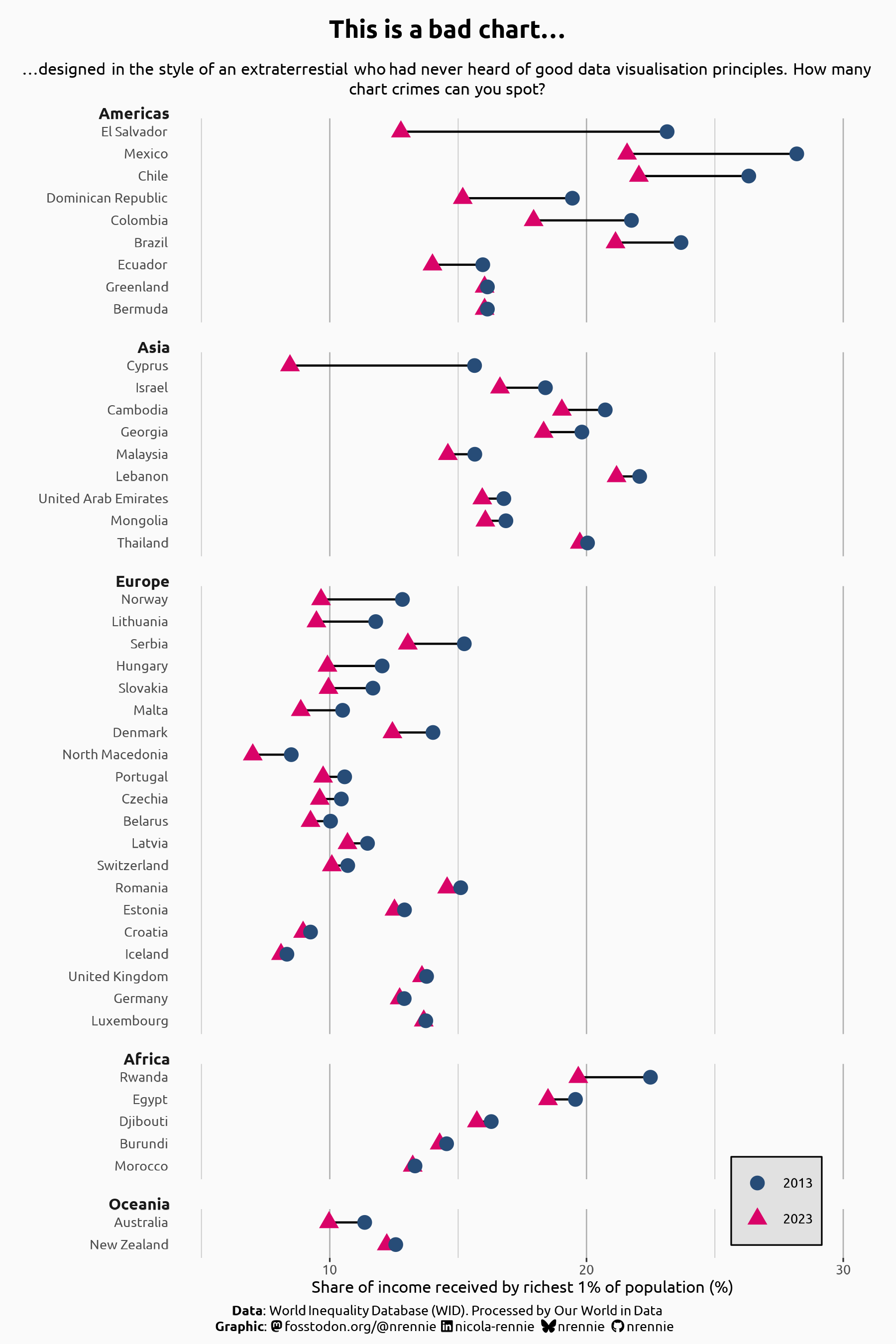
Step 4: Limit data and sort categories < svg class="anchor-symbol" aria-hidden="true" height="26" width="26" viewBox="0 0 22 22" xmlns="http://www.w3.org/2000/svg"> < path d="M0 0h24v24H0z" fill="currentColor"> < path d="M3.9 12c0-1.71 1.39-3.1 3.1-3.1h4V7H7c-2.76.0-5 2.24-5 5s2.24 5 5 5h4v-1.9H7c-1.71.0-3.1-1.39-3.1-3.1zM8 13h8v-2H8v2zm9-6h-4v1.9h4c1.71.0 3.1 1.39 3.1 3.1s-1.39 3.1-3.1 3.1h-4V17h4c2.76.0 5-2.24 5-5s-2.24-5-5-5z">
This chart is still looking very busy, and is trying to show too much data at once. We have data on the income inequality for (almost) every country, over many different years, information on the continent of each country, and we’re also trying to show the variability for each country. To tell a clearer story, we need to limit how much information goes in one chart.
-
Limit the data: In this example, we’ll limit the data to consider only the income inequality values in 2013 and 2023. Since not all countries have data available in these years, this also has the effect of reducing the number of country categories that are visualised.
-
Order categories: Although there can be arguments for alphabetical ordering of categories, this is often not the most appropriate choice (though it is often the default setting when creating charts). If there is a natural ordering to the categories (such as month of the year), it should be used. Otherwise, sorting by magnitude can be beneficial. Within each continent group, we order the countries from highest to lowest average percentage (y-axis value), and make the continent grouping clearer.
Step 5: Select colours and icons < svg class="anchor-symbol" aria-hidden="true" height="26" width="26" viewBox="0 0 22 22" xmlns="http://www.w3.org/2000/svg"> < path d="M0 0h24v24H0z" fill="currentColor"> < path d="M3.9 12c0-1.71 1.39-3.1 3.1-3.1h4V7H7c-2.76.0-5 2.24-5 5s2.24 5 5 5h4v-1.9H7c-1.71.0-3.1-1.39-3.1-3.1zM8 13h8v-2H8v2zm9-6h-4v1.9h4c1.71.0 3.1 1.39 3.1 3.1s-1.39 3.1-3.1 3.1h-4V17h4c2.76.0 5-2.24 5-5s-2.24-5-5-5z">
By considering what data we’re presenting, and portraying it more clearly, we’ve identified a few potential data issues. There are several countries in Europe (and similarly in Oceania) which all have identical values. These warrant some further investigation to check if they are genuine, or perhaps imputed values. As that isn’t the topic of this blog post, we’ll discard these values for now. There is an argument that the chart is still too busy looking, so we’ll further limit the data to look only at countries where the inequality has decreased between 2013 and 2023. You can imagine a second chart, designed in the same way.
-
Connect the dots: Moving from a simple scatter chart to dumbbell plots makes it easier to compare changes for different countries.
-
Choose better colours: Removing the semi-transparency makes the circles easier to see, and choosing bolder colours improves contrast against the background. We also add a legend to define the years
-
Don’t rely on colour: Not everyone perceives colours in the same way, and relying on colour alone to differentiate categories can make your chart inaccessible to some readers. Although there is an argument that this is unnecessary when considering only increasing values over time (since the blue is always to the right of the pink), we use triangles and circles to also differentiate the years, with a legend is added as well.
Step 6: Use text to add context < svg class="anchor-symbol" aria-hidden="true" height="26" width="26" viewBox="0 0 22 22" xmlns="http://www.w3.org/2000/svg"> < path d="M0 0h24v24H0z" fill="currentColor"> < path d="M3.9 12c0-1.71 1.39-3.1 3.1-3.1h4V7H7c-2.76.0-5 2.24-5 5s2.24 5 5 5h4v-1.9H7c-1.71.0-3.1-1.39-3.1-3.1zM8 13h8v-2H8v2zm9-6h-4v1.9h4c1.71.0 3.1 1.39 3.1 3.1s-1.39 3.1-3.1 3.1h-4V17h4c2.76.0 5-2.24 5-5s-2.24-5-5-5z">
The final step is to add an informative title and subtitle, rather than the placeholder bad chart text.
-
Statement title: Rather than a title that simply says what the data is, we can add a title that draws attention to either the main message, or a specific aspect of the chart we want a reader to remember.
-
Informative ubtitle: The subtitle text can be used to explain the source(s) and limitations of the data. These additional descriptions can aid a reader in interpreting the chart.
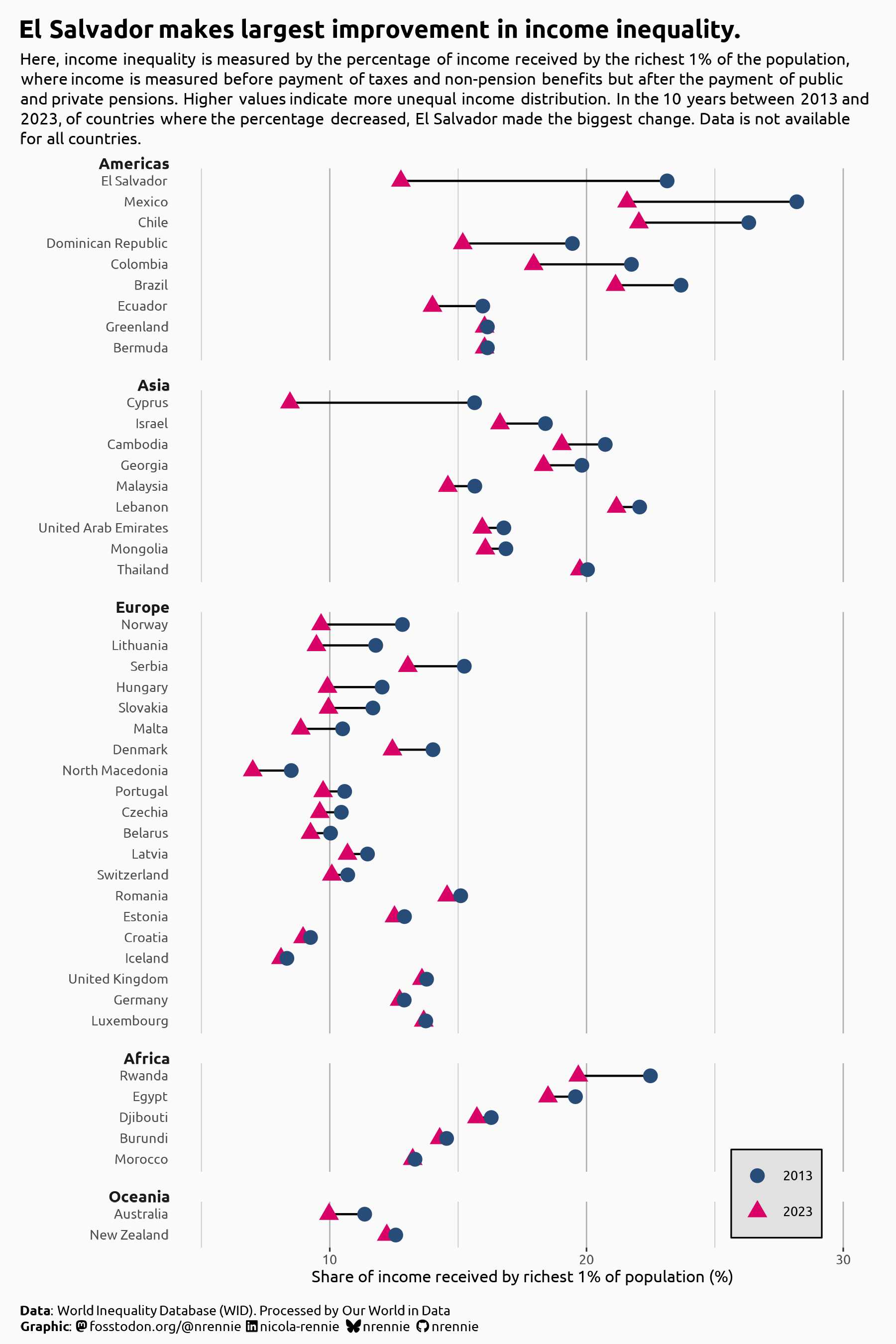
Some further annotations to highlight interesting points might also be useful to add.
Final thoughts < svg class="anchor-symbol" aria-hidden="true" height="26" width="26" viewBox="0 0 22 22" xmlns="http://www.w3.org/2000/svg"> < path d="M0 0h24v24H0z" fill="currentColor"> < path d="M3.9 12c0-1.71 1.39-3.1 3.1-3.1h4V7H7c-2.76.0-5 2.24-5 5s2.24 5 5 5h4v-1.9H7c-1.71.0-3.1-1.39-3.1-3.1zM8 13h8v-2H8v2zm9-6h-4v1.9h4c1.71.0 3.1 1.39 3.1 3.1s-1.39 3.1-3.1 3.1h-4V17h4c2.76.0 5-2.24 5-5s-2.24-5-5-5z">
This is definitely an improvement on the original chart type. However, rather than trying to fix a terrible chart, it can often be better to start from scratch. Start by thinking what you are trying to communicate, and what chart type does that best. Don’t be afraid to throw a bad chart in the bin and start again!
The code for these charts (the bad original, the interim charts, and the final version) can be found on GitHub.
R-bloggers.com offers daily e-mail updates about R news and tutorials about learning R and many other topics. Click here if you're looking to post or find an R/data-science job.
Want to share your content on R-bloggers? click here if you have a blog, or here if you don't.