

Want to share your content on R-bloggers? click here if you have a blog, or here if you don't.


The introduction of innovative tools like Shiny and Quarto has empowered researchers and data scientists to transform complex data into interactive and insightful reports. This progress is not just an improvement in data visualization but a significant leap towards a new paradigm in clinical research.
In this article, we’ll delve into the core functionalities of Shiny and Quarto and explore how we can create dynamic and interactive reports with practical examples.
Table of Contents
- Getting Started with Shiny and Quarto
- Shiny and Quarto in Clinical Research
- A Shiny Application in Quarto
- Conclusion
- Resources
- Connect with Us
Getting Started with Shiny and Quarto
Brief Introduction to Shiny and Quarto
Before we dive into the practical aspects of using Shiny and Quarto in clinical research, let’s get a brief understanding of these powerful tools:
Shiny
Shiny is an R package that empowers you to create interactive web applications with ease. It’s particularly well-suited for building interactive reports and dashboards, making it an excellent choice for presenting clinical research data in an engaging and user-friendly manner. With Shiny, you can seamlessly integrate R code with web-based user interfaces, allowing you to create interactive elements like sliders, buttons and plots that respond to user inputs in real time.
Quarto
Quarto is a dynamic document format that combines code, text and graphics into a single, cohesive document. It’s designed to make reproducible reporting and sharing of research findings straightforward. Quarto integrates with R and other programming languages, making it a valuable tool for creating dynamic clinical research reports that can be easily updated as new data becomes available.


Installation and setup instructions
To get started with Shiny and Quarto, you’ll need to set up your environment. Here’s a step-by-step guide to help you install and configure these tools:
Install R and RStudio
- If you haven’t already, download and install R from CRAN.
- Install RStudio, an integrated development environment for R, from the RStudio website.
Install Shiny
- Open RStudio.
- In the RStudio console, run the following command to install the Shiny package:
install.packages("shiny")
Install Quarto
- Go to Quarto Get Started Page.
- Download the Quarto CLI setup file according to your OS. Open the downloaded setup file to install Quarto CLI.
- Install dependencies
- Non-RStudio installation: Select your preferred IDE on the same page to see instructions.
- RStudio installation: Follow the instructions below or select RStudio on the same page and see the latest instructions from Posit.
- In the RStudio console, run the following commands to install dependencies:
install.packages("tidyverse")
install.packages("palmerpenguins")
- Download a Quarto file.
- Open the file in RStudio and click on Render button.
Create a New Shiny App
- To create a new Shiny app, go to File > New File > Shiny Web App in RStudio.
- Follow the prompts to set up your Shiny app, including choosing a directory and a name for your app.
Start a new Quarto Document
- To start a new Quarto document, you can create a plain text file with the “.quarto” extension.
- You can also use the “New File” option in RStudio and select “Quarto Document” to create a Quarto document.
- In the dialogue box, you have the option to output a Document, Presentation or Interactive webpage.

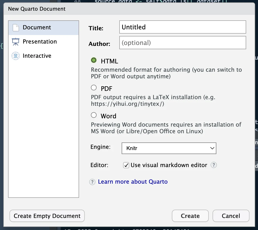
New Quarto Document Creation Interface
- For each of the sections, there are some additional inputs needed.
- Title and author are the 1st 2 inputs. Followed by the final output format. You could select the one you need and leave the engine settings to its default value.
- Finally, click on Create to create the new Quarto file.
Install Required Packages
- Depending on your specific needs, you may need to install additional R packages for data analysis, visualization, or other tasks.
- You can install packages using the install.packages() function.
Now that you have Shiny and Quarto set up, you can begin creating interactive clinical research reports and dashboards. In the following sections, we’ll delve deeper into how to harness the power of Shiny and Quarto to transform your clinical research projects.
Next, let’s explore practical examples and case studies that demonstrate their capabilities.
Wondering how open-source technology is transforming pharmaceutical data analysis? Check out this article for an in-depth look at how R Shiny is leading the way in creating more efficient and transparent research methodologies.
Shiny and Quarto in Clinical Research
Clinical Trial Analysis
In this case study, we’ll explore how Shiny and Quarto can be employed in a clinical trial setting to enhance data analysis, visualization and reporting. Clinical trials are pivotal in evaluating the safety and efficacy of new medical treatments, making them an ideal scenario for demonstrating the capabilities of these tools.
Imagine you’re conducting a clinical trial to assess the effectiveness of a new drug for treating a specific medical condition. Traditional reporting methods might involve static charts and tables that are time-consuming to update as new trial data emerges.
However, with Shiny and Quarto, you can create an interactive dashboard that allows real-time exploration of trial outcomes, ensuring that medical professionals and researchers always have access to the latest information.
A Shiny Application in Quarto
Let’s create a Quarto Shiny web application for analyzing clinical trial data using the echarts4r and reactable packages. This is a Shiny web application that analyzes clinical trial data using the echarts4r and reactable packages within the Shiny framework. It creates an interactive dashboard for exploring and visualizing clinical data.
Let’s break down the Quarto code step by step:
YAML Header
title: "Clinical Data Analysis with {echarts4r} and {reactable} in a Shiny App"
format:
  html:
    page-layout: custom
server: shiny
This specifies metadata and configuration for the document.
- The title is set to “Clinical Data Analysis with {echarts4r} and {reactable} in a Shiny App.”
- The document format is specified as an HTML page with a custom layout.
- The server is set to “shiny,” indicating that this document will be used for a Shiny web application.
R Setup Chunk
# Load your clinical trial data
remotes::install_github(
  "insightsengineering/random.cdisc.data"
)
data(
  "cadsl", package = "random.cdisc.data"
)

# Load the required libraries
library(shiny)
library(echarts4r)
library(reactable)
library(rmarkdown)
library(dplyr)
This code chunk loads the necessary data and libraries.
- We are installing a package to use sample data from the package
{random.cdisc.data} - The data is loaded to R memory
- Libraries like
{shiny},{echarts4r},{reactable},{rmarkdown}and{dplyr}are loaded to provide the required functionality.
Shiny User Interface (UI)
#| panel: sidebar
selectInput(
  "sex_filter", "Select Sex", choices = c(
    "All", unique(as.character(cadsl$SEX))
  )
)
selectInput(
  "race_filter", "Select Race", choices = c(
    "All", unique(as.character(cadsl$RACE))
  )
)
- This section defines the user interface elements of the Shiny app.
- It includes two
selectInputelements within the sidebar panel, allowing users to select a sex and a race for data filtering.
UI Panel for Data Visualization
#| panel: fill
echarts4rOutput("echarts_plot")
h4("Data used for plot")
reactableOutput("reactable_table")
- This section defines the panels for displaying data visualizations.
- It includes an echarts4r plot output
(echarts_plot)and a reactable table output(reactable_table)within the main content area.
Shiny Server Logic
#| context: server
filtered_data <- reactive({
    df <- cadsl
    if (input$sex_filter != "All") {
      df <- df[df$SEX == input$sex_filter, ]
    }
    if (input$race_filter != "All") {
      df <- df[df$RACE == input$race_filter, ]
    }
    return(df)
  })

  # ECharts4R plot
  output$echarts_plot <- renderEcharts4r({ filtered_data() |>
      group_by(DTHFL) |>
      e_charts_("AGE") |>
      e_scatter_("BMRKR1", symbol_size = 5) |>
      echarts4r::e_title("Safety Analysis") |>
      echarts4r::e_color(
        c("green", "red")
      ) |>
      echarts4r::e_legend(
        formatter = 'Death {name}'
      ) |>
      e_axis_labels("Age", "Biomarker") |>
      e_tooltip(
        formatter = JS(
          "function(params) {
          console.log(params);
          return(
          'Age: ' + params.value[0] + '' +
          'Biomarker Value: ' +
          Math.round(params.value[1]) + '' +
          'Death: ' + params.seriesName
          )}"
        )
      )
  })

  # reactable table
  output$reactable_table <- renderReactable({ filtered_data() |>
      reactable()
  })
- This part of the code defines the server-side logic for the Shiny app.
- It creates a reactive expression called
filtered_datathat filters the clinical data based on user inputs (selected sex and race). - The
renderEcharts4rfunction generates an interactive scatter plot using echarts4r based on the filtered data. The plot visualizes Age vs Biomarker value. The colours on the plot indicate whether a patient has passed away. - The renderReactable function generates an interactive table using
reactablebased on the filtered data.
This code sets up a Shiny web application that allows users to select and filter clinical trial data by sex and race, visualizing the data through an interactive scatter plot and an interactive table. The echarts4r package is used for creating the scatter plot and the reactable package is used for generating the interactive table. This interactive dashboard provides a dynamic way to explore and analyze clinical trial data.
Full Code:
---
title: "Clinical Data Analysis with {echarts4r} and {reactable} in a Shiny App"
format:
  html:
    page-layout: custom
server: shiny
---

# Load your clinical trial data
remotes::install_github(
  "insightsengineering/random.cdisc.data"
)
data(
  "cadsl", package = "random.cdisc.data"
)

# Load the required libraries
library(shiny)
library(echarts4r)
library(reactable)
library(rmarkdown)
library(dplyr)


#| panel: sidebar
selectInput(
  "sex_filter", "Select Sex", choices = c(
    "All", unique(as.character(cadsl$SEX))
  )
)
selectInput(
  "race_filter", "Select Race", choices = c(
    "All", unique(as.character(cadsl$RACE))
  )
)

#| panel: fill
echarts4rOutput("echarts_plot")
h4("Data used for plot")
reactableOutput("reactable_table")


#| context: server
filtered_data <- reactive({
    df <- cadsl
    if (input$sex_filter != "All") {
      df <- df[df$SEX == input$sex_filter, ]
    }
    if (input$race_filter != "All") {
      df <- df[df$RACE == input$race_filter, ]
    }
    return(df)
  })

  # ECharts4R plot
  output$echarts_plot <- renderEcharts4r({ filtered_data() |>
      group_by(DTHFL) |>
      e_charts_("AGE") |>
      e_scatter_("BMRKR1", symbol_size = 5) |>
      echarts4r::e_title("Safety Analysis") |>
      echarts4r::e_color(
        c("green", "red")
      ) |>
      echarts4r::e_legend(
        formatter = 'Death {name}'
      ) |>
      e_axis_labels("Age", "Biomarker") |>
      e_tooltip(
        formatter = JS(
          "function(params) {
          console.log(params);
          return(
          'Age: ' + params.value[0] + '' +
          'Biomarker Value: ' +
          Math.round(params.value[1]) + '' +
          'Death: ' + params.seriesName
          )}"
        )
      )
  })

  # reactable table
  output$reactable_table <- renderReactable({ filtered_data() |>
      reactable()
  })
Finally, click on “Run Document” at the top of the page. Then open the port where the app is deployed on your browser.

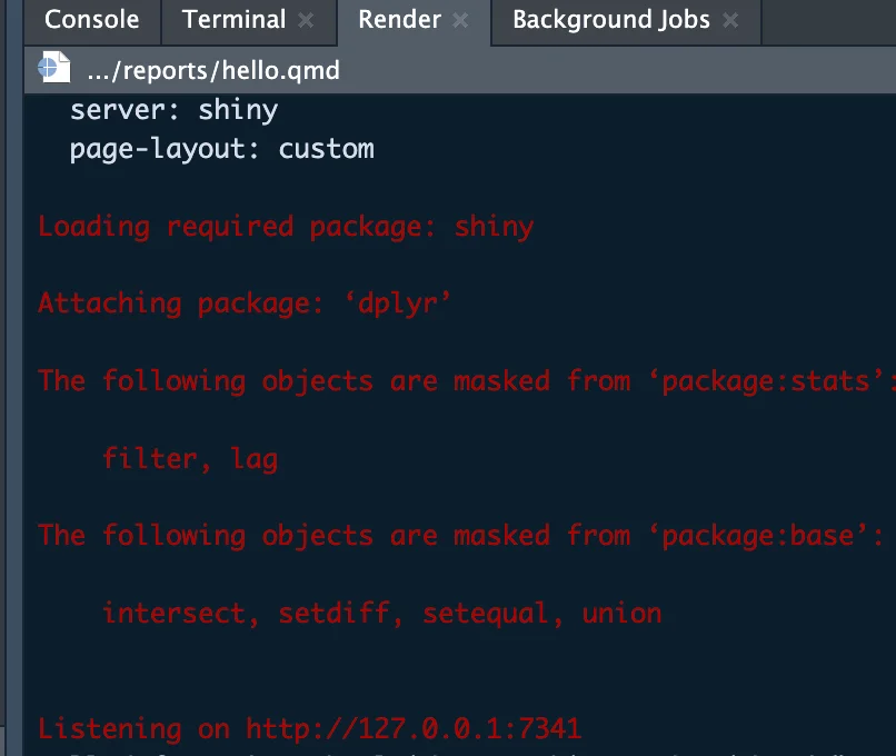
R Console Output with Shiny App Initialization
In this case, it is http://127.0.0.1:7341.
Open this link on the browser. And Voila! We have a Shiny App launched from a Quarto document. Yes, it’s that easy!
Conclusion
In our exploration of clinical research, we’ve uncovered the remarkable potential of Shiny and Quarto to revolutionize the way we collect, analyze and report data.
Clinical research, a cornerstone of medical progress, demands tools that can keep pace with the complexity of healthcare data and the urgency of patient care. Shiny and Quarto rise to this challenge with remarkable capabilities.
The transformative power of Shiny and Quarto in clinical research is undeniable. Their ability to make data come to life, facilitate collaboration and expedite decision-making is a game-changer.
The journey ahead is filled with exciting possibilities, and we encourage you to embark on it with enthusiasm and dedication. Embrace interactive reporting, explore its potential and be part of the movement that is reshaping the future of healthcare research for the betterment of all.
Resources
Shiny Resources
- Official Shiny Documentation: The official documentation provides comprehensive information on getting started with Shiny, building applications and advanced topics. You can find it at Shiny Documentation.
- Shiny Tutorial: RStudio offers a helpful Shiny tutorial that covers the basics of creating interactive web applications. You can access it at Shiny Tutorial.
- Shiny Gallery: The Shiny Gallery showcases a wide range of Shiny applications and examples, offering inspiration and practical use cases. Explore it at Shiny Gallery.
Quarto Resources
- Official Quarto Documentation: The official documentation provides detailed guidance on using Quarto for creating dynamic documents. You can find it at Quarto Documentation.
- Quarto GitHub Repository: The GitHub repository contains the latest updates, issues and community contributions related to Quarto. Visit it at Quarto GitHub Repository.
Pharmaceutical Domain Resources
- FDA’s Regulatory Guidelines: The U.S. Food and Drug Administration (FDA) provides comprehensive guidelines and regulations for pharmaceutical research and development. Access these guidelines at FDA Regulations and Guidances.
- Pharmaceutical Industry Journals: Journals such as “Nature Reviews Drug Discovery” “Clinical Pharmacology & Therapeutics” and “Pharmaceutical Research” provide valuable insights into the latest research and trends in the pharmaceutical domain.
- Pharmaceutical News and Publications: Websites like “Pharmaceutical Technology” and “Pharmaceutical Journal” offer news, articles and publications related to the pharmaceutical industry.
- ClinicalTrials.gov: This resource provides a comprehensive database of clinical trials in various therapeutic areas. It can be useful for staying updated on ongoing research. Explore it at ClinicalTrials.gov.
- Pharmaceutical Conferences and Events: Attending conferences and events in the pharmaceutical industry, such as those organized by the Drug Information Association (DIA) or the American Association of Pharmaceutical Scientists (AAPS) can provide networking opportunities and access to the latest research.
These resources should serve as valuable references for those interested in Shiny, Quarto and the pharmaceutical domain, whether you’re looking to develop interactive applications, create dynamic documents, or stay informed about industry trends and regulations.
Connect with Us
We at Appsilon are dedicated advocates of Shiny and Quarto, driven by a profound fascination for their potential in clinical research. With 10+ years of hands-on experience in utilizing these tools, we’ve witnessed their transformative capabilities in enhancing data analysis and reporting in the medical field.
If you’re eager to explore Shiny, Quarto, or have questions and insights to share, we’re here to connect, collaborate, and empower your journey.
Interested in enhancing data integrity in life sciences? Discover the role of R package validation in ensuring reliable and compliant data analysis in this detailed exploration.
The post appeared first on appsilon.com/blog/.
R-bloggers.com offers daily e-mail updates about R news and tutorials about learning R and many other topics. Click here if you're looking to post or find an R/data-science job.
Want to share your content on R-bloggers? click here if you have a blog, or here if you don't.