

Want to share your content on R-bloggers? click here if you have a blog, or here if you don't.
The pandemic continues at full speed in Turkey where I live, because the government doesn’t conduct the process well; the data they provide is so doubtful, and the decisions they made are very inconsistent. So, I wondered about the situation in the other part of the world, especially the developed countries.
In order to that, we will compare the performance of some developed countries; these are France, Germany, the United Kingdom, and the United States. The dataset for this article can be found here.
In the dataset, we have the number of new cases and new deaths per day, and the population number of related countries. In the below code block, we are replacing blank and NA data with zeros for new cases and new deaths variables. We will limit the data to only this year.
library(tidyverse)
library(lubridate)
library(readxl)
library(plotly)
library(scales)


#Preparing the dataset
data <- read_excel("covid-19_comparing.xlsx")

data %>%
  mutate(
    date=as.Date(.$date),
    new_deaths=if_else(is.na(.$new_deaths), 0, .$new_deaths),
    new_cases=if_else(is.na(.$new_cases), 0 , .$new_cases)
    ) %>%
  filter(.$date >= "2021-01-01", .$date <= "2021-04-26"  ) -> df
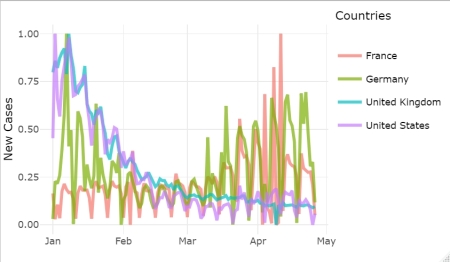
First, we will compare the number of cases per day(new_cases) but we have to scale the related variable because each country has a different population. The scaling metric we are going to use is the normalized function. I preferred the ggplotly function for ease of analysis on the graph because we can click on each legend to extract the related countries from the plot, and re-click to put it on back.
#Normalizing function
normalize <- function(x) {
  return((x - min(x)) / (max(x) - min(x)))
}

#Draw normalized results for comparising
df %>%
  group_by(location) %>%
  mutate(new_cases=normalize(new_cases)) %>%
  ggplot(aes(date,new_cases,color=location))+
  geom_line(size=1, alpha = 0.7) +
  scale_y_continuous(limits = c(0, 1))+
  guides(color=guide_legend(title="Countries"))+
  labs(x="", y="New Cases")+
  theme_minimal() -> cases_norm

ggplotly(cases_norm)
Since the beginning of the year, the spread of the disease has decreased dramatically in the UK and the USA, but the opposite has happened in France. As for Germany, it declined until March, but then their numbers rose. But in April, all countries declined radically.

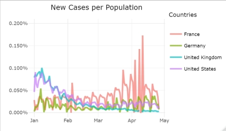
To confirm the above trends for all countries, this time we will draw the number of daily cases per population on the graph. It looks like the same trends for the countries when we examine the below plot.
#New cases per population
df %>%
  group_by(location) %>%
  mutate(casesPerPop=new_cases/population) %>%
  ggplot(aes(date,casesPerPop,color=location))+
  geom_line(size=1, alpha = 0.7) +
  scale_y_continuous(limits = c(0, 0.002),labels = percent_format())+
  guides(color=guide_legend(title="Countries"))+
  labs(x="",y="",title = "New Cases per Population")+
  theme_minimal()+
  theme(plot.title = element_text(hjust = 0.5)) -> cases_perpop

ggplotly(cases_perpop)
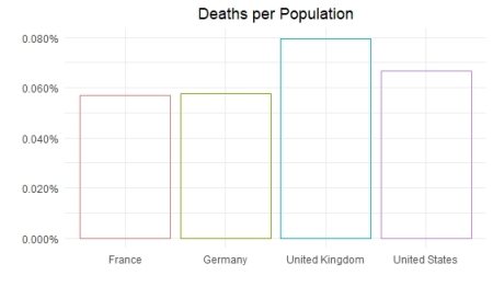
I also want to know that the death rate, in order to shed on light the health system for the related countries. To do that we will plot the death toll per population and per case amount.
#Deaths per Population
df %>%
  group_by(location) %>%
  mutate(deathsPerPop=sum(new_deaths)/population) %>%
  ggplot(aes(location,deathsPerPop,color=location))+
  geom_bar(stat = "identity",position = "identity",fill=NA)+
  scale_y_continuous(limits = c(0, NA),labels = percent_format())+
  labs(x="",y="",title = "Deaths per Population")+
  theme_minimal()+
  theme(legend.position = "none", plot.title = element_text(hjust = 0.5))
When we examine the below graph, despite the UK is better for the spread of the virus, it looks worst for the death rate per population.
#Deaths per Case
df %>%
  group_by(location) %>%
  mutate(deathsPerCase=sum(new_deaths)/sum(new_cases)) %>%
  ggplot(aes(location,deathsPerCase,color=location))+
  geom_bar(stat = "identity",position = "identity",fill=NA)+
  scale_y_continuous(limits = c(0, NA),labels = percent_format())+
  labs(x="",y="",title = "Deaths per Case")+
  theme_minimal()+
  theme(legend.position = "none", plot.title = element_text(hjust = 0.5))
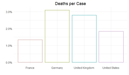
This time Germany performs worse than others. It should be noted that despite France less performed for the daily cases, it seems to have best results for both death rates.
While the effect of the pandemic decreases in developed countries, we had to be a full closure in Turkey by the government, unfortunately. As much as the virus is dangerous, bad management is also dangerous.
References
- The data source: Our World in Data
- R for Data Science: Hadley Wickham & Garrett Grolemund
- Predicting injuries for Chicago traffic crashes: Julia Silge
R-bloggers.com offers daily e-mail updates about R news and tutorials about learning R and many other topics. Click here if you're looking to post or find an R/data-science job.
Want to share your content on R-bloggers? click here if you have a blog, or here if you don't.