

Want to share your content on R-bloggers? click here if you have a blog, or here if you don't.
This is the third post about LifeCycle Grids. You can find the first post about the sense of LifeCycle Grids and A-Z process for creating and visualizing with R programming language here. Lastly, here is the second post about adding monetary metrics (customer lifetime value – CLV – and customer acquisition cost – CAC) to the LifeCycle Grids.
Even after we added CLV and CAC to the LifeCycle Grids and obtained a representative view, there is always space for improvements. The main problem is that we combined customers with different characteristics like source of attraction, actual lifetime, and other features that we can use for better analysis. Therefore, in order to make our analysis more detailed, we will study how to combine Cohort Analysis and LifeCycle Grids in this post.
The main principle of Cohort Analysis is to combine customers through some common characteristics (e.g. registration date, first purchase date, medium/source/campaign of attraction and so on). Cohort Analysis allows us to split customers into homogeneous groups. Therefore, we can obtain benefits from combining homogeneous cohorts through acquisition characteristics with the homogeneous groups (grids) through lifecycle phase.
In addition, we will assume that we have not only actual CLV (CLV to date) but also predicted CLV (potential value). This can be helpful in some cases, for example when different advertisement campaigns are targeted to various customer segments that have different behavior and potential values as a result.
We will study how to combine customers with both first purchase date cohorts and campaign cohorts and distribute them into LifeCycle Grids, which interesting perspectives we have for analyzing, and how to visualize results.
Ok, let’s start by creating data sample with the following code:
# loading libraries
library(dplyr)
library(reshape2)
library(ggplot2)
library(googleVis)

set.seed(10)
# creating orders data sample
data <- data.frame(orderId=sample(c(1:5000), 25000, replace=TRUE),
product=sample(c('NULL','a','b','c'), 25000, replace=TRUE,
prob=c(0.15, 0.65, 0.3, 0.15)))
order <- data.frame(orderId=c(1:5000),
clientId=sample(c(1:1500), 5000, replace=TRUE))
date <- data.frame(orderId=c(1:5000),
orderdate=sample((1:500), 5000, replace=TRUE))
orders <- merge(data, order, by='orderId')
orders <- merge(orders, date, by='orderId')
orders <- orders[orders$product!='NULL', ]
orders$orderdate <- as.Date(orders$orderdate, origin="2012-01-01")
rm(data, date, order)
# creating data frames with CAC, Gross margin, Campaigns and Potential CLV
gr.margin <- data.frame(product=c('a', 'b', 'c'), grossmarg=c(1, 2, 3))
campaign <- data.frame(clientId=c(1:1500),
campaign=paste('campaign', sample(c(1:7), 1500, replace=TRUE), sep=' '))
cac <- data.frame(campaign=unique(campaign$campaign), cac=sample(c(10:15), 7, replace=TRUE))
campaign <- merge(campaign, cac, by='campaign')
potential <- data.frame(clientId=c(1:1500),
clv.p=sample(c(0:50), 1500, replace=TRUE))
rm(cac)

# reporting date
today <- as.Date('2013-05-16', format='%Y-%m-%d')
As a result, we’ve obtained the following data frames:
- campaign, which includes campaign name and customer acquisition cost for each customer,
- margin, which includes gross margin for each product,
- potential, which includes potential values / predicted CLV for each client,
- orders, which includes orders from our customers with products and order dates.
We will start by calculating necessary indexes (CLV, frequency, recency, potential value, CAC and average time lapses between purchases), adding campaigns, and defining cohort features based on the first purchase date for each customer with the following code:
# calculating CLV, frequency, recency, average time lapses between purchases and defining cohorts

orders <- merge(orders, gr.margin, by='product')

customers <- orders %>%
# combining products and summarising gross margin
group_by(orderId, clientId, orderdate) %>%
summarise(grossmarg=sum(grossmarg)) %>%
ungroup() %>%
# calculating frequency, recency, average time lapses between purchases and defining cohorts
group_by(clientId) %>%
mutate(frequency=n(),
recency=as.numeric(today-max(orderdate)),
av.gap=round(as.numeric(max(orderdate)-min(orderdate))/frequency, 0),
cohort=format(min(orderdate), format='%Y-%m')) %>%
ungroup() %>%
# calculating CLV to date
group_by(clientId, cohort, frequency, recency, av.gap) %>%
summarise(clv=sum(grossmarg)) %>%
arrange(clientId)
# calculating potential CLV and CAC
customers <- merge(customers, campaign, by='clientId')
customers <- merge(customers, potential, by='clientId')
# leading the potential value to more or less real value
customers$clv.p <- round(customers$clv.p / sqrt(customers$recency) * customers$frequency, 2)

rm(potential, gr.margin, today)
Therefore, we’ve obtained the customers data frame that looks like:
clientId cohort frequency recency av.gap clv  campaign   cac  clv.p
1        2012-06    5       23      60   32  campaign 2   14  25.02
2        2012-01    2      426      36   20  campaign 4   10   4.65
3        2012-09    4       64      48   24  campaign 4   10  17.50
4        2012-03    2      286      66   25  campaign 2   14   0.24
5        2012-01    6       89      66   54  campaign 1   11  11.45
6        2012-04    5       85      64   27  campaign 3   12   3.25
Furthermore, we need to define segments based on frequency and recency values. We will do this with the following code:
# adding segments
customers <- customers %>%
 mutate(segm.freq=ifelse(between(frequency, 1, 1), '1',
 ifelse(between(frequency, 2, 2), '2',
 ifelse(between(frequency, 3, 3), '3',
 ifelse(between(frequency, 4, 4), '4',
 ifelse(between(frequency, 5, 5), '5', '>5')))))) %>%
 mutate(segm.rec=ifelse(between(recency, 0, 30), '0-30 days',
 ifelse(between(recency, 31, 60), '31-60 days',
 ifelse(between(recency, 61, 90), '61-90 days',
 ifelse(between(recency, 91, 120), '91-120 days',
 ifelse(between(recency, 121, 180), '121-180 days', '>180 days'))))))

# defining order of boundaries
customers$segm.freq <- factor(customers$segm.freq, levels=c('>5', '5', '4', '3', '2', '1'))
customers$segm.rec <- factor(customers$segm.rec, levels=c('>180 days', '121-180 days', '91-120 days', '61-90 days', '31-60 days', '0-30 days'))
Ok, this is the time for combining Cohort Analysis and LifeCycle grids into the mixed segmentation model.
First purchase date cohorts
We will start with a fairly common approach of combining cohorts, specifically with the first purchase date cohorts where the first purchase date is used for combining customers into groups (cohorts). Let’s take a look at this mixed segmentation from three perspectives, which I believe can be interesting:
- We calculated average CLV and CAC in the previous post for each grid. And it is obvious that the grid consists of very different customers who are in the same lifecycle phase at the moment. Splitting customers into cohorts can be helpful in order to find how average values were obtained and whether or not there are difference between cohorts. We can obtain more accurate view and make more accurate decisions while working with groups of customers. The first prospect is a more visible structure of total averages (CLV and CAC) and comparison cohorts.
- When we deal with cohorts that are based on a period characteristic (first purchase date in our case), we are sure that the composition of the cohort is constant. For instance, we will create monthly cohorts in our case and each new customer who makes the first purchase next month, she will be included in the next month’s cohort. Therefore, once the present month ends, we definitely know how many customers there are in the cohort and who they are. So, what is the benefit of such an obvious thing? If you like the LifeCycle Grids approach, you will certainly use it regularly, every week/month/quarter for example. It can be helpful to see paths of customer flows over the time and again, it can be easier and more helpful to deal with groups of customers who are combined into cohorts than with all of them together. Therefore, we can work with exact cohort flows from grid to grid since its “birthday”, analyze paths and proportions of the best and worst customers, direct activities on customers who are in the exact checkpoint of their path and analyze the effect of these activities, and compare the progress of different cohorts.
- If we compare cohorts that are in the same grid, we will find the other interesting thing. For instance, we will have 14 cohorts in grid [3 purchases : 31-60 days] with customers who have made the same number of purchases (3) but with a different starting point of their lives/lifetimes with us. In other words, customers from cohort 2012-01 have been with us for 12 months more than customers from cohort 2013-01 have. What does their being located in the same grid mean? It means they had a different purchasing pace. The 2013-01 cohort clients have made their purchases faster than the 2012-01 cohort. Therefore, we can calculate purchasing pace for each cohort that allows us to answer the question “when is the best time for making an offer or contact the customer?”. Note: you can find what the suitable offer is for the customer with the sequential analysis of shopping carts.
Let’s work with these prospects. We will start by combining LifeCycle Grids and first purchase date cohorts using the following code:
lcg.coh <- customers %>%
 group_by(cohort, segm.rec, segm.freq) %>%
 # calculating cumulative values
 summarise(quantity=n(),
 cac=sum(cac),
 clv=sum(clv),
 clv.p=sum(clv.p),
 av.gap=sum(av.gap)) %>%
 ungroup() %>%
 # calculating average values
 mutate(av.cac=round(cac/quantity, 2),
 av.clv=round(clv/quantity, 2),
 av.clv.p=round(clv.p/quantity, 2),
 av.clv.tot=av.clv+av.clv.p,
 av.gap=round(av.gap/quantity, 2),
 diff=av.clv-av.cac)
1. Structure of averages and comparison cohorts
We will start with two trivial charts:
- differences between average CLV to date and average CAC for analyzing net customer value to date by cohort,
- total average CLV (CLV to date + potential value) and average CAC for analyzing potential value by cohort. Note: actual CLV is dark, potential CLV is light, and CAC is the red line.
ggplot(lcg.coh, aes(x=cohort, fill=cohort)) +
theme_bw() +
theme(panel.grid = element_blank())+
geom_bar(aes(y=diff), stat='identity', alpha=0.5) +
geom_text(aes(y=diff, label=round(diff,0)), size=4) +
facet_grid(segm.freq ~ segm.rec) +
theme(axis.text.x=element_text(angle=90, hjust=.5, vjust=.5, face="plain")) +
ggtitle("Cohorts in LifeCycle Grids - difference between av.CLV to date and av.CAC")

ggplot(lcg.coh, aes(x=cohort, fill=cohort)) +
theme_bw() +
theme(panel.grid = element_blank())+
geom_bar(aes(y=av.clv.tot), stat='identity', alpha=0.2) +
geom_text(aes(y=av.clv.tot+10, label=round(av.clv.tot,0), color=cohort), size=4) +
geom_bar(aes(y=av.clv), stat='identity', alpha=0.7) +
geom_errorbar(aes(y=av.cac, ymax=av.cac, ymin=av.cac), color='red', size=1.2) +
geom_text(aes(y=av.cac, label=round(av.cac,0)), size=4, color='darkred', vjust=-.5) +
facet_grid(segm.freq ~ segm.rec) +
theme(axis.text.x=element_text(angle=90, hjust=.5, vjust=.5, face="plain")) +
ggtitle("Cohorts in LifeCycle Grids - total av.CLV and av.CAC")


2. Analyzing customer flows
Let’s study how we can visualize customers’ flows from grid to grid with the Sankey diagram. Assume we want to see the progress of the 2012-09 cohort as of the dates: 2012-10-01, 2013-01-01 and 2013-04-01. We will use the following code:
# customers flows analysis (FPD cohorts)

# defining cohort and reporting dates
coh <- '2012-09'
report.dates <- c('2012-10-01', '2013-01-01', '2013-04-01')
report.dates <- as.Date(report.dates, format='%Y-%m-%d')

# defining segments for each cohort's customer for reporting dates
df.sankey <- data.frame()

for (i in 1:length(report.dates)) {

orders.cache <- orders %>%
filter(orderdate < report.dates[i])

customers.cache <- orders.cache %>%
select(-product, -grossmarg) %>%
unique() %>%
group_by(clientId) %>%
mutate(frequency=n(),
recency=as.numeric(report.dates[i] - max(orderdate)),
cohort=format(min(orderdate), format='%Y-%m')) %>%
ungroup() %>%
select(clientId, frequency, recency, cohort) %>%
unique() %>%
filter(cohort==coh) %>%
mutate(segm.freq=ifelse(between(frequency, 1, 1), '1 purch',
ifelse(between(frequency, 2, 2), '2 purch',
ifelse(between(frequency, 3, 3), '3 purch',
ifelse(between(frequency, 4, 4), '4 purch',
ifelse(between(frequency, 5, 5), '5 purch', '>5 purch')))))) %>%
mutate(segm.rec=ifelse(between(recency, 0, 30), '0-30 days',
ifelse(between(recency, 31, 60), '31-60 days',
ifelse(between(recency, 61, 90), '61-90 days',
ifelse(between(recency, 91, 120), '91-120 days',
ifelse(between(recency, 121, 180), '121-180 days', '>180 days')))))) %>%
mutate(cohort.segm=paste(cohort, segm.rec, segm.freq, sep=' : '),
report.date=report.dates[i]) %>%
select(clientId, cohort.segm, report.date)

df.sankey <- rbind(df.sankey, customers.cache)
}

# processing data for Sankey diagram format
df.sankey <- dcast(df.sankey, clientId ~ report.date, value.var='cohort.segm', fun.aggregate = NULL)
write.csv(df.sankey, 'customers_path.csv', row.names=FALSE)
df.sankey <- df.sankey %>% select(-clientId)

df.sankey.plot <- data.frame()
for (i in 2:ncol(df.sankey)) {

df.sankey.cache <- df.sankey %>%
group_by(df.sankey[ , i-1], df.sankey[ , i]) %>%
summarise(n=n())

colnames(df.sankey.cache)[1:2] <- c('from', 'to')

df.sankey.cache$from <- paste(df.sankey.cache$from, ' (', report.dates[i-1], ')', sep='')
df.sankey.cache$to <- paste(df.sankey.cache$to, ' (', report.dates[i], ')', sep='')

df.sankey.plot <- rbind(df.sankey.plot, df.sankey.cache)
}

# plotting
plot(gvisSankey(df.sankey.plot, from='from', to='to', weight='n',
options=list(height=900, width=1800, sankey="{link:{color:{fill:'lightblue'}}}")))
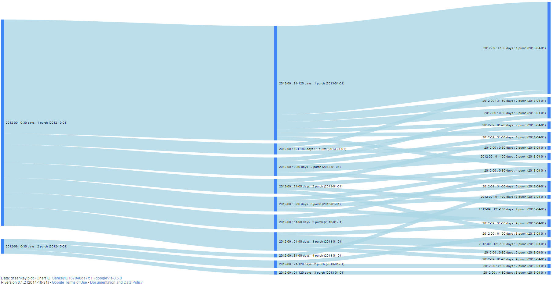
Note: if you plot this chart on your computer, it is interactive and you can highlight any paths and checkpoints.
Therefore, we can easily identify dominant paths, find the proportion of the best or worst clients, direct activities on customers who are in the exact checkpoint of their path and analyze the effect of these activities, and compare the progress of different cohorts. Lastly, we saved the path for each client in the customers_path.csv file that you can use for future work.
3. Analyzing purchasing pace
We will start by plotting the average time lapses between purchases. Actually, we already calculated this index when we created lcg.coh data frame:
ggplot(lcg.coh, aes(x=cohort, fill=cohort)) +
theme_bw() +
theme(panel.grid = element_blank())+
geom_bar(aes(y=av.gap), stat='identity', alpha=0.6) +
geom_text(aes(y=av.gap, label=round(av.gap,0)), size=4) +
facet_grid(segm.freq ~ segm.rec) +
theme(axis.text.x=element_text(angle=90, hjust=.5, vjust=.5, face="plain")) +
ggtitle("Cohorts in LifeCycle Grids - average time lapses between purchases")

This is not surprising: the time lapses increase by increasing the age of cohort. Of course, we have to take into account the boundaries on the recency axis. The larger the range of the boundary, the higher the probability to find older cohorts with a higher pace than younger cohorts. However, our main goal is to work with values that we’ve calculated.
Here are some points I want you to pay attention to:
- We used averages. This means that we mixed customers with different purchase patterns. The averages can be used as an indicator for finding clients who have reached the mean line. However, in order to improve results, you can try to find some common features that would allow you to combine customers with similar behaviors and not only to split cohorts by behavior patterns but furthermore to understand why there are some differences. Therefore, you can make more personal offers to these groups of customers at the most suitable time. Note: this approach can be helpful for finding purchase behavior patterns as well as suitable offers.
- Of course, we could split customers into segments based on average pace of purchases, hence avoiding cohorts. However, cohort analysis helps us to understand some roots of acquisition, e.g. time of first purchase/registration, medium/source/campaign of attraction, which can be very helpful for predicting future behavior as well as potential CLV.
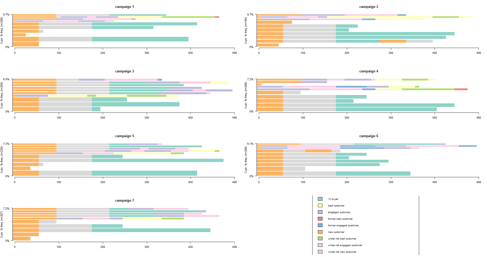
Campaign cohorts
The second example of cohort analysis is to combine customers by the advertisement campaign they were attracted by. This obviously can be helpful because we usually attract different customers with different campaigns. Therefore, we can expect that clients who were attracted by one campaign have some similarities in behavior and are sensitive to the exact same offers/communication channels. Furthermore, we would easily compare progress of campaigns in terms of monetary values (CLV and CAC).
We will use the same charts as the ones for first purchase date cohorts. Because we’ve added the campaign name to the data sample earlier, we can adapt our code by changing “cohort” value to “campaign” only:
# campaign cohorts
lcg.camp <- customers %>%
group_by(campaign, segm.rec, segm.freq) %>%
# calculating cumulative values
summarise(quantity=n(),
cac=sum(cac),
clv=sum(clv),
clv.p=sum(clv.p),
av.gap=sum(av.gap)) %>%
ungroup() %>%
# calculating average values
mutate(av.cac=round(cac/quantity, 2),
av.clv=round(clv/quantity, 2),
av.clv.p=round(clv.p/quantity, 2),
av.clv.tot=av.clv+av.clv.p,
av.gap=round(av.gap/quantity, 2),
diff=av.clv-av.cac)

ggplot(lcg.camp, aes(x=campaign, fill=campaign)) +
theme_bw() +
theme(panel.grid = element_blank())+
geom_bar(aes(y=diff), stat='identity', alpha=0.5) +
geom_text(aes(y=diff, label=round(diff,0)), size=4) +
facet_grid(segm.freq ~ segm.rec) +
theme(axis.text.x=element_text(angle=90, hjust=.5, vjust=.5, face="plain")) +
ggtitle("Campaigns in LifeCycle Grids - difference between av.CLV to date and av.CAC")

ggplot(lcg.camp, aes(x=campaign, fill=campaign)) +
theme_bw() +
theme(panel.grid = element_blank())+
geom_bar(aes(y=av.clv.tot), stat='identity', alpha=0.2) +
geom_text(aes(y=av.clv.tot+10, label=round(av.clv.tot,0), color=campaign), size=4) +
geom_bar(aes(y=av.clv), stat='identity', alpha=0.7) +
geom_errorbar(aes(y=av.cac, ymax=av.cac, ymin=av.cac), color='red', size=1.2) +
geom_text(aes(y=av.cac, label=round(av.cac,0)), size=4, color='darkred', vjust=-.5) +
facet_grid(segm.freq ~ segm.rec) +
theme(axis.text.x=element_text(angle=90, hjust=.5, vjust=.5, face="plain")) +
ggtitle("Campaigns in LifeCycle Grids - total av.CLV and av.CAC")

ggplot(lcg.camp, aes(x=campaign, fill=campaign)) +
theme_bw() +
theme(panel.grid = element_blank())+
geom_bar(aes(y=av.gap), stat='identity', alpha=0.6) +
geom_text(aes(y=av.gap, label=round(av.gap,0)), size=4) +
facet_grid(segm.freq ~ segm.rec) +
theme(axis.text.x=element_text(angle=90, hjust=.5, vjust=.5, face="plain")) +
ggtitle("Campaigns in LifeCycle Grids - average time lapses between purchases")
And we’ve obtained these charts:


I believe everything is clear with these charts. I don’t think that Sankey diagram can be helpful enough for campaign cohorts. If we have some general campaigns that work for a long time period, we can obtain chaotic paths. Instead, I suggest studying a more accurate and visual approach that would be used for campaigns as well as first purchase date cohorts.
Dessert part – Lifecycle phase sequential analysis
Each customer has a path of migration from one grid to another that is based on purchasing behavior and affects CLV. They all have the same initial grid [1 purchase : 0-30 days], but since maximum 30 days (in our case) they had started a journey through grids. My idea is to analyze the path patterns of each cohort and identify cohorts that attracted customers with the path we prefer or not in order to make relevant offers. We will use the lifecycle phase sequential analysis for this. Note: you can find the example of shopping cart sequential analysis in my previous posts that started here so you can obtain other benefits of the method.
Everything we need for this is to reproduce paths through grids for each customer. We will do this with the following code:
# lifecycle phase sequential analysis
library(TraMineR)

min.date <- min(orders$orderdate)
max.date <- max(orders$orderdate)

l <- c(seq(0,as.numeric(max.date-min.date), 10), as.numeric(max.date-min.date))

df <- data.frame()
for (i in l) {

cur.date <- min.date + i
print(cur.date)

orders.cache <- orders %>%
filter(orderdate <= cur.date)

customers.cache <- orders.cache %>%
 select(-product, -grossmarg) %>%
 unique() %>%
 group_by(clientId) %>%
 mutate(frequency=n(),
 recency=as.numeric(cur.date - max(orderdate))) %>%
 ungroup() %>%
 select(clientId, frequency, recency) %>%
 unique() %>%

 mutate(segm=
 ifelse(between(frequency, 1, 2) & between(recency, 0, 60), 'new customer',
 ifelse(between(frequency, 1, 2) & between(recency, 61, 180), 'under risk new customer',
 ifelse(between(frequency, 1, 2) & recency > 180, '1x buyer',

 ifelse(between(frequency, 3, 4) & between(recency, 0, 60), 'engaged customer',
 ifelse(between(frequency, 3, 4) & between(recency, 61, 180), 'under risk engaged customer',
 ifelse(between(frequency, 3, 4) & recency > 180, 'former engaged customer',

 ifelse(frequency > 4 & between(recency, 0, 60), 'best customer',
 ifelse(frequency > 4 & between(recency, 61, 180), 'under risk best customer',
 ifelse(frequency > 4 & recency > 180, 'former best customer', NA)))))))))) %>%

 mutate(report.date=i) %>%
 select(clientId, segm, report.date)

df <- rbind(df, customers.cache)
}

df <- df %>%
mutate(grid=paste(segm.rec, segm.freq, sep=' : ')) %>%
select(clientId, grid, report.date)
We’ve checked the position of each customer in the LifeCycle Grids as of past dates. Here are two things that I want you to pay attention to: If you have quite a few customers, it would take a lot of time to reproduce grids for each past day. Therefore, we’ve used 10-day gaps in the loop that doesn´t seem detrimental in terms of accuracy as our minimal recency time lapse is 60 days.
Secondly, it would be quite tough to work with 36 grids. Therefore, we used 9 segments which you can adapt to your needs:
- new customer (1-2 purchases and 0-60 days recency),
- under risk new customer (1-2 purchases and 61-180 days recency),
- 1x buyer (1-2 purchases and >180 days recency),
- engaged customer (3-4 purchases and 0-60 days recency),
- under risk engaged customer (3-4 purchases and 61-180 days recency),
- former engaged customer (3-4 purchases and >180 days recency),
- best customer (>4 purchases and 0-60 days recency),
- under risk best customer (>4 purchases and 61-180 days recency),
- former best customer (>4 purchases and >180 days recency).
We will do sequential analysis with the following code:
# converting data to the sequince format
df <- dcast(df, clientId ~ report.date, value.var='grid', fun.aggregate = NULL)
df.seq <- seqdef(df, 2:ncol(df), left='DEL', right='DEL', xtstep=10)

# creating df with first purch.date and campaign cohort features
feat <- df %>% select(clientId)
feat <- merge(feat, campaign[, 1:2], by='clientId')
feat <- merge(feat, customers[, 1:2], by='clientId')

# plotting the 10 most frequent sequences based on campaign
seqfplot(df.seq, border=NA, group=feat$campaign)

# plotting the 10 most frequent sequences based on campaign
seqfplot(df.seq, border=NA, group=feat$campaign, cex.legend=0.9)

# plotting the 10 most frequent sequences based on first purch.date cohort
coh.list <- sort(unique(feat$cohort))
# defining cohorts for plotting
feat.coh.list <- feat[feat$cohort %in% coh.list[1:6] , ]
df.coh <- df %>% filter(clientId %in% c(feat.coh.list$clientId))
df.seq.coh <- seqdef(df.coh, 2:ncol(df.coh), left='DEL', right='DEL', xtstep=10)
seqfplot(df.seq.coh, border=NA, group=feat.coh.list$cohort, cex.legend=0.9)
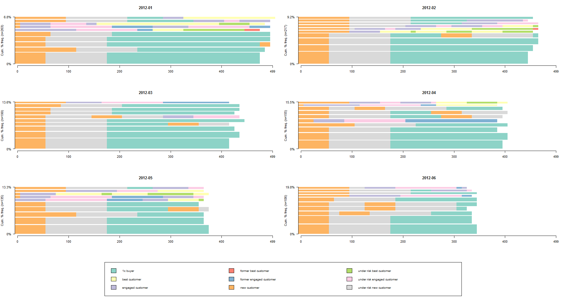
What I really like about this approach is that we’ve easily led all customers to point zero of their life/lifetime with us. What I mean is that we replaced the first day of their lifetime (exact calendar date) with us with day 0 for all customers. This way, we switched from calendar dates to sequence dates. Therefore, all our sequences start from day 0. The white spaces mean that the next grid is unknown at the moment.
We can compare cohorts via share of customers with the different paths and current lifecycle phase (last color stripe). We can see that, for instance, 2012-01 cohort has brought us some part of customers who are the best now (yellow stripe), but 2012-03 cohort hasn’t.
In this way, we can identify different patterns in paths. For example, we can see the history of migrations for current best customers. Have they become the best ones avoiding under risk or former segments? Was there anything that could affect them and how we would use this for other clients?
Conclusions. We’ve studied how Cohort analysis can help us to combine customers into groups by common characteristics and obtain more clear view for differences between customers who are in the same grid of LifeCycle Grids. Also we’ve touched sequential analysis which helped us to find some patterns in the customers’ journey through grids. And we’ve found that customers who are on the same phase of lifecycle can have significantly different purchasing behavior. Therefore, it can be the topic for the future work: to create cohorts based on purchasing behavior/patterns.
Thank you for reading this! Feel free to share your thoughts about.
R-bloggers.com offers daily e-mail updates about R news and tutorials about learning R and many other topics. Click here if you're looking to post or find an R/data-science job.
Want to share your content on R-bloggers? click here if you have a blog, or here if you don't.